Role
|
Team
|
Overview
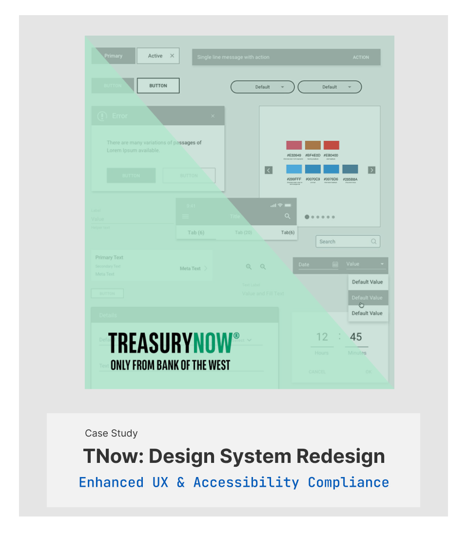
Bank of the West is a financial services company headquartered in San Francisco, California. I worked for the commercial banking group, and the TreasuryNow application is a highly intuitive Digital Banking Platform. The application is a digital self-service, informational, and transactional application. When I started at Bank of the West, we ran a usability test on the existing application, and the result wasn’t satisfying to the potential users and the bank leadership.
My Approach
I created a new design system, which is a web & mobile framework and is a digital Interaction guideline. I began with researching the user pain point to solve the design problem. I needed to understand and define those problems. Once I understood the issues, I ideate by considering potential constraints.
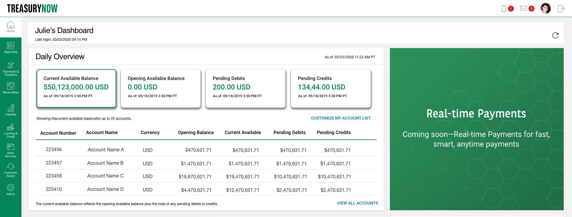
My mission was to redesign the TreasuryNow web and mobile application to improve overall UI/UX and show banking products and services. I redesigned the entire global library to satisfy new requirements and reach business goals. The design system is a series of components that can be reused in different combinations. Design systems allow you to manage design at scale. I created a new design system, a web & mobile framework, and a digital Interaction guideline.
Pain Points
- Lack of intuitive UI/UX and clarity
- Lot’s of bugs open- over 1000 bugs and defects were open
- The Dev team wasn’t following the existed style guide fully, and as a result, the application had a lot of inconsistencies throughout the application
- The style guide and the component library were outdated and needed a major redesign
- New business requirements were put on hold for an extended time due to having so many bugs open and the priorities first approach.
- There was lots of patching going on instead of fixing the root cause of the issues, which was the lack of a robust Design System
- Significant problems with accessibility and lack of ADA compliant colors
- Lack of good design strategy and structure
Design Goals
- Rebranded the application as TreasuryNow
- Created an up to date Design System
- Designed intuitive user experience
- Customized user experience for web and mobile application
- Increased product and services visibility and design consistency
- Solved ADA issues
- Improved overall app look and feel
- Redesigned user flows
- Added new component interactive functionalities and utilities
- Discover the main pain point of users and test possible solutions with prototyping and testing
Click on the link to see the full Design System Manager live >
Challenge
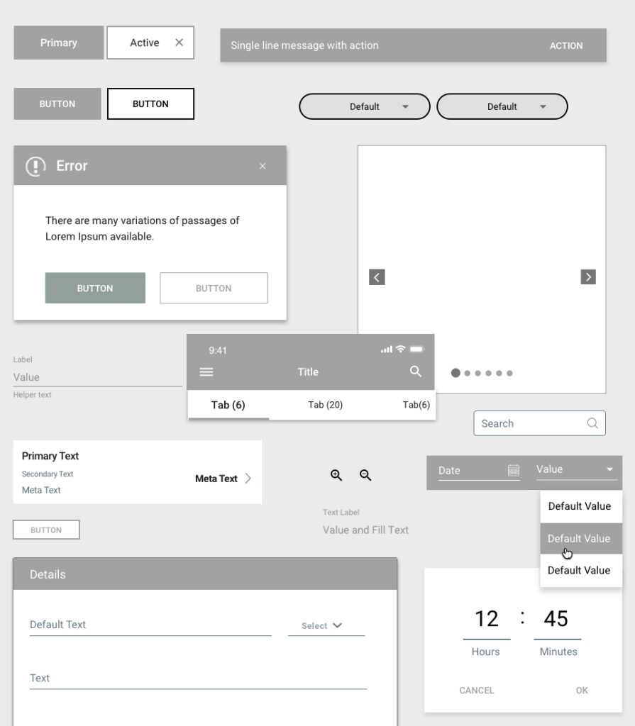
I created a new design system that led to redesigning the Style Guide and the Sketch Library. I’ve included ADA compliant colors and covered the full redesign of the global component library. The design system covers design principles, UX/UI guidelines, development guidelines, User flows/Interaction guidelines, reusable sketch library, resources, and documentation.
DMS is used by designers, developers, content teams, business teams, business owners, and vendors.
Purpose & Solution
Efficiency: Instead of repeatedly building similar components from scratch, Design Systems enable designers & developers to reuse components and thereby increase efficiency.
Consistency: Design Systems introduce a shared set of principles and rules to build components. It becomes much easier to create consistent experiences across different platforms.
Scale: Increased efficiency and consistency lead a company to build faster products at scale.
Design for flexibility. Every user is different and so is the device and their internet access. The foundation of our system has been designed and built to gracefully adjust to these factors to always offer the best experience possible.
Atomic & Modular Methodology
Atomic design is a methodology for creating design systems. Clients and team members can better appreciate the concept of design systems by seeing the steps laid out in front of them.
Atoms are the basic building blocks—colors, typography, spacing, etc.
Molecules are relatively simple groups of UI elements functioning together as a unit. Form labels, search input, and button can join together to create a search form molecule.
Organisms are relatively complex UI components composed of groups of molecules and atoms or other microorganisms. These organisms form distinct sections of an interface.
Templates are page-level objects that place components into a layout and articulate the design’s underlying content structure. To build on our previous example, we can take the header organism and apply it to a homepage template.
Pages are specific templates, representative text, images, and media into the template to show real content in action.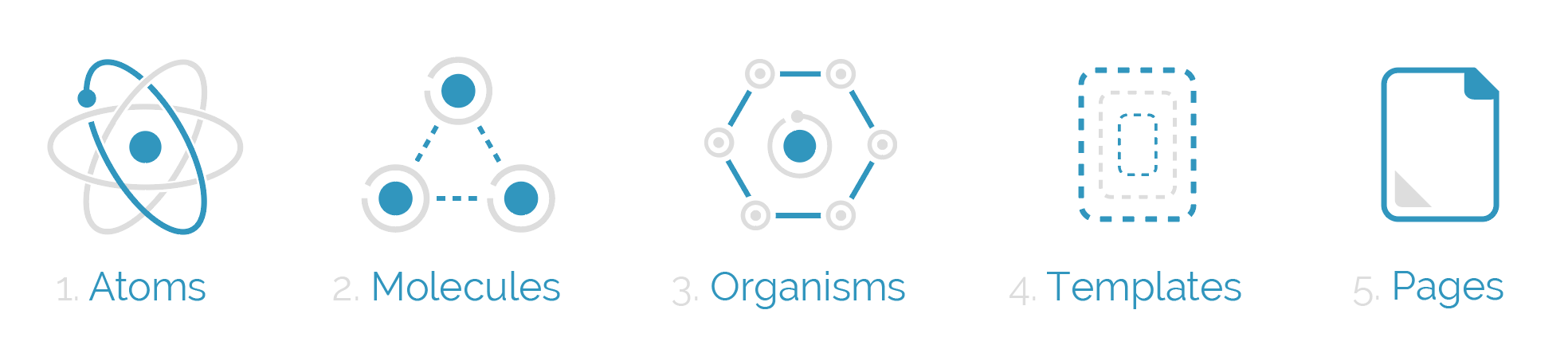
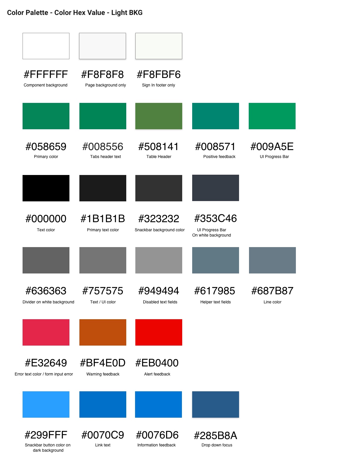
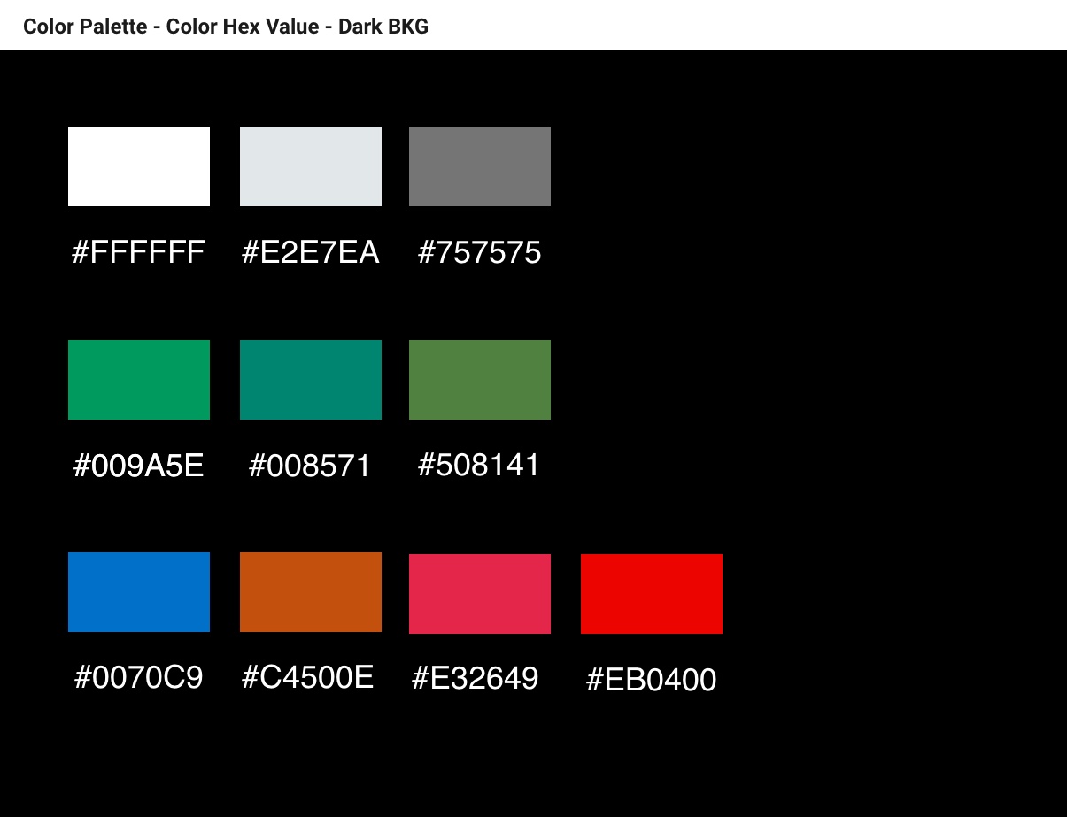
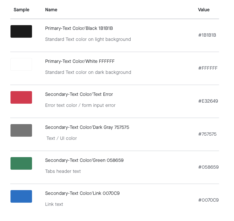
Color Accessibility (ADA)
Color accessibility enables people with visual impairments or color vision deficiencies to interact with digital experiences in the same way as their non-visually-impaired counterparts. I solved following ADA issues, design inconsistencies, and UI/UX issues. People with disabilities have the same opportunities as everyone else to use our application. Contrast elements should have a color contrast ratio of at least 4.5:1. Enter a foreground and background color. Contrast requirements also apply to all UI elements on the page. The new color palette is ADA compliant and will solve visibility issues for all the UI elements, including some of the following items.
. Text readability- background and text
. Color filters, pickers, swatches, and color combinations
. Button & tab states
. Alert messaging
. Navigation highlights
. Table highlights
. Icons visibility
. Borders
Color Palette Redesign
Color is a key element in our design system used to create meaning and consistency. Our color palette helps to unify our brand’s experiences, from product interfaces to marketing.
You can apply color to:
- Convey emotion
- Express a tone
- Guide attention
- Pinpoint critical items
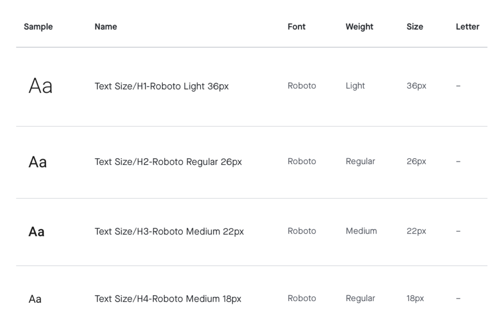
Typography
The best typography is adaptable and offers a range of ways to be used within a design. Sometimes it may need to be expressive and others times it may need to be more serious.
We chose a distinctive font stack that can easily transition throughout our platform, through a variety of uses. It can be welcoming and playful for marketing designs or usable and simple in our products.
It is optimized for legibility within an interface and has a high level of performance within our digital platform. In the case of marketing it can be used for nearly everything, from bold landing page headlines to beautiful, publication-level content designs.
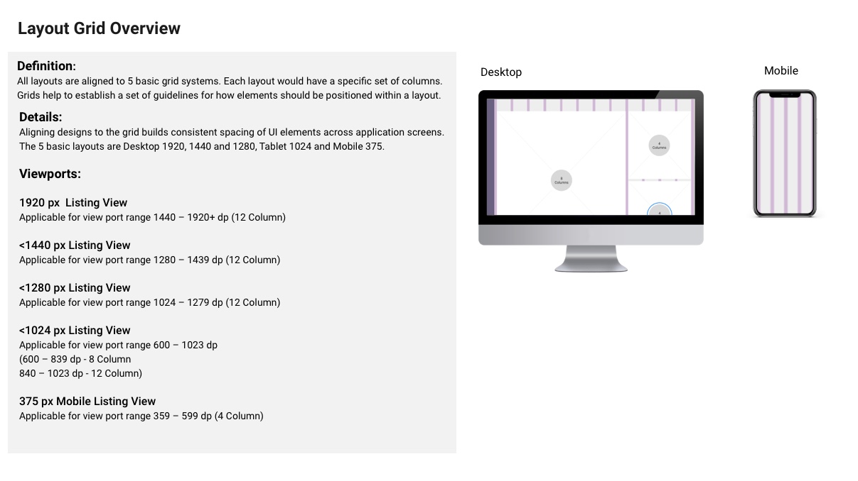
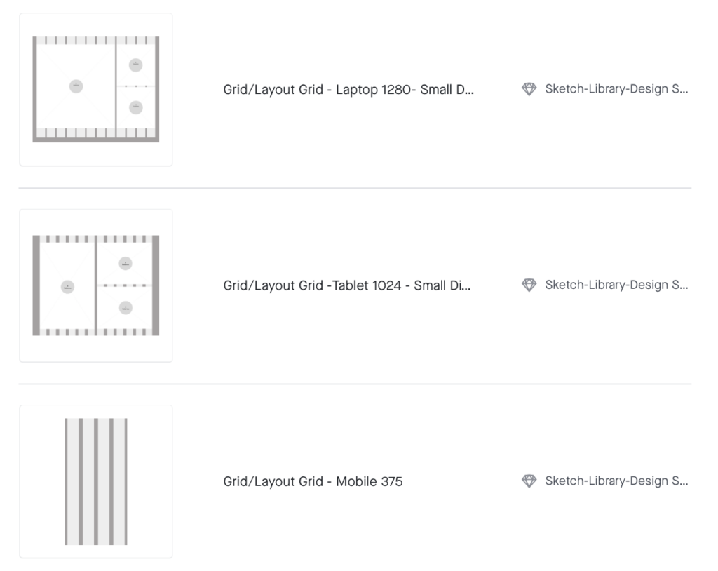
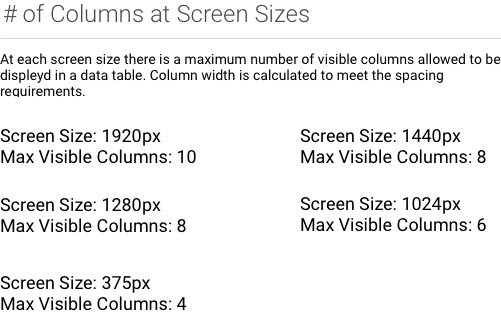
Layout Grids
All layouts are aligned to 5 basic grid systems. Each layout would have a specific set of columns.
Grids help to establish a set of guidelines for how elements should be positioned within a layout.
Aligning designs to the grid builds consistent spacing of UI elements across application screens.
The 5 basic layouts are Desktop 1920, 1440 and 1280, Tablet 1024 and Mobile 375.
Viewports:
1920 px Listing View
Applicable for view port range 1440 – 1920+ dp (12 Column)
1440 px Listing View
Applicable for view port range 1280 – 1439 dp (12 Column)
1280 px Listing View
Applicable for view port range 1024 – 1279 dp (12 Column)
1024 px Listing View
Applicable for view port range 600 – 1023 dp
(600 – 839 dp – 8 Column
840 – 1023 dp – 12 Column)
375 px Mobile Listing View
Applicable for view port range 359 – 599 dp (4 Column)
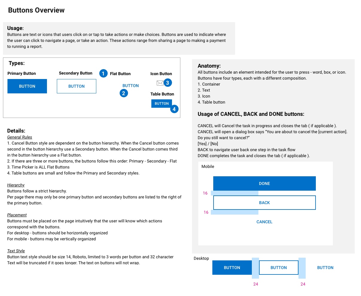
Buttons
Buttons indicate important actions and clearly inform the user what will happen when they interact with it.
Buttons are used primarily for actions, whereas links should be used as navigational elements that are secondary within the interface, such as within body copy.
Buttons are commonly used in:
- Forms
- Interactive cards
- Modal windows
- Taskbars and toolbars within applications
- Marketing banners
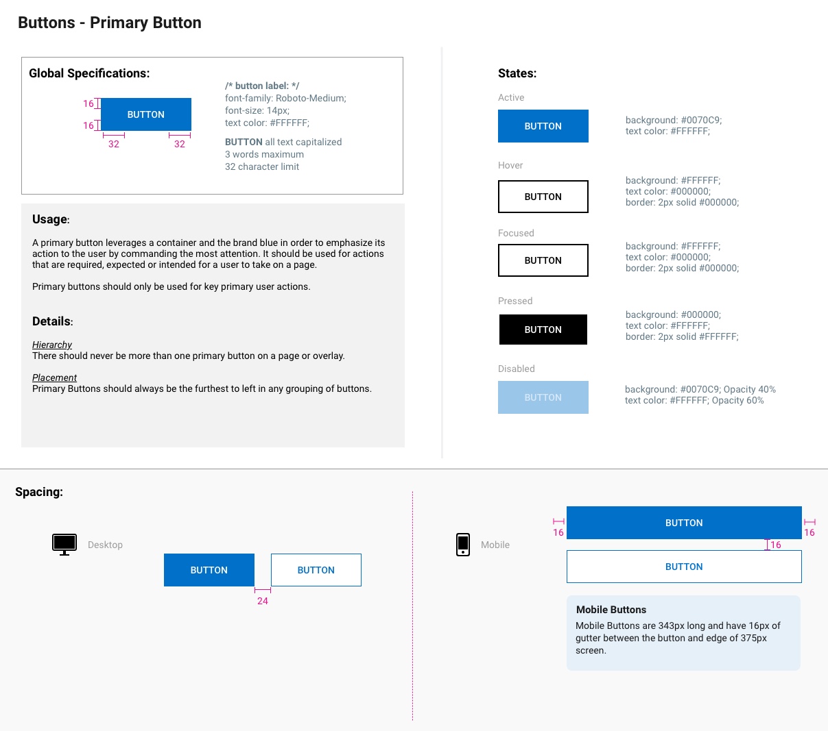
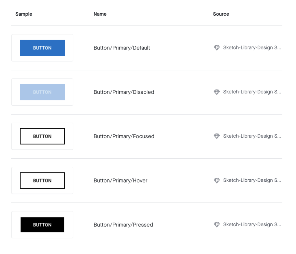
Primary buttons indicate the main action that should be taken on a page or within a set of primary and secondary actions to indicate the primary action.
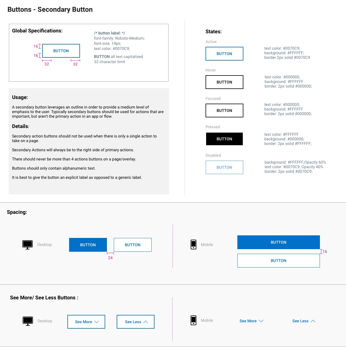
A secondary button leverages an outline in order to provide a medium level of emphasis to the user. Typically secondary buttons should be used for actions that are important, but aren’t the primary action in an app or flow.
Button usage guidelines:
. Secondary action buttons should not be used when there is only a single action to take on a page.
. Secondary Actions will always be to the right side of primary actions.
. There should never be more than 4 actions buttons on a page/overlay.
. Buttons should only contain alphanumeric text.
. It is best to give the button an explicit label as opposed to a generic label.
A flat button does not have an outline and conveys the lowest level of emphasis to the user. A flat button has many potential use cases but should generally be used for less pronounced actions.
Button usage guidelines:
. Flat buttons should not be used when there is a key succesful action buttons required in a flow. Flat buttons should be used if there are many potential actions on the same page that should convey the same level of emphasis.
. Flat buttons can be used as the “counteraction” to a primary button in a flow (e.g. “Continue” is the primary action while “Cancel” is the secondary action).
. Flat buttons should be used to minimize distraction from important content on the page.
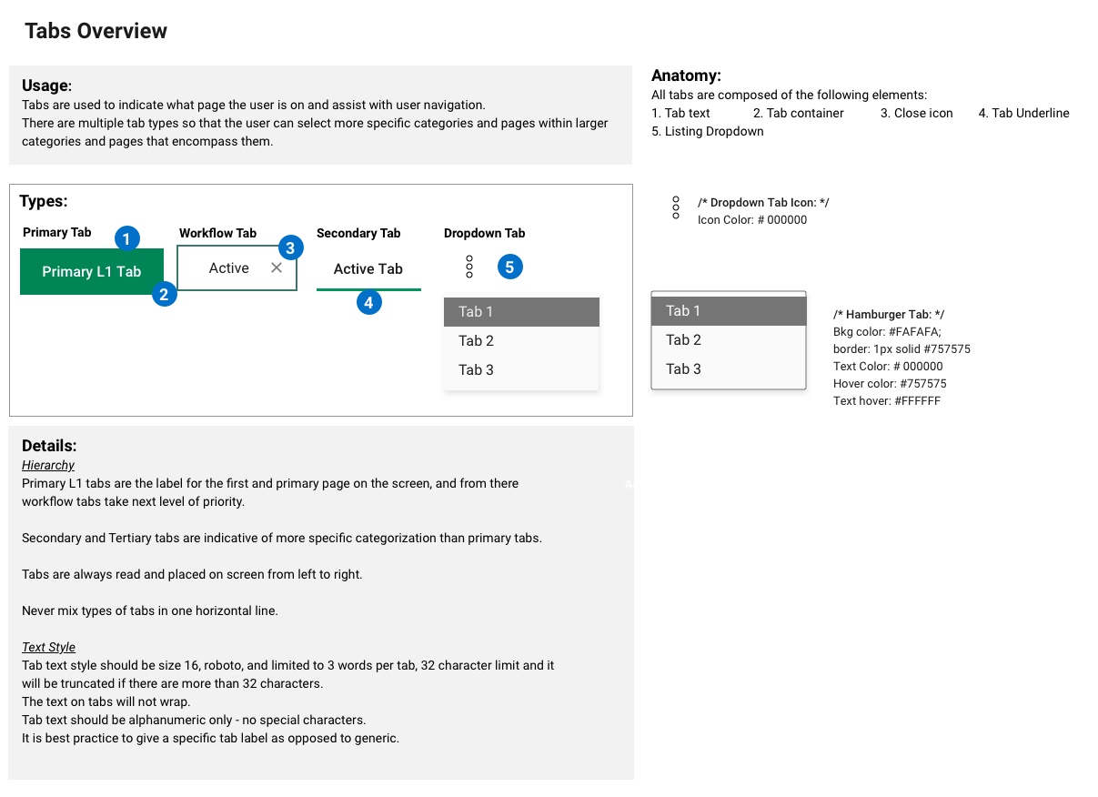
Tabs
Tabs are used to indicate what page the user is on and assist with user navigation.
There are multiple tab types so that the user can select more specific categories and pages within larger categories and pages that encompass them.
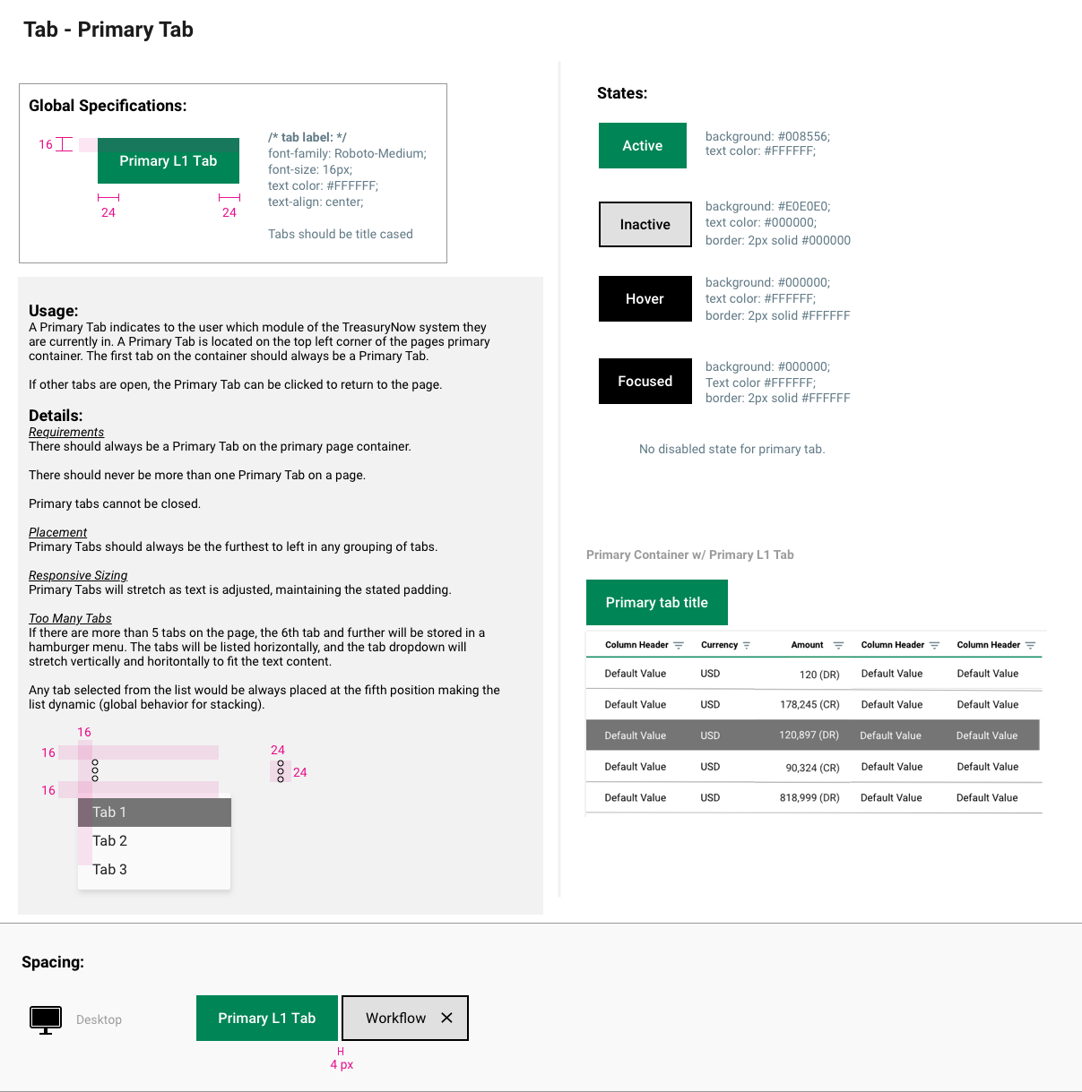
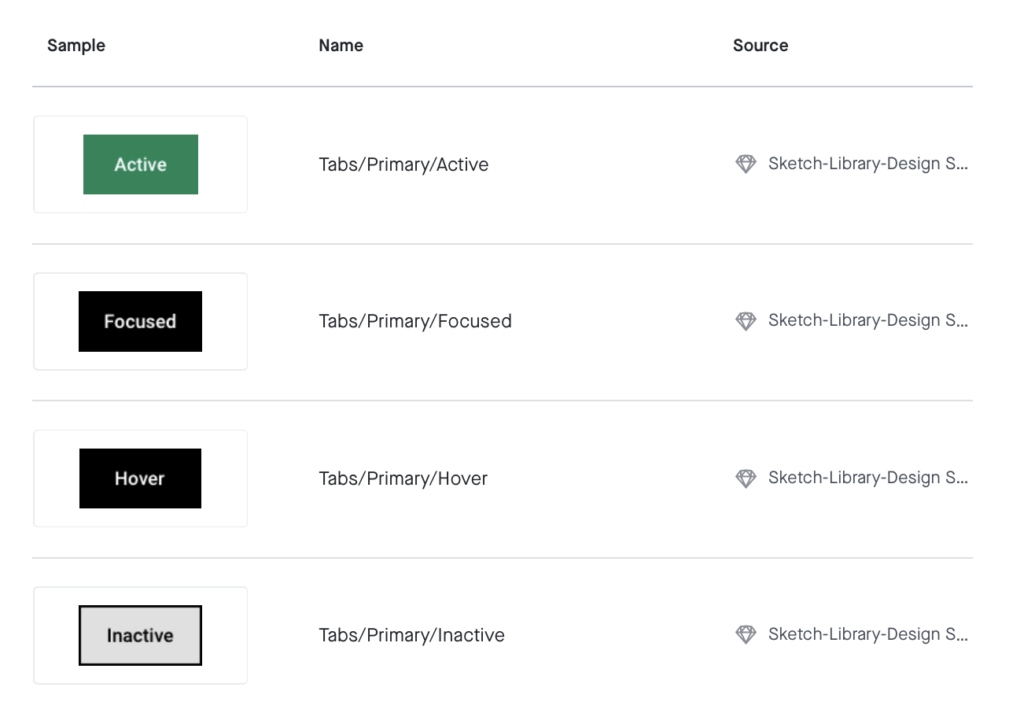
. Primary tabs are the label for the first and primary page on the screen, and from there workflow tabs take next level of priority.
. Secondary and Tertiary tabs are indicative of more specific categorization than primary tabs.
. Tabs are always read and placed on screen from left to right.
. Never mix types of tabs in one horizontal line.
Tab text style should be size 16, roboto, and limited to 3 words per tab, 32 character limit and it will be truncated if there are more than 32 characters.
The text on tabs will not wrap.
Tab text should be alphanumeric only – no special characters.
It is best practice to give a specific tab label as opposed to generic.
A Primary Tab indicates to the user which module of the system they are currently in. A Primary Tab is located on the top left corner of the pages primary container. The first tab on the container should always be a Primary Tab.
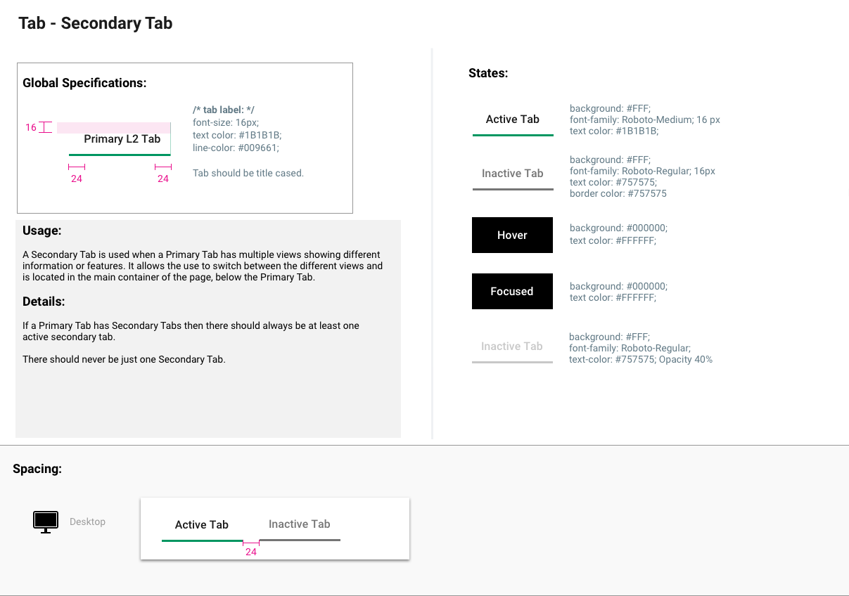
A Secondary Tab is used when a Primary Tab has multiple views showing different information or features. It allows the use to switch between the different views and is located in the main container of the page, below the Primary Tab.
A Pill Tab is typically used as a Tertiary Tab for tables and allow for filtering on multiple different selections – for example, date and payment type. The Pill tab should generally be used as the tertiary tab on a page, within a secondary tab.
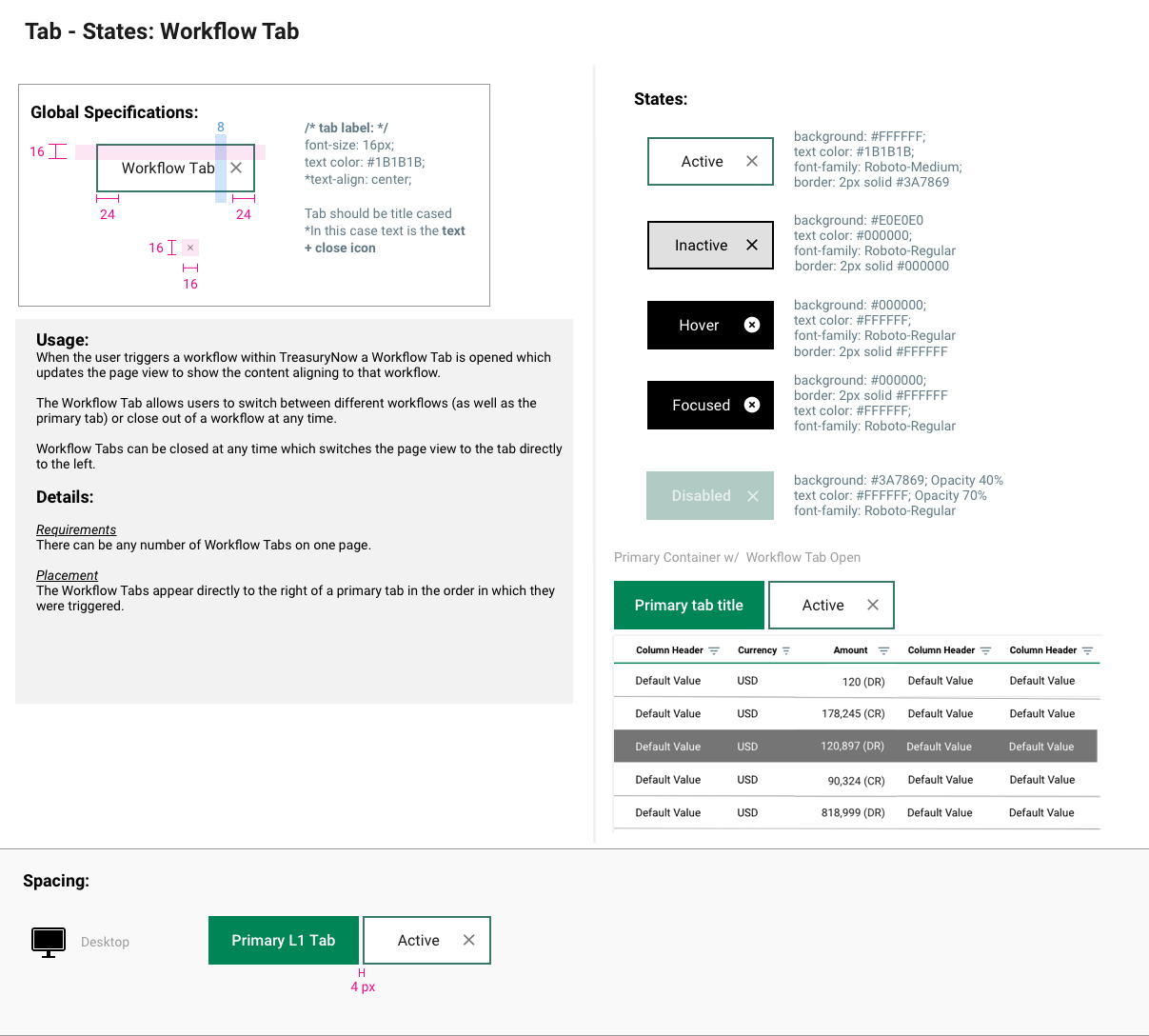
When the user triggers a workflow within application a Workflow Tab is opened which updates the page view to show the content aligning to that workflow.
The Workflow Tab allows users to switch between different workflows (as well as the primary tab) or close out of a workflow at any time.
Workflow Tabs can be closed at any time which switches the page view to the tab directly to the left.

Spacing
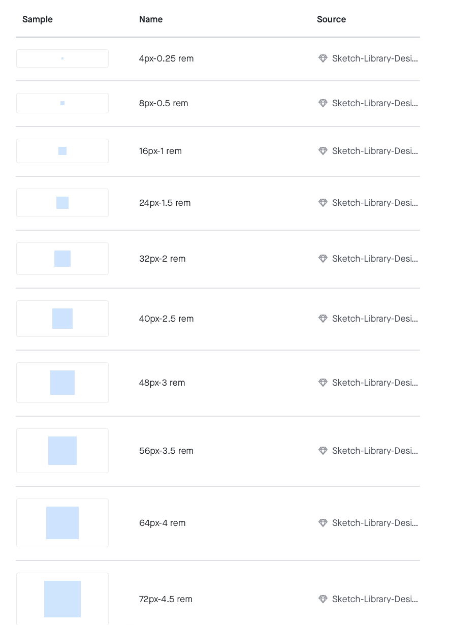
Spacing tokens are used to consistently apply margin and padding across components and UIs. Having a set spacing scale brings a rhythm to the product and creates a natural and familiar flow from page to page. Use denominations of 8, between 8 and 80 pixels.
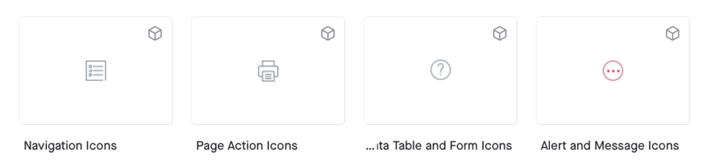
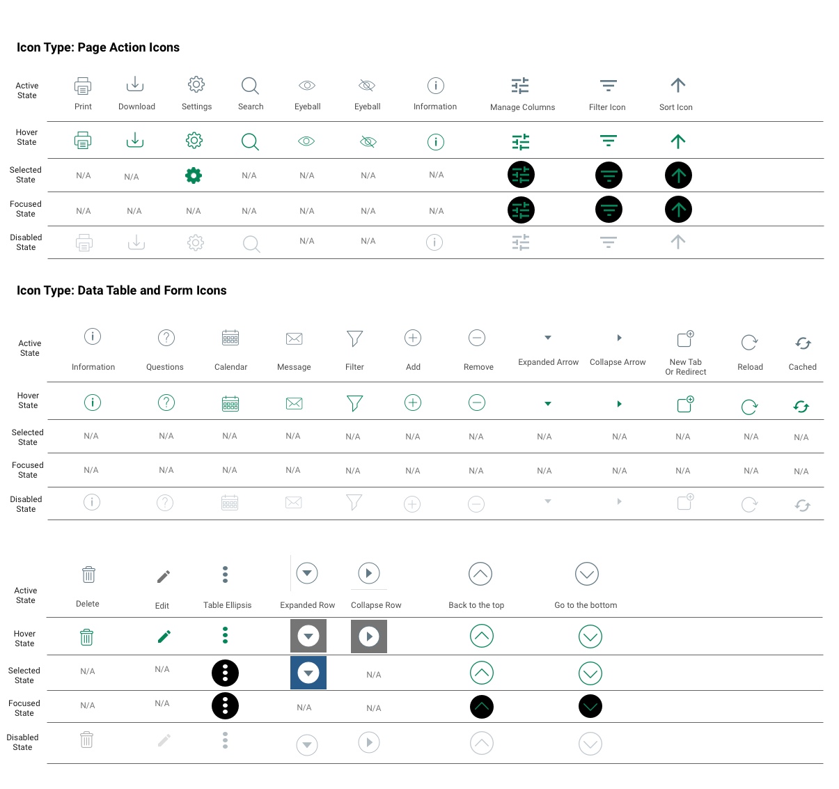
Icons
Icons are small images used to indicate information to the user; they are a visual expression of the brand and product and communicate the core ideas and intents of the product.
They can be clicked on to navigate or view more information, used to delineate options, or simply to add visuals to TreasuryNow.
The icons are always found as shown in the library, and follow brand coloring.
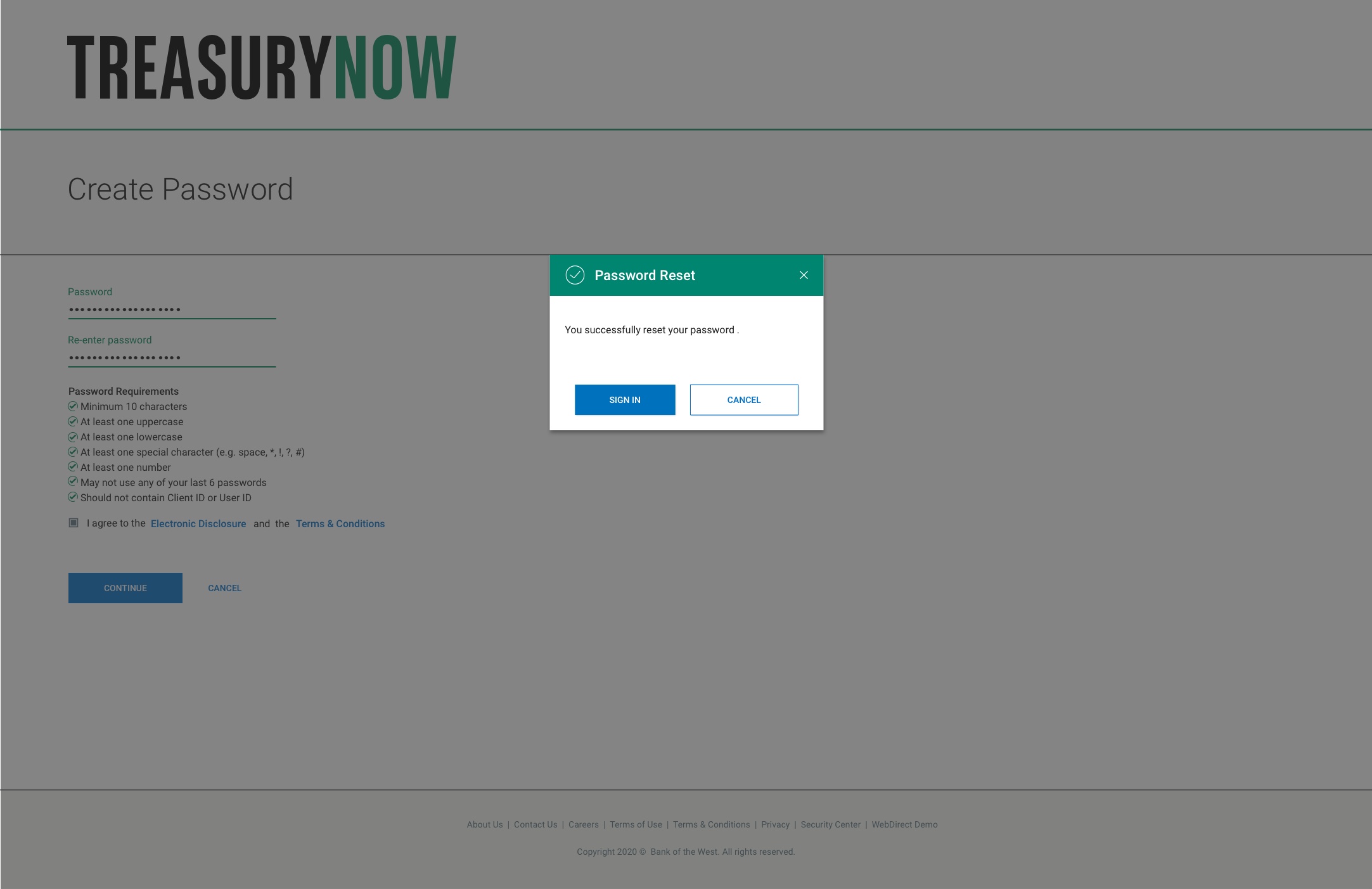
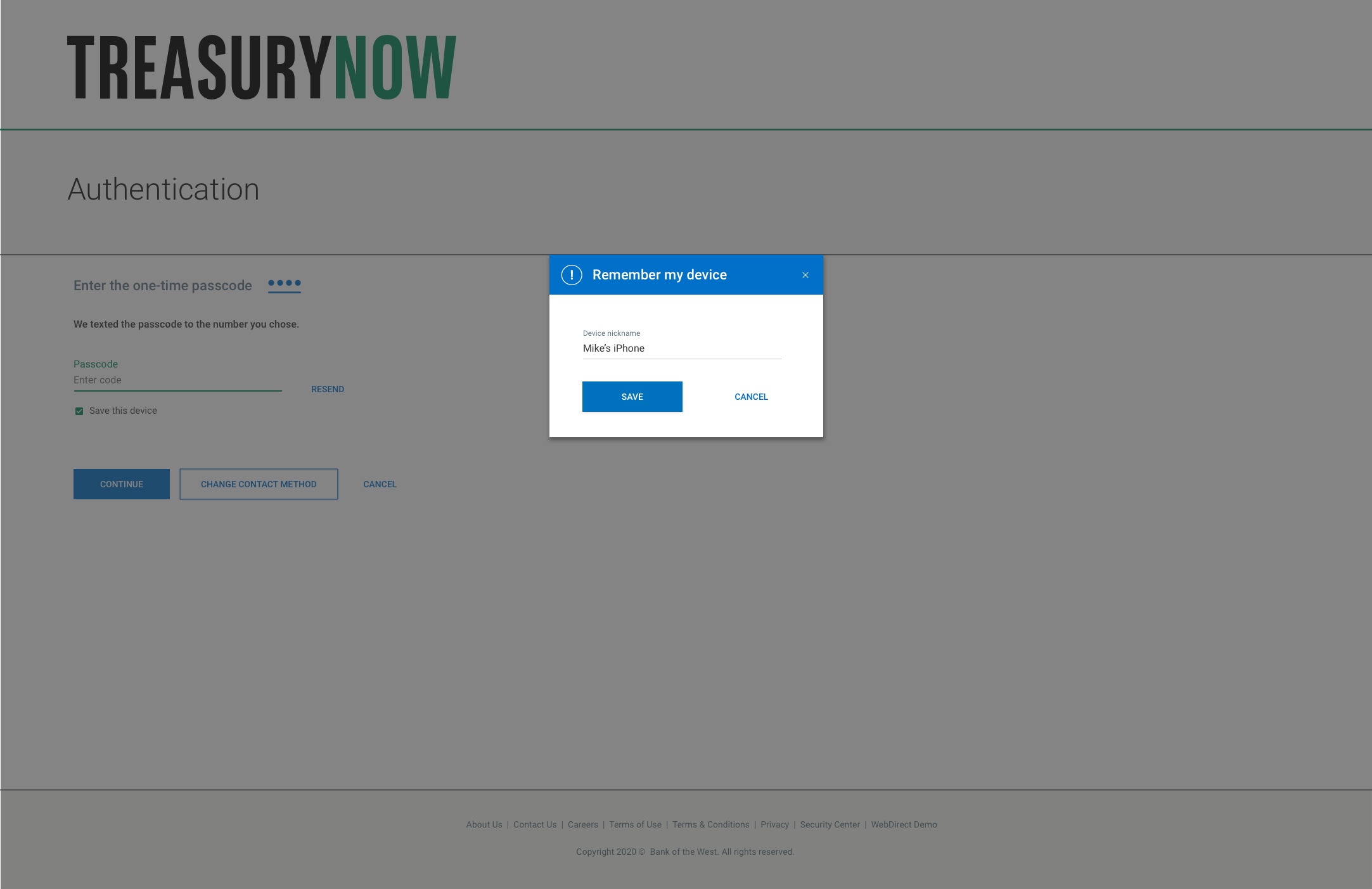
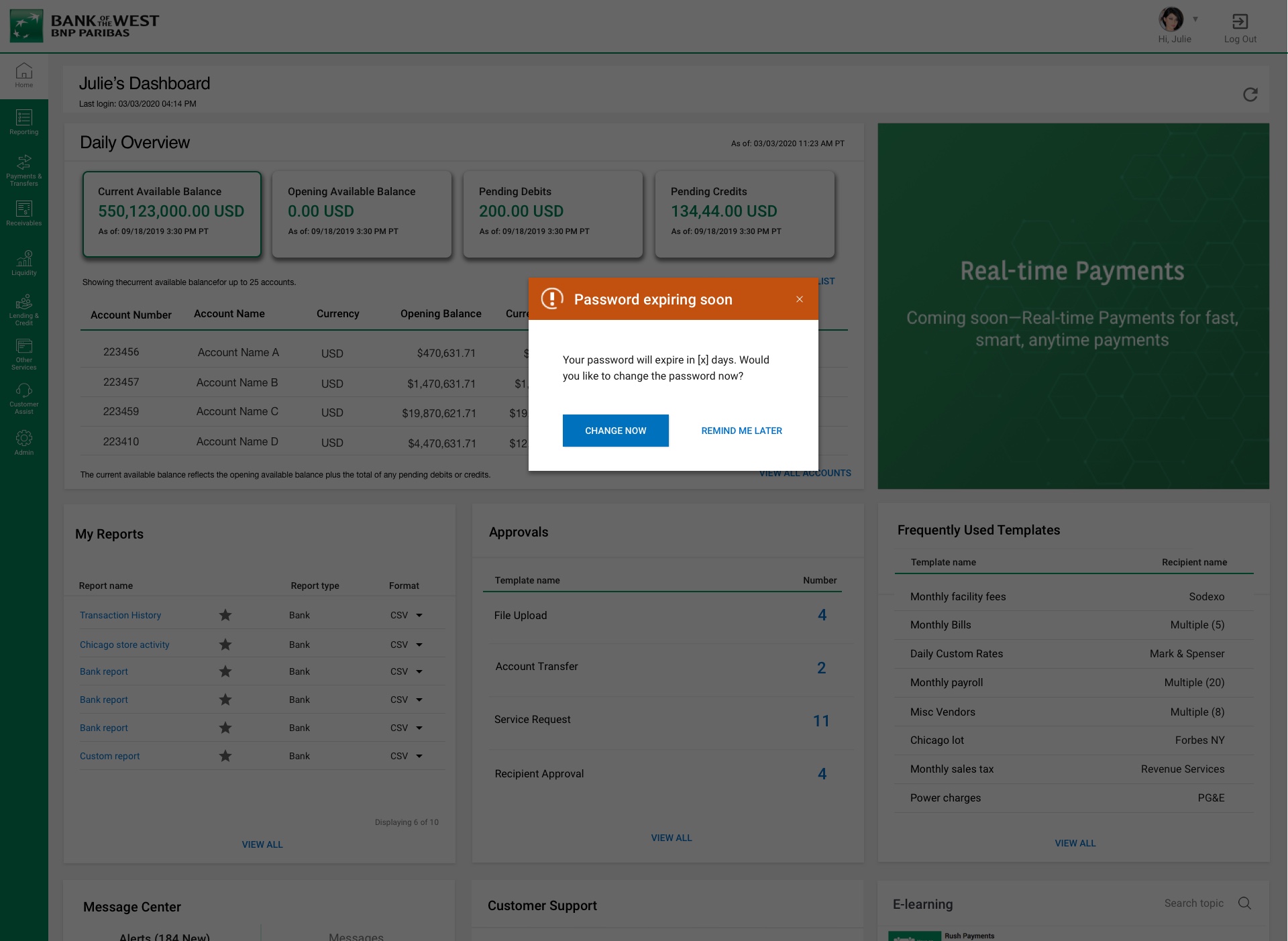
Alert Messages
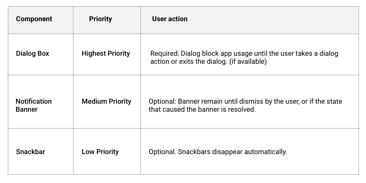
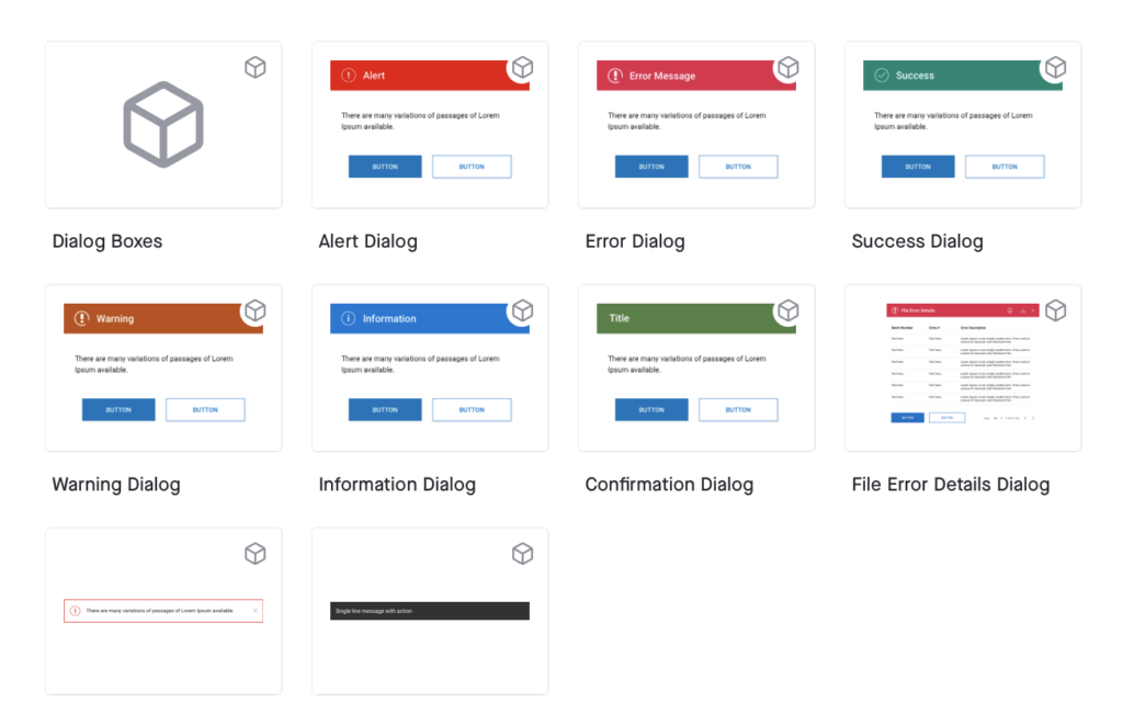
- A dialog box is a type of secondary window which provide critical information to a user action or asks for a decision to continue on a specific task. Dialogs disable all app functionality when they appear, and remain on screen until confirmed, dismissed, or a required action has been taken.
- Notification Box is a type of secondary window which provides critical information to a user. A notification message box is notifying the user about something and won’t disable all app functionality when they appear and remain on screen until dismissed.
- Snack-bars provide temporary messages or a system feedback at the bottom of the screen.
Snackbars inform users of a process that an app has performed or will perform. They appear temporarily, towards the bottom of the screen. They shouldn’t interrupt the user experience, and they don’t require user input to disappear.
When to use:
Dialogs should be used for:
. Errors that blocks an app’s normal operation.
. Critical information that requires a specific user task, decision, or acknowlagement.
. Dialogs could be informational or warning.

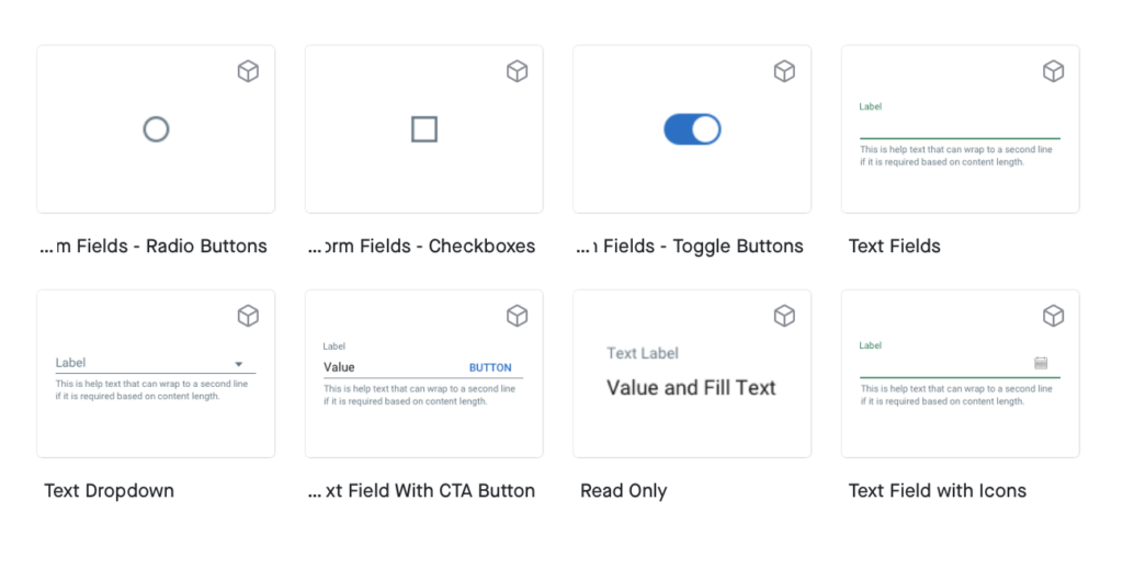
Input Fields
There are an array of form elements with many uses. They can be used to input information or make selections.
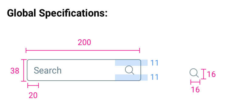
Search Box
The search box allows the user to search information.
Usage:
The search box is used through TreasuryNow for when the user needs to conduct a search.
It is often used to search the table, and is located above and right aligned with the table in alignment with table icons. (Out of scope)
Search Box follows standard spacing rules, and is often 16px below a table title and 16px above the table.
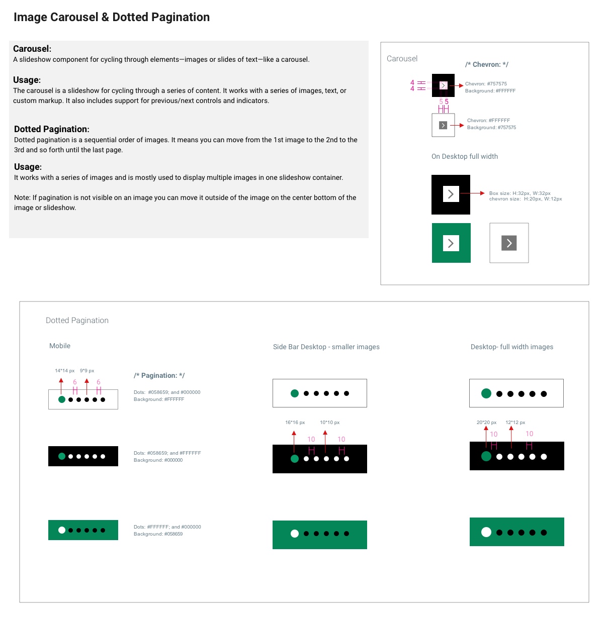
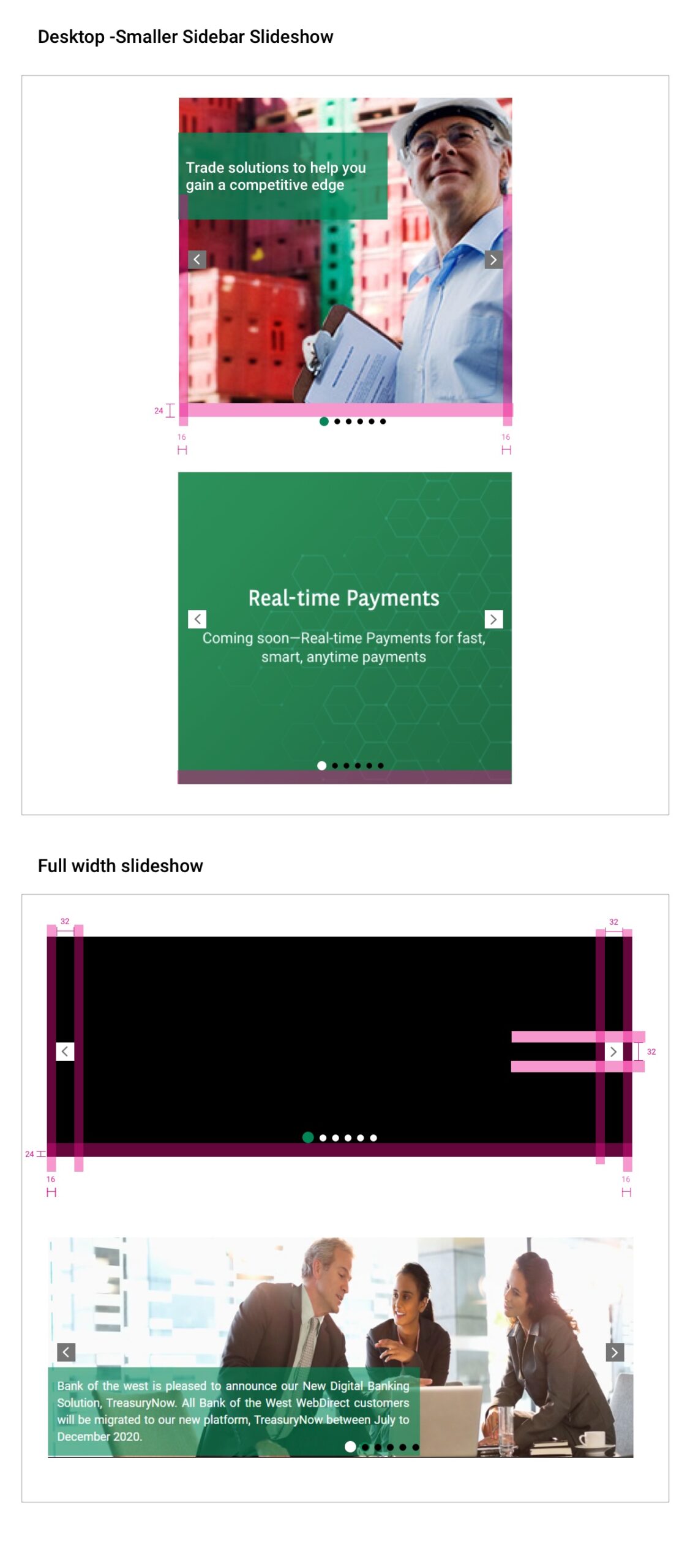
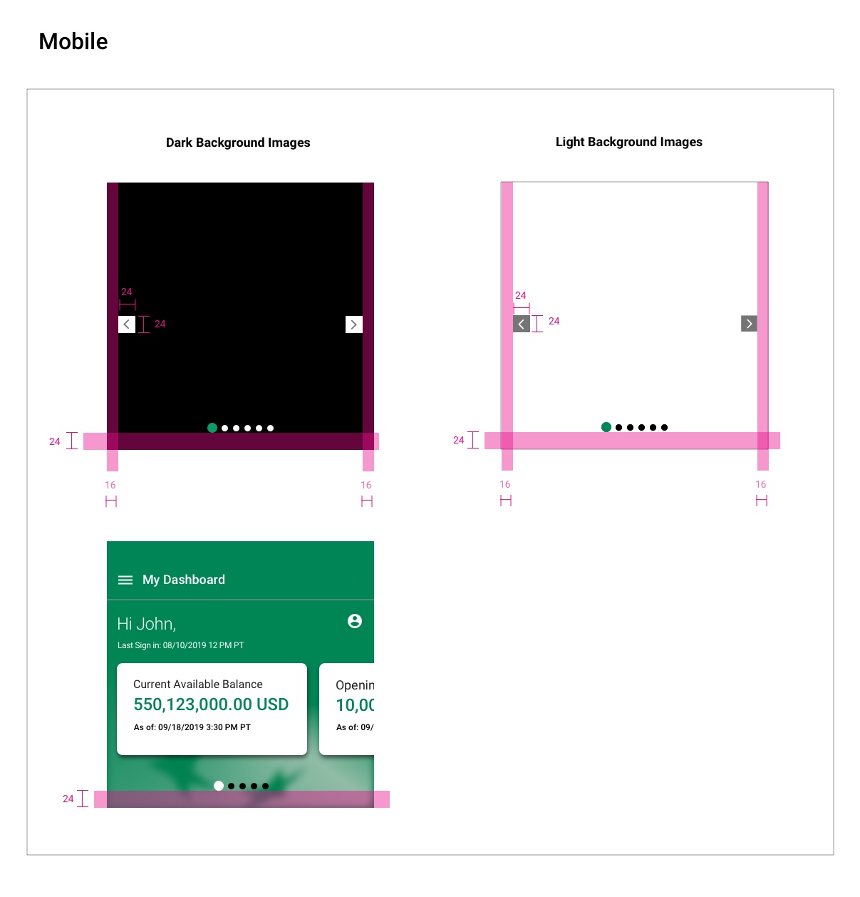
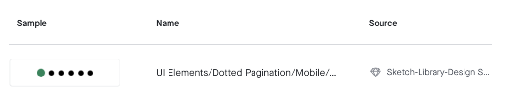
Dotted Pagination
Dotted pagination is a sequential order of images. It means you can move from the 1st image to the 2nd to the 3rd and so forth until the last page.
It works with a series of images and is mostly used to display multiple images in one slideshow container.
Note: If pagination is not visible on an image you can move it outside of the image on the center bottom of the image or slideshow.

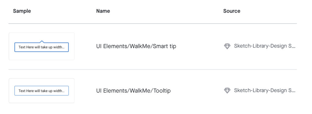
Tooltip
When activated a tooltip displays a text label identifying an element, such as a description of its function. A tooltip is displayed upon tapping and holding a screen element or component (on mobile) or hovering over it (desktop). Continuously display the tooltip as long as the user long-presses or hovers over the tooltip.
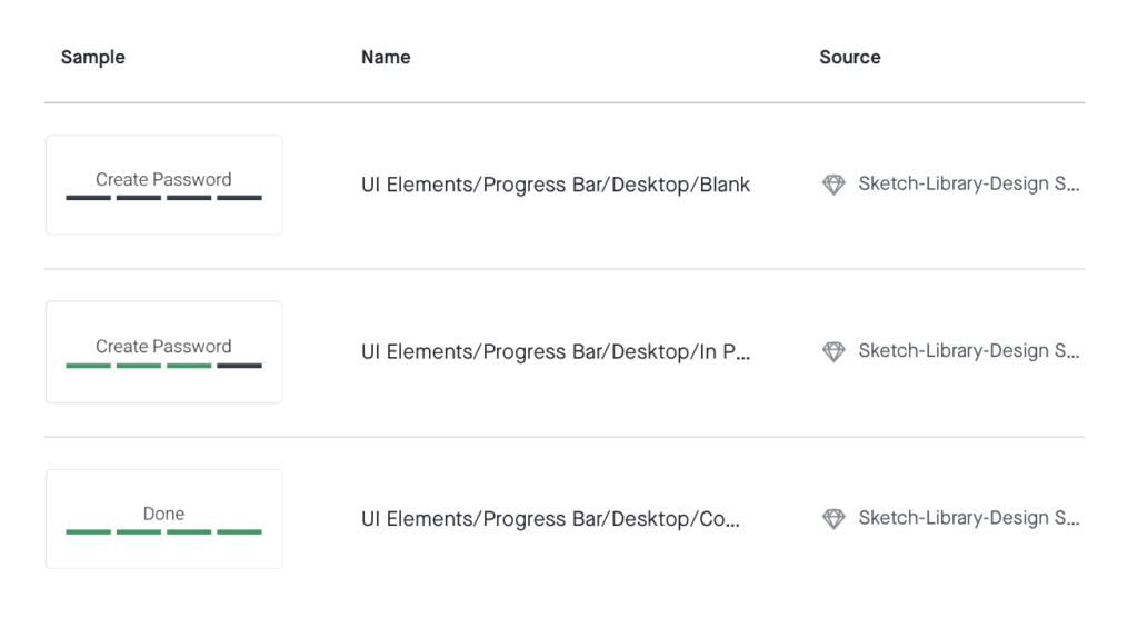
Progress Bar
Progress Bar: express an unspecified wait time or display the length of a process as well as showing progress of an action to the user.
Progress bar inform users about the status of ongoing processes, such as creating a password. They communicate an app’s state and indicate available actions, such as steps for creating a password or the status of the process.
Type: Progress Bar
1. Active line state
2. Inactive line state
 Status Bar
Status Bar: is a graphical control element used to display progress of an action to the user.
Status indicators inform users about the status of ongoing processes, such as creating a password. They communicate an app’s state and indicate available actions, such as steps for creating a password or the status of the process.
Type: Status Bar
1. Active circle state
2. Inactive circle state
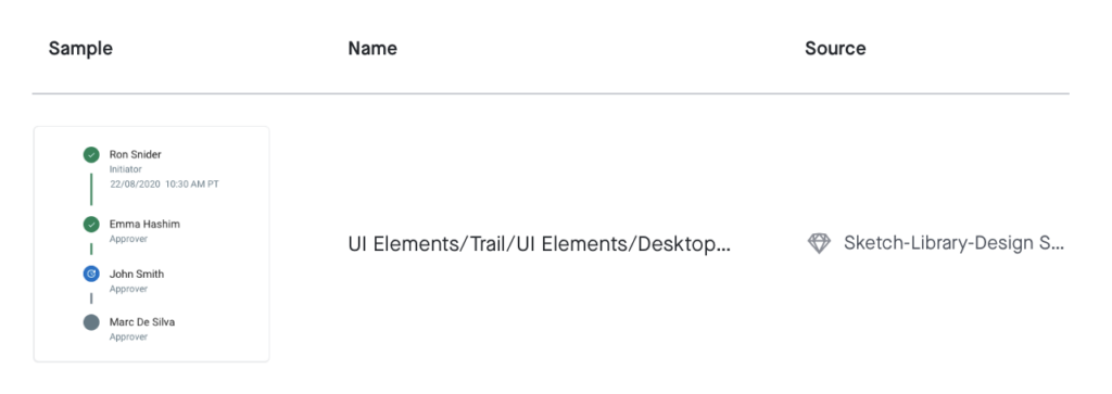
 Trail
Trail
A progress tracker is used to show multiple steps of a process until completion. It contains multiple steps which expand and minimize to show additional information. A tracker has three step types: blank, in progress and complete.
The standard trail is used for trails that occur in primary panels and larger containers, as opposed to right-side panels or smaller widgets. The smaller trail is used within the right panel or smaller widgets to complete the trail function – showing multiple steps.
The smaller trail has two states, expanded and minimized, and the minimized state is used to show the step that is occuring or should be focused on.
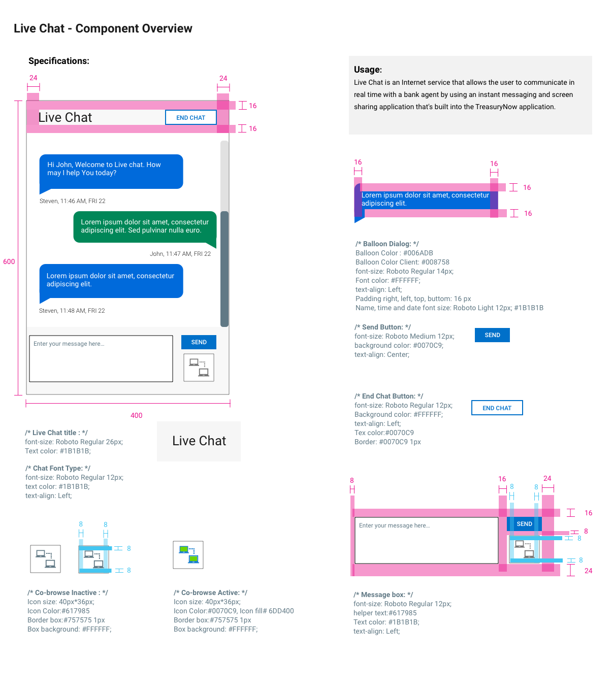
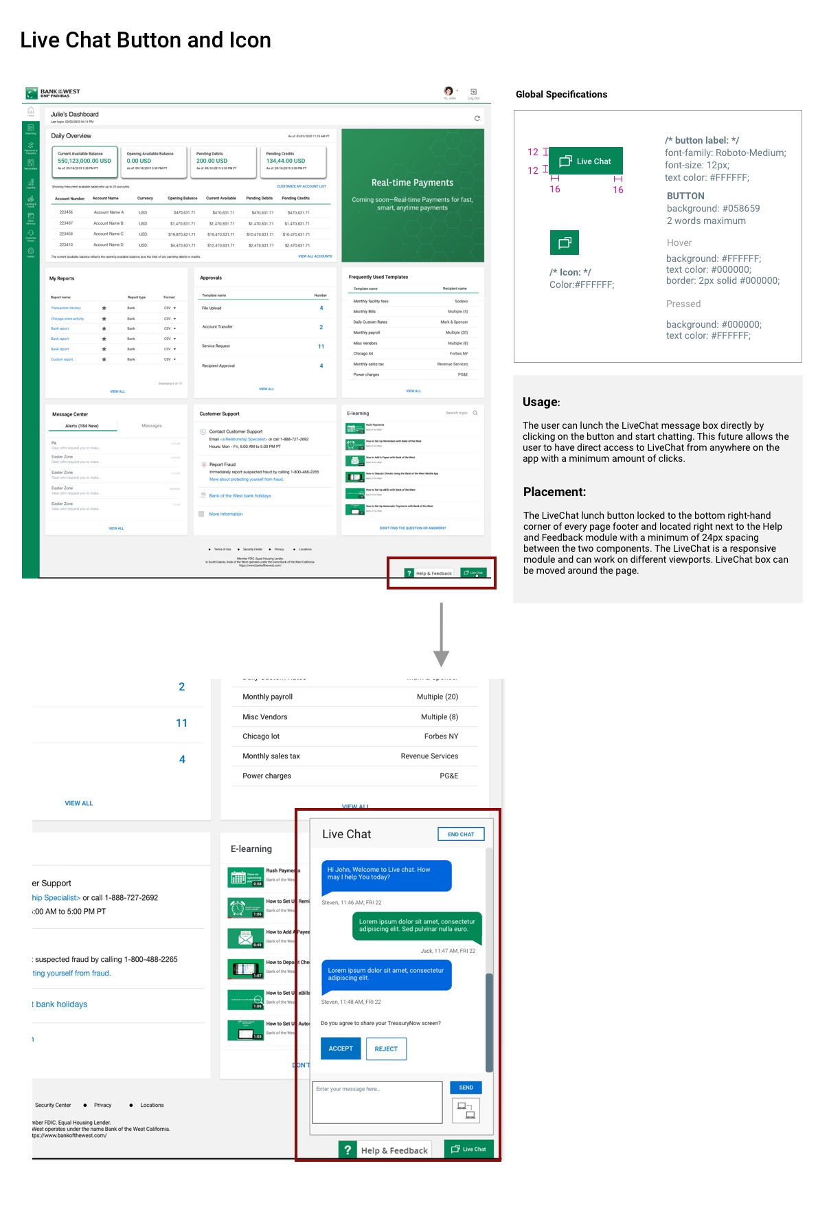
Live Chat
Live Chat is an Internet service that allows the user to communicate in real time with an agent by using an instant messaging and screen sharing application that’s built into the TreasuryNow application.
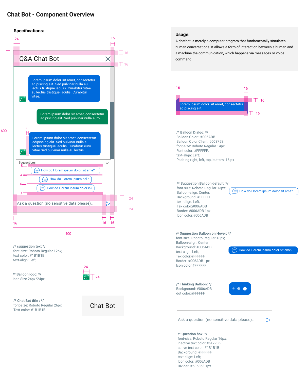
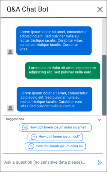
Chatbot
A chatbot is merely a computer program that fundamentally simulates human conversations. It allows a form of interaction between a human and a machine the communication, which happens via messages or voice command.
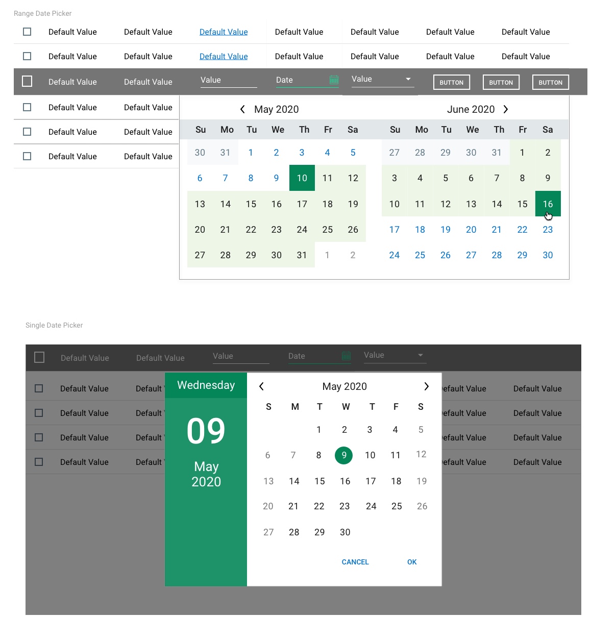
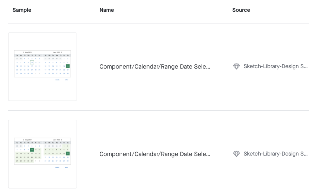
Calendar
Calendars are used frequently throughout the application. They can be used either in a single select or date range context. Either context will follow the same global specifications.
Placement
The calendar component appears directly below the calendar field with no margin between the component and the field. The calendar should normally be left aligned (meaning the left edge of the calendar should align with the left edge of the field.
Interaction
The calendar opens when the user clicks anywhere in the calendar field, including the icon.
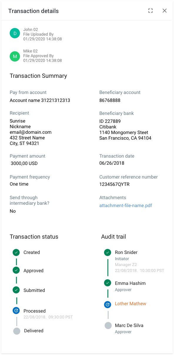
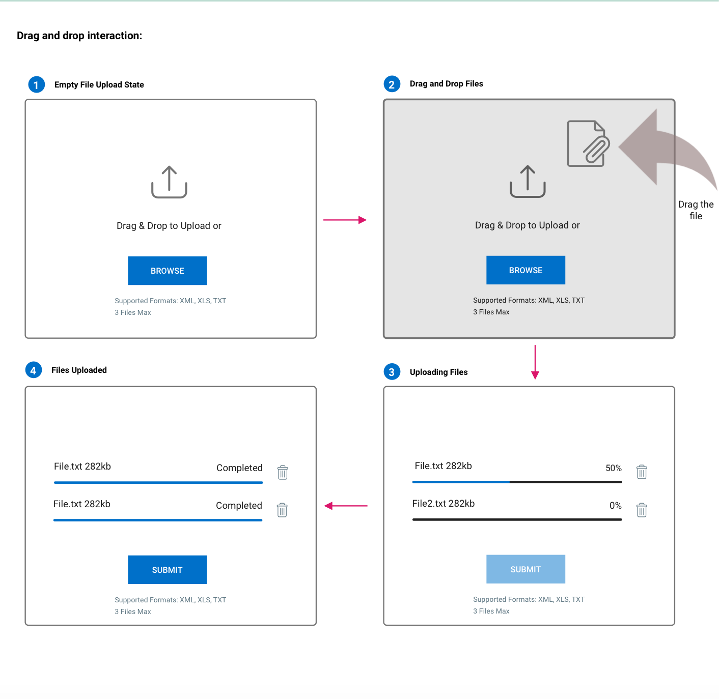
File Upload
The file upload component is used to allow the user to upload one or many documents in the system across many different workflows. The Progress Indicator is an element of the File Upload that shows the user how the status of their file upload.
Placement
File upload components will always be placed within a countainer and will stretch to fit the width of the container, so width is dynamic. This is true for both the drag and drop bounding box and the file upload progress indicator.
Functionality
File upload components can take one or many documents, this must be determined by business requirements.
File upload will always convey status to the user via a percentage or text.
Users can drag and drop a file to upload it, or can browse their local files.
Certain File Upload components may need to run a validation on the file to ensure it is free of errors. This must be defined in the business requirement.
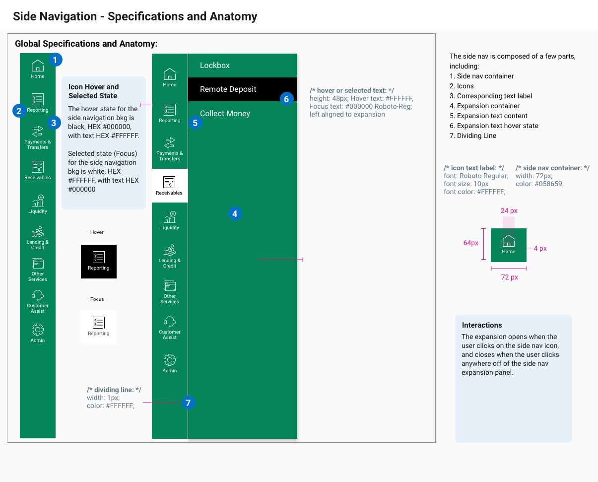
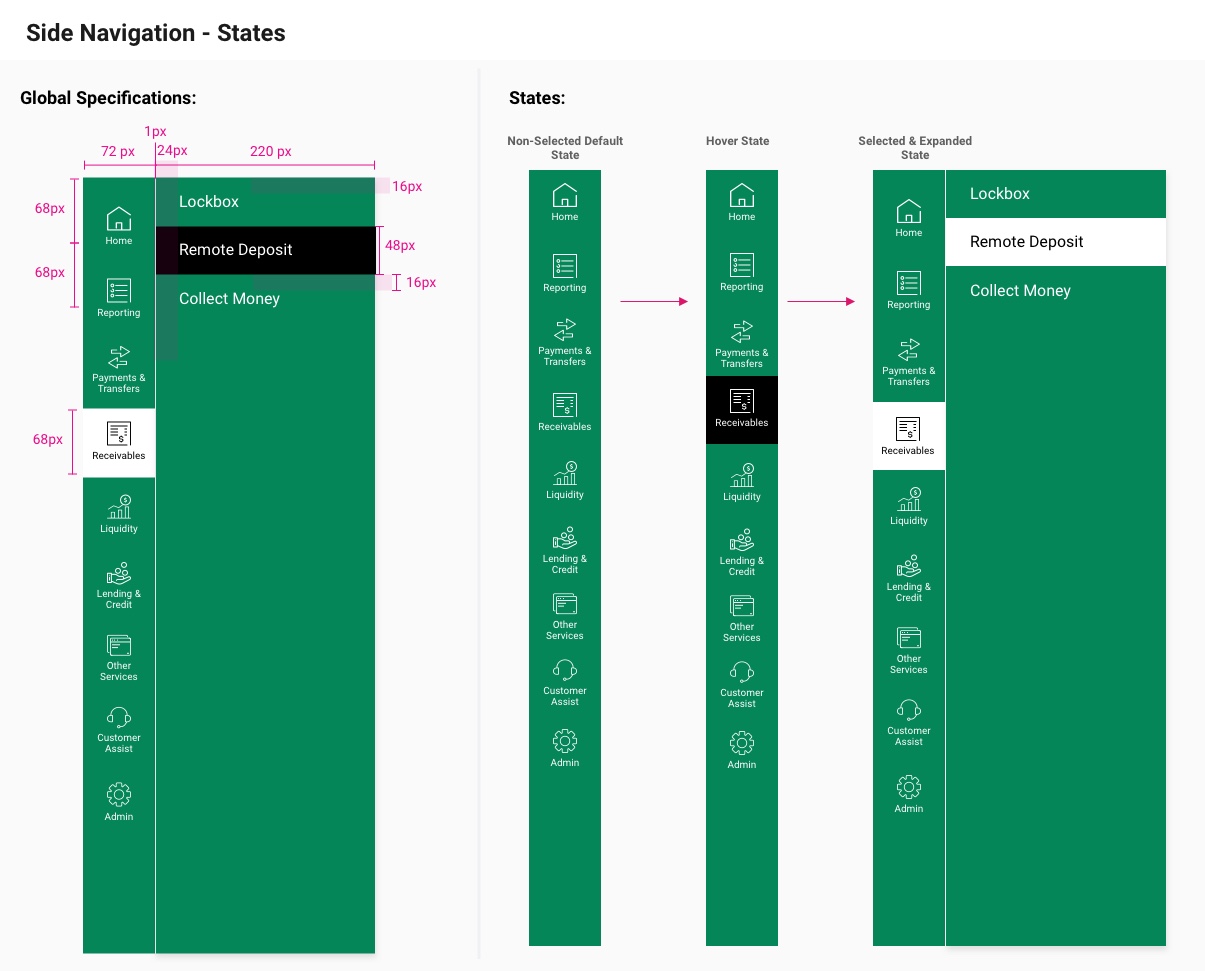
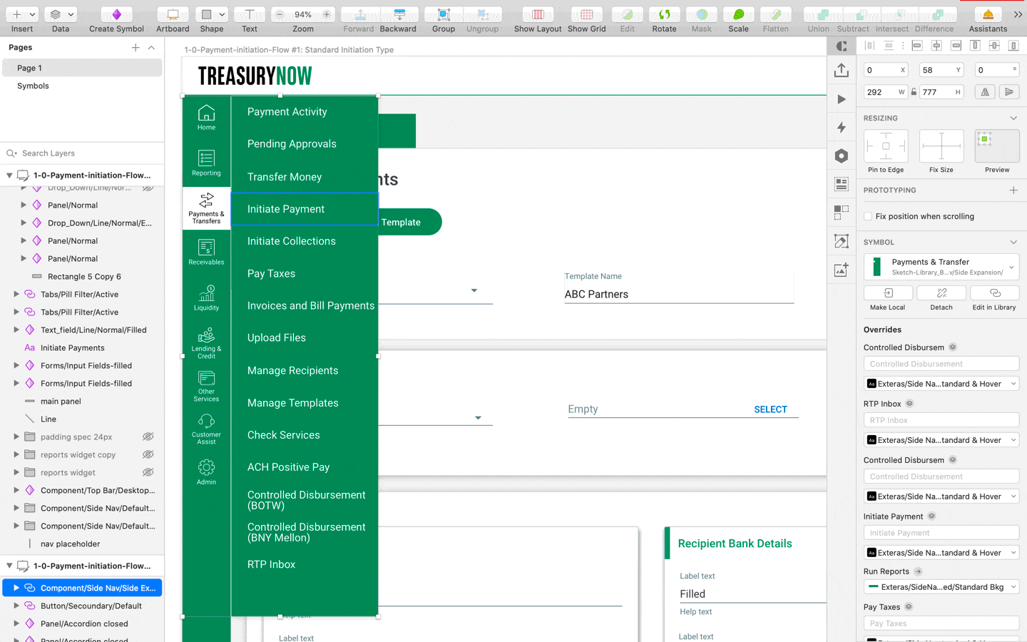
Side Navigation
Side Navigation is present on the left side of every application page to list pages and functionalities the user can access. It allows for user navigation between modules. It also expands to give the user more options for selecting where to navigate to, and can always be used for the user to return to their home page.
Placement
The side navigation is always aligned to the far left of the screen, and fills the height of the screen.
All icons will be placed vertically in line – never horizontally located next to one another or non-centered.
Text Style
The icon text labels is consistent with typography component, and labels will not exceed two lines of text.
Entitlements
Icons will be determined by the level of entitlements that a user has, and spacing between icons will stay the same regardless of number of icons.
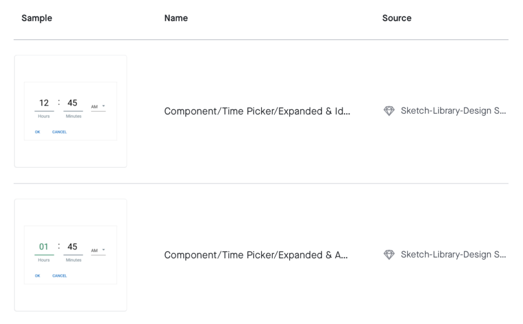
Time Picker
A time picker is used to select a specific time from a range of established times – using the 12 or 24 hour clock.
Launch:
The time picker will be launched by tapping an input field with a clock icon.
Placement:
The component should display below the input field as defined. Once the time has been selected the selected value should be displayed within the input field.
Options:
Clock can be in 12 or 24 hour time format.
The user should be unable to enter an invalid time in both of these formats.
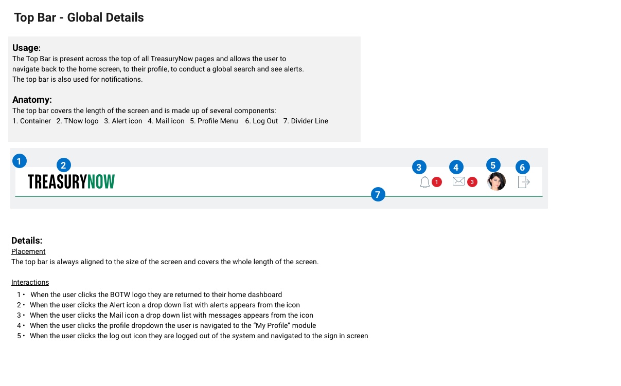
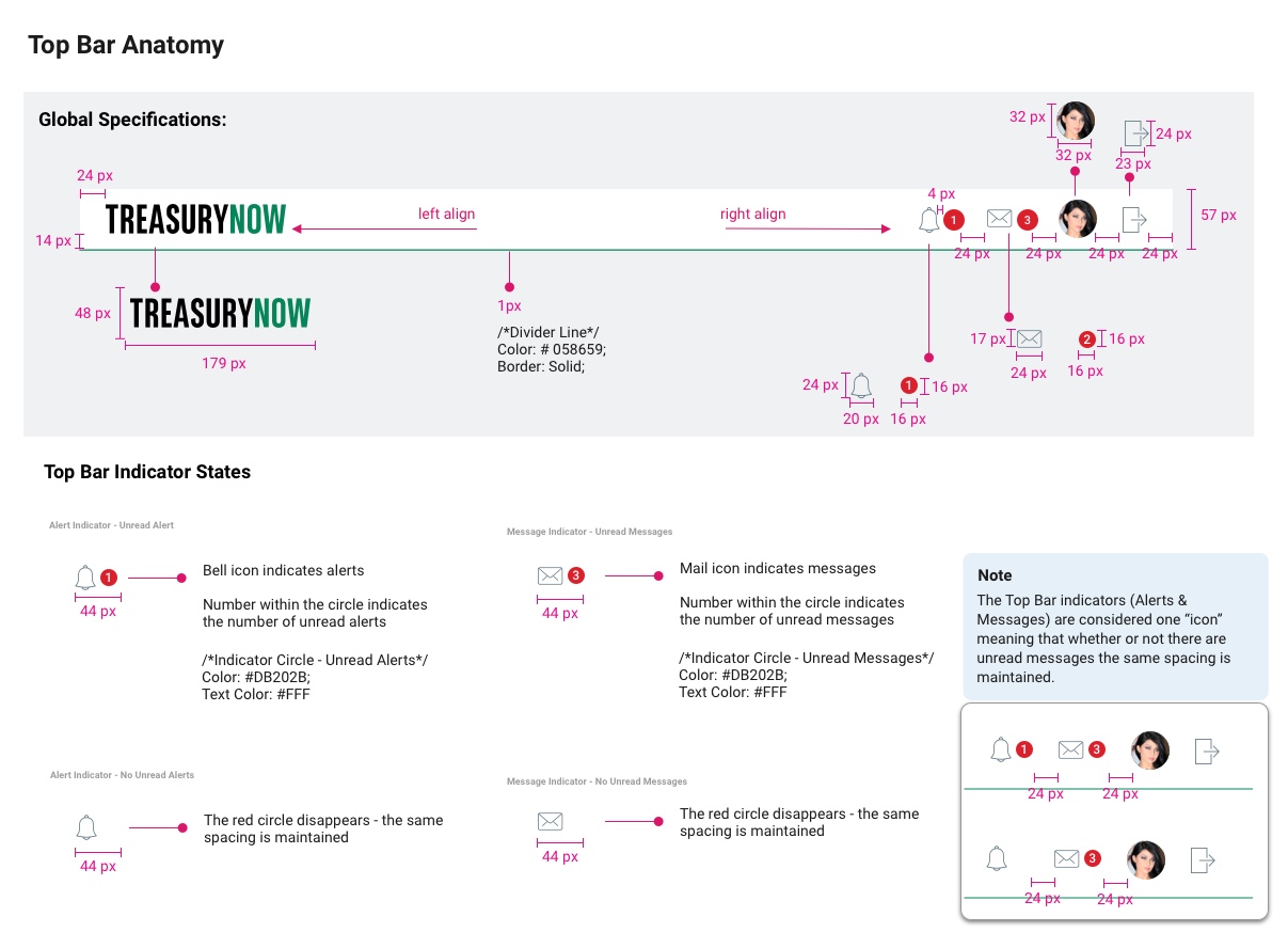
 Top Bar
The Top Bar is present across the top of all application pages and allows the user to navigate back to the home screen, to their profile, to conduct a global search and see alerts. The top bar is also used for notifications.
Placement
The top bar is always aligned to the size of the screen and covers the whole length of the screen.
Interaction
- When the user clicks the logo they are returned to their home dashboard
- When the user clicks the Alert icon a drop down list with alerts appears from the icon
- When the user clicks the Mail icon a drop down list with messages appears from the icon
- When the user clicks the profile dropdown the user is navigated to the “My Profile” module
- When the user clicks the log out icon they are logged out of the system and navigated to the sign in screen
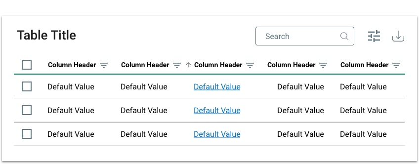
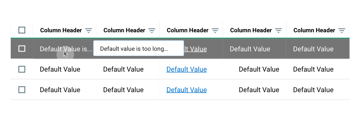
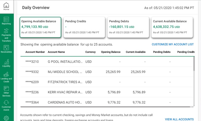
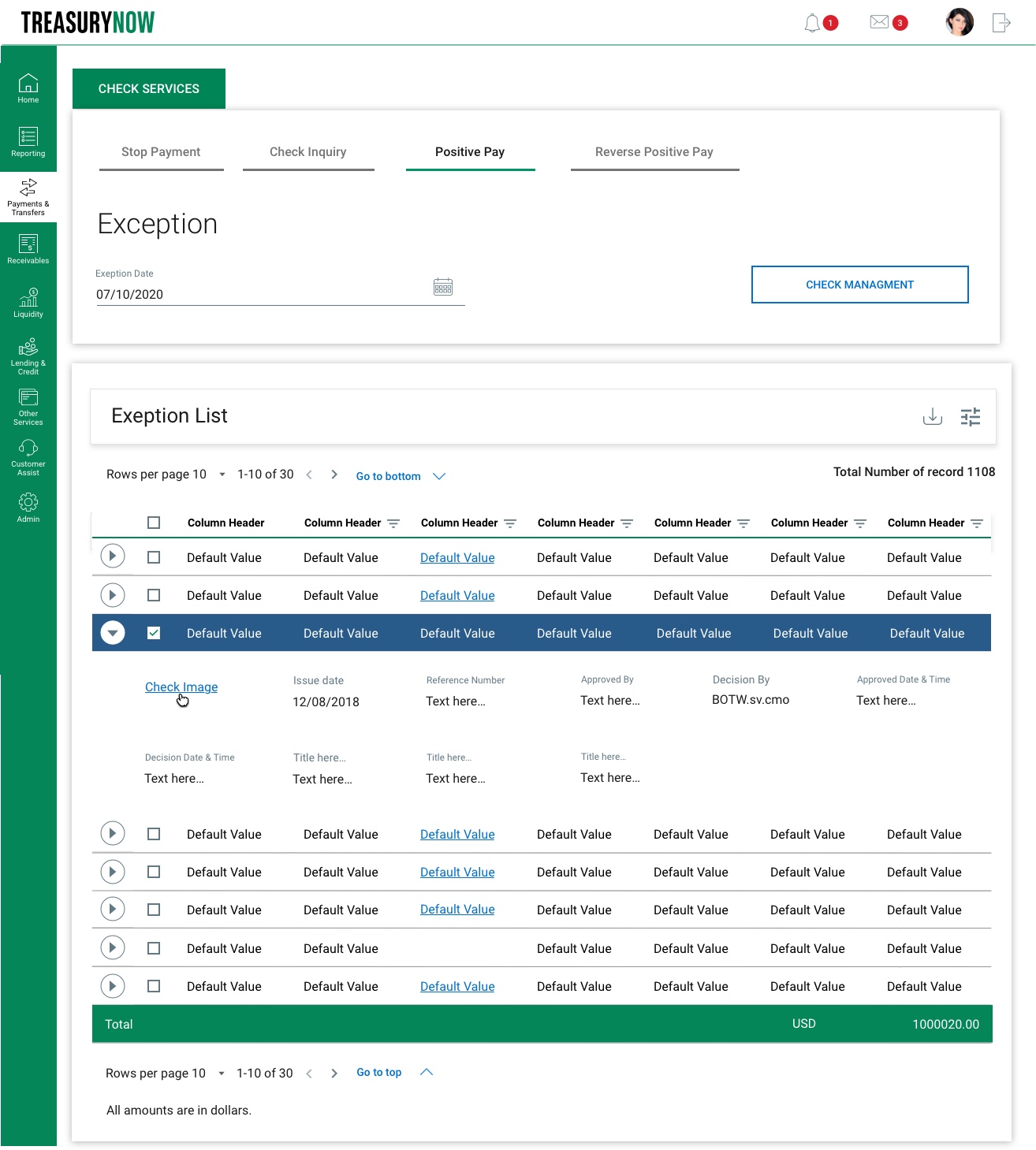
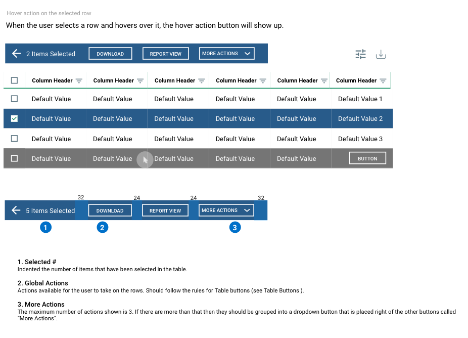
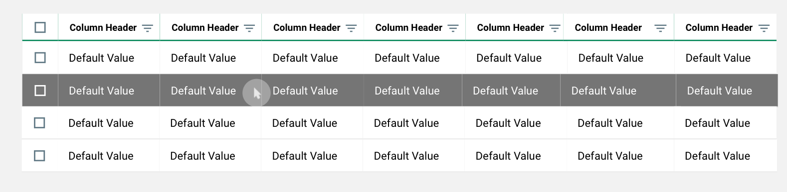
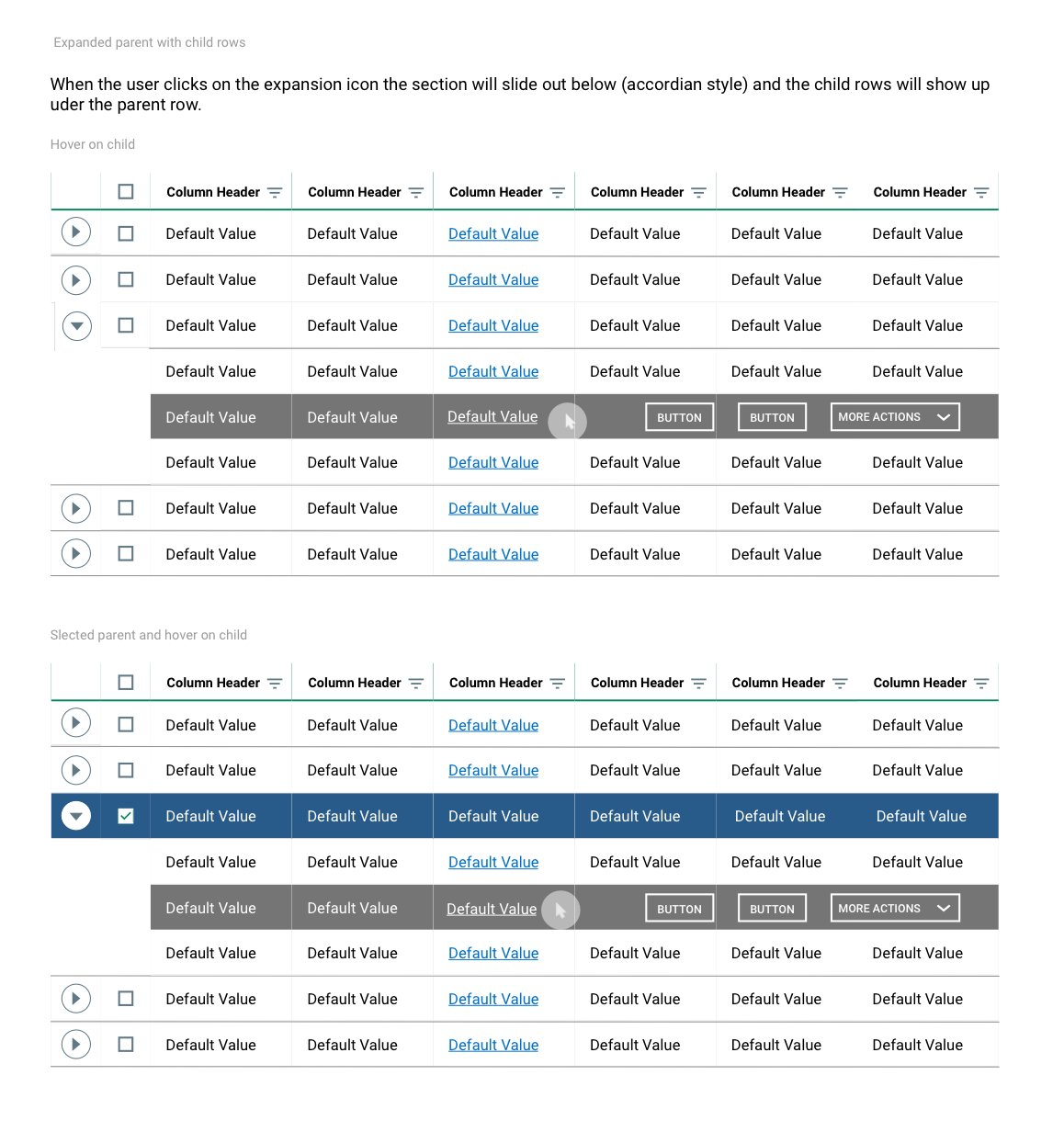
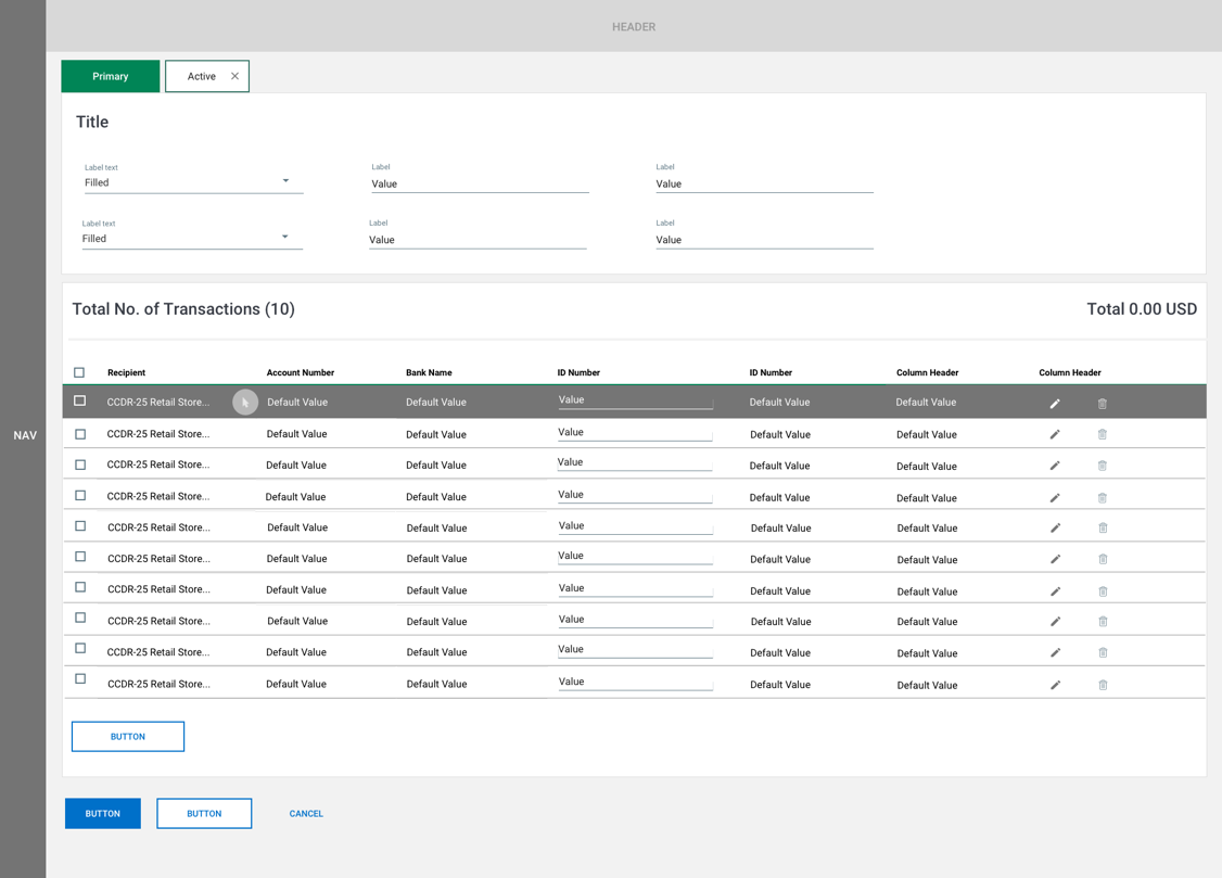
Data Tables
Tables are an arrangement of rows and columns that are used to display related information in a way that is clear to the user. The user can sort the table, search the table, and take actions on specific data in the table.
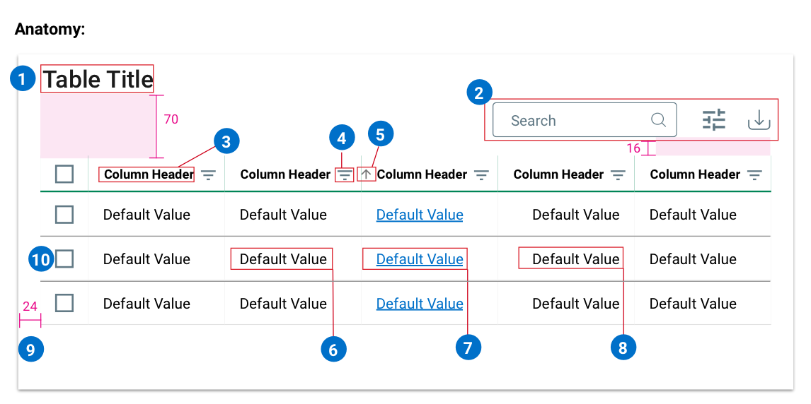
1. Table Title
A table will usually have a title that describes the content of the table. Use Title Case; all words are capitalized, except non-initial articles like “a, the, and”, etc.
2. Table Actions
Tables have a series of default actions.
3. Column Header
Title for column content, should always be left aligned. Use Title Case; all words are capitalized, except non-initial articles like “a, the, and”, etc.
4. Search Filter
The search filter allows the user to search information on a particular column. It will follow the same color patterns as a standard icon button (see Table Structure & Padding, see Icon Buttons).
5. Sorting Tool
The sorting tool allows the user to sort information based on the date on a particular column. It will follow the same color patterns as a standard icon button (see Table Structure & Padding, see Icon Buttons).
6. Column Content
The raw data for the column. Standard is to left align the data.
7. Link Content
Certain content in a table will link the user to another page. If that is the case then the content should be denoted by the brand blue.
8. Numerical Content
If the content within a table is numerical it will right align.
9. Spacing
The table container will always have 24px of space from the container it is within.
10. Row checkboxes
The unselected row checkboxes will always have 20px*20px and the selected checkboxes will always have 12*12px fill inside of 20*20px container.
Results
- Provided design strategy and structure through research, user interviews, stockholders interviews, gathered requirements, user testing and feedback.
- Created an up to date Design System that solved UI/UX issues. The Design System helped to create consistent experiences across different platforms.
- Design Systems enable designers & developers to reuse components and thereby increase efficiency.
- Design System increased efficiency and consistency, leading the company to build faster products at scale and closed many bugs and defects.
- I designed an intuitive user experience that helped increased product and services visibility and user accessibility.
- Solved ADA issues
- Improved overall app look and feel and rebranded application as TreasuryNow.
- Redesign component and data tables and added new component interactive functionalities and utilities