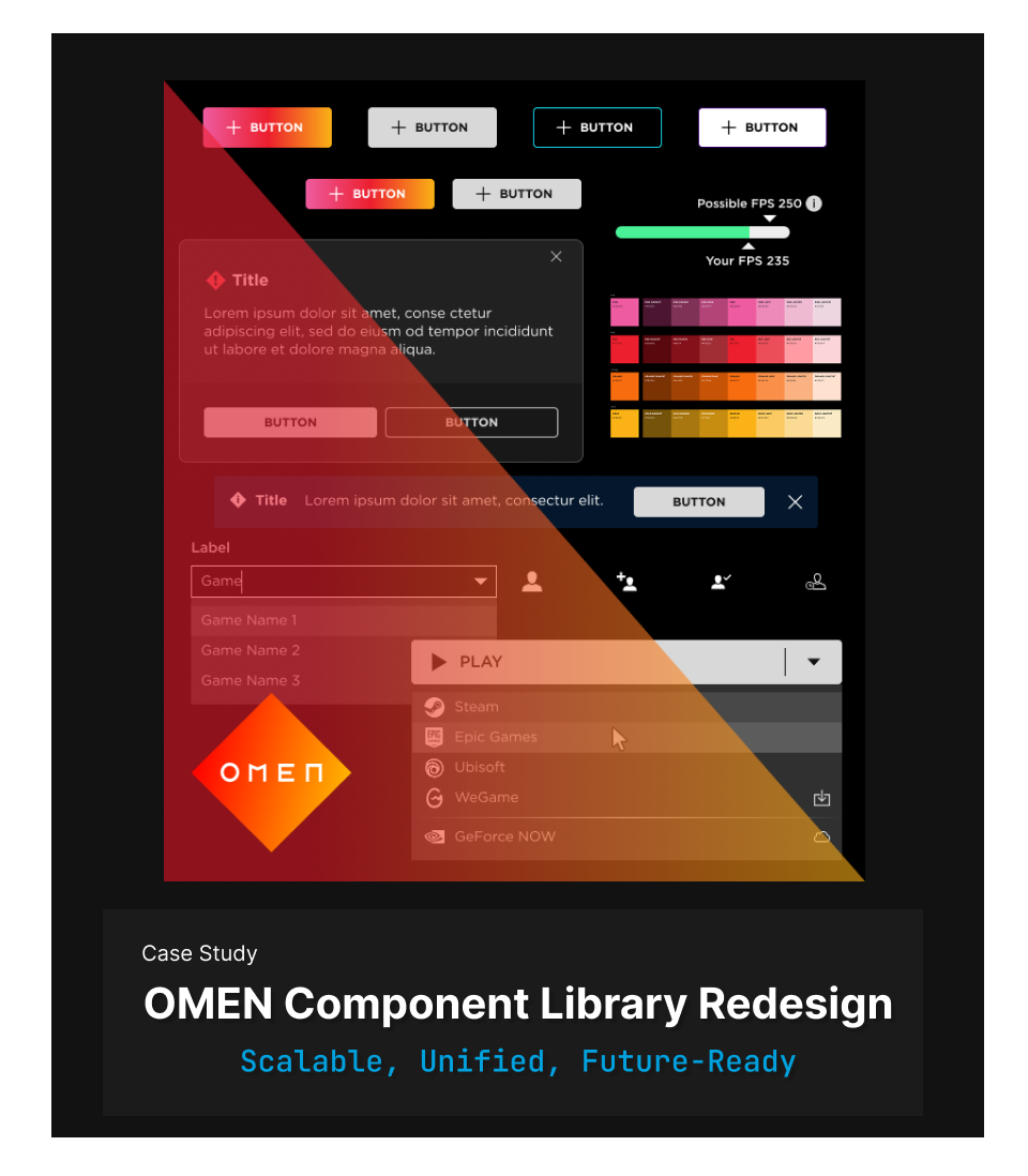
🎯 Project Overview
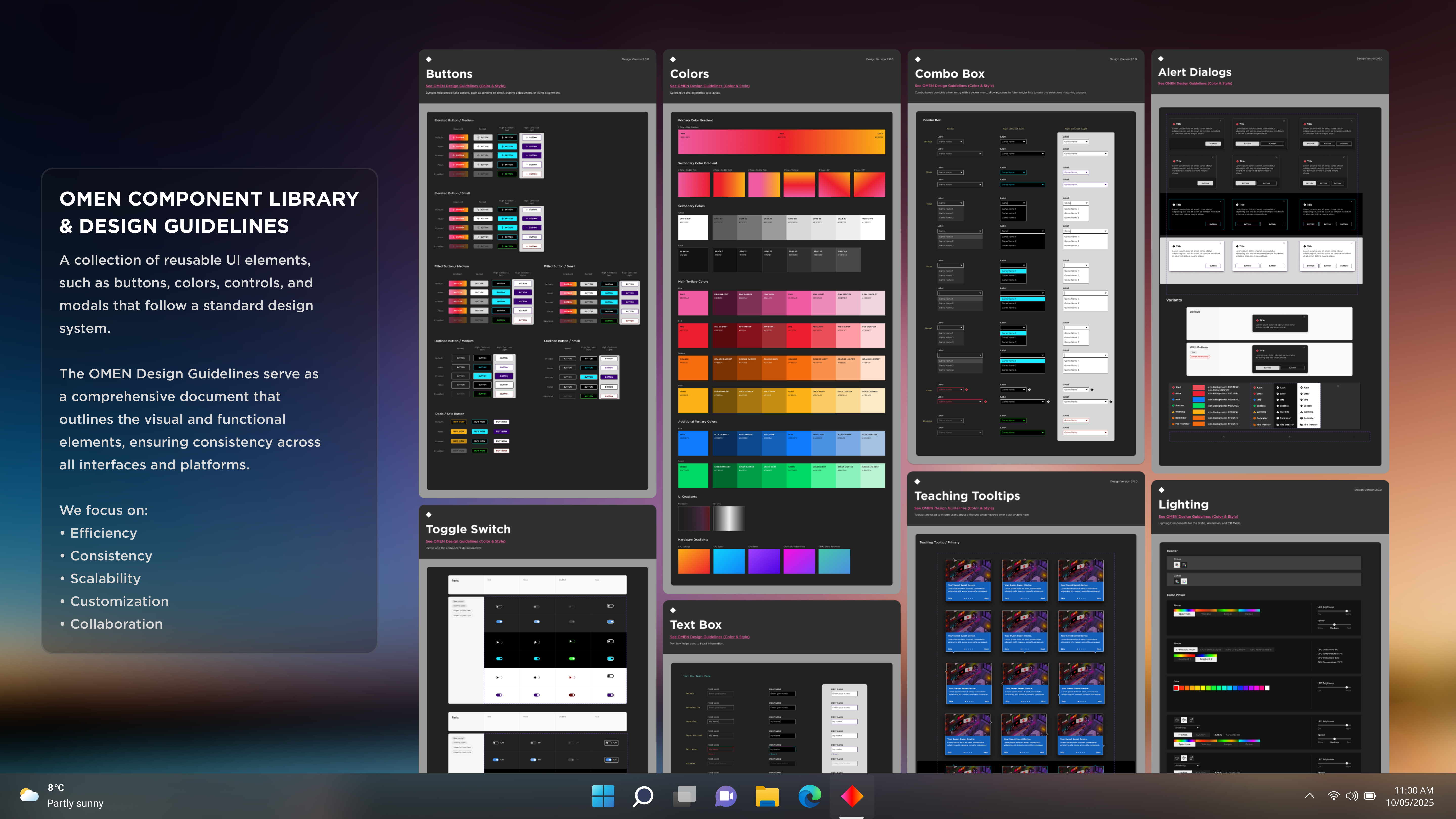
The OMEN Component Library Redesign aimed to establish a scalable, modular, and consistent design system aligned with Windows 11 guidelines. The project introduced Atomic Design principles to improve usability, accessibility, and development efficiency, benefiting both designers and engineers in maintaining a unified UI.
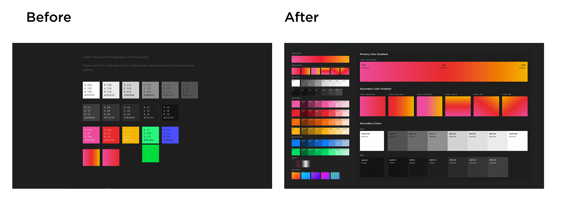
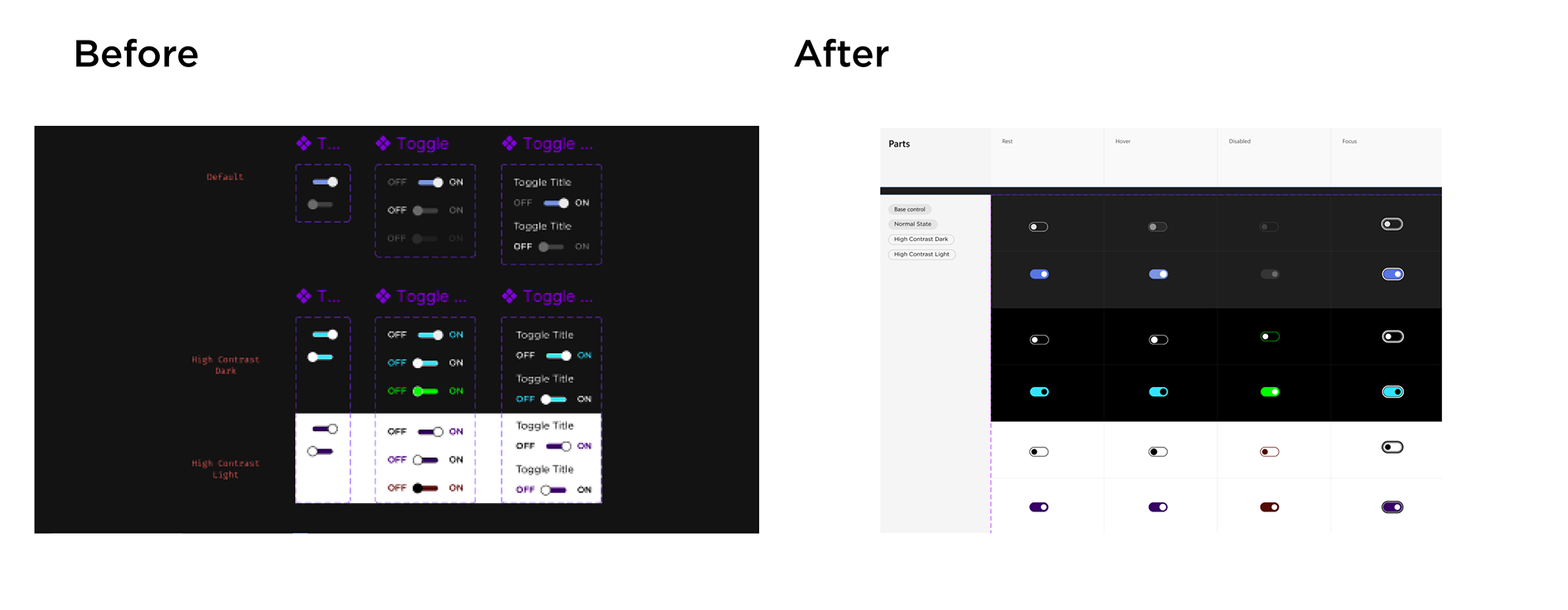
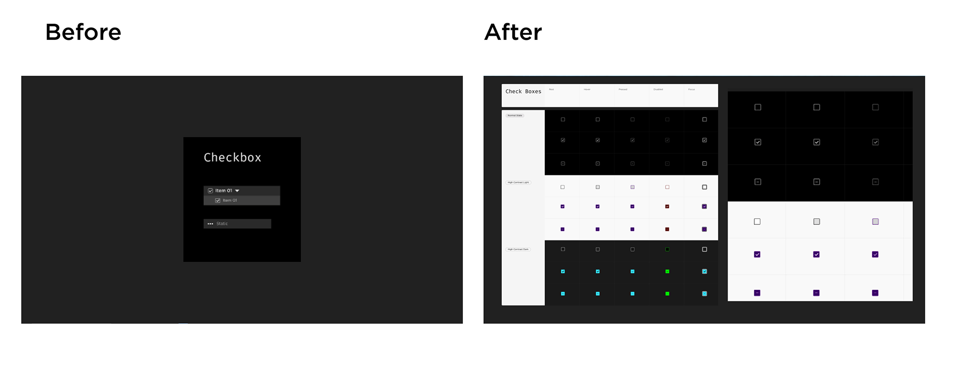
🔹 Before: Inconsistent UI components, lack of standardization, and inefficiencies in handoffs.
🔹 After: A structured, well-documented, and scalable component library with clear design principles.
🚨 Challenges & Problem Statements
🛑 Inconsistent UI Elements: Different button styles, sizing issues, and component variations across modules.
🛑 Lack of a Unified System: No structured component hierarchy, making collaboration difficult.
🛑 Inefficient Developer Handoffs: Components were often rebuilt, increasing design-developer friction.
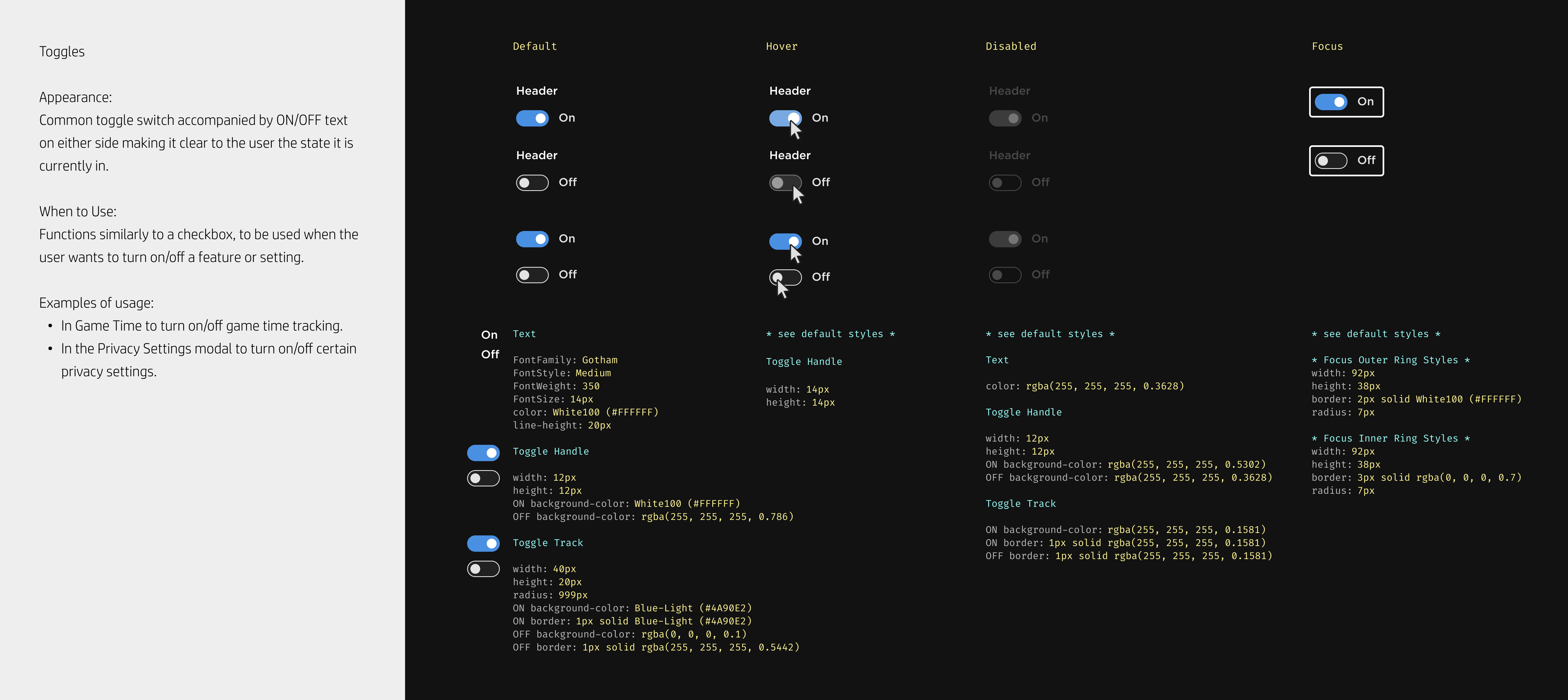
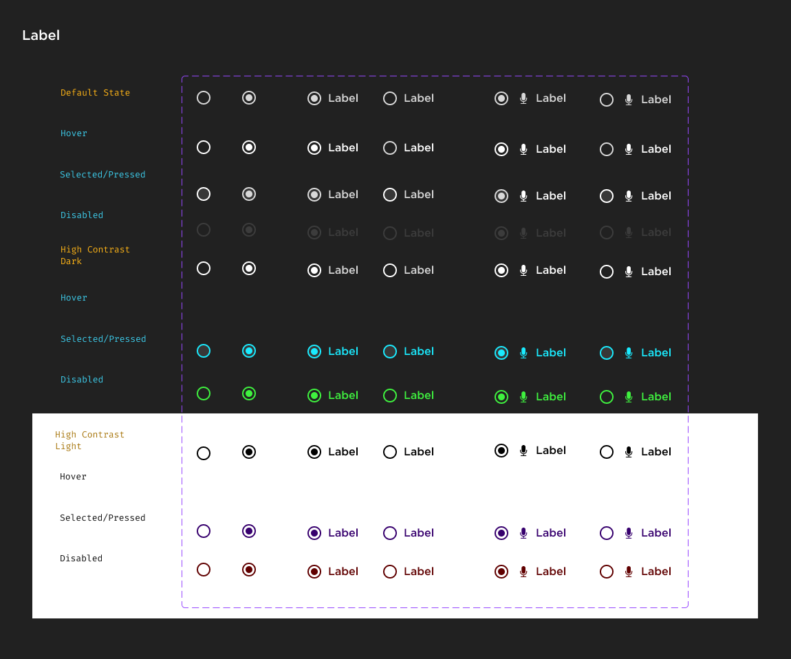
🛑 Accessibility Concerns: High-contrast variants were not systematically implemented.
💬 Quote from Developer: “We spent too much time figuring out which button to use—this redesign makes it clearer and saves us hours of work.”
🔍 Internal Research & Key Insights
Instead of a traditional user study, we focused on internal feedback loops with designers and developers to refine usability:
📌 Developer Pain Points: Difficulty finding the right components in Figma.
📌 Designer Frustrations: Lack of reusable components, leading to unnecessary variations.
📌 Common Agreement: The need for a single source of truth to streamline workflows and maintain visual consistency.
📌 Before vs. After Usability Testing Findings
| Testing Area | Before Redesign | After Redesign |
|---|---|---|
| Component Consistency | UI elements varied in size, spacing, and styling across modules. | Standardized button sizes, spacing, and component hierarchy. |
| Navigation & Efficiency | Developers struggled to locate the correct components in Figma. | Improved component organization & documentation reduced search time. |
| Accessibility Compliance | High-contrast and keyboard-navigable components were not systematically implemented. | Fully integrated accessibility guidelines across components. |
| Handoff to Development | Lack of clear specifications led to inconsistencies in development. | Defined component specs & design tokens streamlined handoff. |
📈 Key Impact:
The structured redesign resulted in 40% faster development time and a 30% reduction in UI inconsistencies.
💬 Developer Feedback Summaries on Ease of Integration
✅ Faster Handoff: “Now that everything is standardized, implementing UI components takes way less time.”
✅ Clarity & Documentation: “The new library makes it clear which components we should use—no more guesswork.”
✅ Improved Accessibility: “Adding high-contrast variants and keyboard support was seamless with the updated components.”
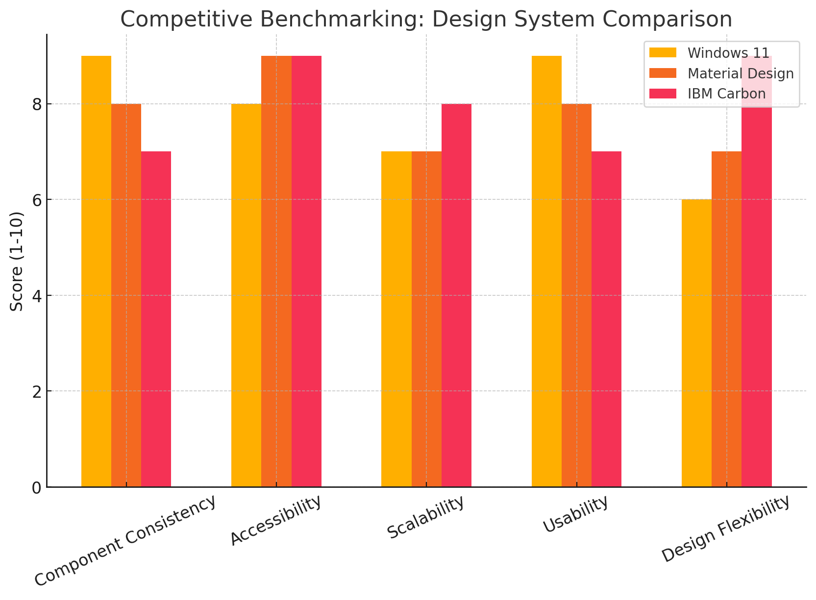
📊 Competitive Benchmarking
We conducted an audit of industry-leading design systems, including:
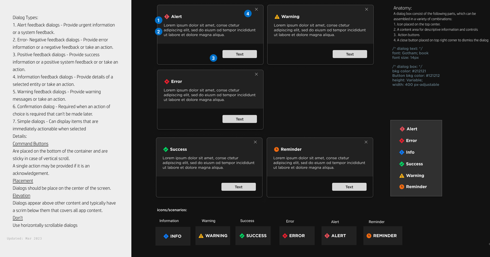
🔍 Windows 11 Design System – Used as a foundation for dialogue boxes and button structures.
🔍 Google Material Design – Inspired consistency rules and accessibility improvements.
🔍 IBM Carbon Design System – Referenced for structuring the component library.
| Design Principle | OMEN (Before) | Windows 11 | Material Design | IBM Carbon |
|---|---|---|---|---|
| Component Consistency | Inconsistent buttons, inputs, and modals. | Unified UI with strict guidelines. | Card-based UI, strict spacing. | Structured, data-heavy focus. |
| Button Design | Varied sizes, no clear hierarchy. | Standardized, rounded, left-aligned. | Ripple effects, strict order. | Flat buttons, clear transitions. |
| Accessibility | Limited contrast, poor keyboard nav. | High-contrast & adaptive text. | WCAG-compliant contrast, theming. | ADA-compliant colors. |
| Navigation | Hard to find components in Figma. | Organized by use case. | Intuitive, clear hierarchy. | Grid-based for easy access. |
| Dialog Boxes | Random button placement. | Minimalist, left-aligned. | Elevated, clear actions. | Focused on user clarity. |
| Scalability | Rigid, hard to scale updates. | Component-based, cross-platform. | Scalable web & mobile. | Enterprise-ready, modular. |


We conducted an audit of industry-leading design systems, analyzing key principles and their applications.
| Design Principle | Windows 11 Design System | Google Material Design | IBM Carbon Design System |
|---|---|---|---|
| Component Structure | Focuses on modular UI components with a strong emphasis on accessibility. | Follows a card-based approach, emphasizing elevation and shadows. | Structured and grid-based, prioritizing data-heavy applications. |
| Button Styles | Consistent button sizes, rounded corners, and minimalistic design. | Uses elevation, ripple effects, and clear hierarchy (primary, secondary, tertiary). | Flat buttons with strong contrast and clear state transitions. |
| Typography | Uses “Segoe UI Variable” for better legibility and adaptive font scaling. | Roboto font, optimized for readability across devices. | IBM Plex Sans, designed for clarity in enterprise interfaces. |
| Color & Accessibility | Prioritizes high contrast and adaptable themes for dark/light mode. | Material color system with WCAG-compliant contrast ratios. | Focuses on data visualization with ADA-compliant color palettes. |
| Dialog Boxes | Minimalist approach with left-aligned buttons. | Follows Material guidelines with elevation and clear actions. | Structured dialogs with strong emphasis on user decision clarity. |
| Use Case Fit | Optimized for modern applications with seamless Windows integration. | Best for mobile and web applications with intuitive UI components. | Ideal for enterprise applications and data-driven interfaces. |
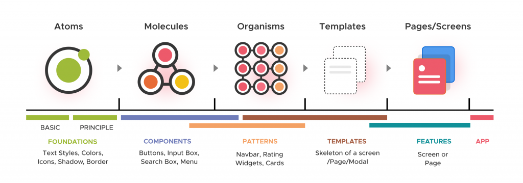
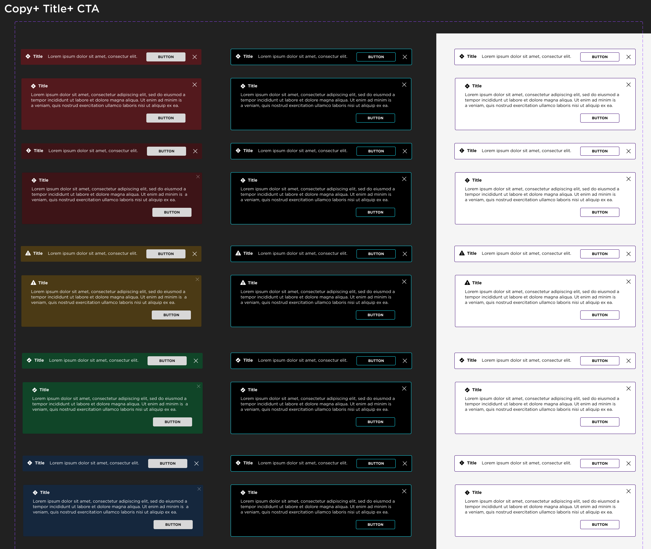
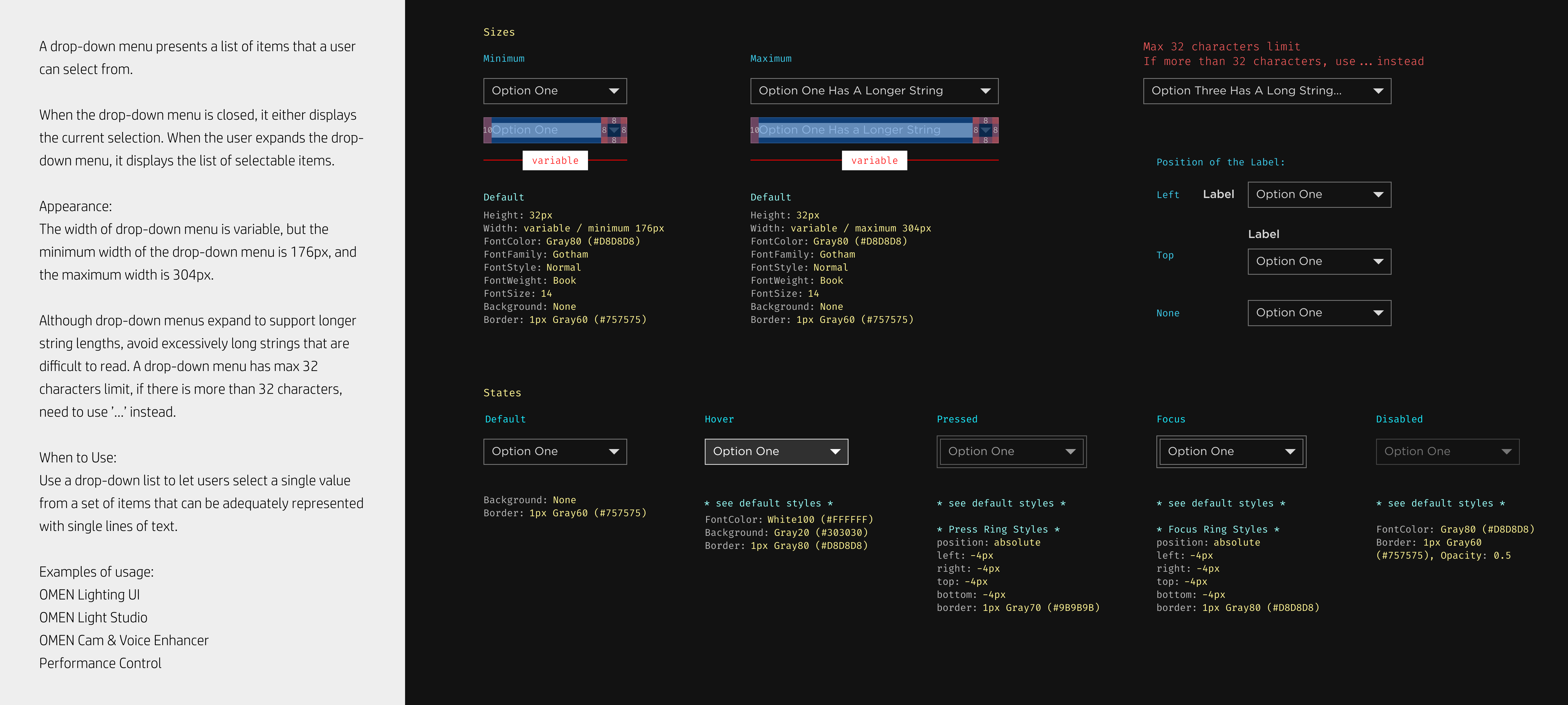
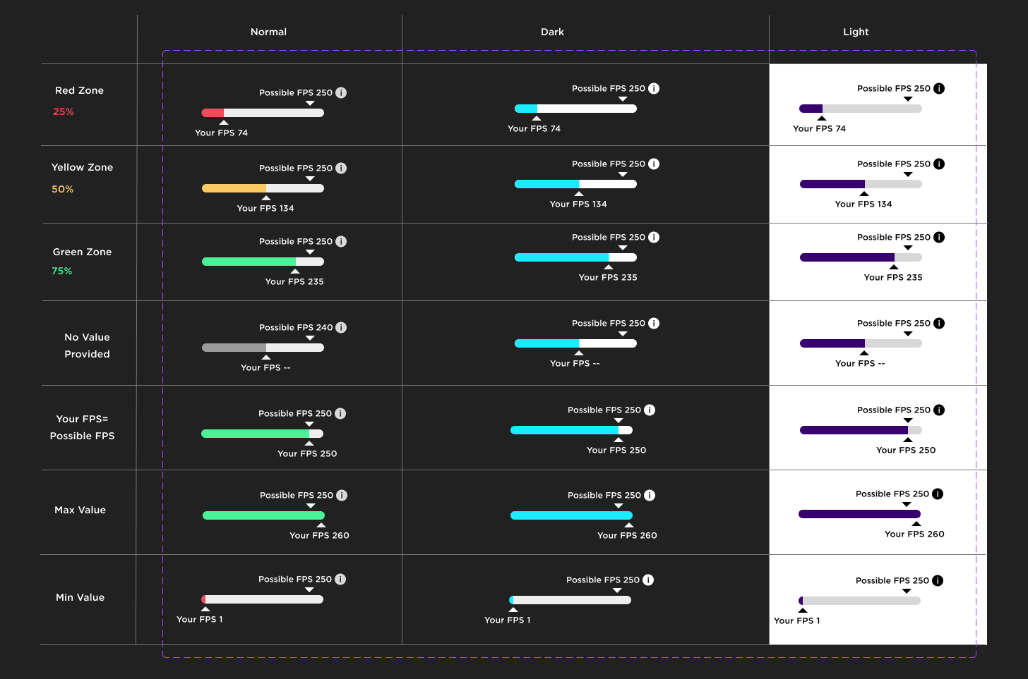
🎨 UX Design Process & Iterations
We applied Atomic Design principles, breaking components into:
🟢 Atoms: Buttons, inputs, labels.
🟡 Molecules: Form fields, cards, alerts.
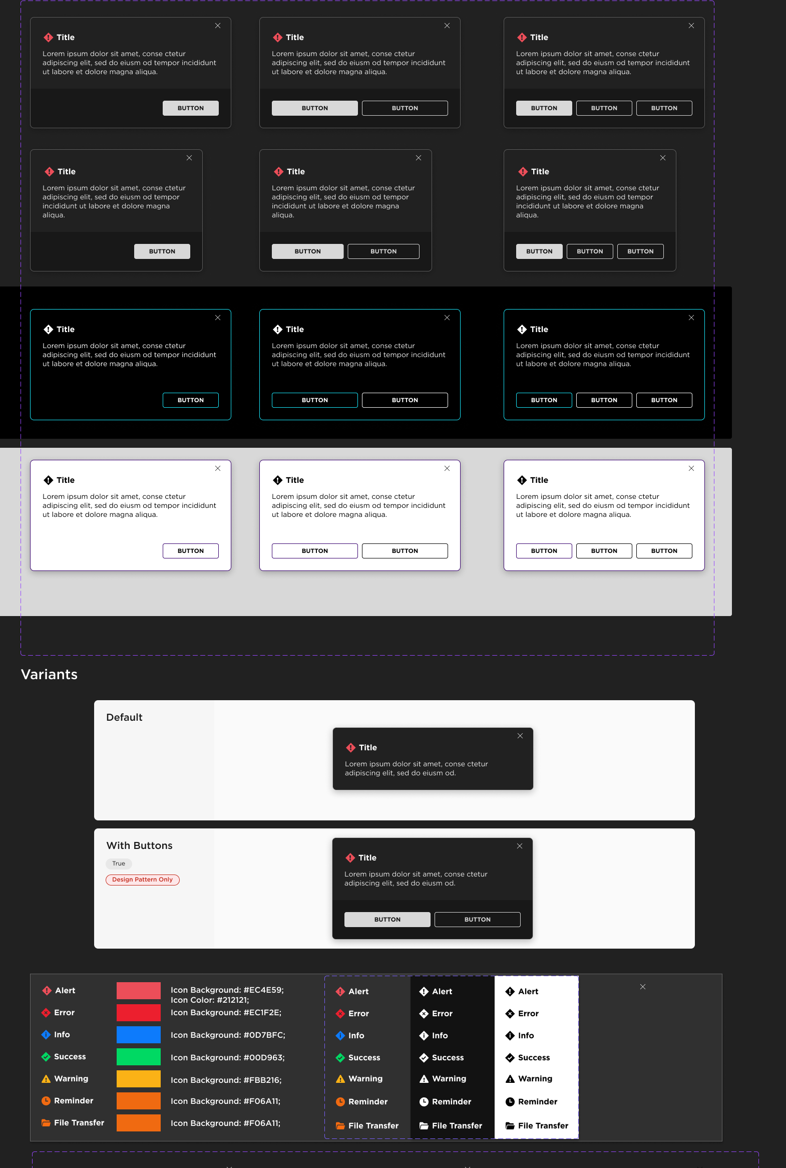
🔴 Organisms: Dialog boxes, navigation elements.
Key Iterations:
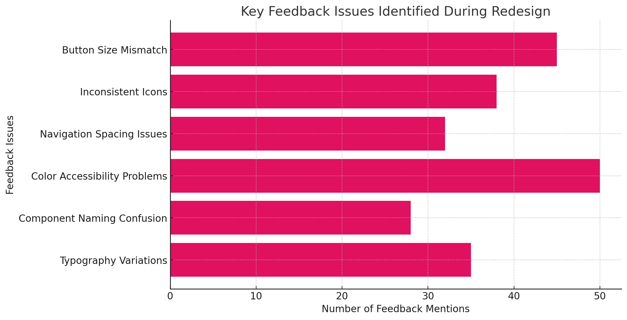
1️⃣ Initial audit identified over 50 button, spacing, and alignment inconsistencies.
2️⃣ First iteration focused on standardizing button sizes, order, and high-contrast variants.
3️⃣ Internal reviews with PMs and developers refined accessibility and usability further.
💬 Quote from PM: “This new system ensures consistency across features—no more mismatched buttons or confusing layouts.”
🔬 Usability Testing & Findings
👨💻 Developer Testing: Ensured ease of integration into the codebase.
🎨 Design Team Reviews: Validated usability and alignment with Windows 11 standards.
📈 Result: Improved clarity in component selection, reducing time spent searching for the right elements.
Developer Pain Points Before OMEN Library Redesign
| Pain Point | Description |
|---|---|
| Inconsistent UI Components | Developers struggled with multiple versions of the same component, leading to confusion and inefficiencies in implementation. |
| Lack of Standardization | Different teams used varying button styles, input fields, and modals, making the overall experience fragmented and inconsistent. |
| Unstructured Design Library | Finding the right component in Figma was time-consuming due to poorly organized assets and missing documentation. |
| Accessibility Challenges | High-contrast and accessible variants were often overlooked, causing compliance issues and additional rework. |
| Inefficient Handoff | Developers received ambiguous designs without clear specifications, leading to frequent back-and-forth discussions with designers. |
| Manual UI Adjustments | Due to inconsistent sizing and spacing rules, developers had to manually adjust components, increasing development time. |
| Scalability Issues | The lack of a modular design system made scaling UI updates across multiple features difficult and error-prone. |
✅ Final UI Solution
✔ Unified Component Library: A single source of truth for OMEN UI elements.
✔ Standardized Button Styles: Consistent sizing, ordering, and contrast settings.
✔ Atomic Design Integration: Clear hierarchy of reusable components.
✔ Improved Developer Collaboration: Faster handoffs and reduced inconsistencies.

OMEN Component Library Redesign – Key Improvements
| Improvement | Description |
|---|---|
| UI Consistency | Standardized button sizes, colors, and layouts across all modules, ensuring a seamless experience. |
| Atomic Design Integration | Implemented a modular design system, breaking down UI elements into reusable components. |
| Faster Development | Pre-built, reusable components reduced development time by 40%, improving workflow efficiency. |
| Improved Accessibility | Ensured high-contrast variants, proper labeling, and keyboard navigation support for better usability. |
| Design-Developer Collaboration | Introduced a shared Figma library with proper documentation, reducing miscommunication and errors. |
| Adoption Rate | Achieved 100% adoption by design and engineering teams, enhancing workflow integration. |
| Alignment with Windows 11 | Followed Windows 11 UI patterns to improve consistency and align with modern design trends. |
📈 Business Impact & Key Metrics
📉 30% Reduction in UI inconsistencies across OMEN Hub.
📈 40% Faster Development Time due to reusable components.
🧩 100% Adoption by design and engineering teams.
🎯 Key Takeaways & Lessons Learned
🚀 Scalability: The redesign lays the foundation for future OMEN product evolution.
🛠 Efficiency Gains: Faster workflows for designers and developers.
🎯 Alignment with Industry Standards: Ensuring a seamless Windows 11-compatible experience.
💬 Quote from Engineering Lead: “This is the most efficient and well-documented design system we’ve had for OMEN.”
| Design Aspect | Before Redesign | After Redesign |
|---|---|---|
| Component Consistency | Inconsistent button sizes, colors, and styles across modules. | Standardized UI with Atomic Design principles for visual harmony. |
| Button Design | Varied button placement, no defined primary/secondary hierarchy. | Defined button sizes, structured hierarchy (primary, secondary, tertiary). |
| Accessibility | High-contrast modes and keyboard navigation were inconsistent. | Fully WCAG-compliant with clear high-contrast and dark/light mode variants. |
| Navigation & Handoff | Difficult for developers to find the correct components in Figma. | Organized component library with structured naming and documentation. |
| Dialog Boxes | Random button placements, inconsistent modal structures. | Aligned with Windows 11 UI, structured and predictable layout. |
| Scalability | Rigid system, difficult to maintain and update UI across features. | Modular Atomic Design system allows for scalable UI expansion. |
🚀 Scalability Roadmap & Future Evolution
The OMEN Component Library is designed with scalability in mind, ensuring long-term adaptability as the product evolves.
🔹 Continuous Updates – The library will expand as new UI patterns emerge to support modern design trends and accessibility improvements.
🔹 Cross-Platform Consistency – Future iterations will ensure seamless integration across Windows, web, and gaming interfaces.
🔹 Component Extensibility – A flexible modular structure allows for easy addition of new UI elements without breaking existing workflows.
🤖 AI & Automation: The Next Step
Potential AI-driven enhancements could further streamline workflows by:
✅ Automated UI Testing – AI could detect design inconsistencies, ensuring adherence to design standards.
✅ Smart Component Recommendations – Predictive AI could suggest best-fit components based on design patterns and usage history.
✅ Code-Design Syncing – AI-powered tools could automatically generate UI code snippets from Figma designs, reducing manual handoff friction.
🏆 Final Thoughts
This project exemplifies my ability to identify pain points, create scalable solutions, and drive cross-functional collaboration. The OMEN Component Library is now a robust, future-proof system that enhances both usability and development speed.