📌 Overview
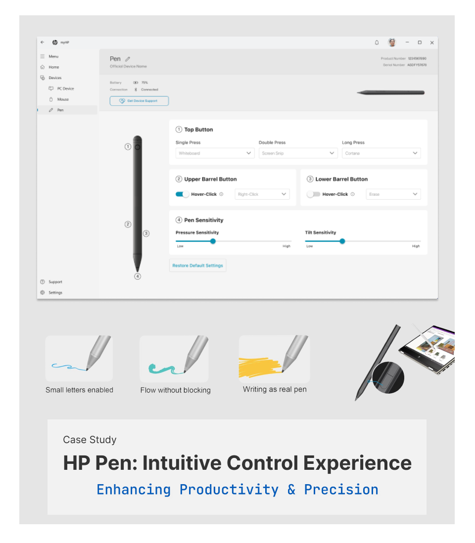
Pen Control is a customization feature within the MyHP PC app, enabling users to personalize digital pen functionalities effortlessly. As the Lead Product Designer, I directed a user-centric strategy addressing usability challenges through iterative prototyping, extensive user testing, and cross-team collaboration. The initiative improved accessibility, simplified interactions, and significantly boosted user satisfaction.

🖥️ My Role & Contributions
- 🎨 Directed overall UX/UI strategy, overseeing iterative prototyping and refinement.
- 🤝 Directed overall UX/UI strategy, overseeing iterative prototyping and refinement.
- 🗒️ Designed and executed user-testing plans, leveraging insights to drive design decisions.
- 🖥️ Optimized interface usability, enhancing interactions specifically for the MyHP PC app.
🎯 Challenges & Objectives
Challenges:
- 📉 Limited visibility of critical pen settings.
- 📚 Information overload confusing users.
- ❓ Ambiguous interaction states.
Objectives:
- ✅ Enhance visibility of pen settings.
- ✅ Simplify UI for efficient interaction.
- ✅ Clarify interactive states.
- ✅ Align with HP’s UX standards.
🔍 Initial User Research & Insights
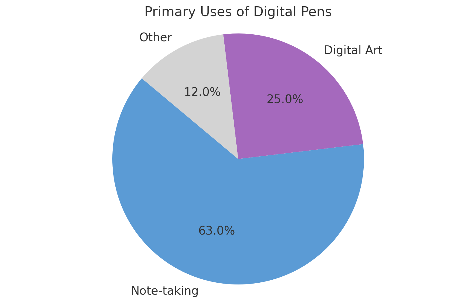
Initial research (15 users: beginners to advanced) revealed:
- 📝 63% primarily use pens for note-taking.
- 🎨 25% frequently engage in digital art.
- 📊 Users prioritize simplicity due to infrequent adjustments.
💬 “I rarely adjust settings—simplicity and speed are crucial.”
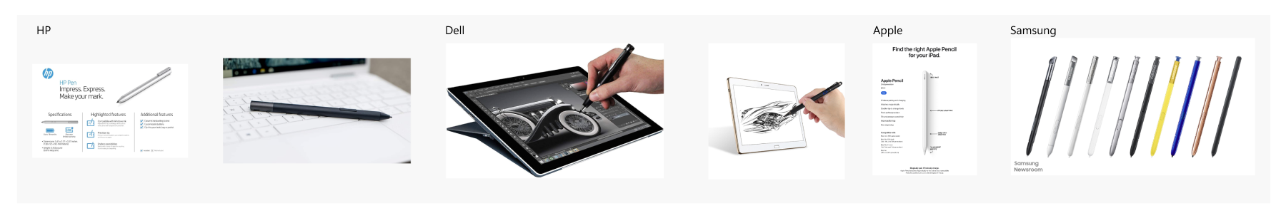
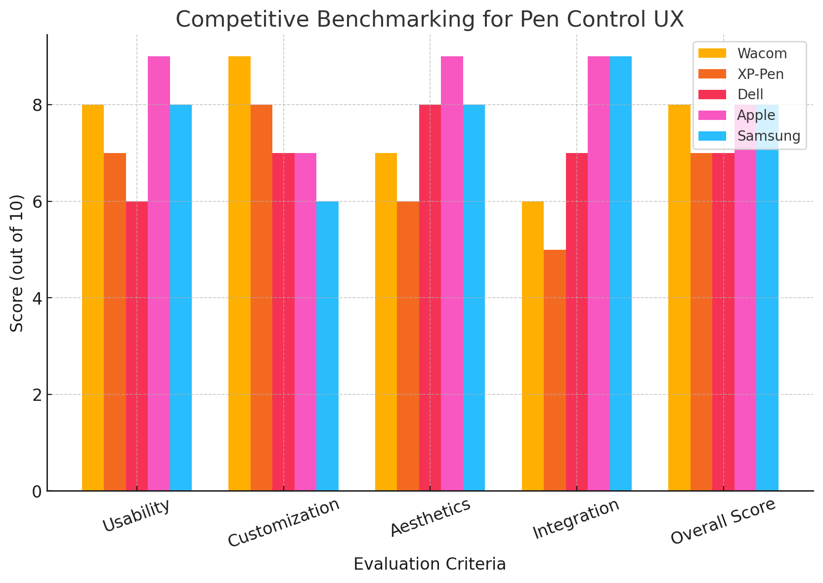
🕵️ Competitive Benchmarking
Evaluated competitors like Wacom and XP-Pen, focusing on:
- 📱 Intuitive interactions
- 🎨 Clean aesthetics
- ⚙️ Streamlined customization
🔄 UX Design Process & Iterations
Ideation & Wireframing:
Outlined intuitive navigation emphasizing ease-of-use in initial wireframes.
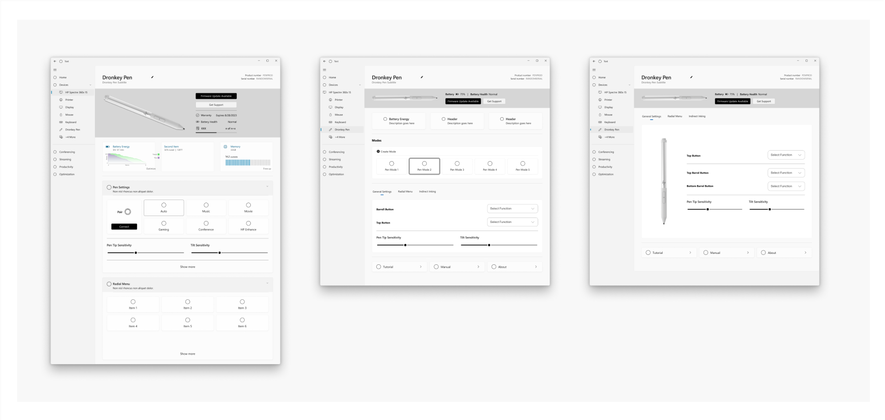
Visual Design:
Ensured consistency with MyHP’s modern, sleek design language, creating visually appealing UI assets tailored to enhance user experience.
🧪 Comprehensive Usability Testing
Conducted two distinct rounds of usability testing:
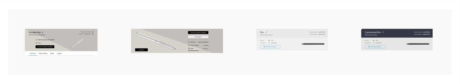
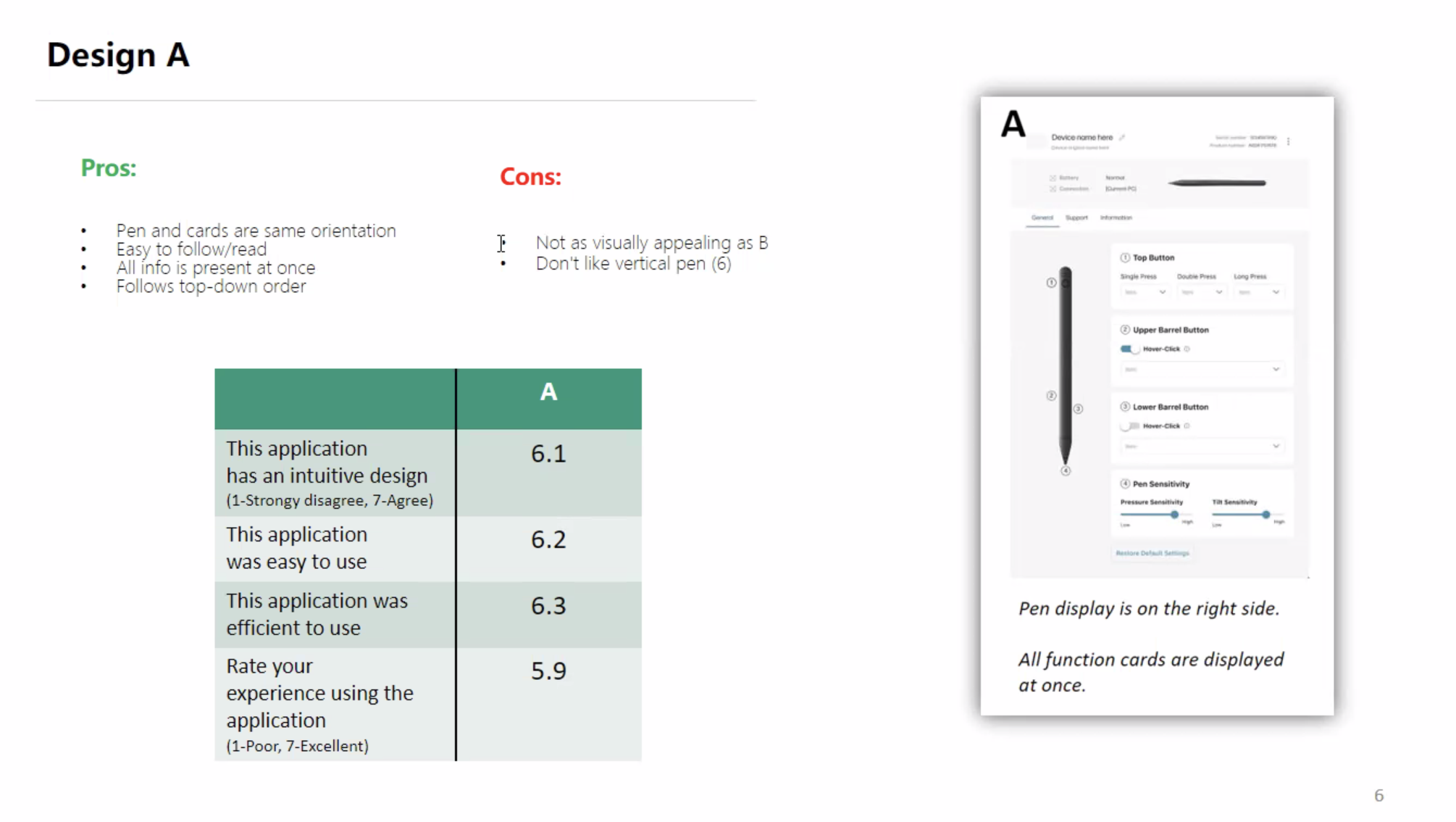
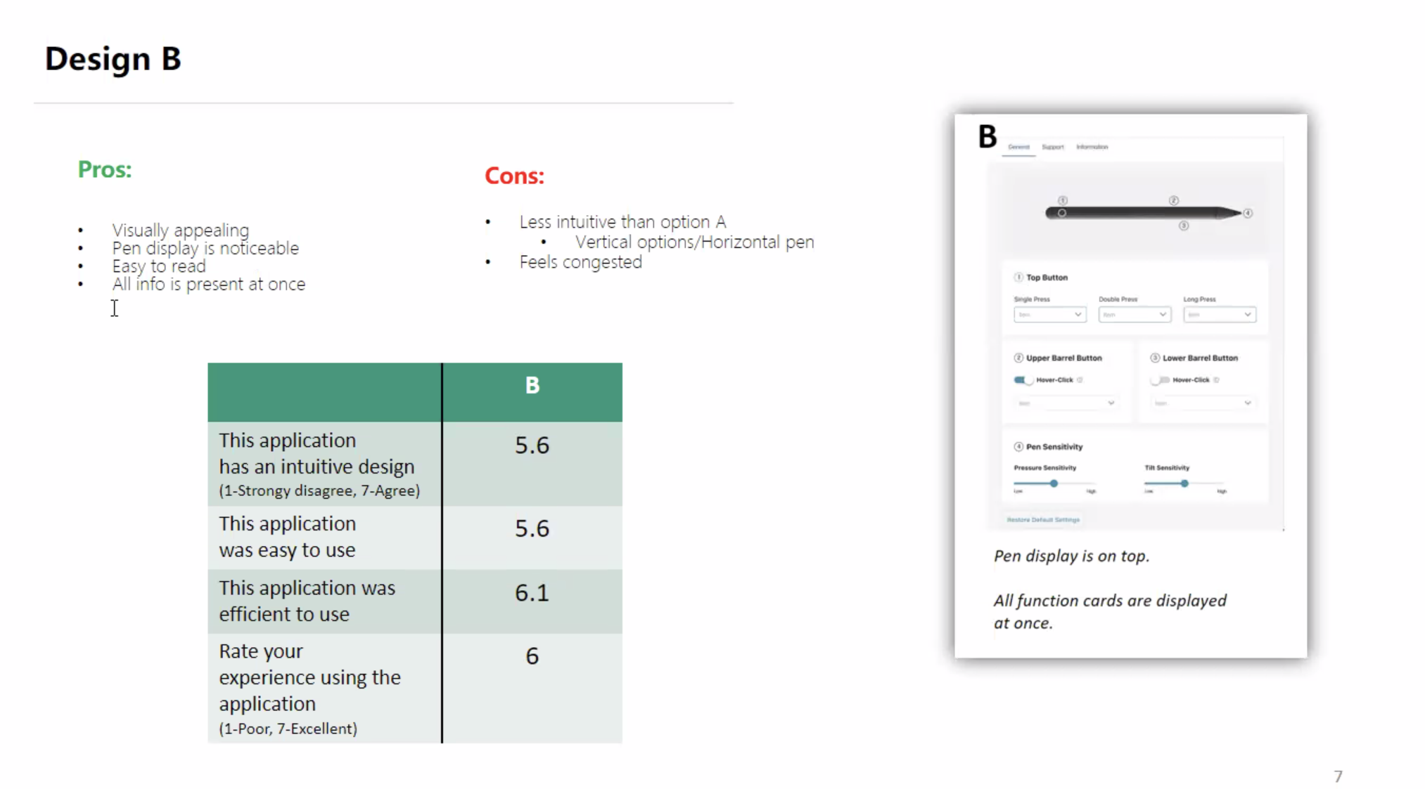
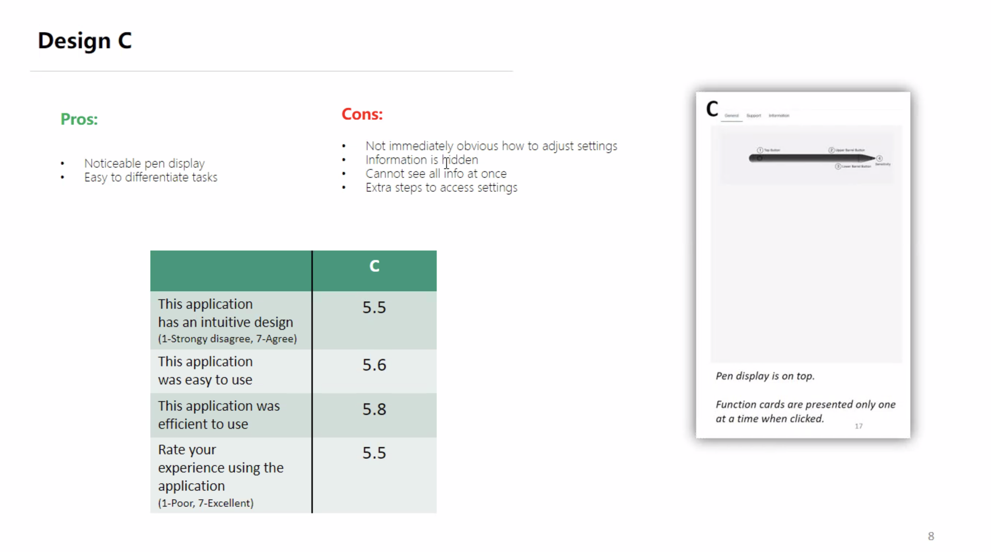
🔖 Round 1: Initial Layout Testing (A, B, C)
- Participants: 15 users (ages 19-52)
- Method: Moderated remote testing on UserTesting.com
| Option | Intuitive Design | Ease of Use | Efficiency | Overall |
|---|---|---|---|---|
| A | 6.7 | 6.4 | 6.5 | 6.5 |
| B | 6.2 | 6.3 | 6.0 | 6.3 |
| C | 6.0 | 5.9 | 6.1 | 6.0 |
Outcome: Chose horizontal layout (Option B), incorporating positive aspects from Option A.
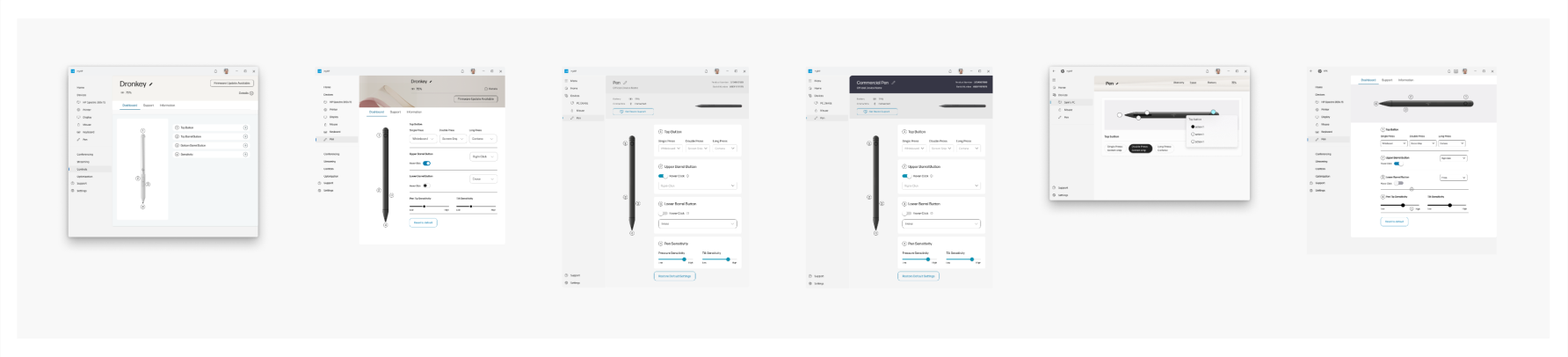
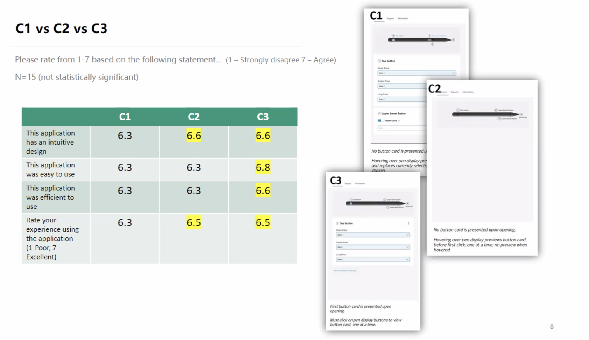
🔖 Round 2: Iterative Refinement Testing (C1, C2, C3)
- Participants: 15 users, unmoderated remote testing
Task-specific results:
- Finding Product Details: 8/8 completion, recommended consistent UI fonts.
- Viewing All Button Functions: 7/8 completion, noted confusion regarding pen/mouse differences.
- Adjusting Pen Tip Sensitivity: 8/8 completion, requested numeric tuning options.
| Iteration | Intuitive Design | Ease of Use | Efficiency | Overall |
| C1 | 6.1 | 6.2 | 6.0 | 6.1 |
| C2 | 6.4 | 6.3 | 6.2 | 6.3 |
| C3 | 6.7 | 6.6 | 6.5 | 6.7 |
✅ Final Choice: Option C3 provided optimal usability, intuitive interactions, and clarity.
📲 Final UI Solution
Incorporated user-driven improvements:
- ✅ Enhanced visibility of the Information tab.
- ✅ Clearly differentiated pen/mouse functions.
- ✅ Standardized UI terminology.
- ✅ Adopted a card-based layout with pre-selected states to clarify interactions.
💬 “This setup finally makes pen customization effortless and clear.”
💬 User Feedback & Recommendations
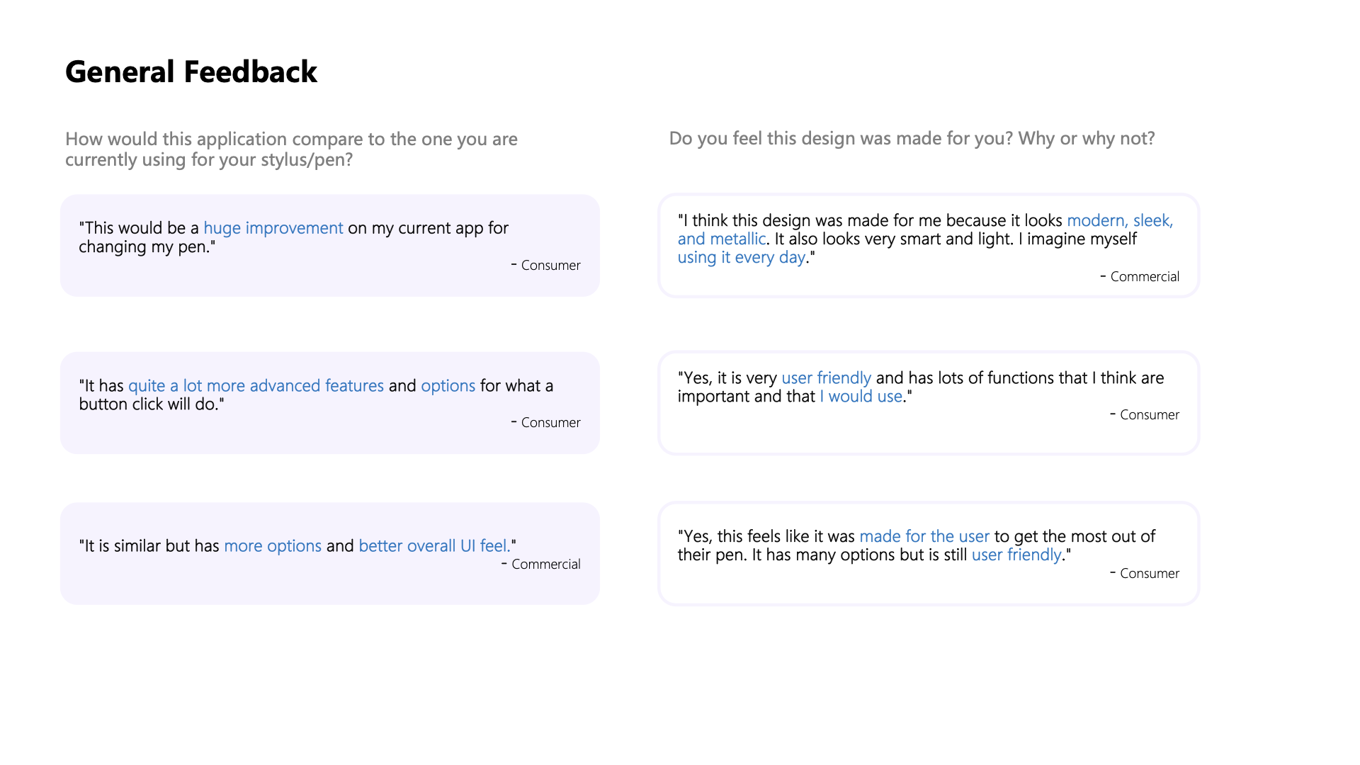
General Feedback:
- “Huge improvement over my current app.”
- “Advanced features with better overall UI feel.”
- “Modern, sleek, and user-friendly design.”
UI Feedback:
- Clear and intuitive visual representation.
- Easy-to-read layout and simplified dashboard.
Future Recommendations:
- Further increase the Information tab visibility.
- Clearly distinguish pen/mouse functionality.
- Ensure terminology consistency across the app.
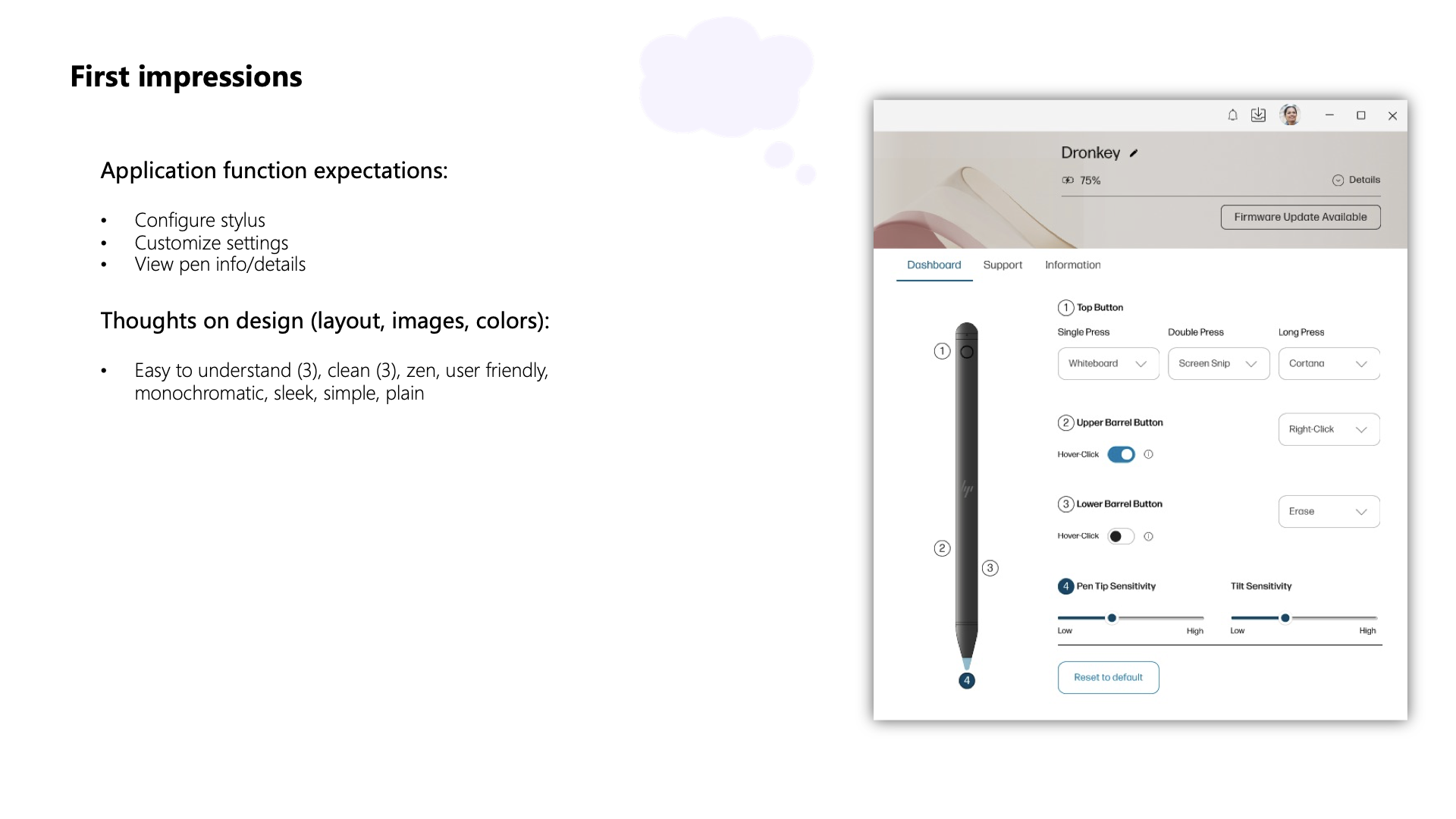
Thoughts on Design (Layout, Images, Colors):
- Easy to understand (3), clean (3), zen, user-friendly, monochromatic, sleek, simple, plain
UI Feedback
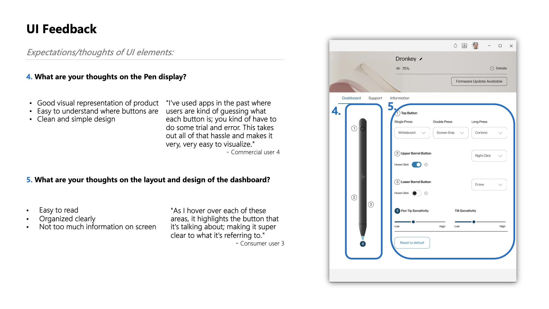
What do you think about the Pen display?
- Good visual representation of the product
- It is easy to understand where buttons are
- Clean and simple design
- Easy to read
- Organized clearly
- Not too much information on the screen
Recommendations
Based on user feedback, consider the following minor changes:
- Enhance the visibility of the Information tab.
- Explore options for providing additional information on button functions without overwhelming the user.
- Ensure consistent terminology across the application for a seamless user experience.
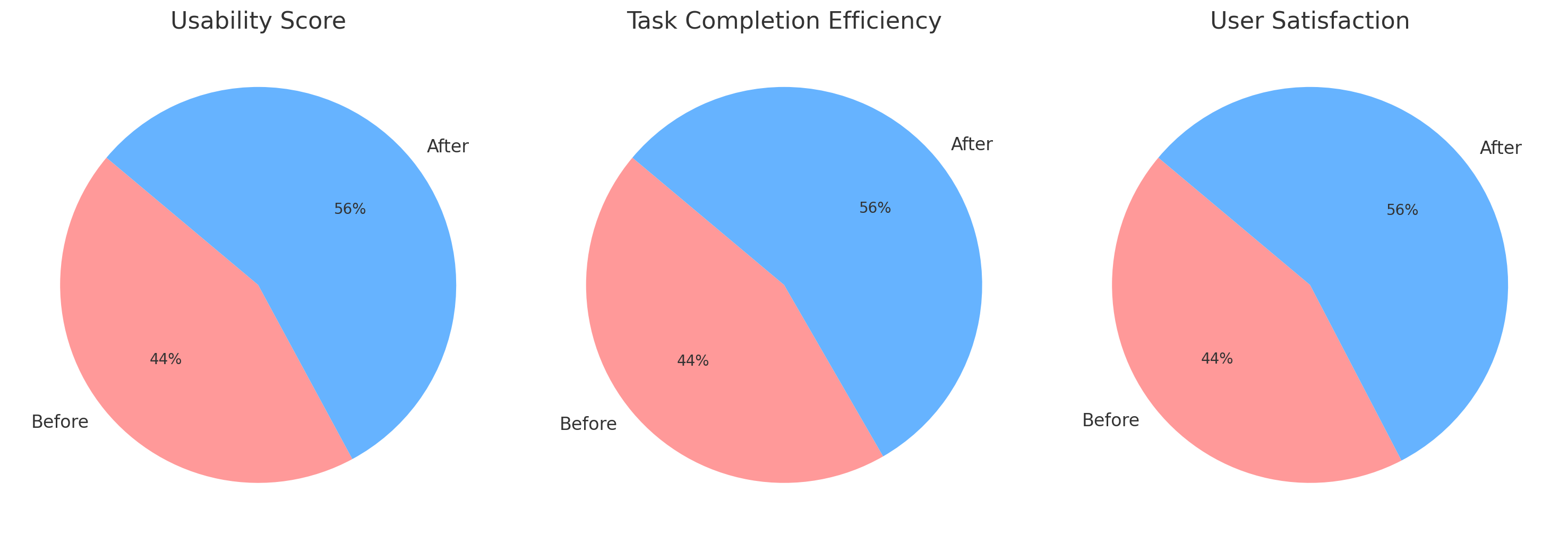
📊 Business Impact & Key Metrics
- 📈 Usability Increase: Ease-of-use improved by 15%.
- ⏳ Efficiency Gain: 20% faster task completion.
- 💬 High User Satisfaction: Positive feedback across user segments.
Usability Scores:
- Before: [■■■■□□□□□□] 55%
- After:  [■■■■■■■□□□] 70%
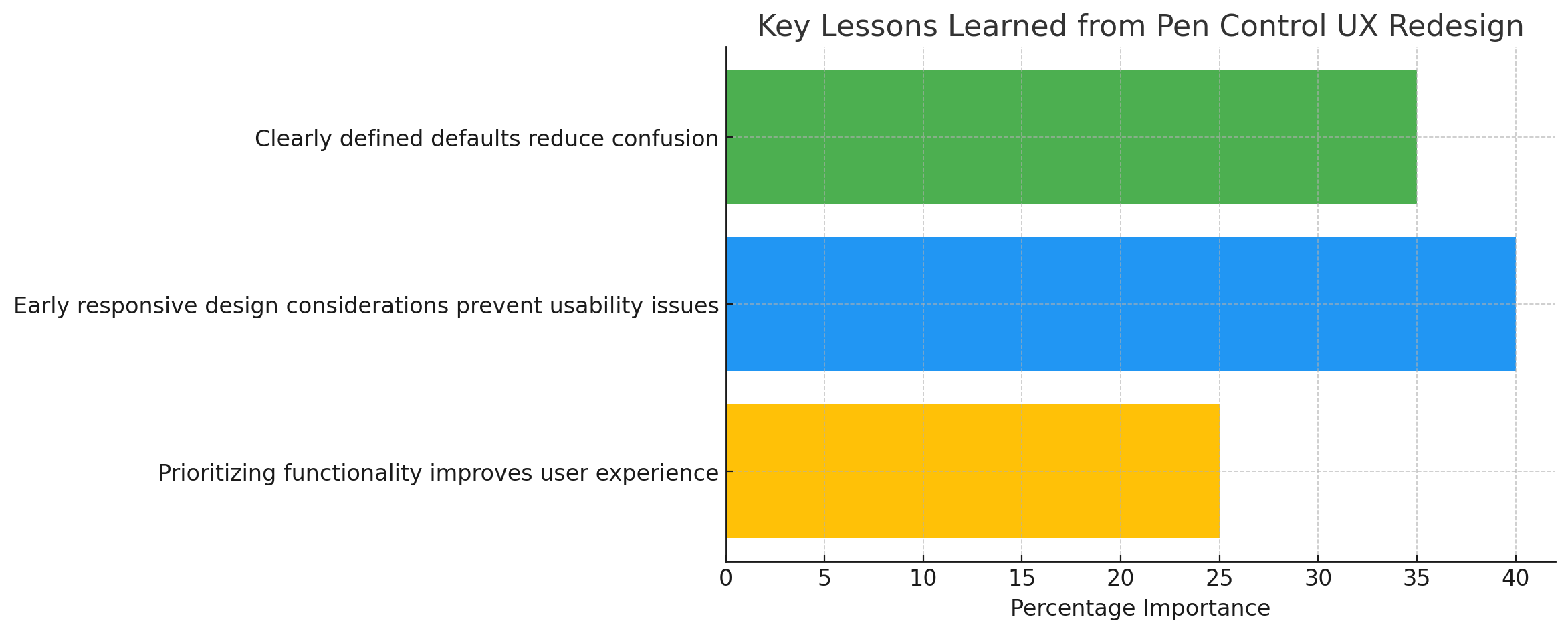
💡 Lessons Learned
- 👁️ Clearly defined defaults reduce confusion.
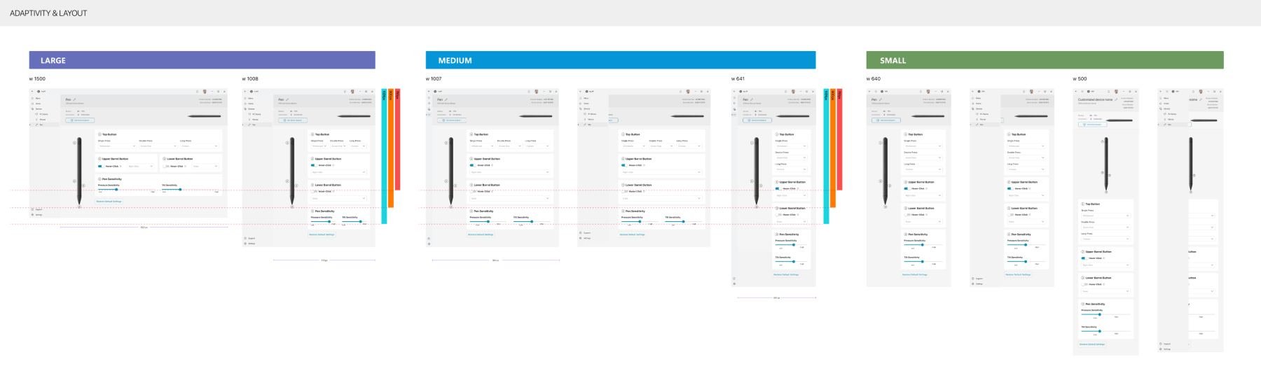
- 📏 Early responsive design considerations prevent future usability issues.
- ⚖️ Prioritizing functionality significantly improves overall user experience.
🚀 Future Roadmap & Next Steps
- 🖥️ Further optimize for smaller screens.
- ⚙️ Expand pen customization options.
- 🔄 Continue iterative improvements through ongoing testing and collaboration.
🏁 Conclusion
The Pen Control UX initiative within MyHP successfully addressed significant usability challenges through user-focused research, iterative design, and strategic collaboration. My role as the Lead Product Designer was pivotal in enhancing the user experience, highlighting the value of a responsive, iterative, and collaborative UX design process.