Role
|
Team
|
Overview
My mission was to create a new game grid for desktop and mobile devices to improve the overall user experience. A game grid is a structure made up of a series of products and used to structure content. Grids add structure to a design. They lead to rational standardized systems that help people absorb the information we’re trying to communicate. After designing the game grid, I went through a quick cycle of the user-centered design process and tested my design through prototype testing.
The redesign project focused on business priorities and user needs. I brought new ideas to the table that had more customer impact potential and provided a better user experience for the game grid display. When I redesigned the product grid layout, I went through a quick cycle of the user-centered design process, tested my updates with users in moderated user testing and contextual inquiry, and then released them.
The Problem
- Outdated design and lack of clarity
- Products needed to stand out more
- Missing the mobile-first approach
- The game grid didn’t look visual enough.
- Game description readability issues. Textual elements were too long.
- Lack of customized mobile user experience and interactions.
- It didn’t have swiping game card functionality on mobile.
- Needed a new mobile game card with swipeable features
- Didn’t show a game feature video
- Didn’t include game genres
- Lack of game suggestion feature based on similar games you have played, new game releases, and what your friends are playing
- Lack of filtering and utility options
The Solution
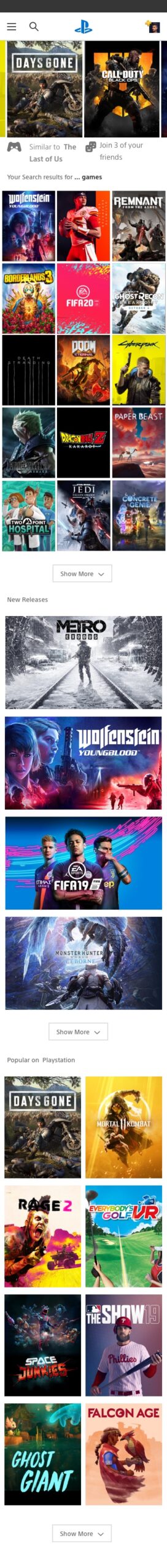
- Created a grid design system that allows potential users to quickly and easily navigate lots of games and choose the one they are interested in
- Increased product visibility and design consistency
- Improved text readability by showing fewer words. I tried to limit the textual elements along with the images
- Created a more visual product grid experience that saves users time
- I made different sizes and shapes of game blocks
- On mobile, designed a game card review features with an expandable view.
- Added a mobile game card swipeable features
- Add utilities. Include pagination, icons, videos, game suggestion notes, swipe gesture
- Developed UX driven solutions that respond to users’ pain points.
- Ability to display video game genres with more clarity
- Completed new game grids and browsing options for desktop and mobile application
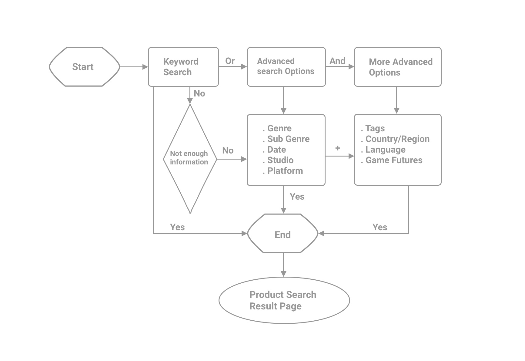
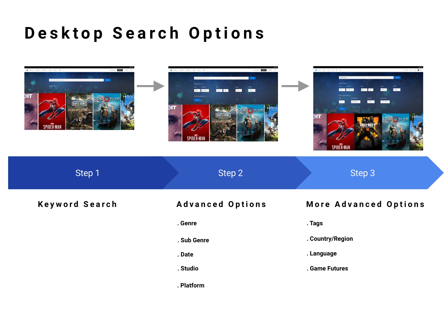
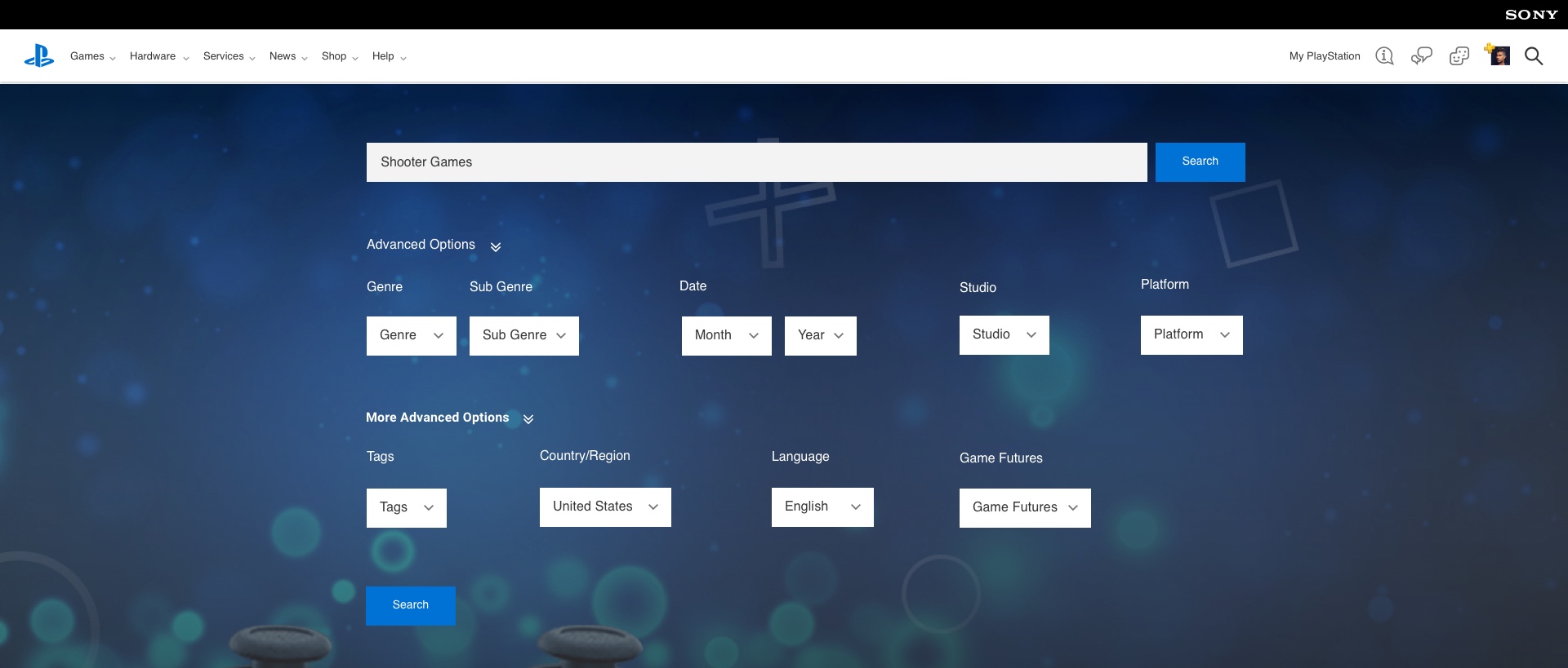
- Created product search flow and filtering options
Research
- My research study aims at making the products and information users are looking for more straightforward and easy to find
- I looked into competitive brands such as Xbox and Nintendo to research industry standards and look into features and functionalities from the UX standpoint.
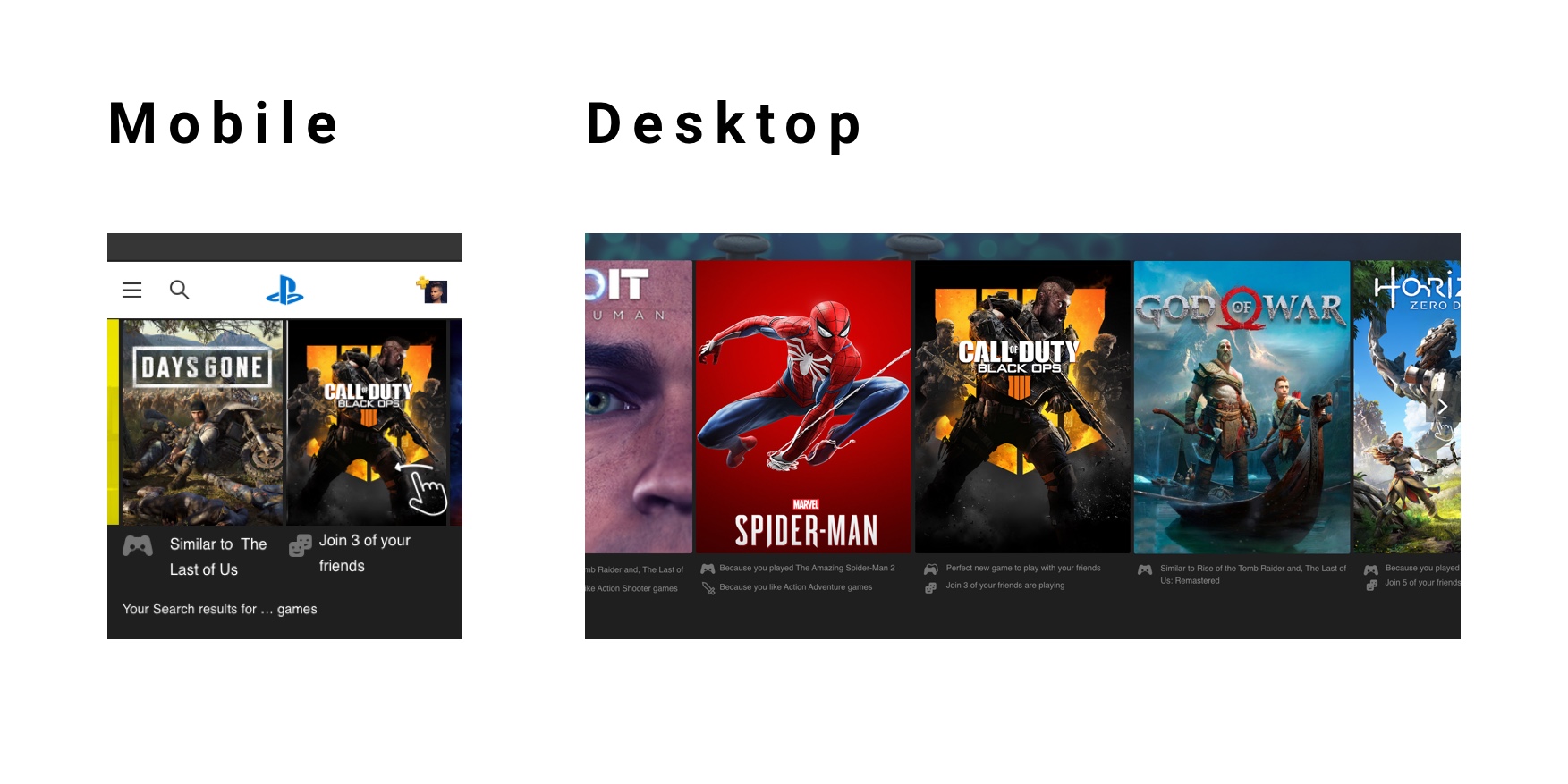
- I found that due to limited space on mobile, games are smaller on mobile viewports. The UX challenge was how to make the game grid from the desktop and translate it into mobile and still impact the small screen as we do on a large screen.
- We needed to increase product visibility on mobile.
- On the mobile game cards, product information should be easy to scan. Incomplete product details can cause problems for the user.
- The product image sells the item. Games Key art and product images are the essential elements for browsing the games.
- For the game image to be compelling, it needs to be both big and high quality.
- On mobile, horizontal swiping is a good option for browsing game categories and game cards. Users should be able to swipe through product images horizontally and not have to scroll down to view a series of images.
- Showing product availability and released date is essential.
- Create a new gradient overlay for more text visibility.
- Filtering options are essential to filter out products. Filtering categories on the product page can help improve the user experience.
- Add new utilities to the game grid.

Competitive & Industry Analysis
- I picked these brands because they are the top product and e-commerce websites.
- I specifically focused on product and game grids.
Understanding who is our user
It is essential to understand who we are designing for and the user’s goals and frustrations.
Persona

Jack Jones
12-year-old male
Income: $30/Week
Living with parents and older sister
Lives in California
Education: Middle School
Goals:
• Doesn’t want to miss any new game releases
• Get Good discounts on games
• Being able to search for a game simply
• Save time and money on PlayStation
• Browse and buy games quickly since he has a short attention span
• View plenty of games videos and images, as he relies on those more than text
• Read the brief description and promptly browse through
• Ability to compete against friends
• Download recommended games
Frustrations:
• New releases and discounted games are not always displayed clearly in the game grids, making it confusing
• Forgets what games he wants as gifts
• Wastes time clicking on games that he is not old enough to play
• Repeatedly has to check what’s new
Design Goals
- Creating new game grids and browsing options for desktop and mobile application
- Creating product search flow and filtering options
- Discover the main pain point of our target market and test possible solutions with prototyping and testing
My Approach
To solve this problem, I conducted industry, market research, and best UX practices to understand and define the problem. Once I understood the situation, I ideate by considering potential constraints. The next step was to test my design, reiterate, and got into the feedback loop.
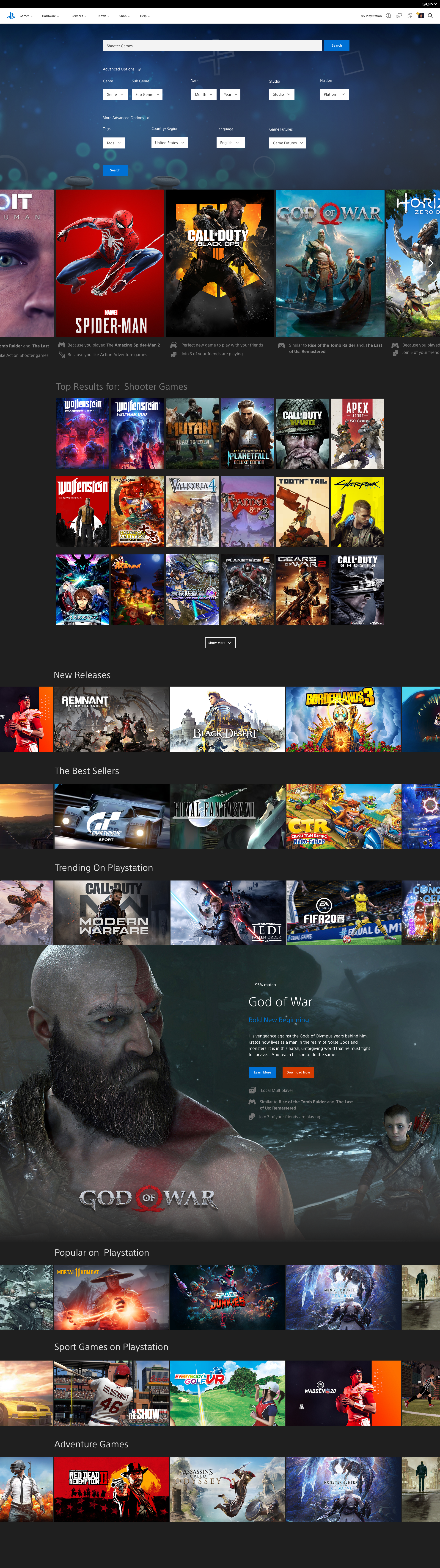
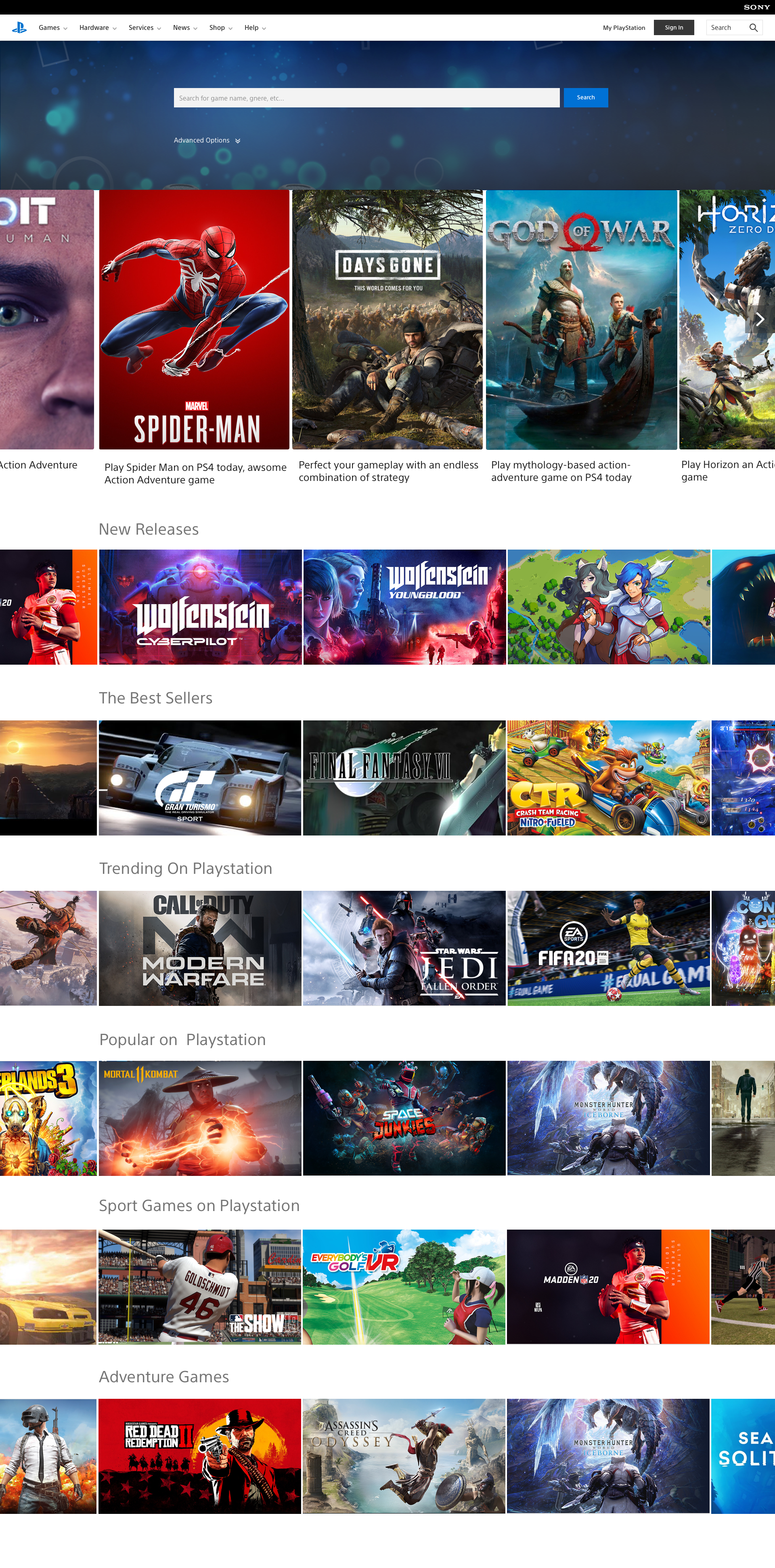
Game Grid Components Design
- I focus on the product interactions within the result page and created swipeable user interactions for desktop and mobile. Swippble option within the game grid can show more information about the game and exclusive deals.
- I created a new interaction flow for displaying game videos on the grid for each game.
- I worked on providing game genres to help the user choose a category they are looking for faster.
- Created filtering options to help users filter out products and find what they are looking for faster.
- I created new components for showing product availability, recommended games and new releases.
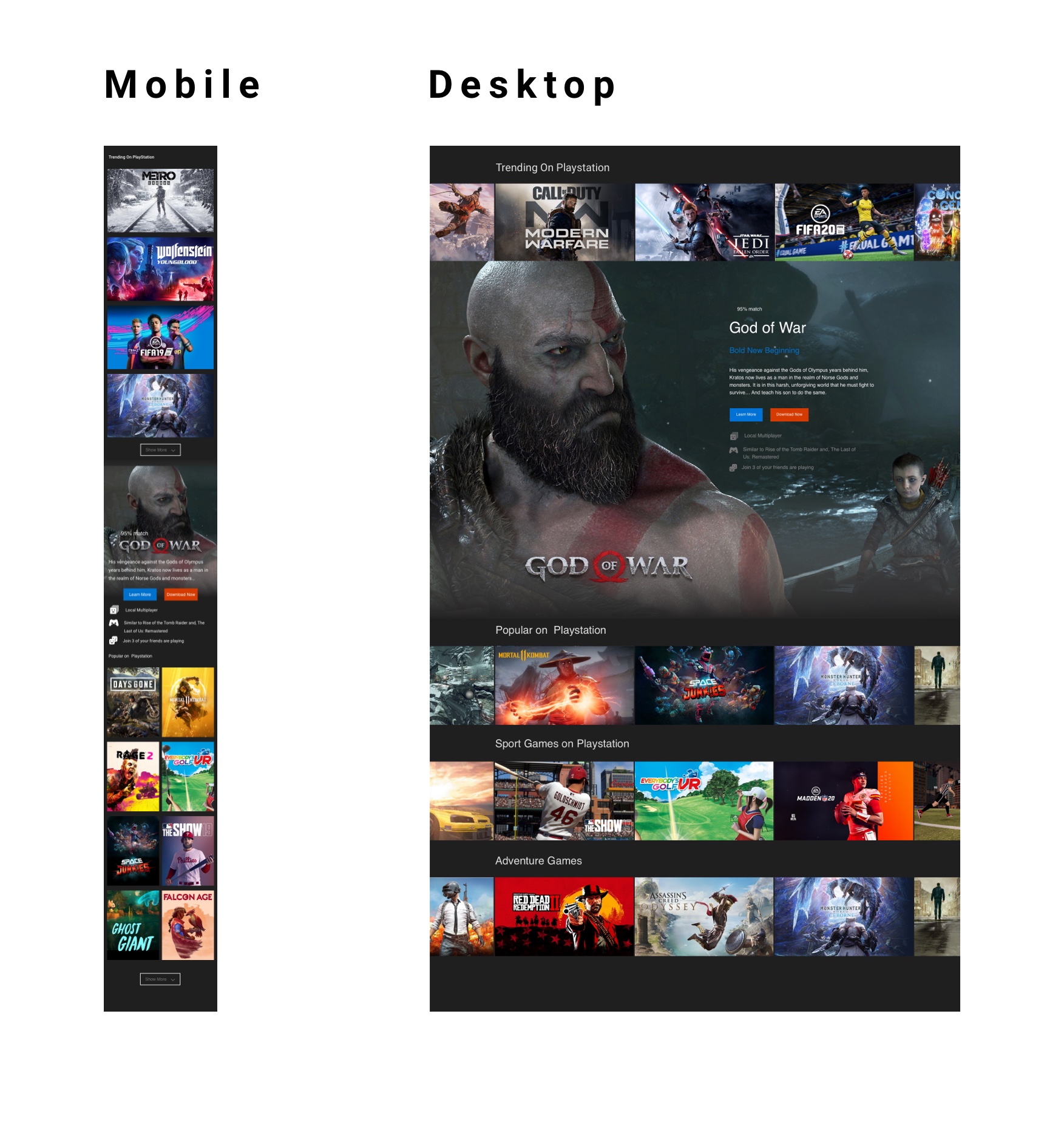
Recommended Games
Game Grid Search Result

Game Recommendation By PS
Search Flow
Game Grid Interactions
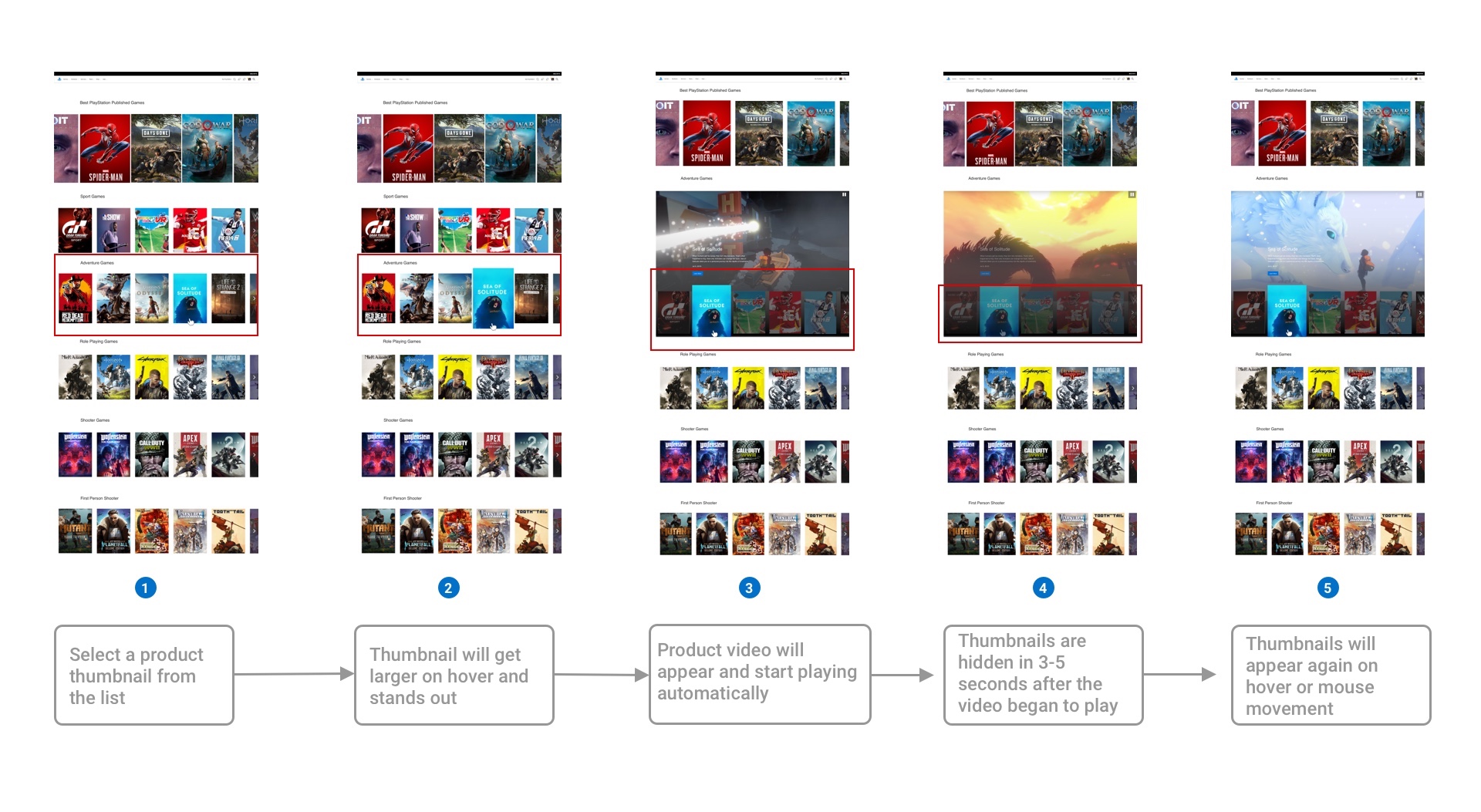
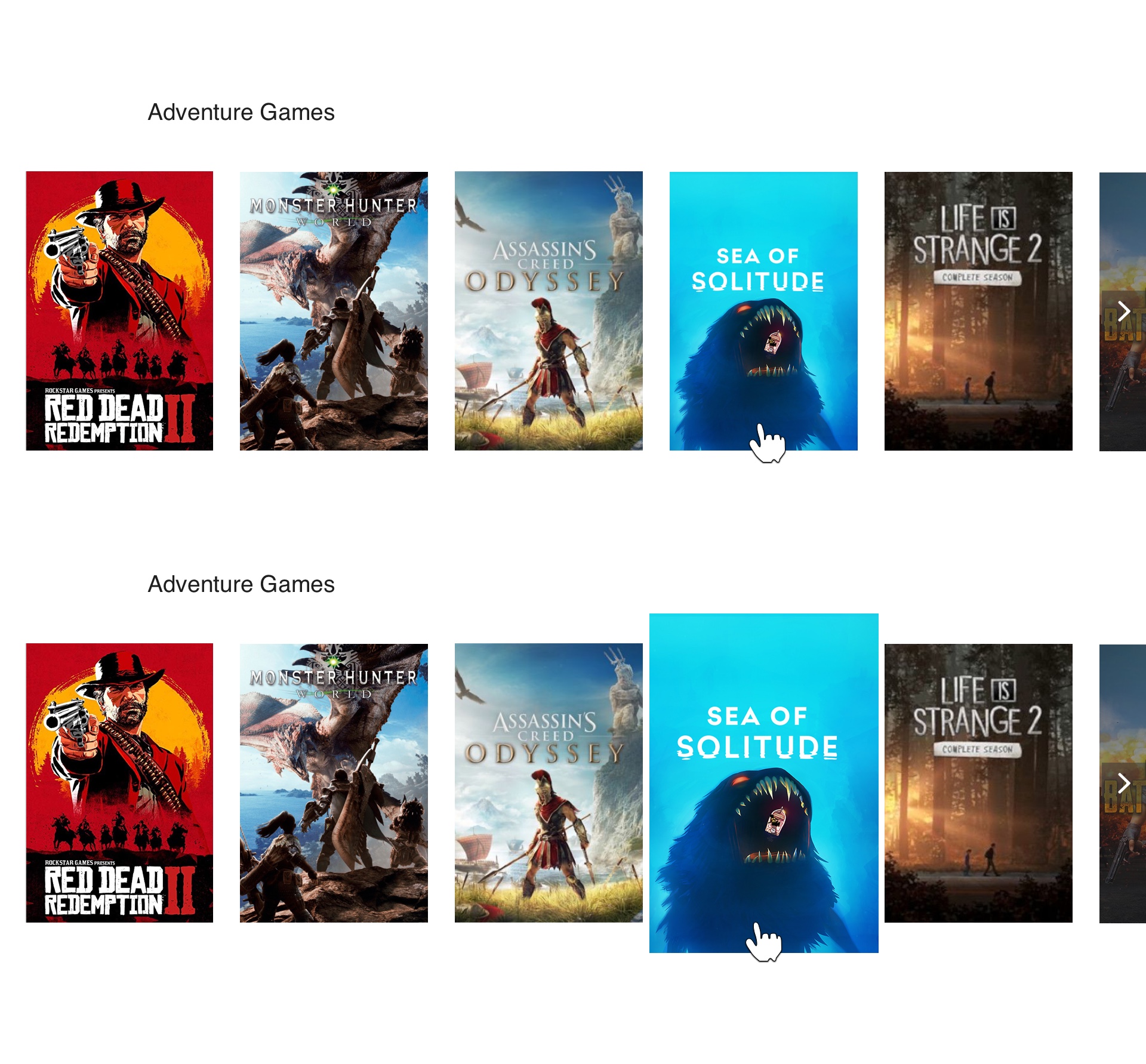
I created a new interaction flow for displaying game videos on the product grid.
Product thumbnails and video interaction behavior on the game grid
- Select a product thumbnail from the list
- Thumbnail will get larger on hover and stands out
- Product video will appear and start playing automatically
- Thumbnails are hidden in 3-5 seconds after the video began to play
- Thumbnails will appear again on hover or mouse movement

Game Grid Product Display Prototyping
My process was to get the prototype in front of users and team members and get some feedback.
Interactive Card Carousel Prototypes
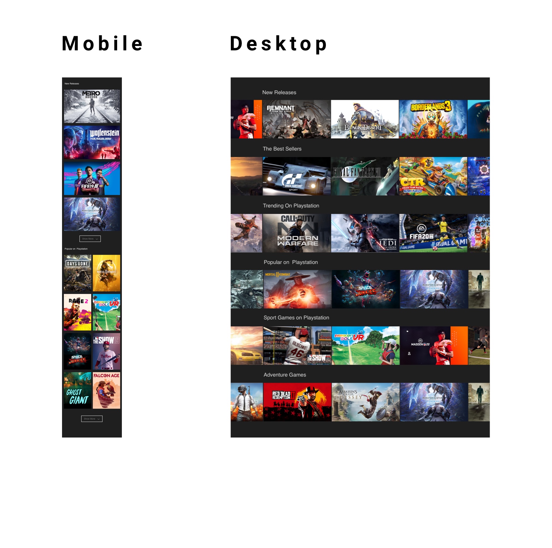
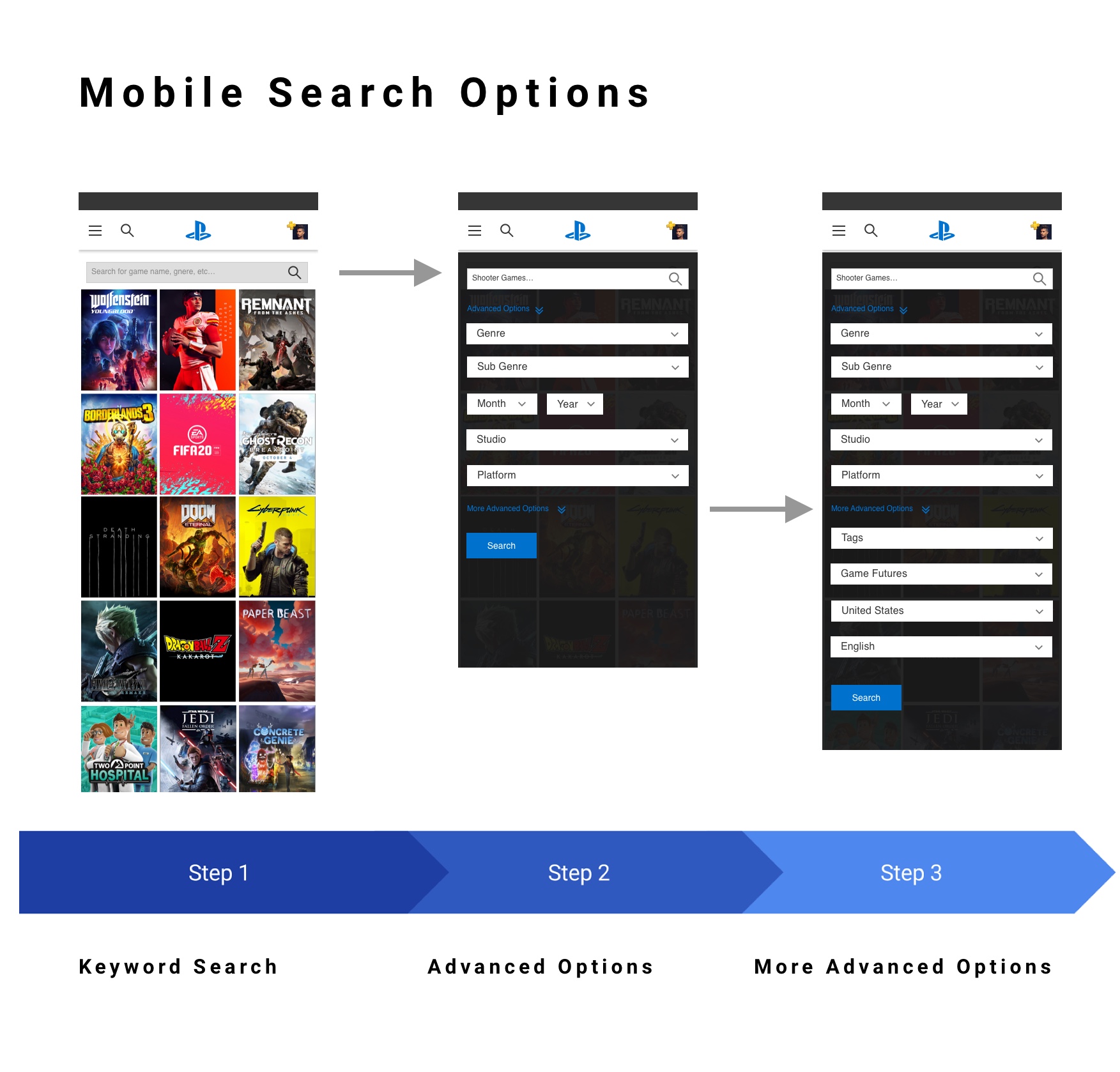
Mobile Product Game Grid Design
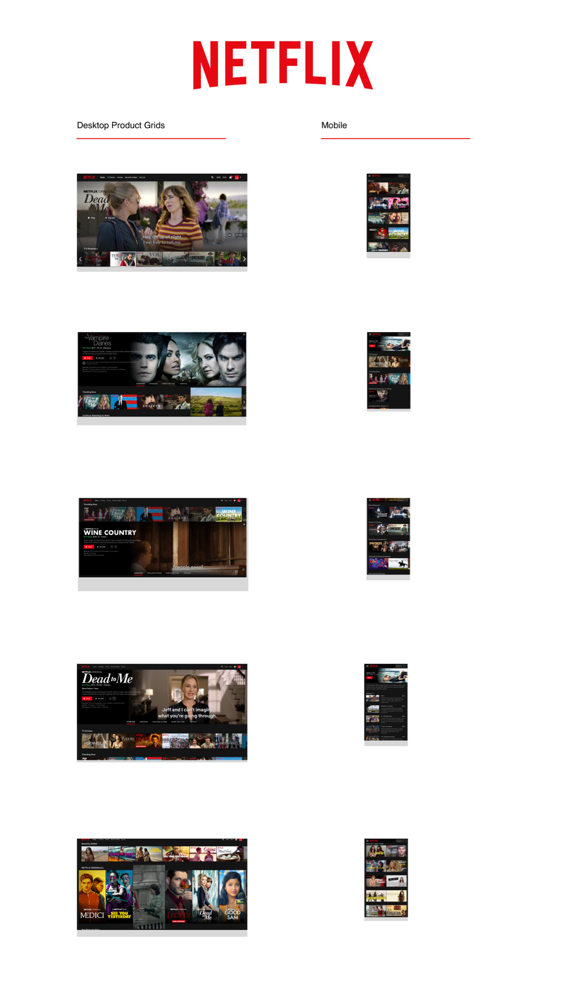
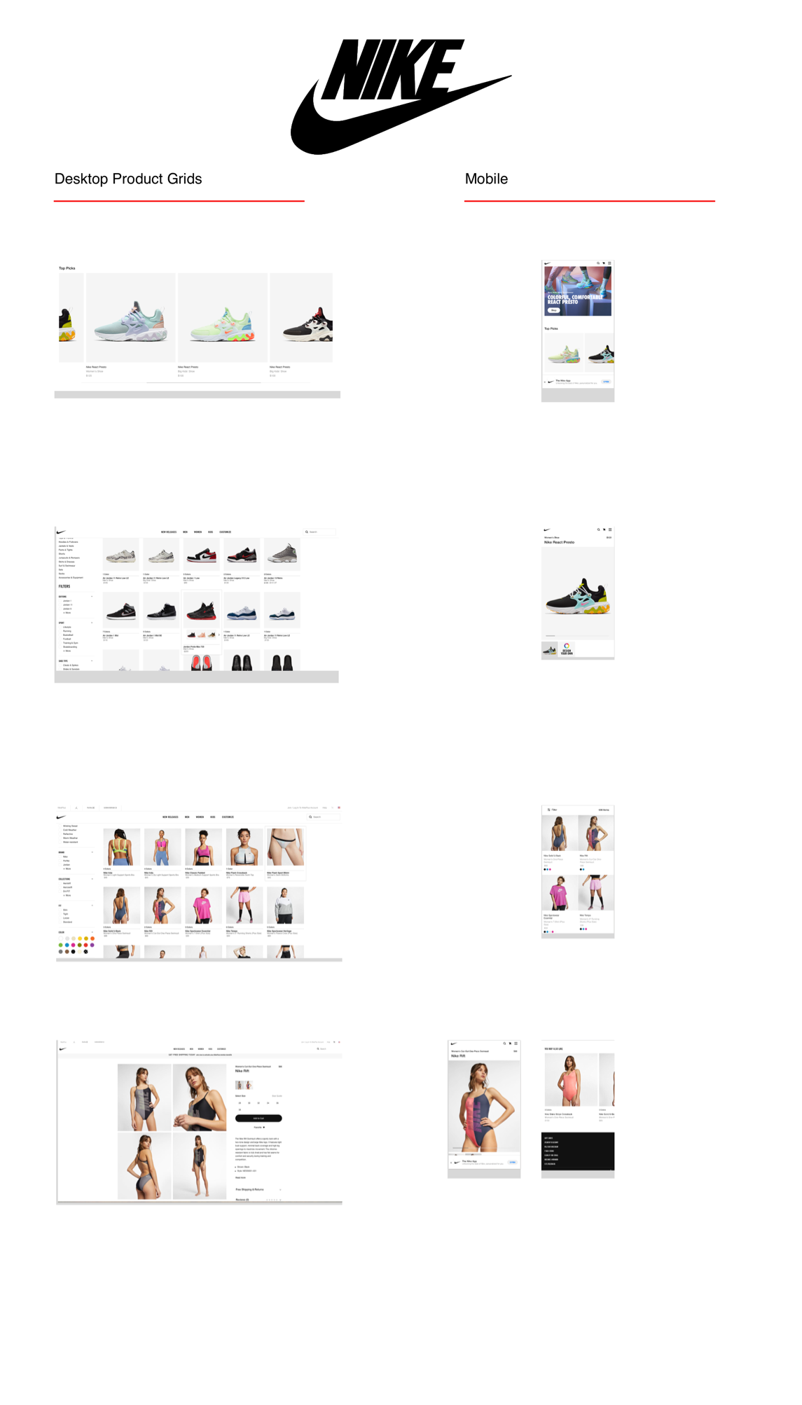
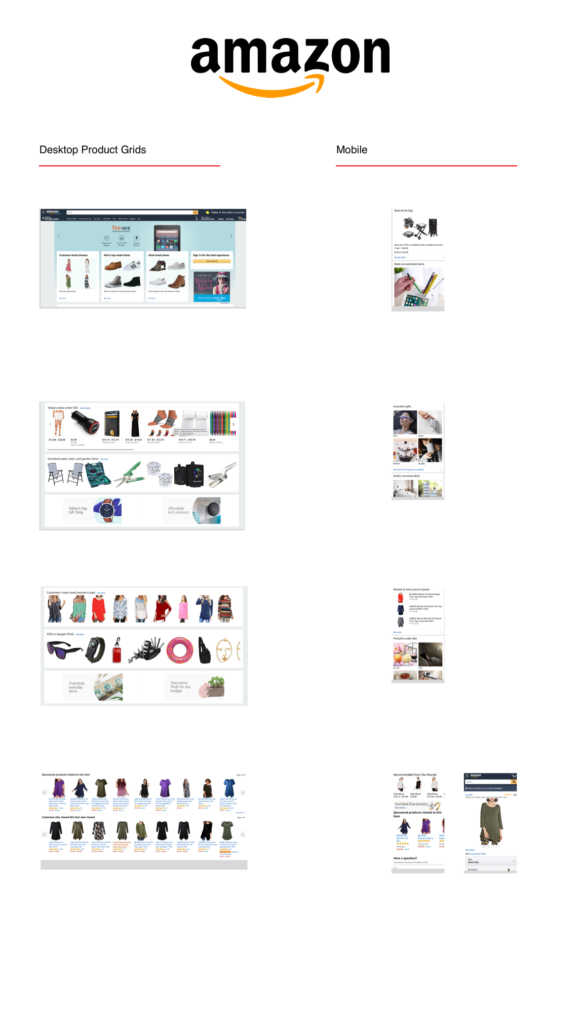
Page layouts and component redesign options for the mobile product grid. Designs including dark, light, and blue backgrounds for the game page results page.


Desktop Product Game Grid Design