Role
|
Team
|
The Story
Bank of the West is a regional financial services company headquartered in San Francisco, California. I worked for the commercial banking group, and the TreasuryNow application is a highly intuitive Digital Banking Platform. The application is a digital self-service, informational, and transactional application.
- Users can sign in and go through bank security with TouchID, FaceID, Mobile PIN, or Password.
- Send Money, Make payments, transfer, and deposit funds on the go.
- View or modify scheduled payments and pay bills.
- Easily move money between Bank of The west accounts and accounts at other banks.
- Deposit checks through the app and gets the receipt in your internal email. Also, verify and view images of cleared checks.
- Manage your credit and debit cards and activate new cards.
- Access your Checking, Savings, Credit card account statements online.
- Quickly look up a transaction without endless scrolling using the search bar.
- The app is available to download at no cost.
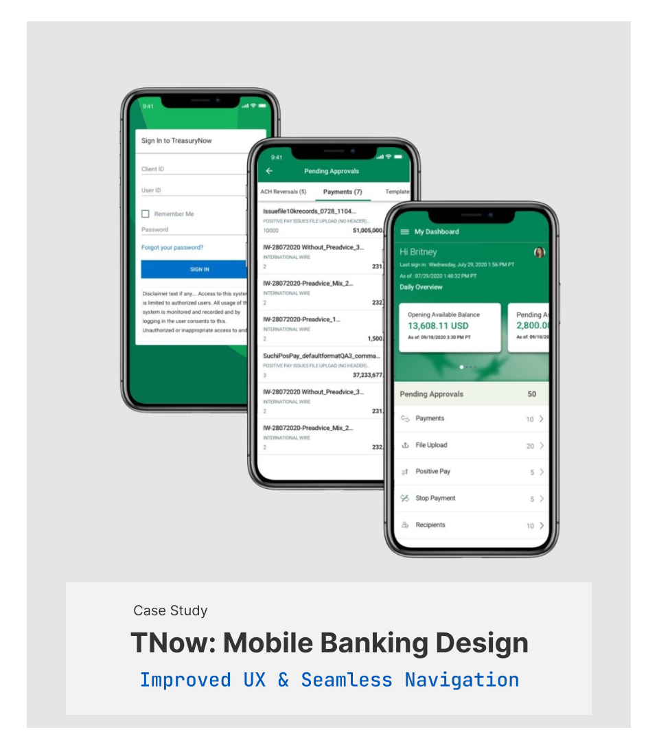
Overview
My mission was to redesign the TreasuryNow finance mobile application to improve overall UI/UX and show banking products and services. I wanted to make the commercial mobile application more intuitive and user friendly. The corporate banking app usually deals with extensive data, making it more convenient and easy to use was the most significant design challenge from the UI/UX standpoint. The redesign solutions will solve the problem with Sign in, user feedback, payment processing, bill pay, check services, Debit/Credit card management, deposits, leaving a note, contacting bank customer service, user management, and improve navigating throughout the app. After redesigning the app, I went through a quick cycle of the user-centered design process and tested my design through prototype testing.
Design Goals
- Rebranded the mobile application
- Design intuitive user dashboards
- Customized user experience for mobile application
- Increased product and services visibility and increase design consistency
- Solved ADA issues
- Improved overall app navigation
- Ability to sign in with multiple authentication methods
- Designed card carousel for payment details
- Redesigned user flow for payments, check services, approvals, RTP, ACH, etc.
- Added new component interactive functionalities and utilities
- Created user feedback ability
- Added ability to manage multiple users for admins
- Added file upload feature
- Designed Live Chat and Chatbot
- Created customized email and alert messaging functions
- Designed customized templates for banking transactions
- Discover the main pain point of users and test possible solutions with prototyping and testing
My Approach
Design without research has no value and is nothing more than an opinion. To solve design problems, I needED to understand and define those problems. Once I understood the difficulties, I ideate by considering potential constraints. The next step was to test my design, reiterate and get into the feedback loop.
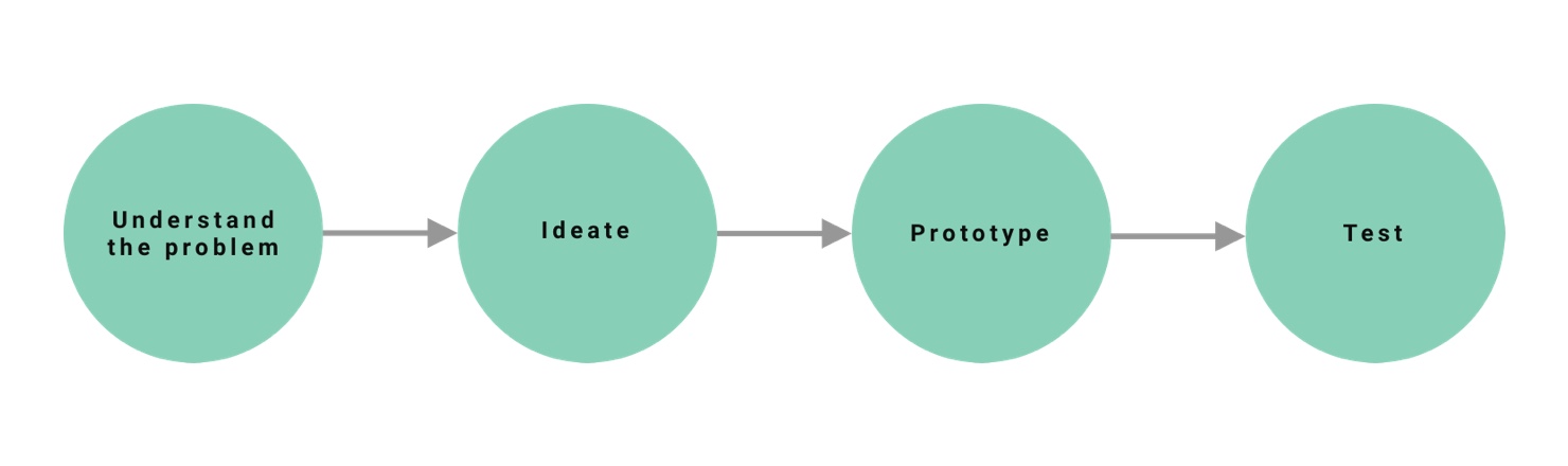
The design process starts with understanding, followed by ideating, prototyping, and testing.
Understanding The Problem
Talking to the Users
Let’s start simple. What are some pain points that users have?
I started interviewing some friends and coworkers that used the application.
Here is what I found:
- Lack of clarity
- Lack of intuitive UI/UX
- Too much work
- No Feedback and Messages
- UI Issues
- Lack of profile management option
- Lack of Sign in multiple methods
Persona

Brian Goldman
40 years old male
Salary 250K
Married
He lives in New York
Education: MBA
Goals:
- Look up extensive transaction data and reports daily
- Need to have access to desktop and mobile app
- He wants to interact with the easy to use digital banking platform
- Save time and money on a banking application
- Easy access to customer services assistance
- Wants to have access to corporate payments, transfer funds, check balances, transactions, reports, view check images, manage loans, move money between accounts, receivables, liquidity and lending and credit, and manage investments
- Easy access to self-service Walkthrough information
- Leave comments and feedback
Frustrations:
- Has difficulty sign in to the application via different Sign in methods
- Wastes time clicking on irrelevant information
- Has problem searching, sorting, and filtering data
- Difficulty going through transaction flows
- Has difficulty finding relevant data
- Offen has trouble understanding his banking tools
- Offen has trouble leaving feedback
- Has difficulty seeing the error messages
- Has difficulty filling information into the fields every time. instead, he wants to use templates and save them for future transactions
- Has problem sending and receiving messages
- He has difficulty managing his profile info
User Pain Points
I focused on the problems that were important to both user and the business. In this section, I have expanded the most significant pain points and the top reasons that they happen. Most of these reasons are based on the design reviews.
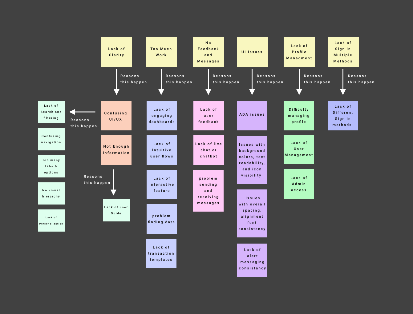
- Lack of product and information clarity and outdated design
- Missing the mobile-first approach
- Didn’t translate desktop functionalities into the mobile-friendly layout properly
- Needed redesign user flows for payments, check services, approvals, RTP, ACH, etc.
- Lack of upload file feature
- Didn’t support customized email and alert messaging functions
- Limited Sign in methods
- Lack of customized templates for banking transactions
- Missing Live Chat and Chatbot
- Didn’t support customer feedback and customer service info
- Lack of interactive features such as card carousel
- Lack of engaging dashboards
- Limited interactive functionalities and utilities
- Issues with overall spacing, alignment font consistency
- Lack of pinch and zoom features
- ADA issues with background colors, text readability, and icon visibility
- Lack of floating buttons
Design System
Style Guide
I created a new mobile Style Guide from scratch. A brand style guide is a holistic set of standards that defines a company’s branding. It references grammar, tone, logo usage, colors, visuals, word usage, point of view, and more.
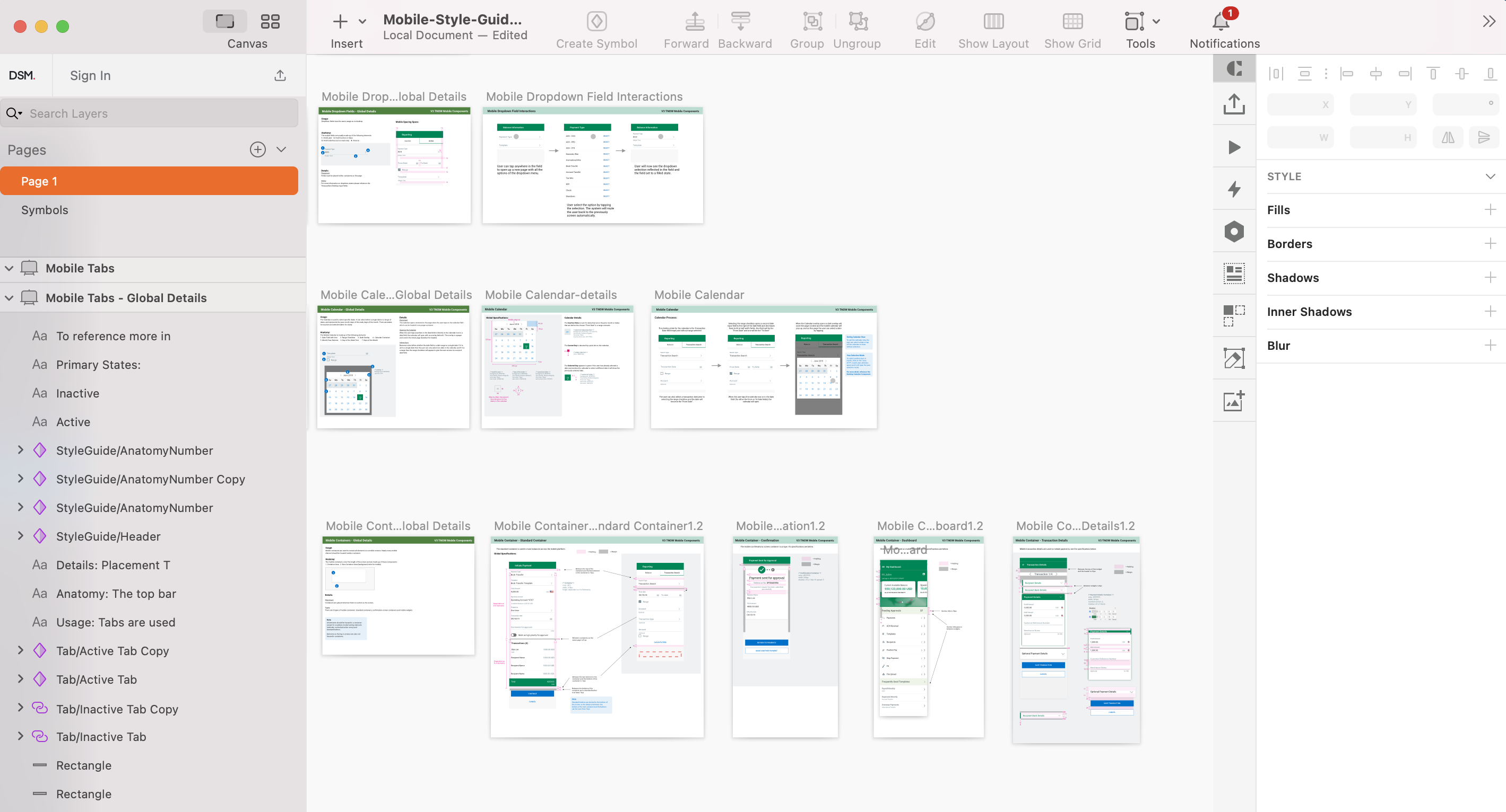
Design System
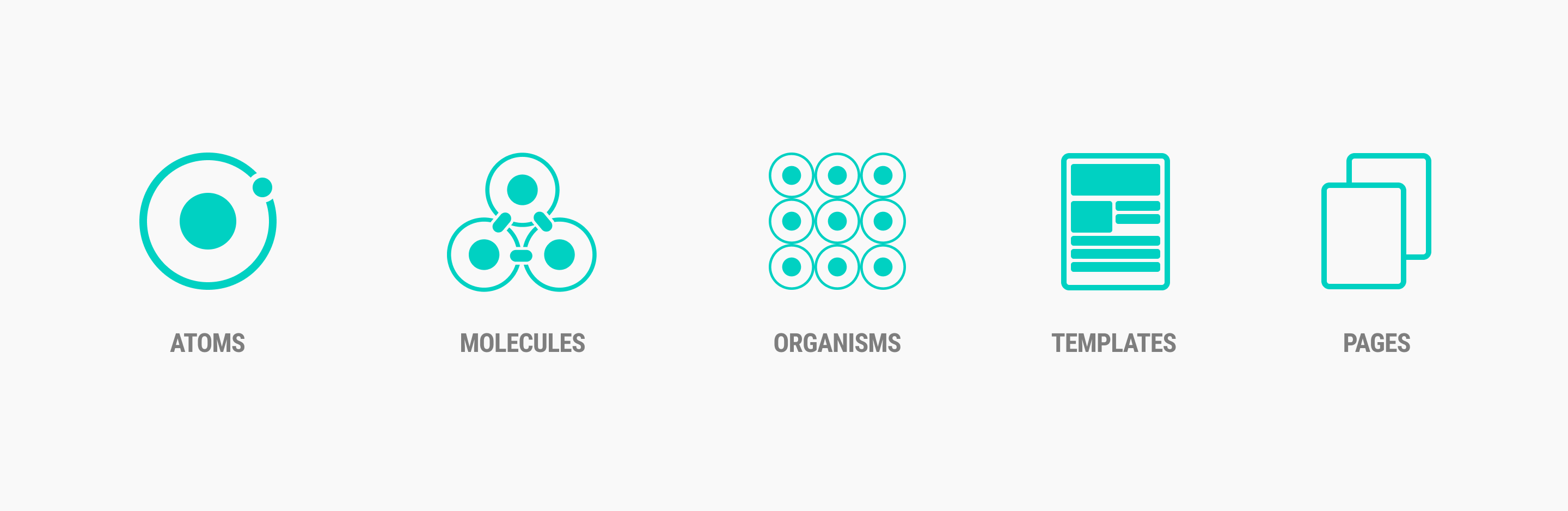
I used atomic design methodology for creating design systems.
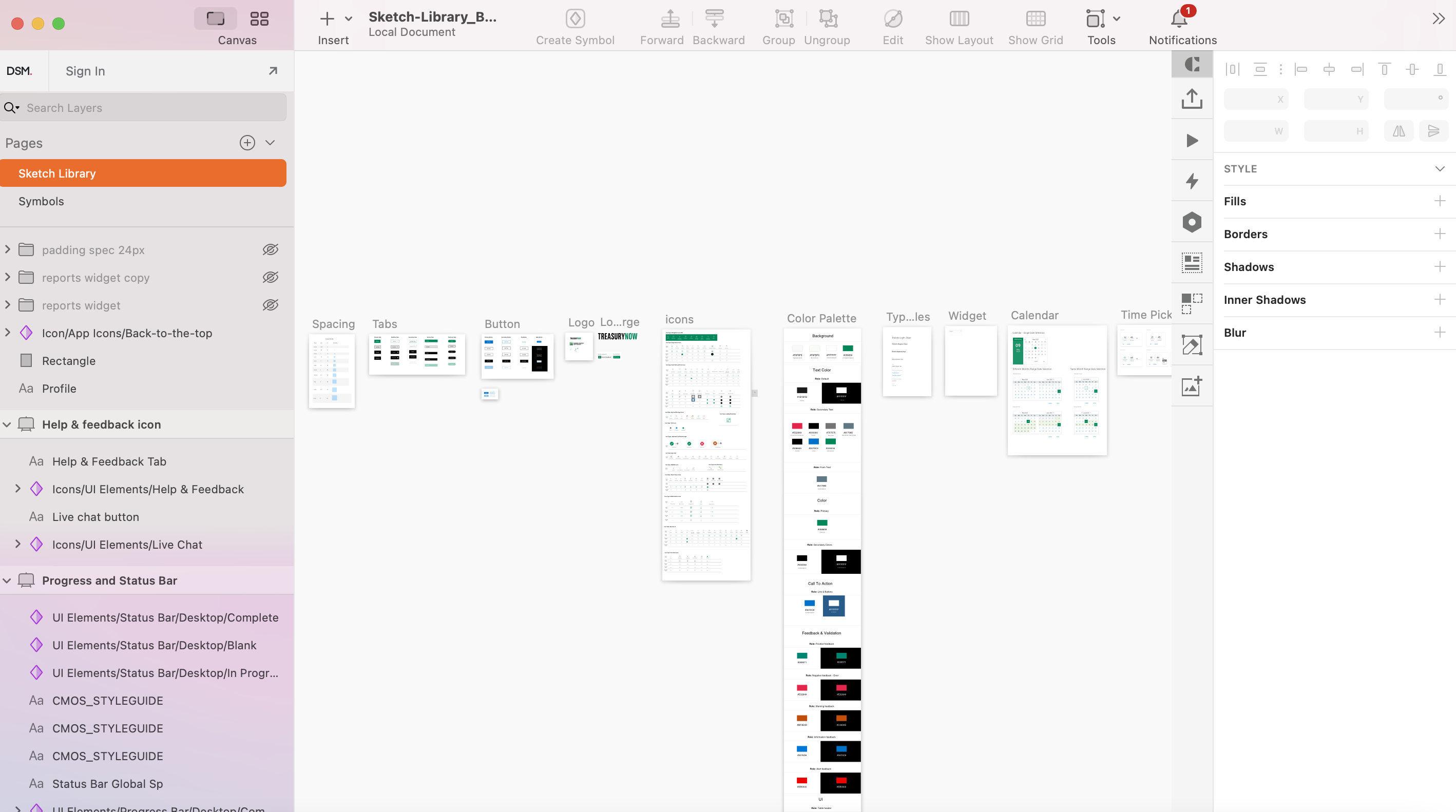
Reusable Sketch Library
My solution to a lack of a unified pattern library was to create a master sketch file. The Master sketch file is a library of components so everyone, including designers, developers, content creators, and stack holders, can use the same design patterns. This pattern library guaranteed a unified branding and look and feel for the entire company products. Through my research, I discovered that the difficulty of not having a centralized design system would lead to a bigger company problem.
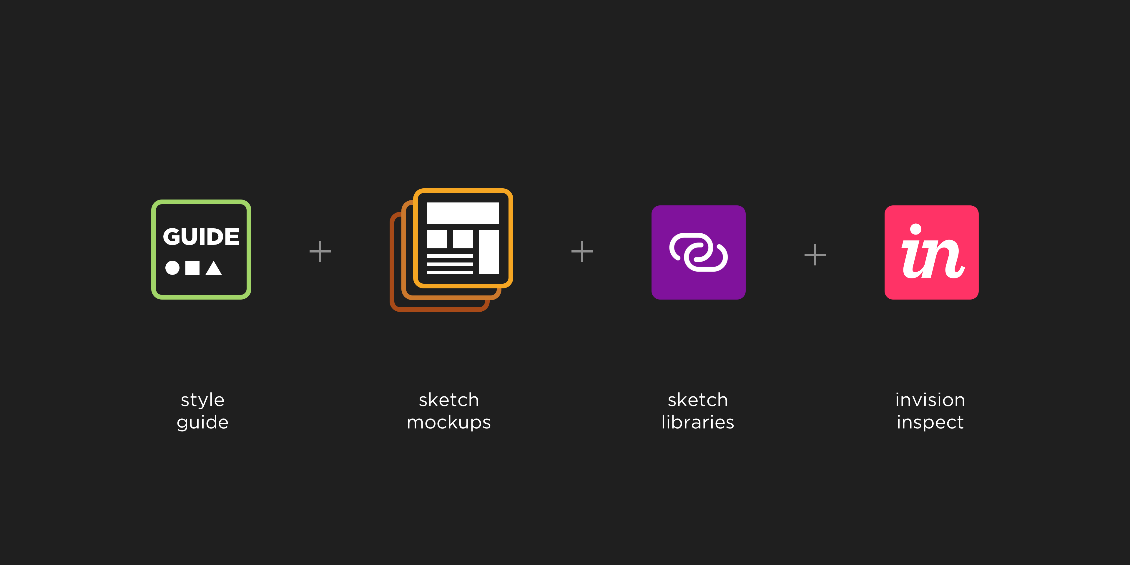
InVision
I created a style guide, provided high fidelity mockups in Sketch, and then uploaded the sketch library into InVision. InVision allowed me to quickly and easily create interactive mockups for my designs and share these mockups with my team. InVision allowed our developers to use the Inspect elements feature to get the code behind UI elements.
Design
App Icons Design
The app icon is one of the first elements that visitors see on your Product Page. It is essential to have an icon that gives a strong first impression while communicating your app’s purpose and utility. I designed the mobile app icons based on the company branding guidelines. I provide app icons for iOS and Android. I followed iOS guidelines and Google’s material design suggestions for icon sizes.
![]()
App Store Marketing Images
I’ve designed the app Store marketing image based on app store creative requirements for the TNow application. Those Screenshots I provided support all device types and showed the application services, features, and functionalities.
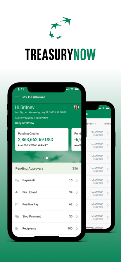
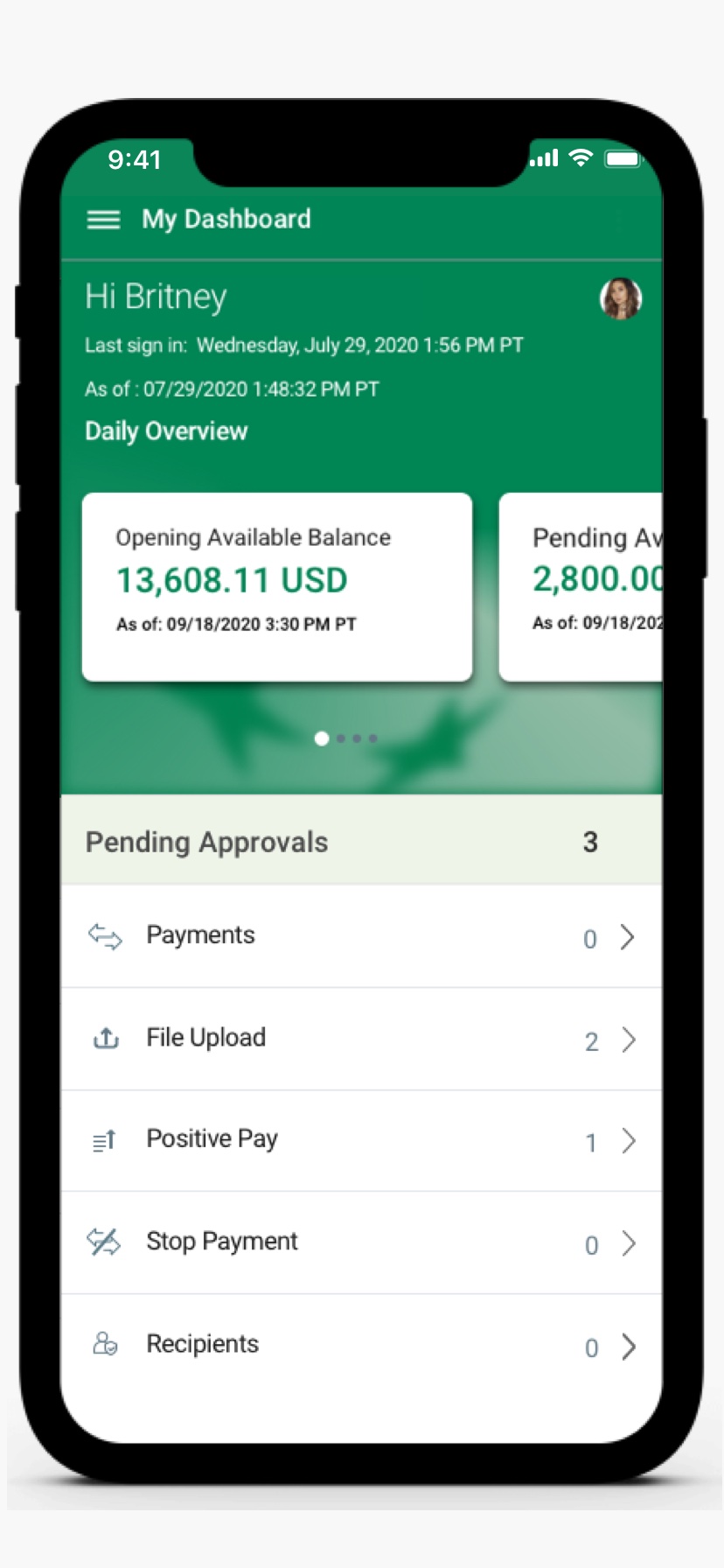
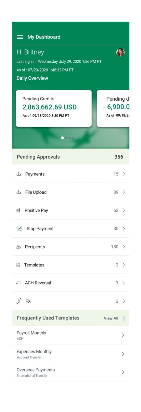
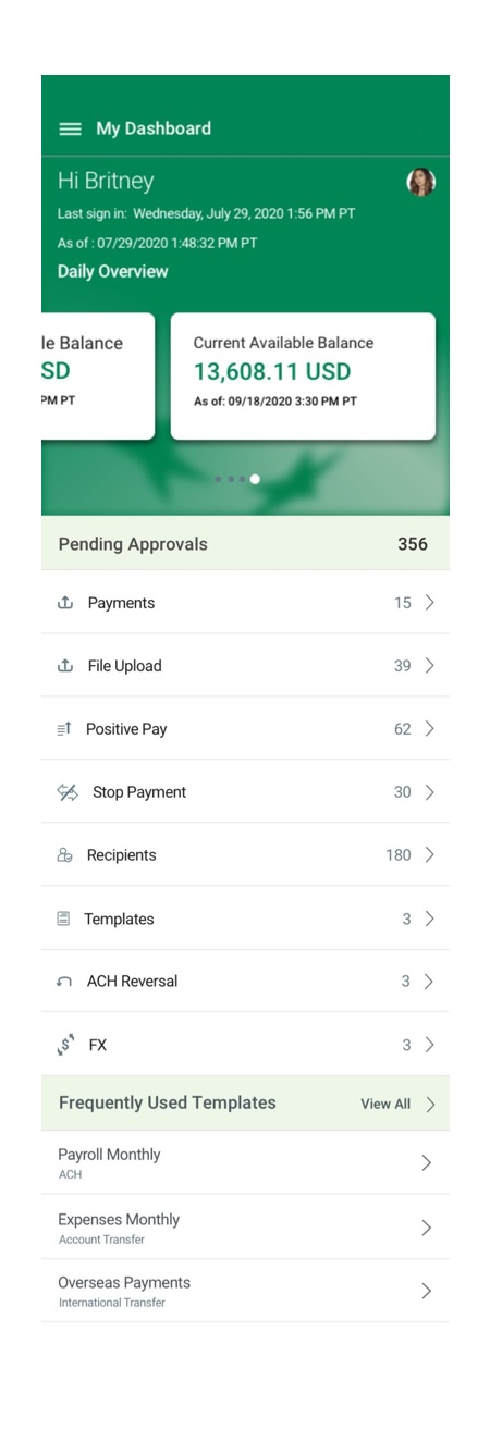
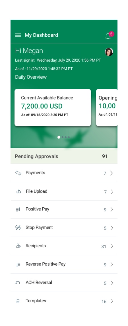
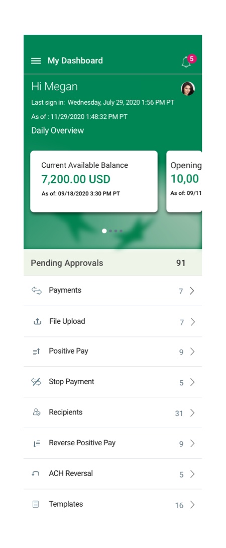
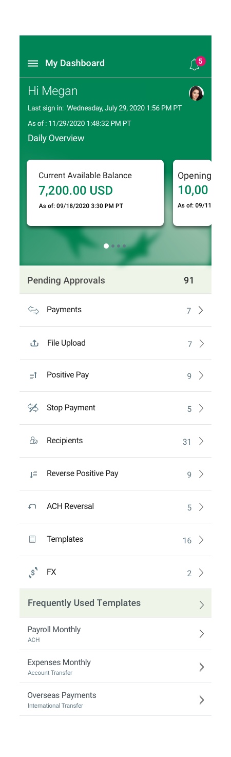
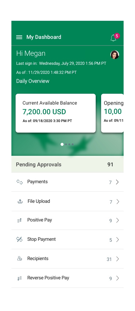
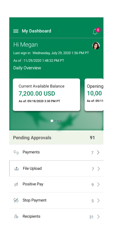
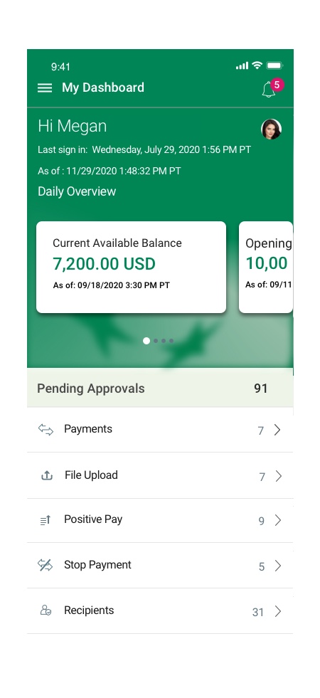
Application Dashboard Design
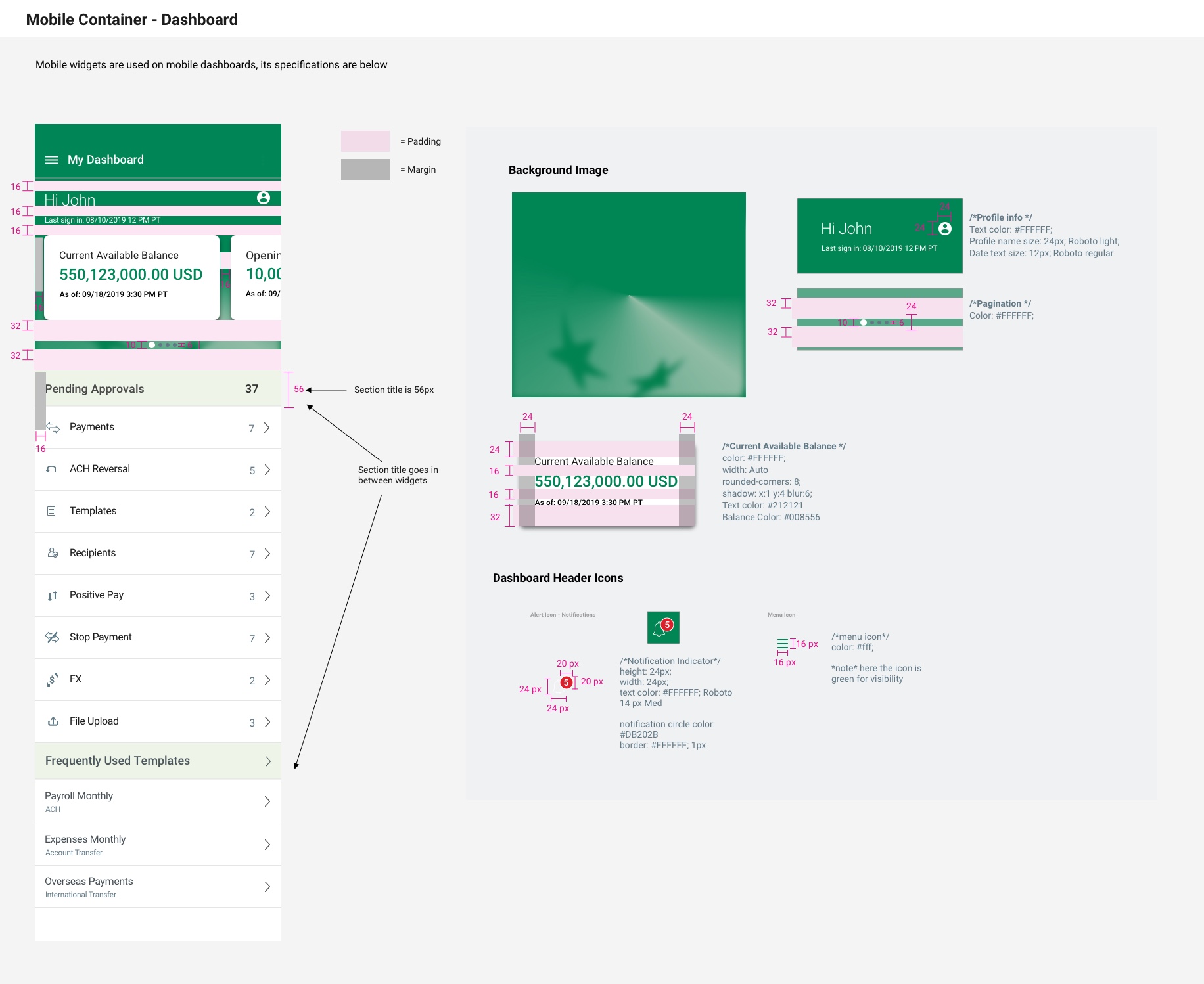
- The first page that users see and interact with is the dashboard page. The goal of the user dashboard is to provide a summarized view of user balances and transactions. It’s an excellent tool for quickly getting a glimpse into what is happening with the user’s bank account, a task you have to take action on, and whether they’re on track with expectations and goals.
- I designed a new customized user dashboard that shows the user’s daily account overview. This component is an interactive swipeable card carousel that offers a quick overview of their account. The user can swipe through opening available balance, pending approvals, debit/credit balances, and current available balance.
- The profile icon on the top right allows users to take action and access their profile.
- Created UI and background graphic for the header
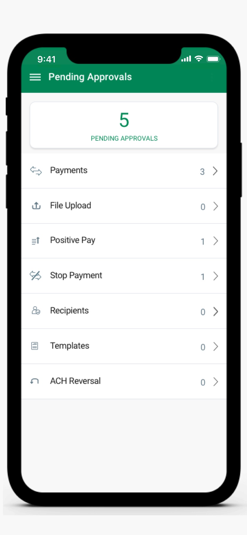
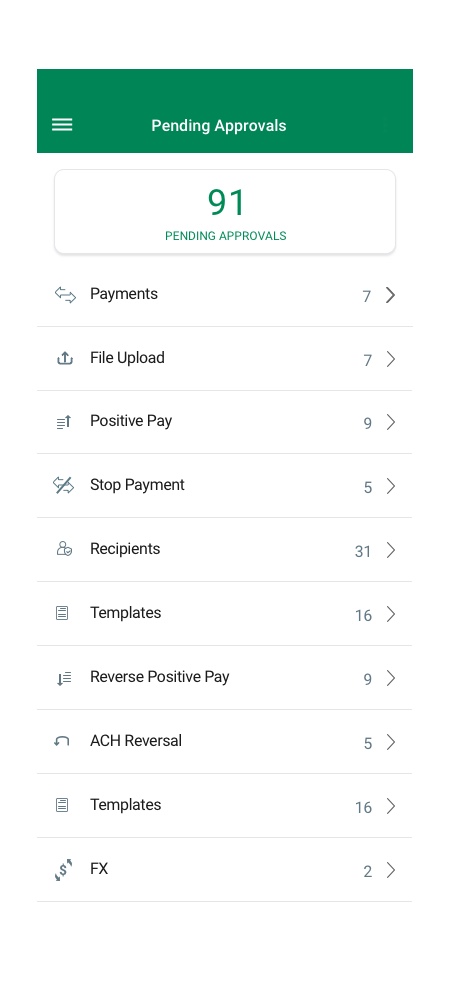
- The pending approval list view provides a quick way for the user to take action on pending items.
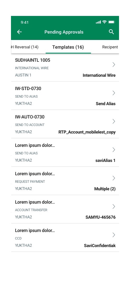
- The frequently used templates allow users to use existing templates to process transactions quickly without entering information manually every time.
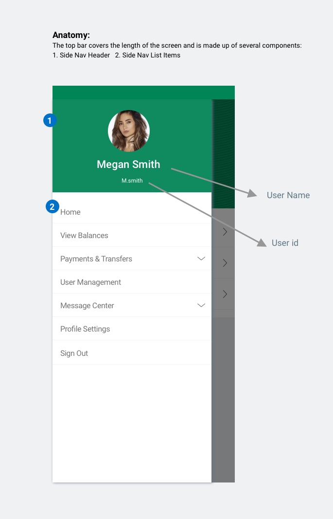
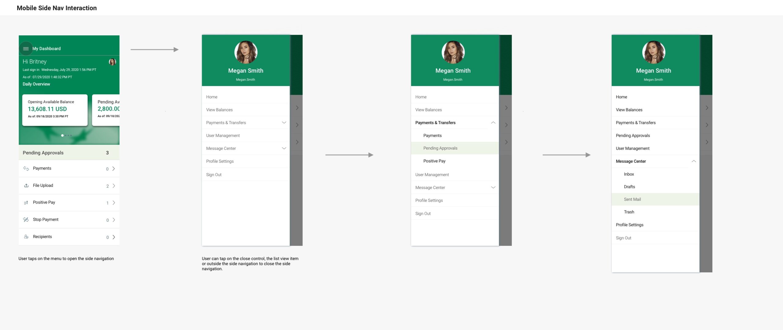
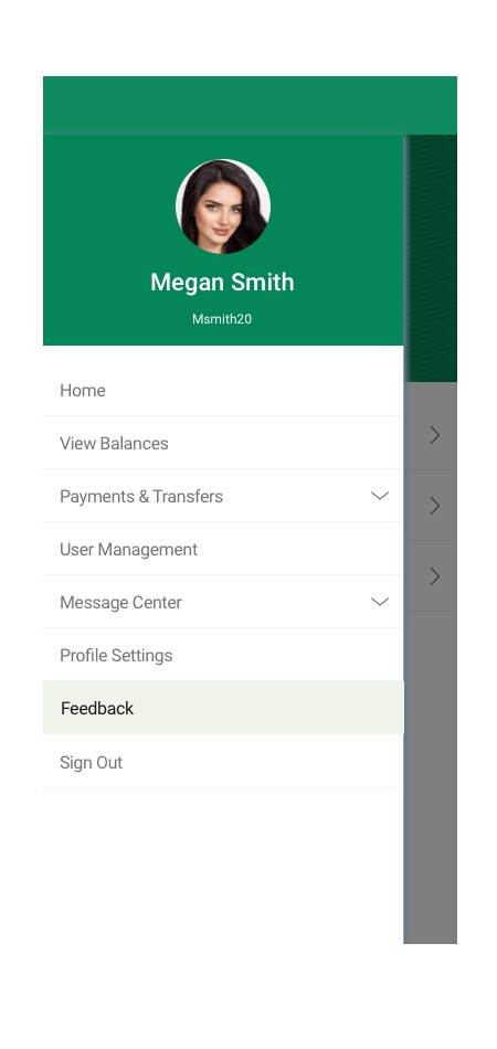
Side Navigation
- The app side Navigation is redesigned based on new business requirements and user needs.
- The mobile side navigation allows the user to navigate between the different modules in the application.
- The top bar covers the length of the screen and is made up of the following components: Side Nav Header and Side Nav List Items
- The side nav is always left-aligned on the screen
- When the user clicks the menu icon, the side navigation drawer is opened
- To close the side navigation, the user can click anywhere outside of the side nav area or clicks on a list item to get into that module
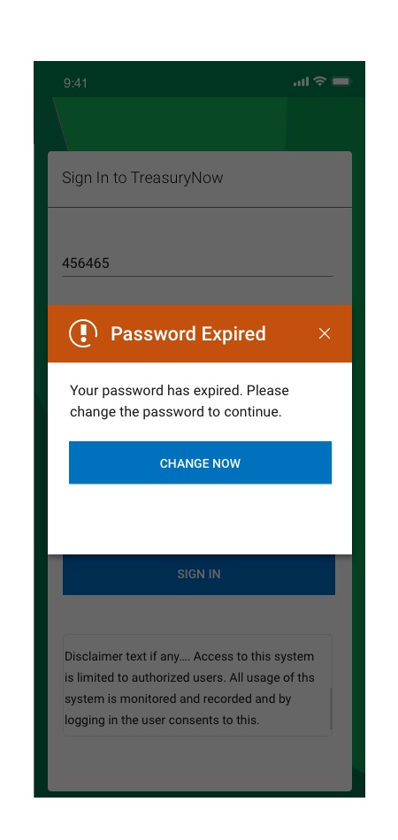
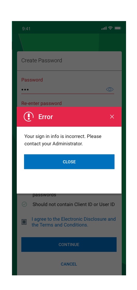
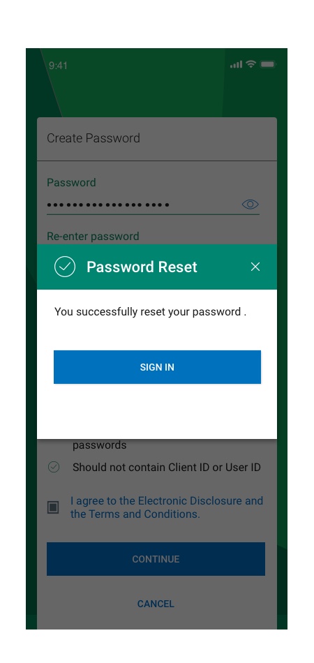
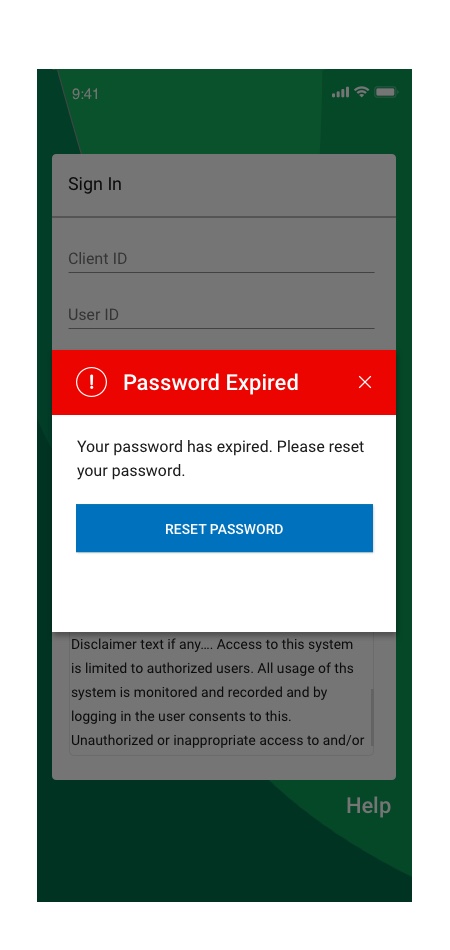
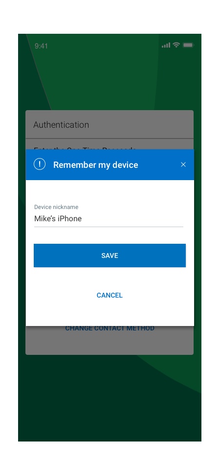
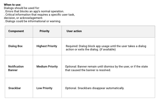
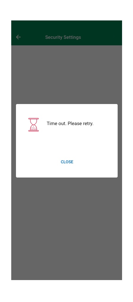
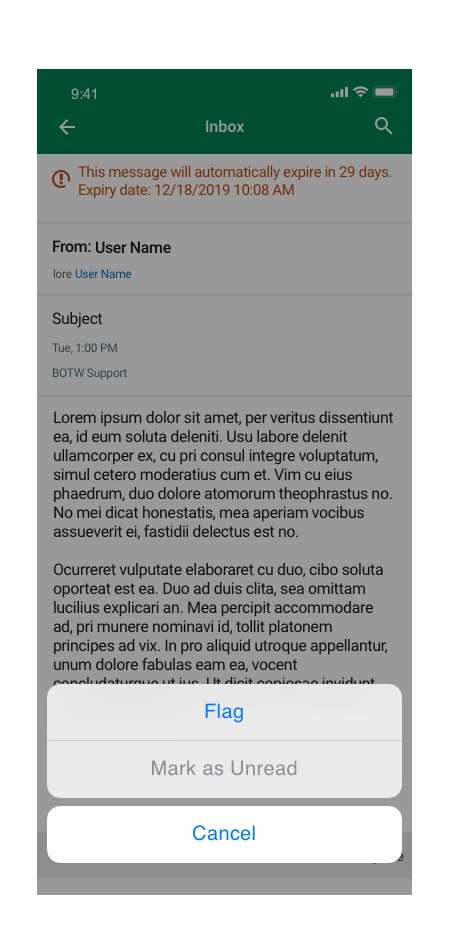
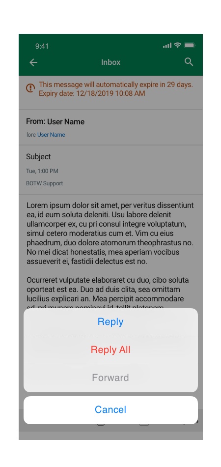
Mobile Dialog – Component Design
A dialog is a type of secondary window which provide critical information to a user action or asks for a decision to continue on a specific task. Dialogs disable all app functionality when they appear, and remain on screen until confirmed, dismissed, or a required action has been taken.
Dialogs are purposefully interruptive, so they should be used sparingly.
Errors that block an app’s normal operation or a task flow:
– Information that requires a specific user task, decision, or acknowledgement
– Alerts or information which would be helpful to a context
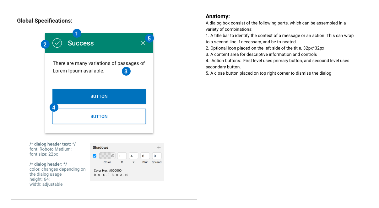
Types:
1. Alert feedback dialogs – Provide urgent information or a system feedback.
2. Error- Negative feedback dialogs – Provide error information or a negative feedback or take an action.3. Positive feedback dialogs – Provide success information or a positive system feedback or or take an action.
4. Information feedback dialogs – Provide details of a selected entity or take an action.5. Warning feedback dialogs – Provide warning messages or take an action.
6. Confirmation dialog – Required when an action of choice is required that can’t be made later.
7. Simple Dialogs – Can display items that are immediately actionable when selected
8. Task assistive dialogs – Containing actions that require for a task completion.
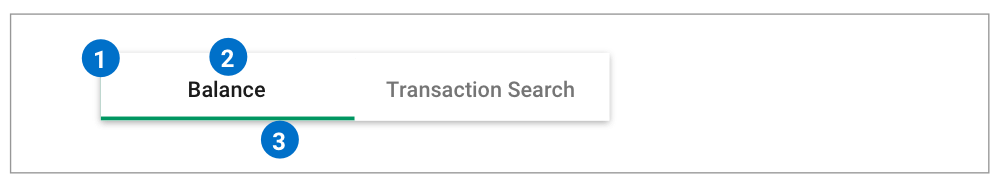
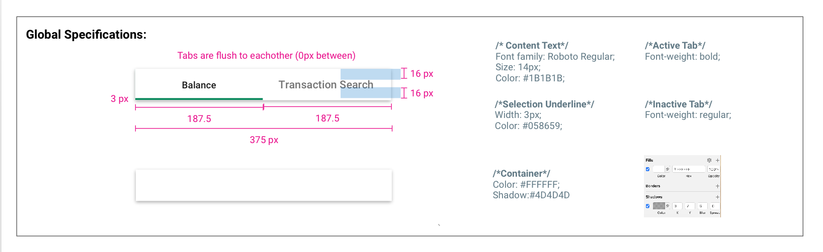
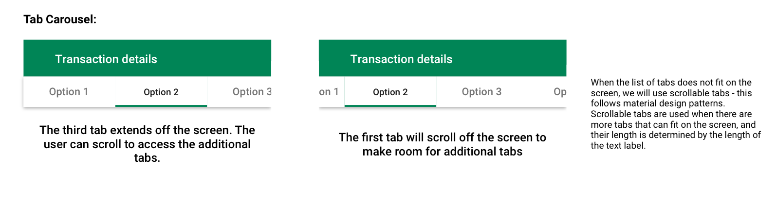
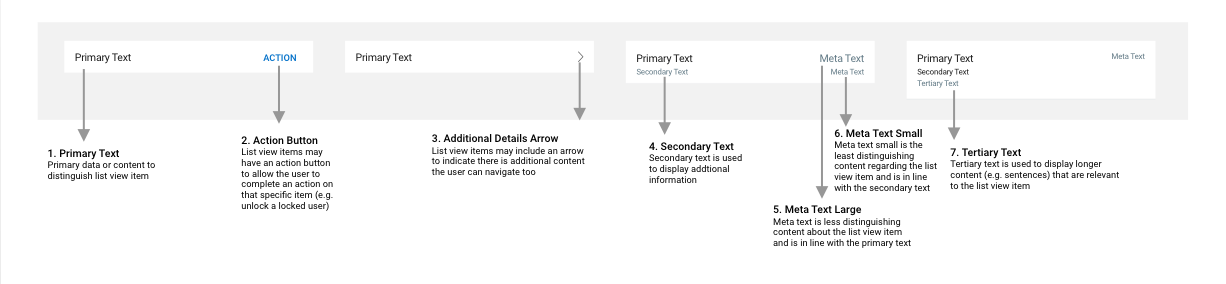
List View Tabs
Tabs are used to separate sections within the same module.
Anatomy:
The top bar covers the length of the screen and is made up of several components:
1. Tab Container 2. Tab Content Text 3. Primary Tab Selection Indicator
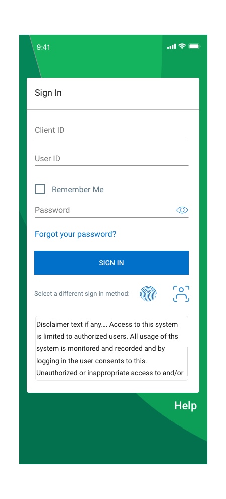
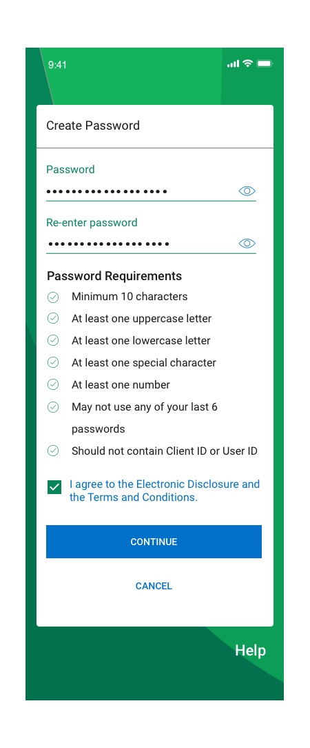
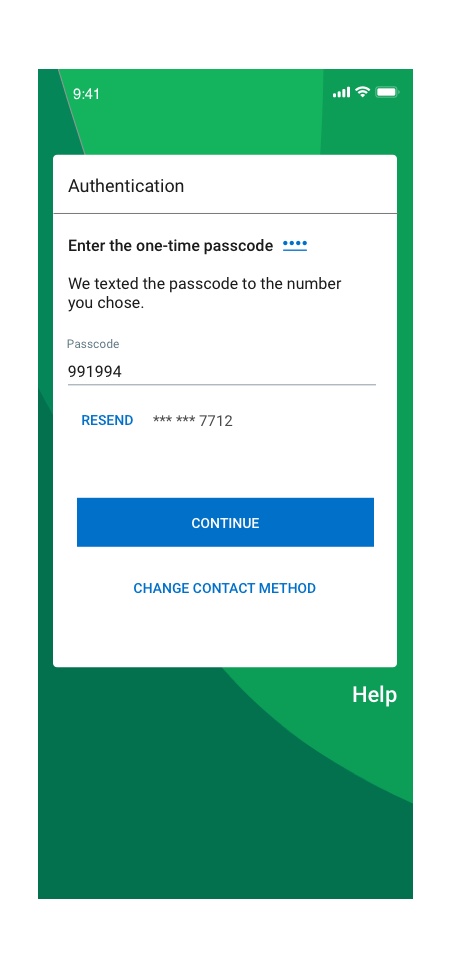
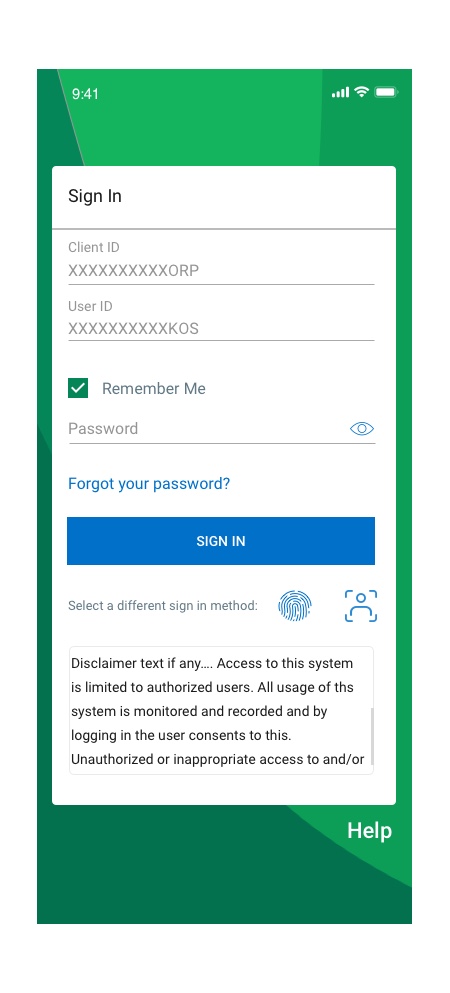
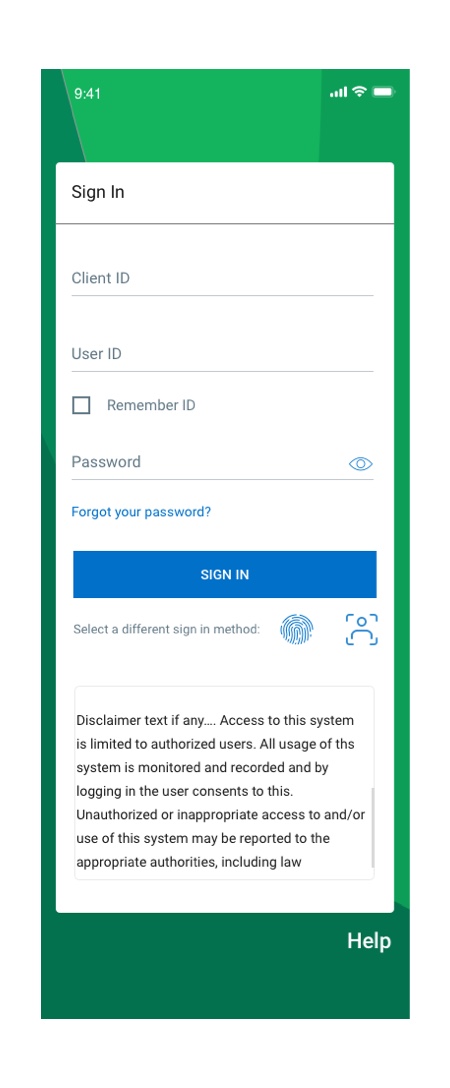
Sign In Flow Re-Design
- My mission was to create new flows for Sign in interaction and include new authentication methods such as face id and fingerprint Sign-in.
- The original Sign-in process only supported password, so it missed other options to sign in to the application from the UX perspective.
- I collaborated with developers, business owners, and content creators to develop the best possible solution for Sign-in methods.
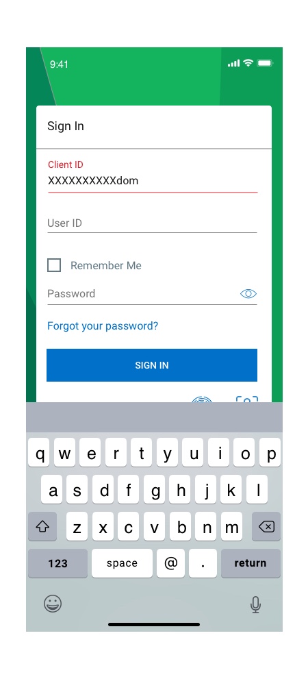
Flow#1-First Time Sign in
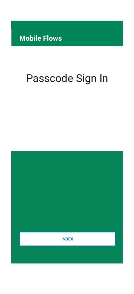


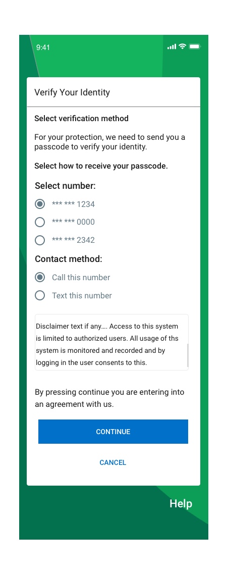
Flow#2-Passcode Sign in
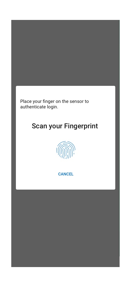
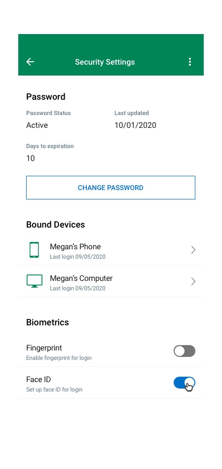
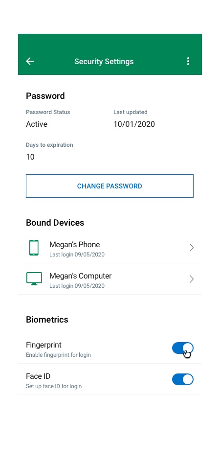
Biometric Sign in
Enabling/activating FaceID biometric at the login page should prompt the user to enter client id, user id, and password. The system will validate the enter info and throw a step-up challenge. Once the user completes the challenge, the system activates the biometric option, and the user should be able to use biometric for login/step-up authentication.
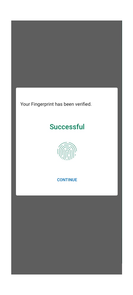
Flow#3-FingerPrint Sign in
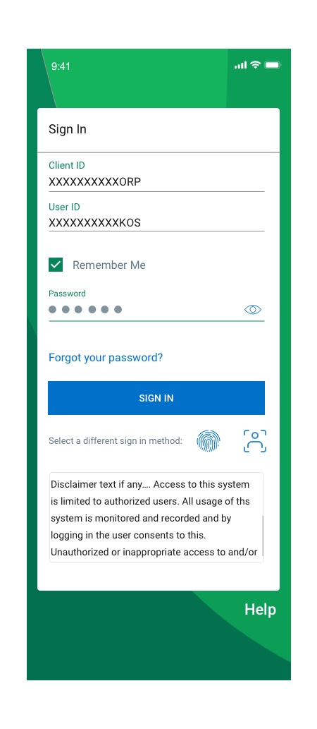
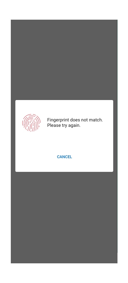
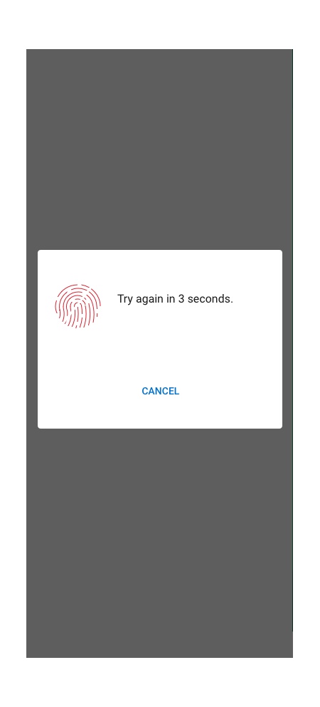
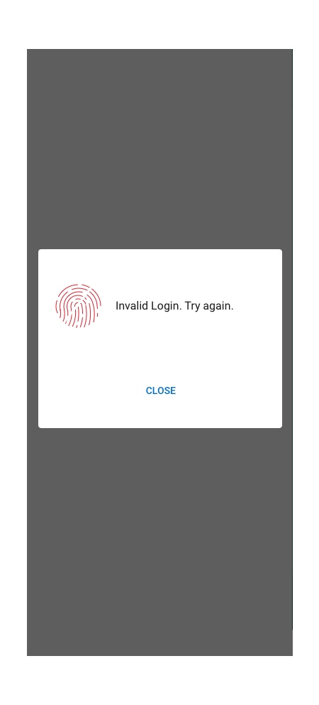
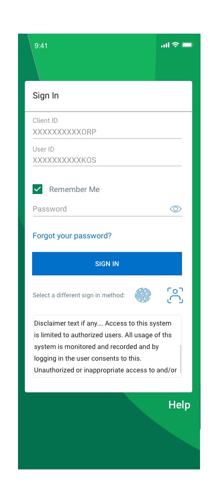
The user should Sign in to the mobile app via fingerprint by entering the client and user ID and then selecting the fingerprint icon. A user can also set the ‘Remember me’ option allowing the system to remember client and user ID. The ‘Remember Me’ option in mobile should be checked in by default. This will enable the user to login into our app via biometric without entering client and user id. A user will get three device attempts to authenticate his/her identity. If the user fails on all three attempts, the system should lockout the user, and he/she needs to call customer service to unlock.
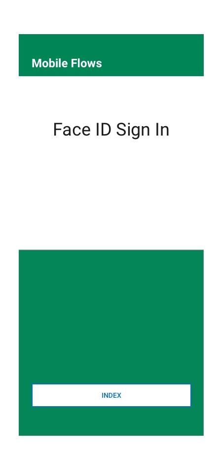
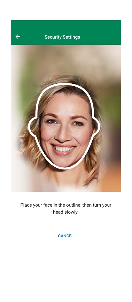
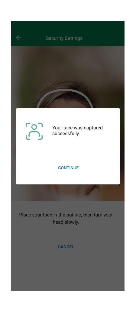
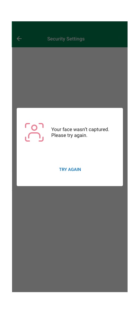
Flow#4-FaceID Sign in
The user should Sign in to the mobile app via FaceID by entering the client and user ID and then selecting the fingerprint icon. A user can also set the ‘Remember me’ option allowing the system to remember client and user ID. This will enable the user to sign in into our app via biometric without entering client and user id. A user will get three device attempts to authenticate his/her identity. If the user fails on all three attempts, the system should lockout the user, and he/she needs to call customer service to unlock.
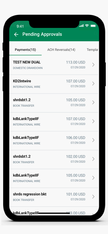
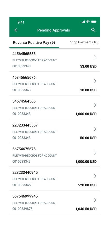
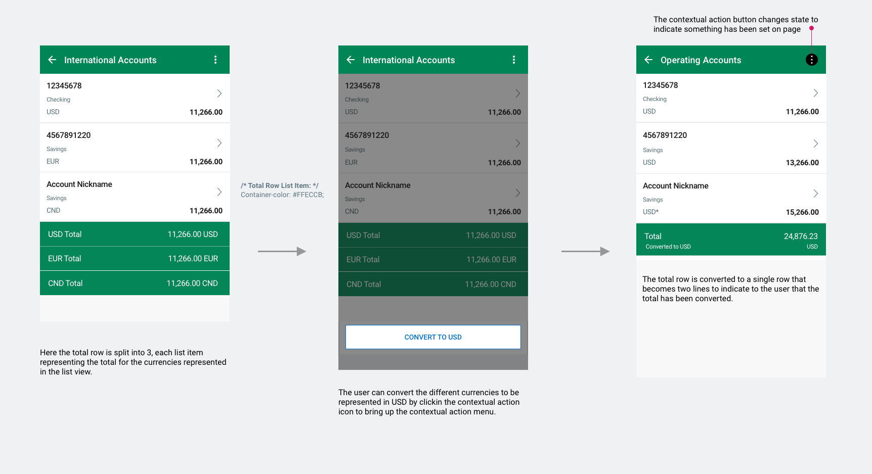
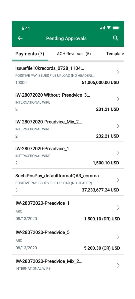
Transaction Payment List View
Certain screens have list views in which the user must be able to select items in the list and take action. Some list views will have a total row.
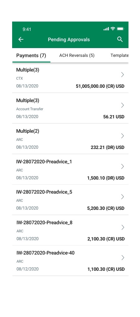
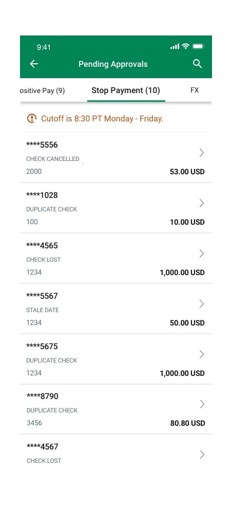
The total row will appear at the bottom of the list view and be highlighted in yellow. The total row can appear as a one line or two line list item depending on the context.
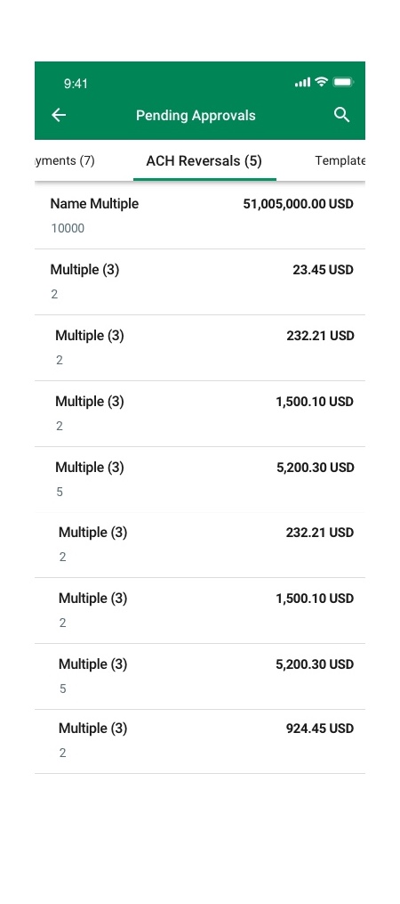
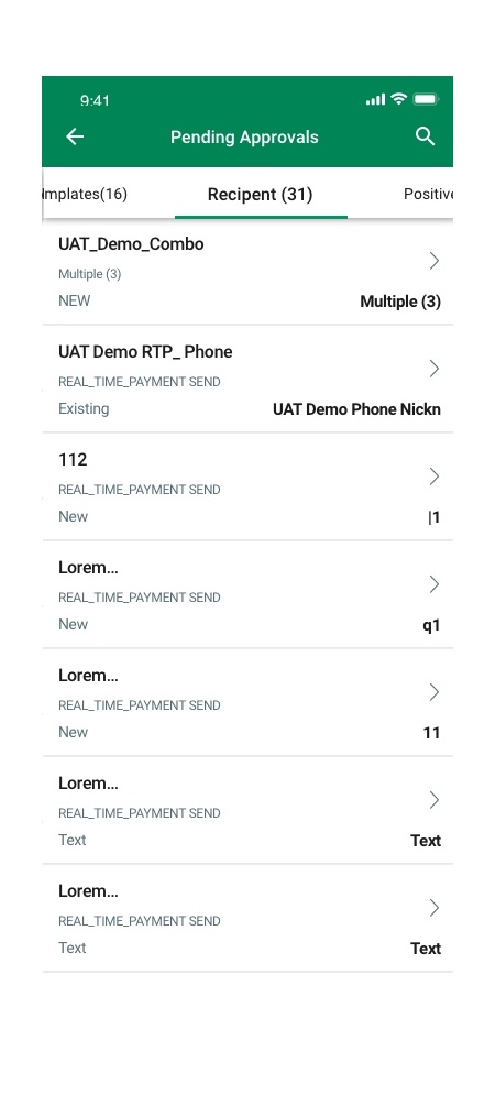
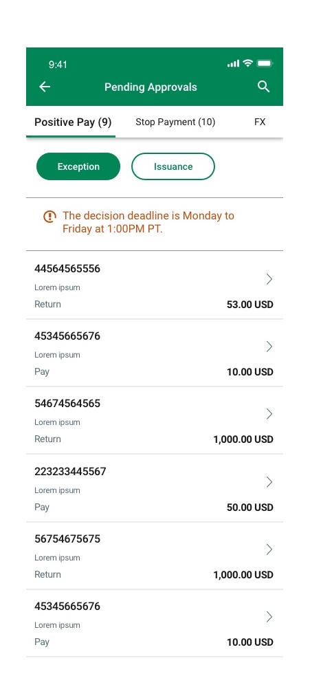
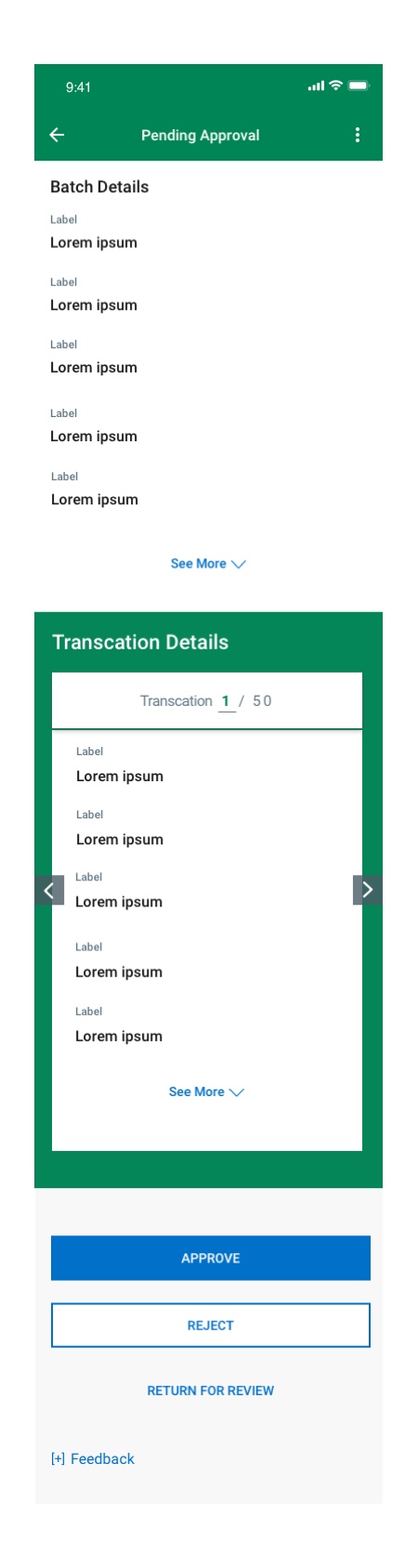
Pending Approval Flow
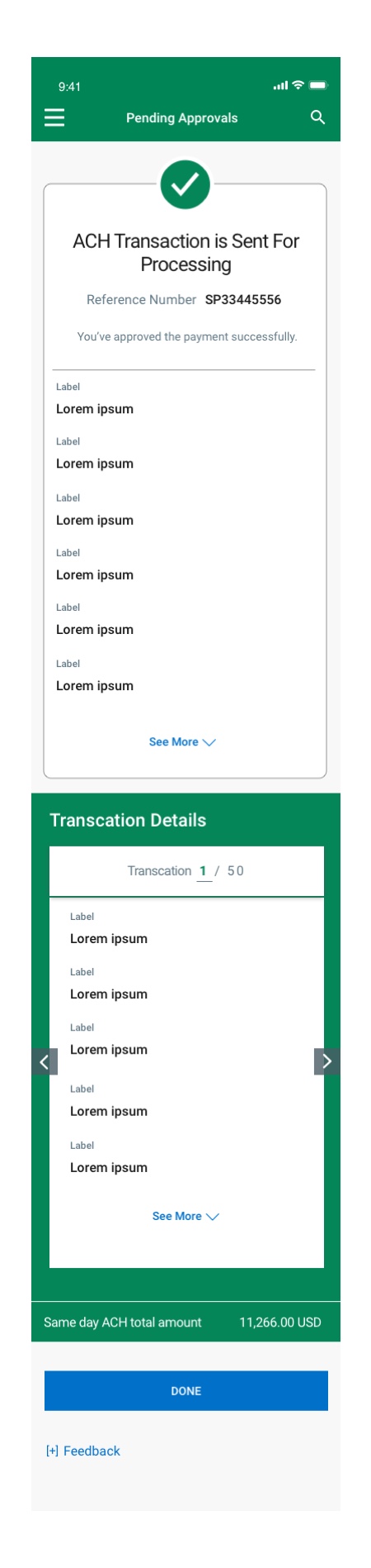
ACH Transaction Flow
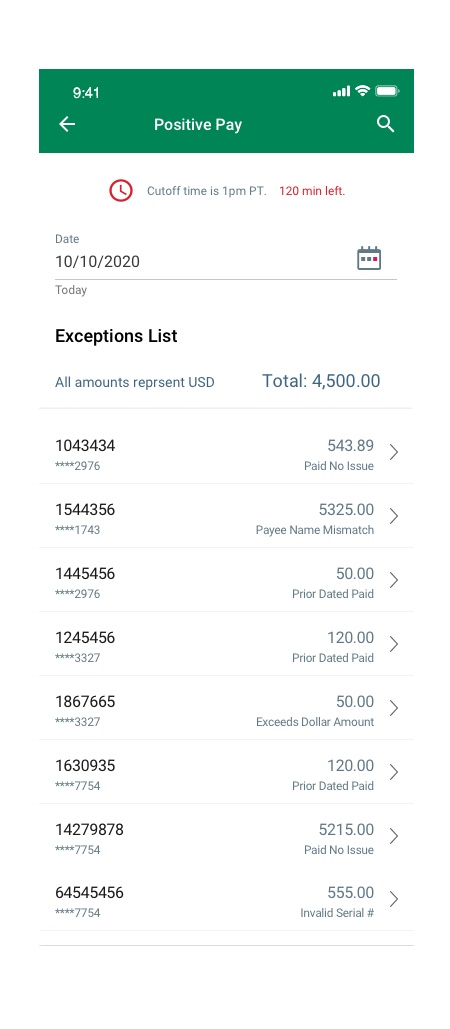
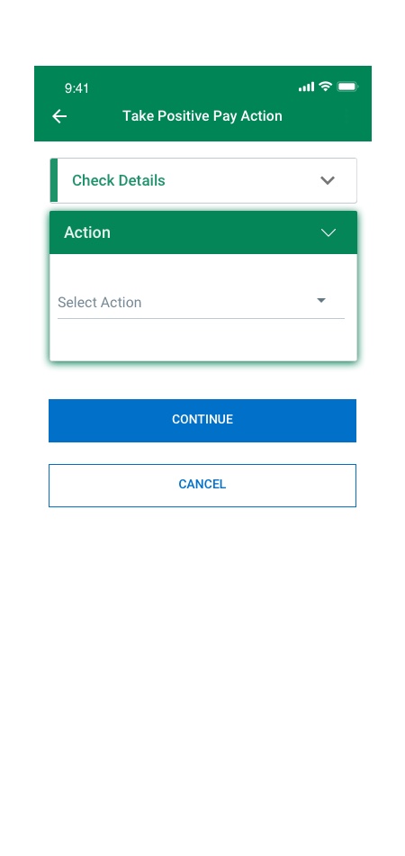
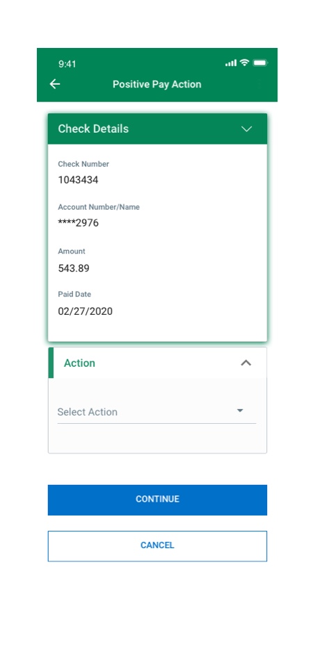
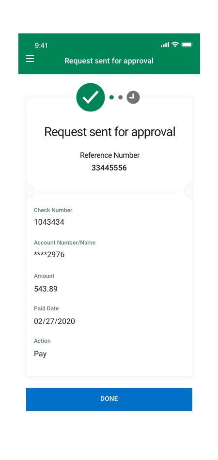
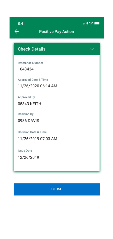
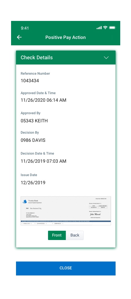
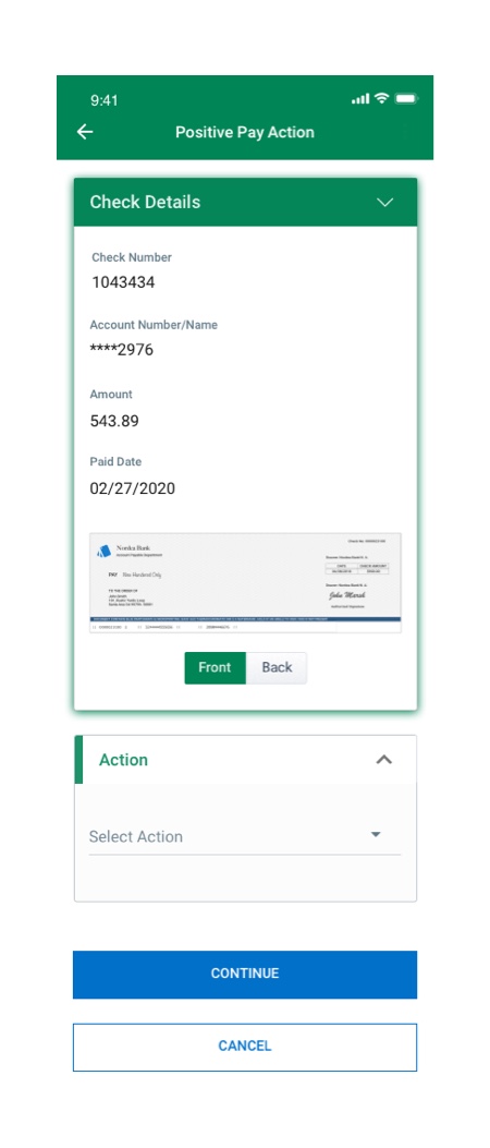
Positive Pay


Reporting – Transaction Search
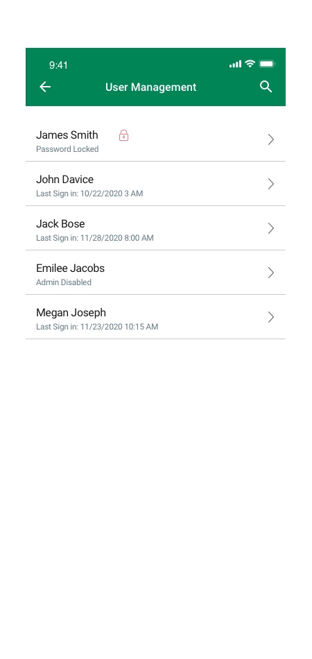
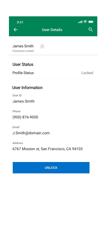
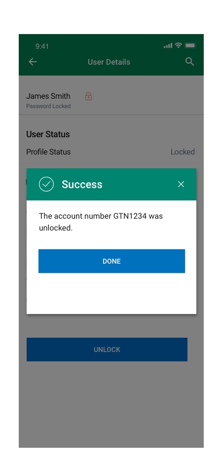
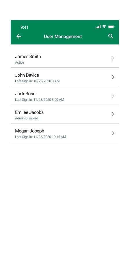
User Management
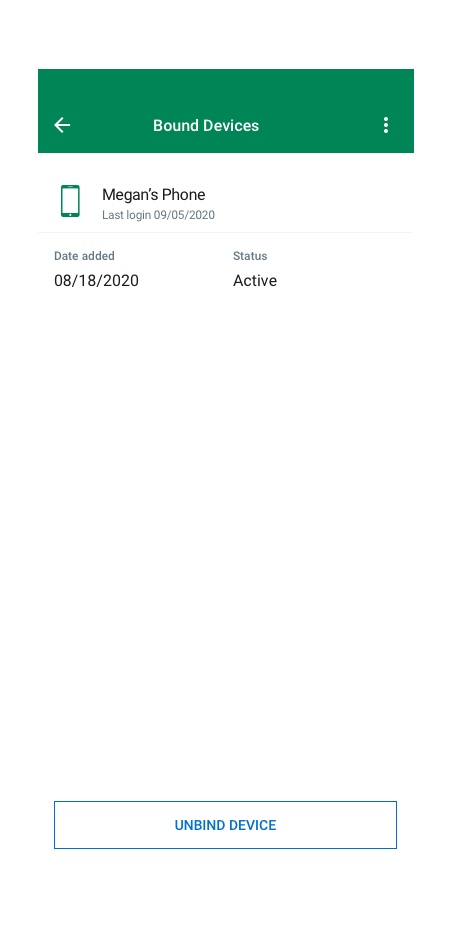
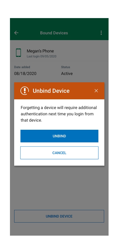
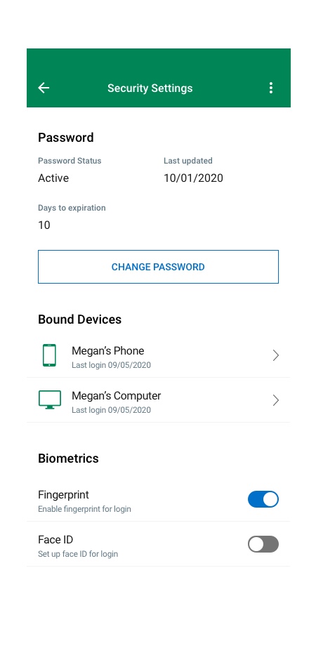
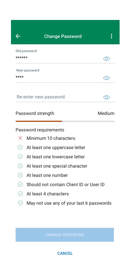
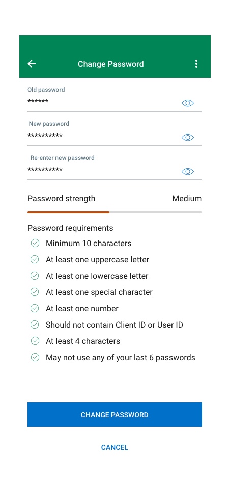
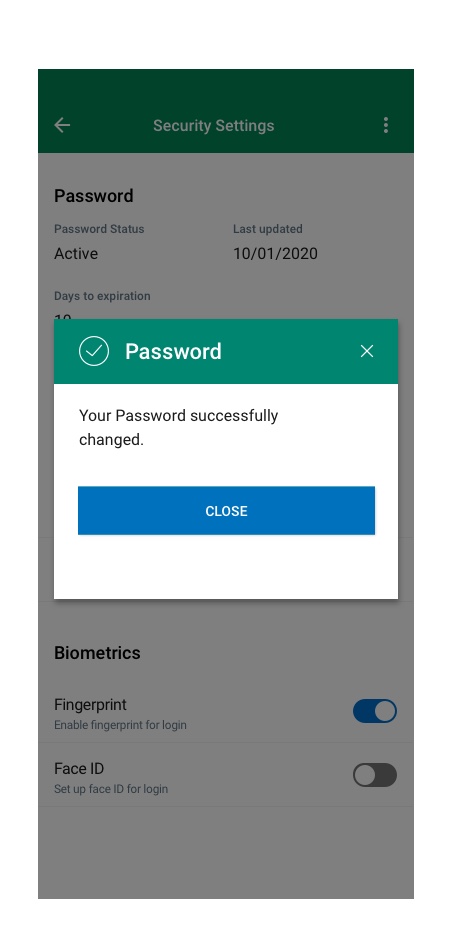
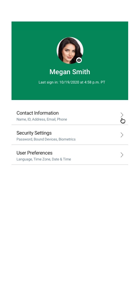
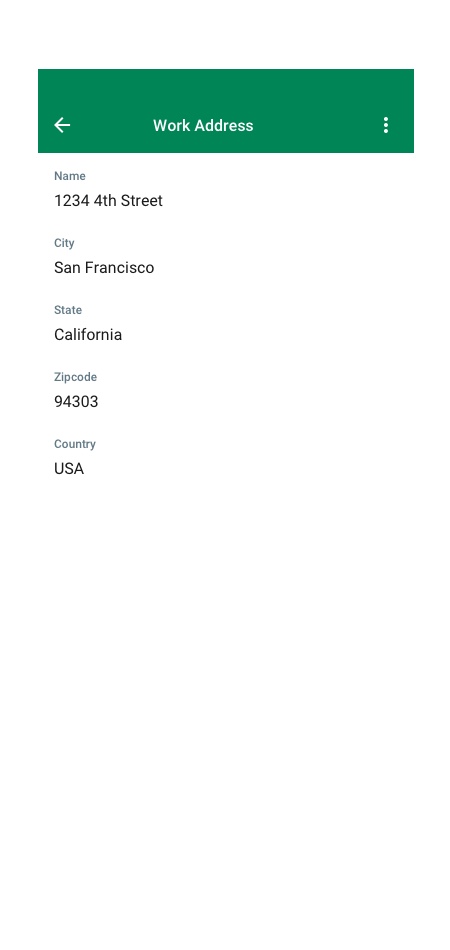
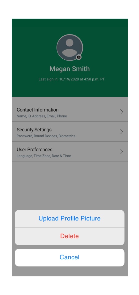
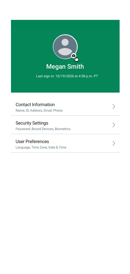
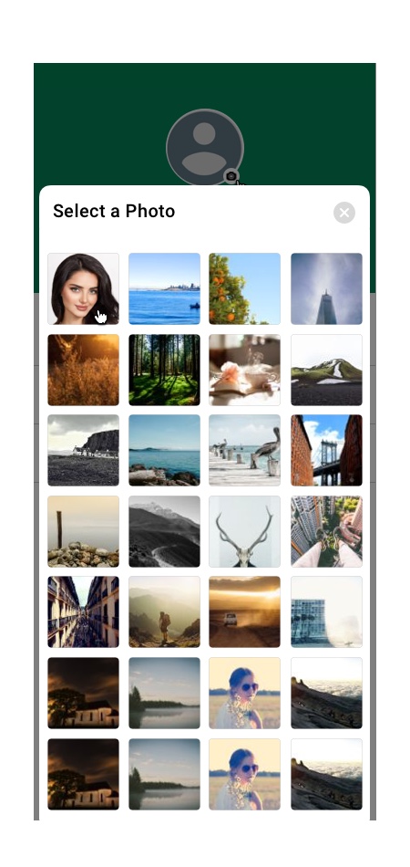
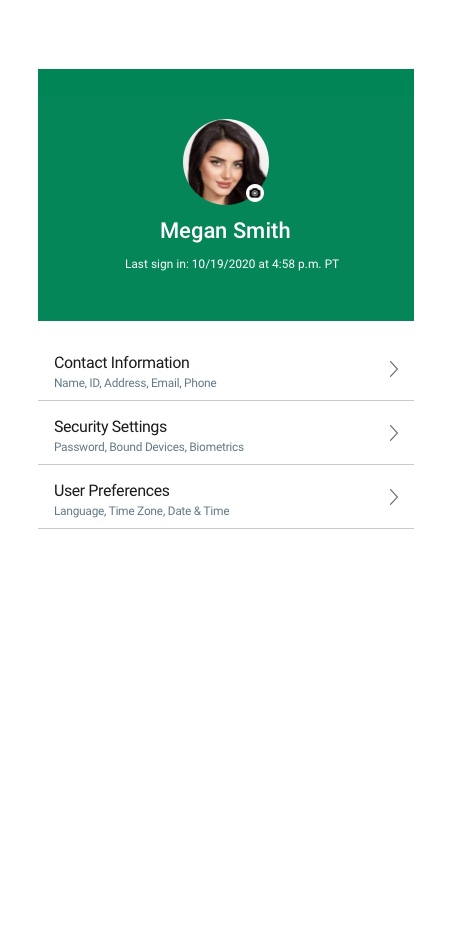
My Profile
Flow#1 Bound Devices
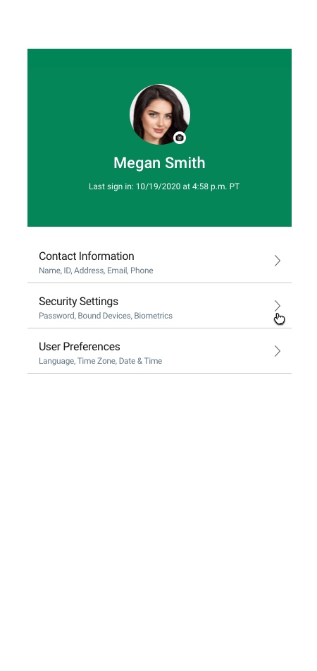

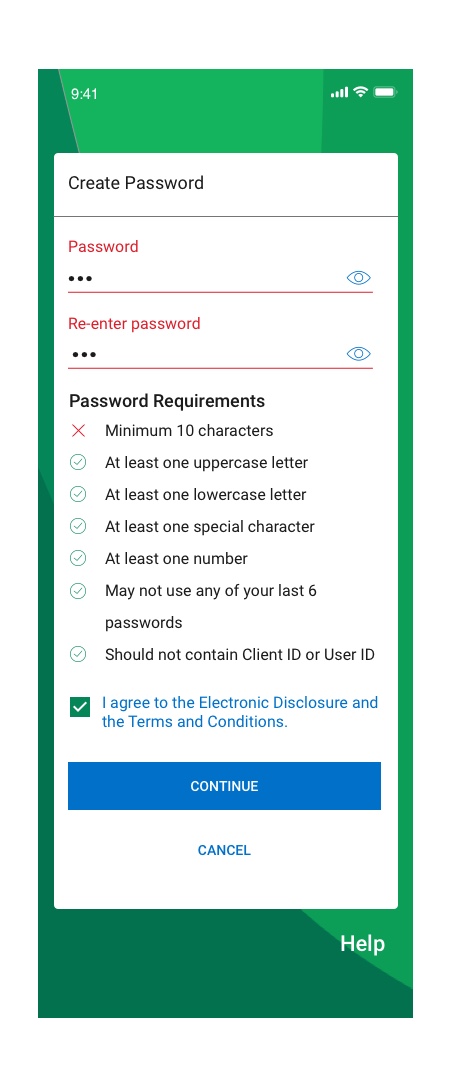
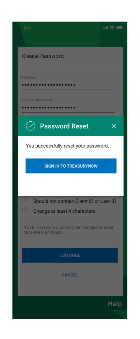
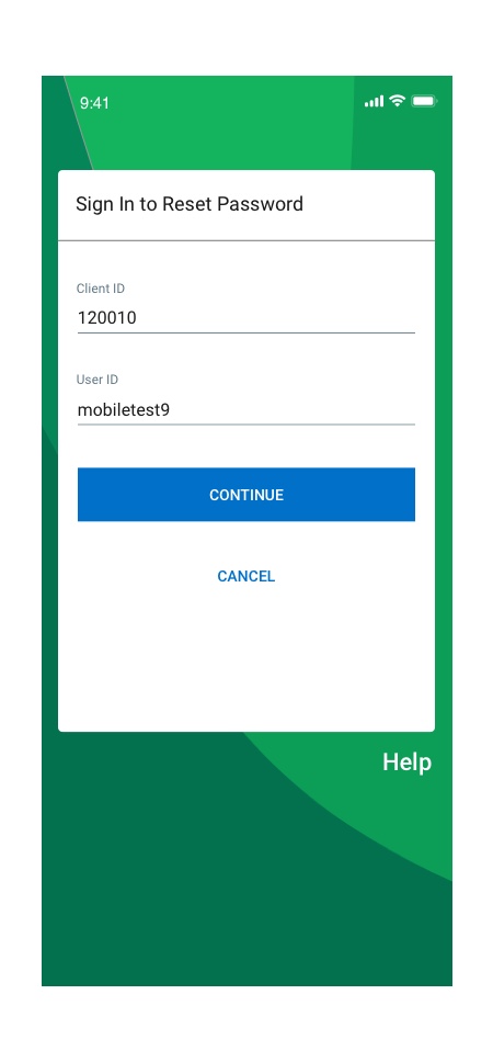
Flow#2 Change Password
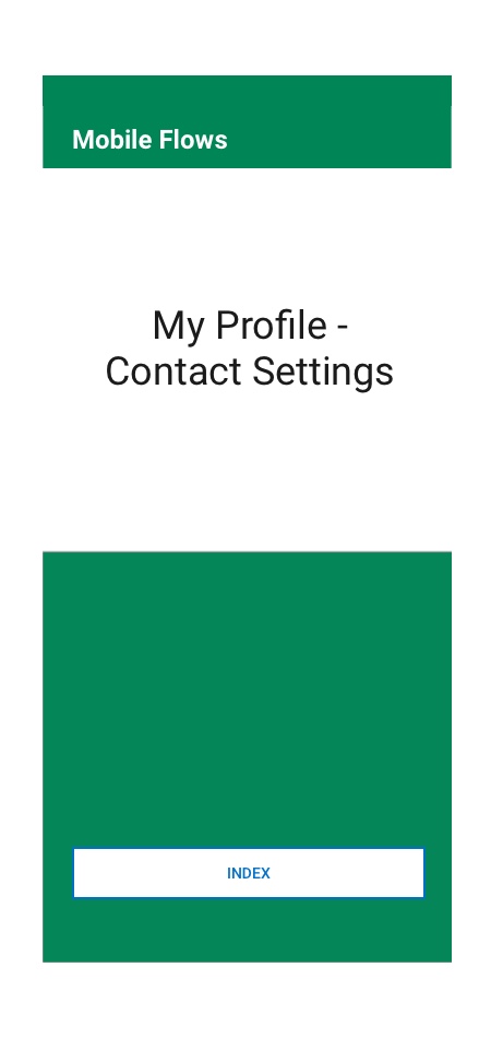
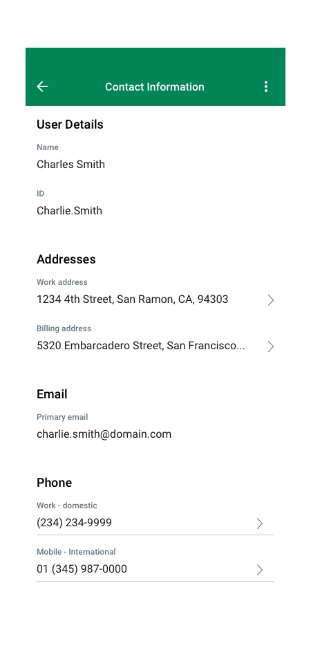
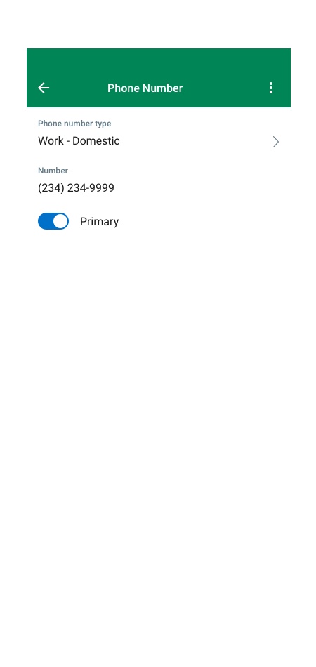
Flow#3 Contact Settings
Flow#4 Face & Voice Setup
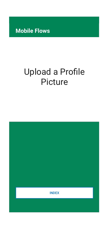
Flow#5 Profile Picture
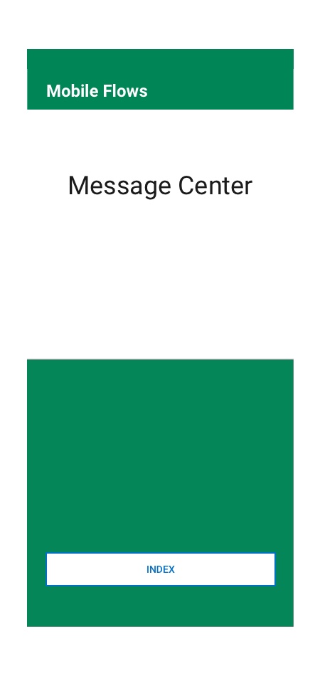
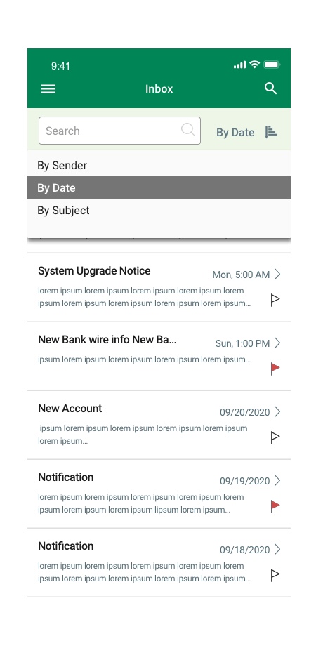
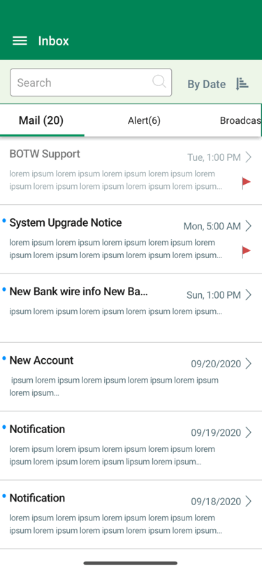
Message Center
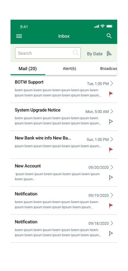
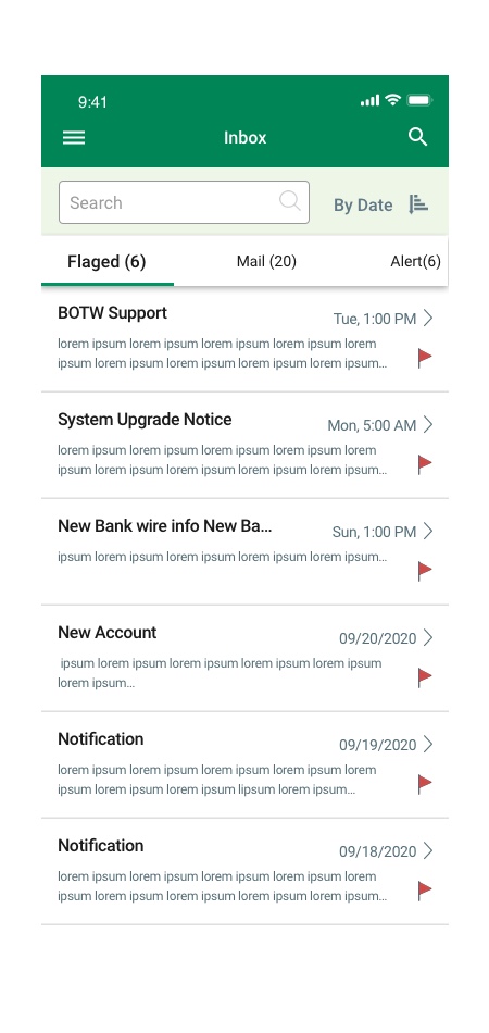
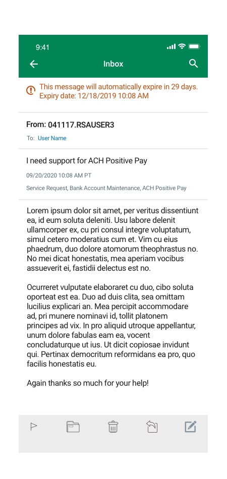
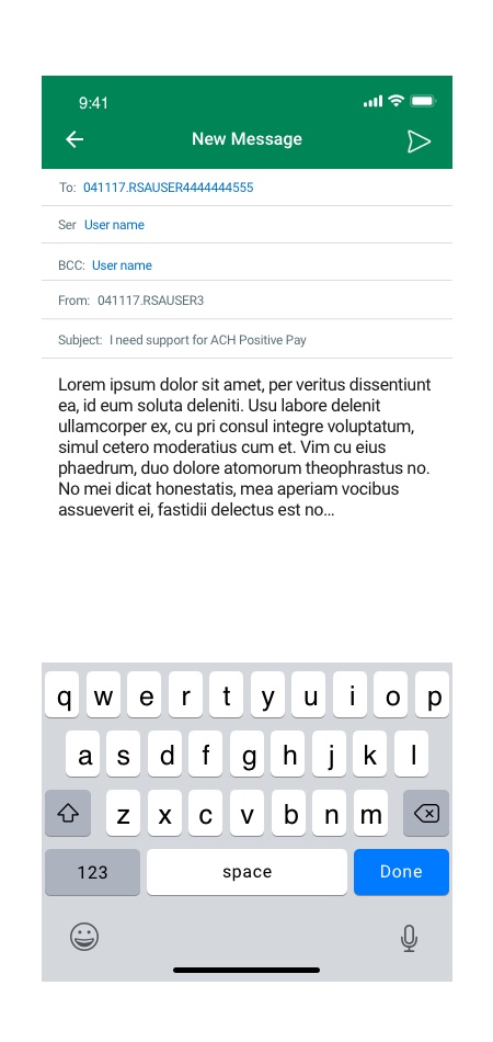
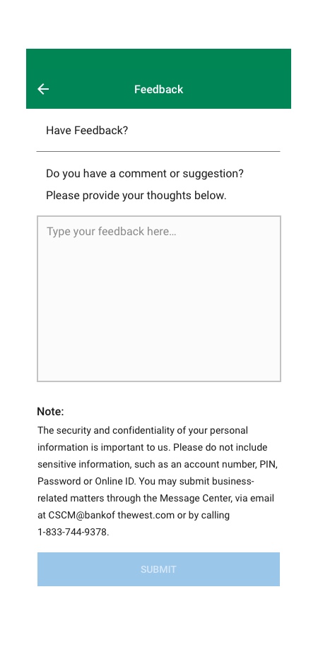
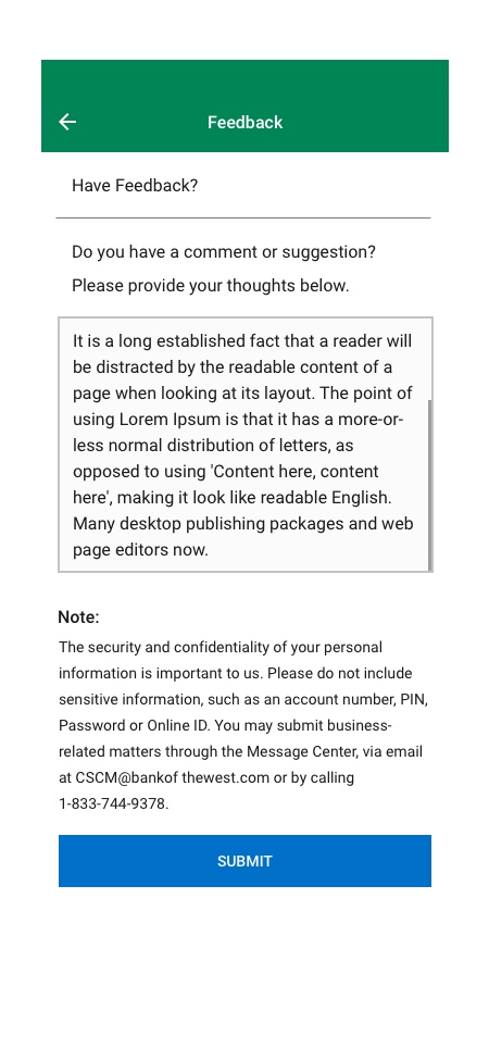
User Feedback
Results
- Collaborated with designers, developers, QA, and business owners to successfully create and launch the mobile application.
- I have designed a customized user experience for TreasuryNow mobile application that improved overall user experience.
- Created an up to date design system, mobile style guide, sketch library that solved UI/UX issues.
- I designed an intuitive user experience that helped increased product and services visibility and user accessibility.
- Solved ADA issues
- Improved overall app look and feel and rebranded application as TreasuryNow.
- Redesigned user flows and provided transactions template redesign.
- Redesign component and listview dashboards and added new component interactive functionalities and utilities
- Discovered the main pain point of users and provided possible solutions with prototyping and testing