
🔹Situation:
The MyHP app lacked an intuitive interface for configuring digital pen settings on supported HP hardware. Users found it difficult to customize functions like button mapping, pressure sensitivity, and shortcut actions, resulting in frustration and low feature adoption across both creative and productivity use cases.
🔹Task:
As a Product Designer, I was tasked with designing an accessible and intuitive Pen Control interface to empower users to easily personalize pen behavior, aligning with hardware capabilities and diverse user workflows (e.g., designers, students, note-takers).
🔹Action:
-
Led end-to-end UX strategy: from user interviews and competitive analysis to UI design, prototyping, and dev handoff.
-
Identified core usability pain points through testing with real users across personas (left-handed users, digital artists, students).
-
Introduced a modular interaction model with simplified visual cues, collapsible settings panels, and dynamic previews.
-
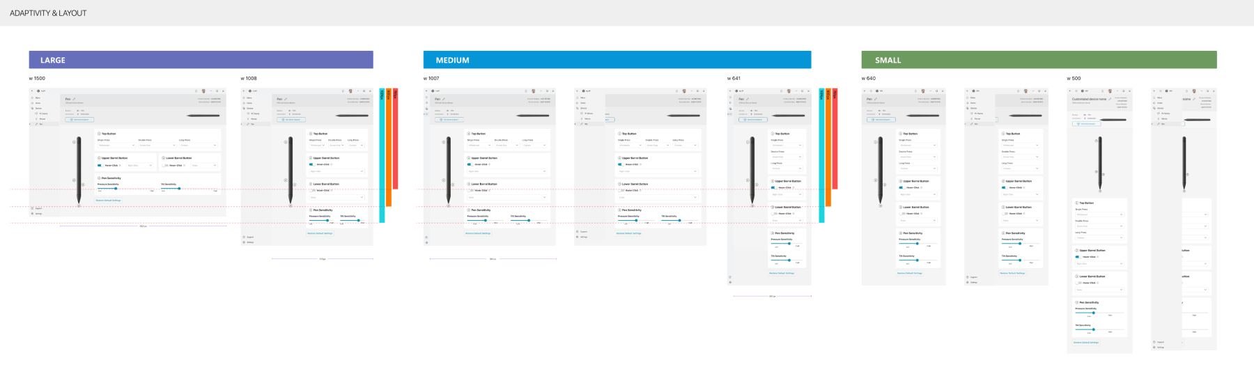
Ensured accessibility compliance (WCAG standards) and improved layout for small screens and touch interactions.
-
Directed iterative prototyping in Figma with testing phases that refined microinteractions and copy clarity.
-
Partnered closely with engineering and QA to validate feasibility, behavior logic, and edge cases across pen types.
-
Collaborated with product and marketing to align the experience with broader MyHP ecosystem goals.
🔹Result:
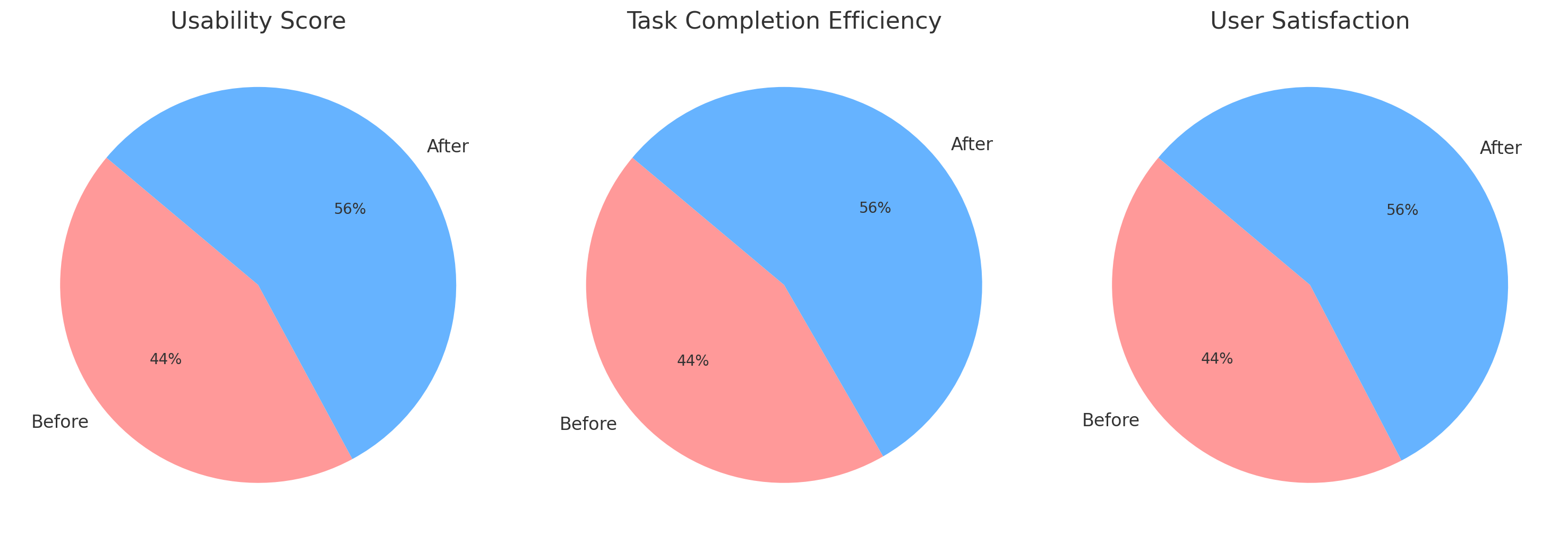
📈 15% increase in usability score (task ease & UI comprehension)
⏳ 20% faster task completion for core personalization actions
💬 High user satisfaction across segments, with praise for clarity and control
♿ Accessibility improved through better focus states, contrast, and layout flow
🔄 The UX model now serves as a template for future hardware-software integrations within the MyHP app
📌 Overview
Pen Control is a customization feature within the MyHP PC app, allowing users to easily personalize digital pen functionalities. As the Lead Product Designer, I directed a user-centric strategy addressing usability challenges through iterative prototyping, extensive user testing, and cross-team collaboration. The initiative enhanced accessibility, streamlined interactions, and significantly improved user satisfaction.

🖥️ My Role & Contributions
- 🎨 Directed overall UX/UI strategy, overseeing iterative prototyping and refinement.
- 🤝 Directed overall UX/UI strategy, overseeing iterative prototyping and refinement.
- 🗒️ Designed and executed user-testing plans, leveraging insights to drive design decisions.
- 🖥️ Optimized interface usability, enhancing interactions specifically for the MyHP PC app.
🎯 Challenges & Objectives
Challenges:
- 📉 Limited visibility of critical pen settings.
- 📚 Information overload confusing users.
- ❓ Ambiguous interaction states.
Objectives:
- ✅ Enhance visibility of pen settings.
- ✅ Simplify UI for efficient interaction.
- ✅ Clarify interactive states.
- ✅ Align with HP’s UX standards.
🔍 Initial User Research & Insights
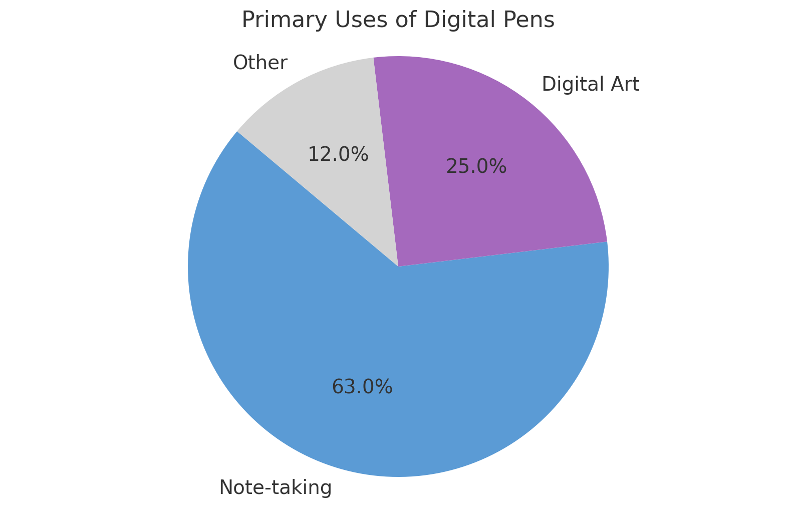
Initial research (15 users: beginners to advanced) revealed:
- 📝 63% primarily use pens for note-taking.
- 🎨 25% frequently engage in digital art.
- 📊 Users prioritize simplicity due to infrequent adjustments.
💬 “I rarely adjust settings—simplicity and speed are crucial.”
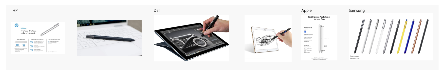
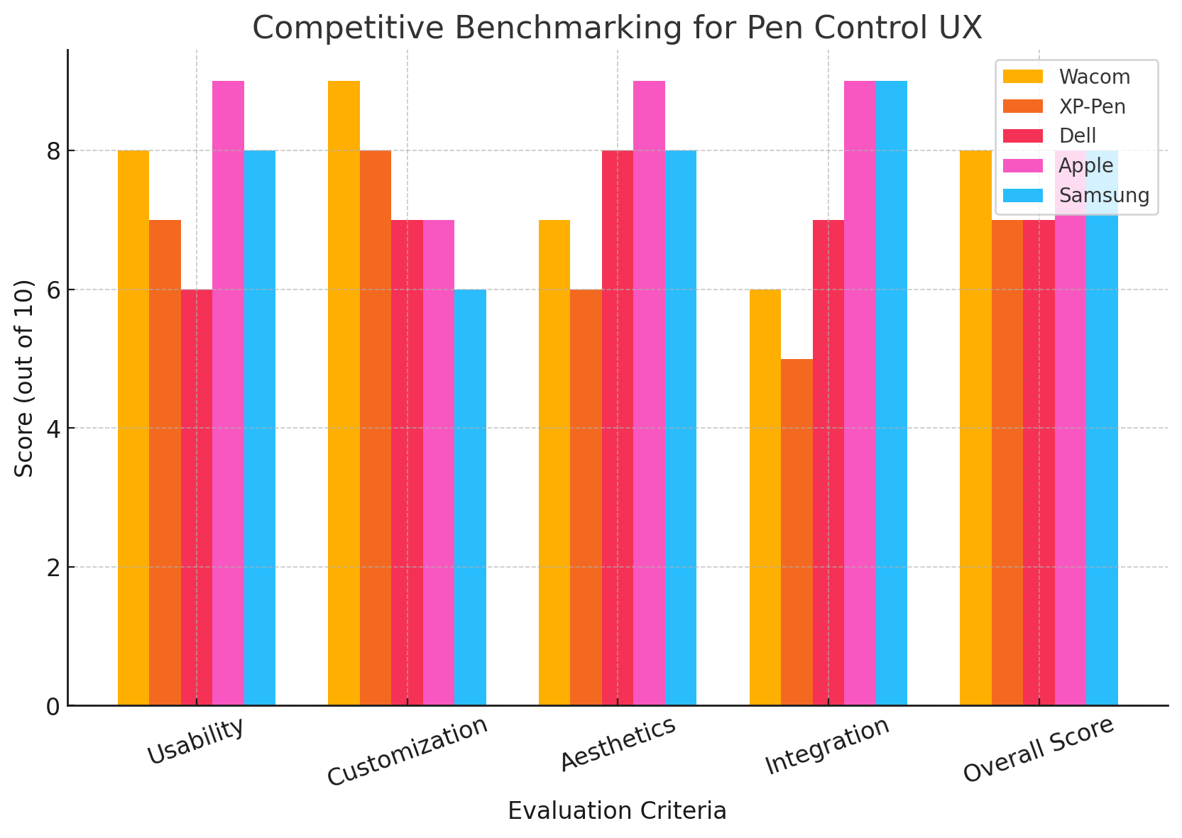
🕵️ Competitive Benchmarking
Evaluated competitors like Wacom and XP-Pen, focusing on:
- 📱 Intuitive interactions
- 🎨 Clean aesthetics
- ⚙️ Streamlined customization
🔄 UX Design Process & Iterations
Ideation & Wireframing:
Outlined intuitive navigation emphasizing ease-of-use in initial wireframes.
Visual Design:
Ensured consistency with MyHP’s modern, sleek design language, creating visually appealing UI assets tailored to enhance user experience.
🧪 Comprehensive Usability Testing
Conducted two distinct rounds of usability testing:
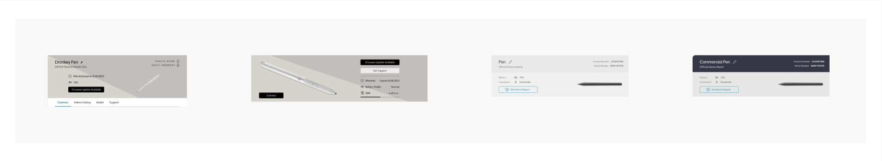
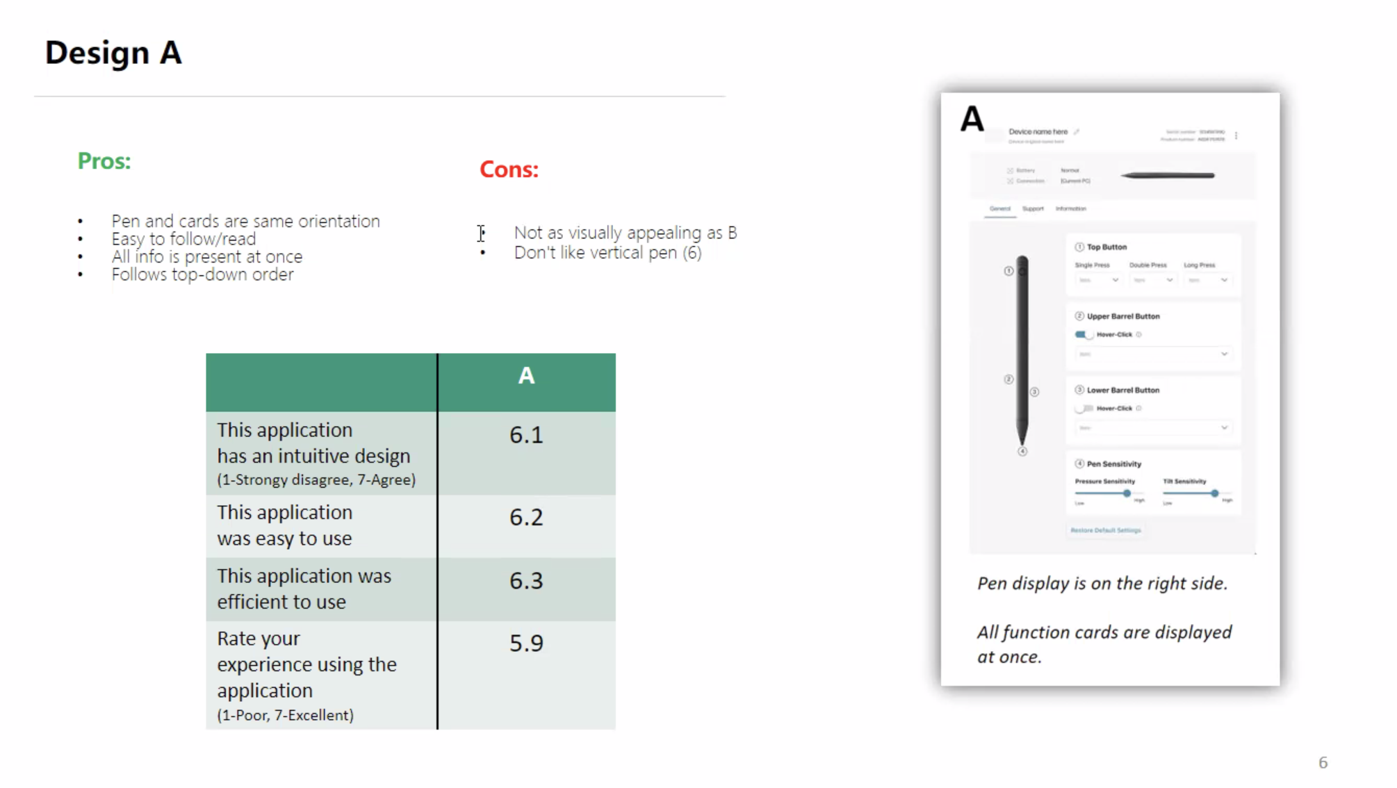
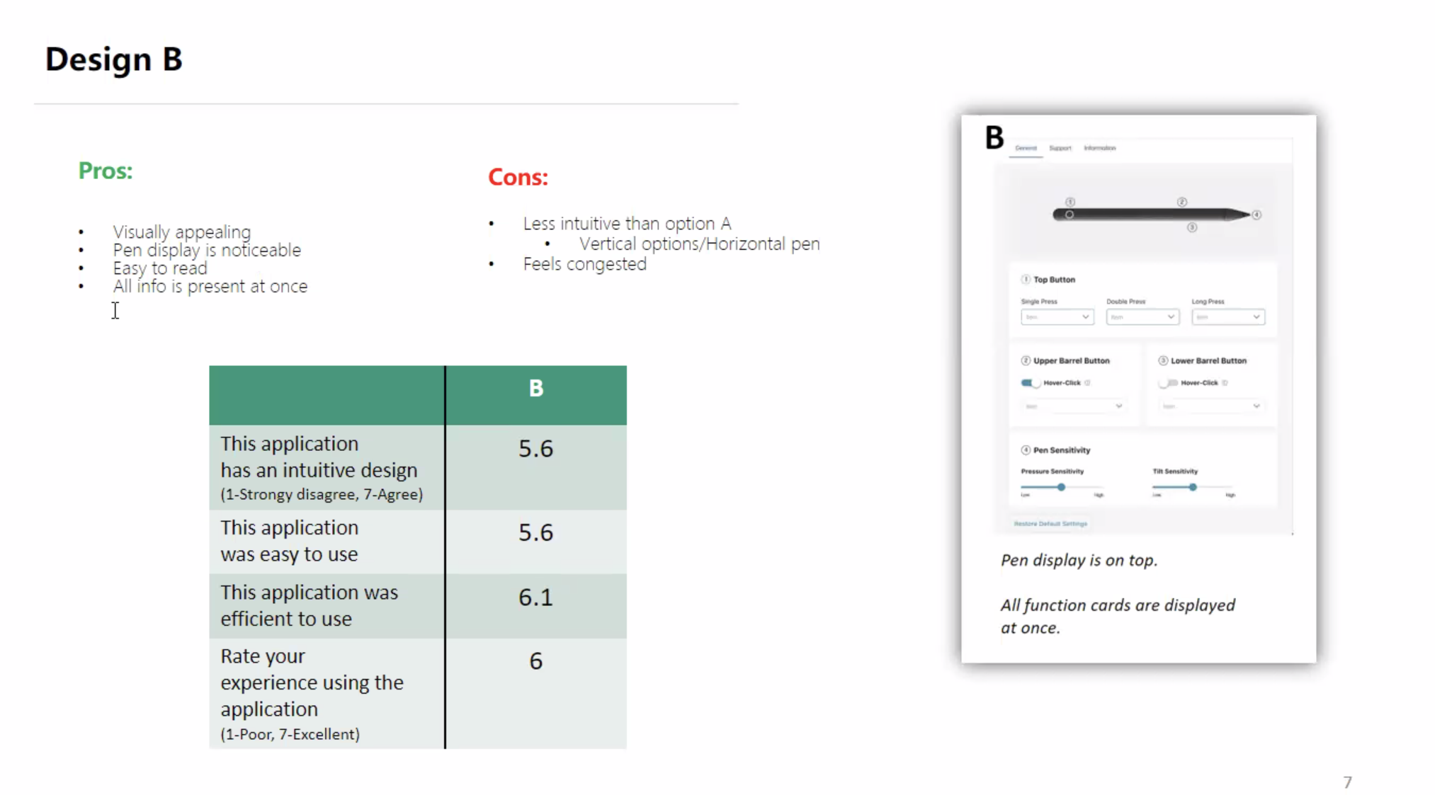
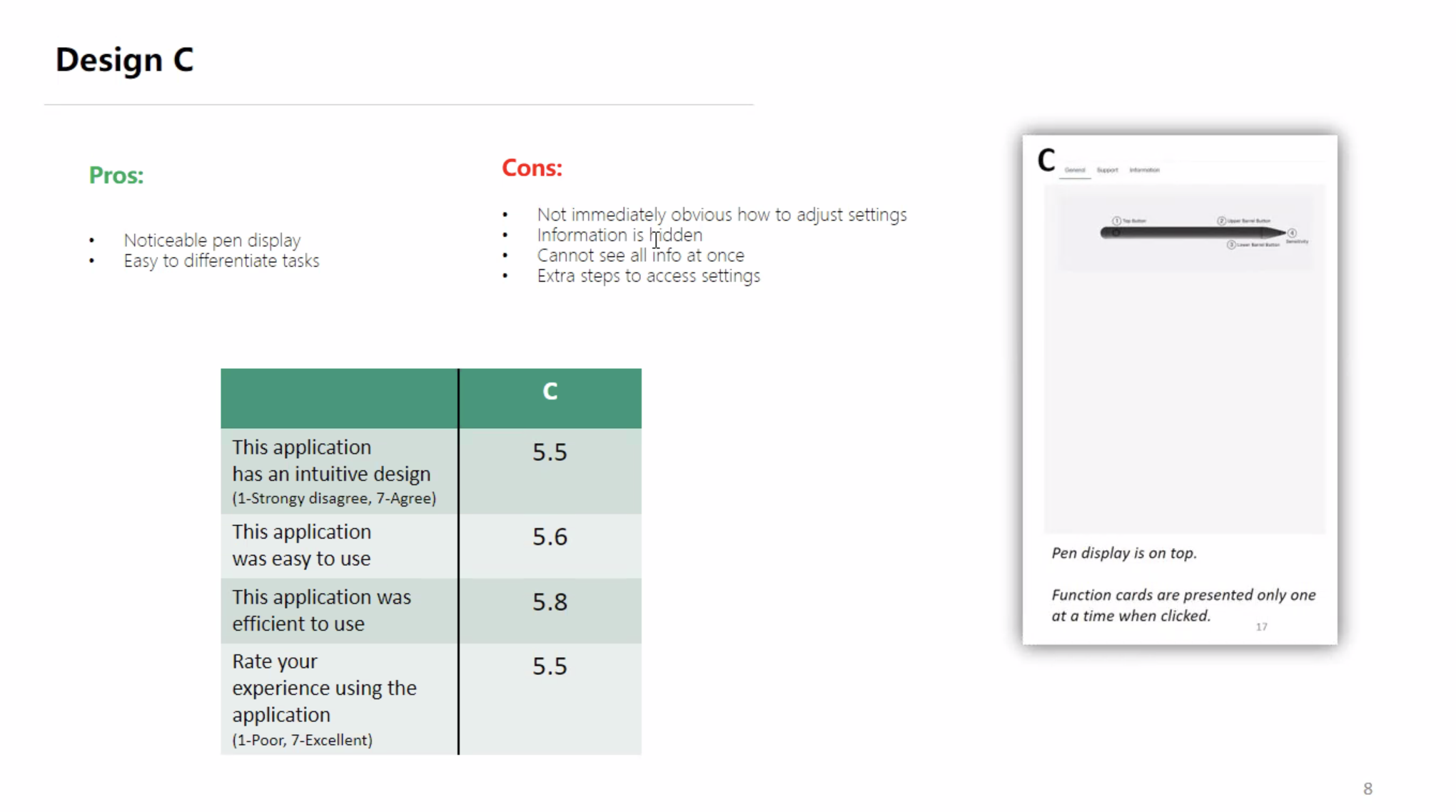
🔖 Round 1: Initial Layout Testing (A, B, C)
- Participants: 15 users (ages 19-52)
- Method: Moderated remote testing on UserTesting.com
| Option | Intuitive Design | Ease of Use | Efficiency | Overall |
|---|---|---|---|---|
| A | 6.7 | 6.4 | 6.5 | 6.5 |
| B | 6.2 | 6.3 | 6.0 | 6.3 |
| C | 6.0 | 5.9 | 6.1 | 6.0 |
Outcome: Chose horizontal layout (Option B), incorporating positive aspects from Option A.
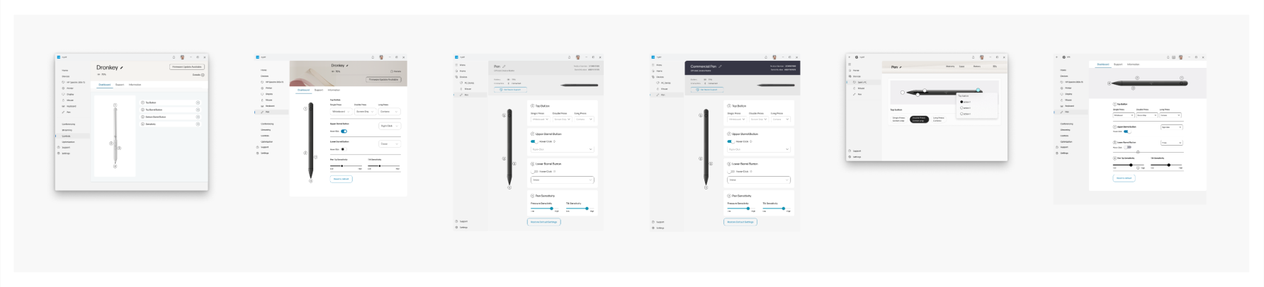
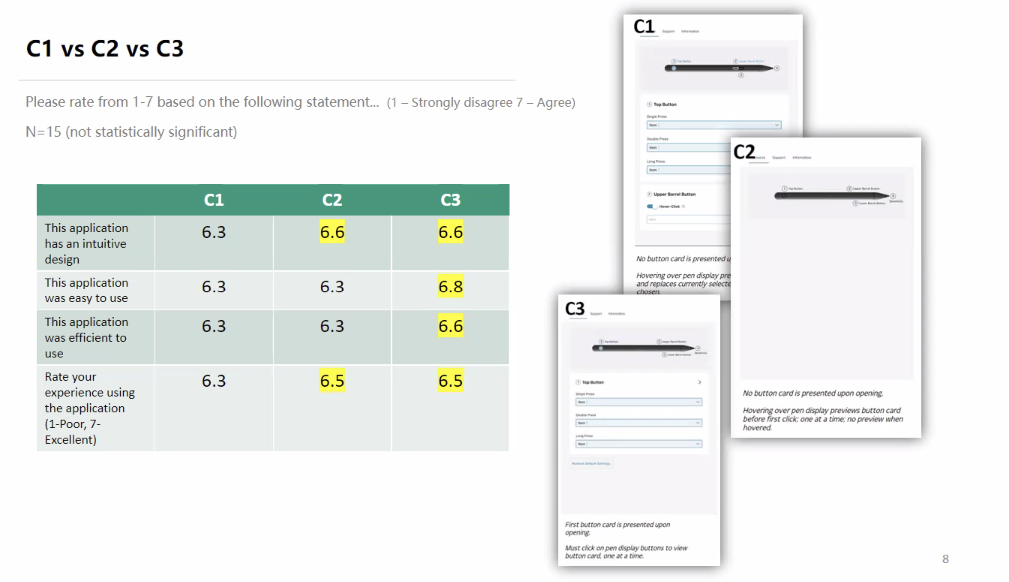
🔖 Round 2: Iterative Refinement Testing (C1, C2, C3)
- Participants: 15 users, unmoderated remote testing
Task-specific results:
- Finding Product Details: 8/8 completion, recommended consistent UI fonts.
- Viewing All Button Functions: 7/8 completion, noted confusion regarding pen/mouse differences.
- Adjusting Pen Tip Sensitivity: 8/8 completion, requested numeric tuning options.
| Iteration | Intuitive Design | Ease of Use | Efficiency | Overall |
| C1 | 6.1 | 6.2 | 6.0 | 6.1 |
| C2 | 6.4 | 6.3 | 6.2 | 6.3 |
| C3 | 6.7 | 6.6 | 6.5 | 6.7 |
✅ Final Choice: Option C3 provided optimal usability, intuitive interactions, and clarity.
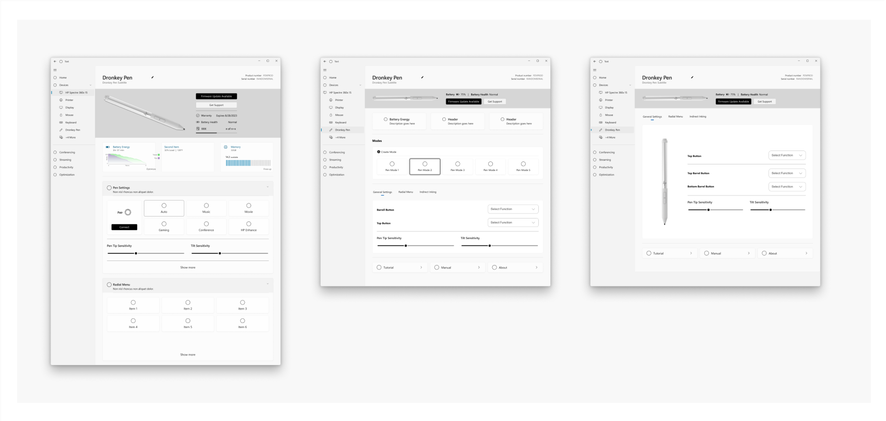
📲 Final UI Solution
Incorporated user-driven improvements:
- ✅ Enhanced visibility of the Information tab.
- ✅ Clearly differentiated pen/mouse functions.
- ✅ Standardized UI terminology.
- ✅ Adopted a card-based layout with pre-selected states to clarify interactions.
💬 “This setup finally makes pen customization effortless and clear.”
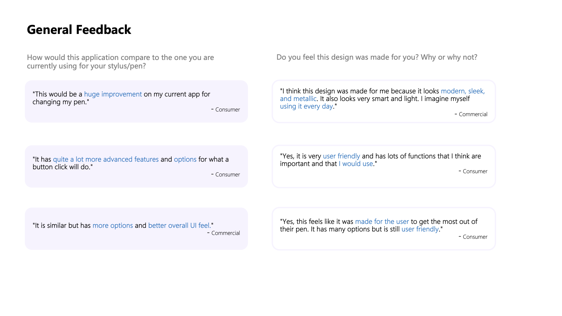
💬 User Feedback & Recommendations
General Feedback:
- “Huge improvement over my current app.”
- “Advanced features with better overall UI feel.”
- “Modern, sleek, and user-friendly design.”
UI Feedback:
- Clear and intuitive visual representation.
- Easy-to-read layout and simplified dashboard.
Future Recommendations:
- Further increase the Information tab visibility.
- Clearly distinguish pen/mouse functionality.
- Ensure terminology consistency across the app.
Thoughts on Design (Layout, Images, Colors):
- Easy to understand (3), clean (3), zen, user-friendly, monochromatic, sleek, simple, plain
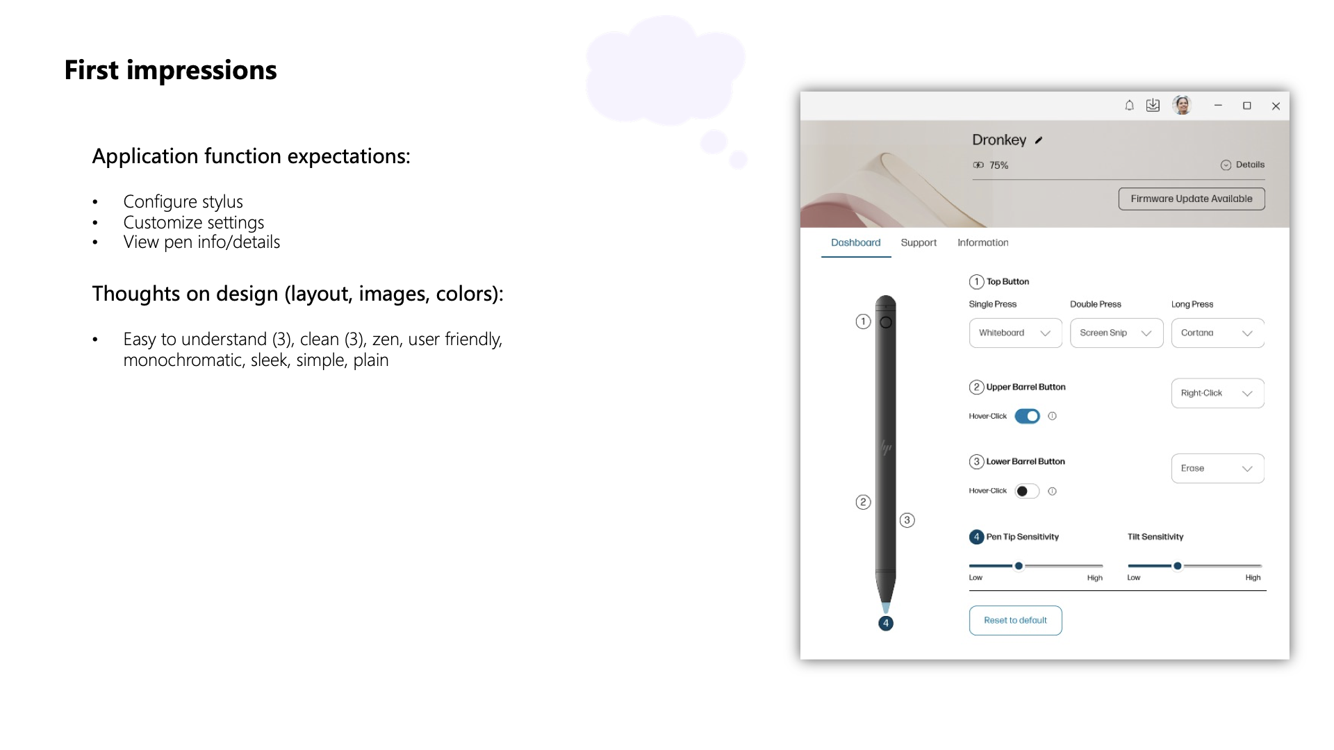
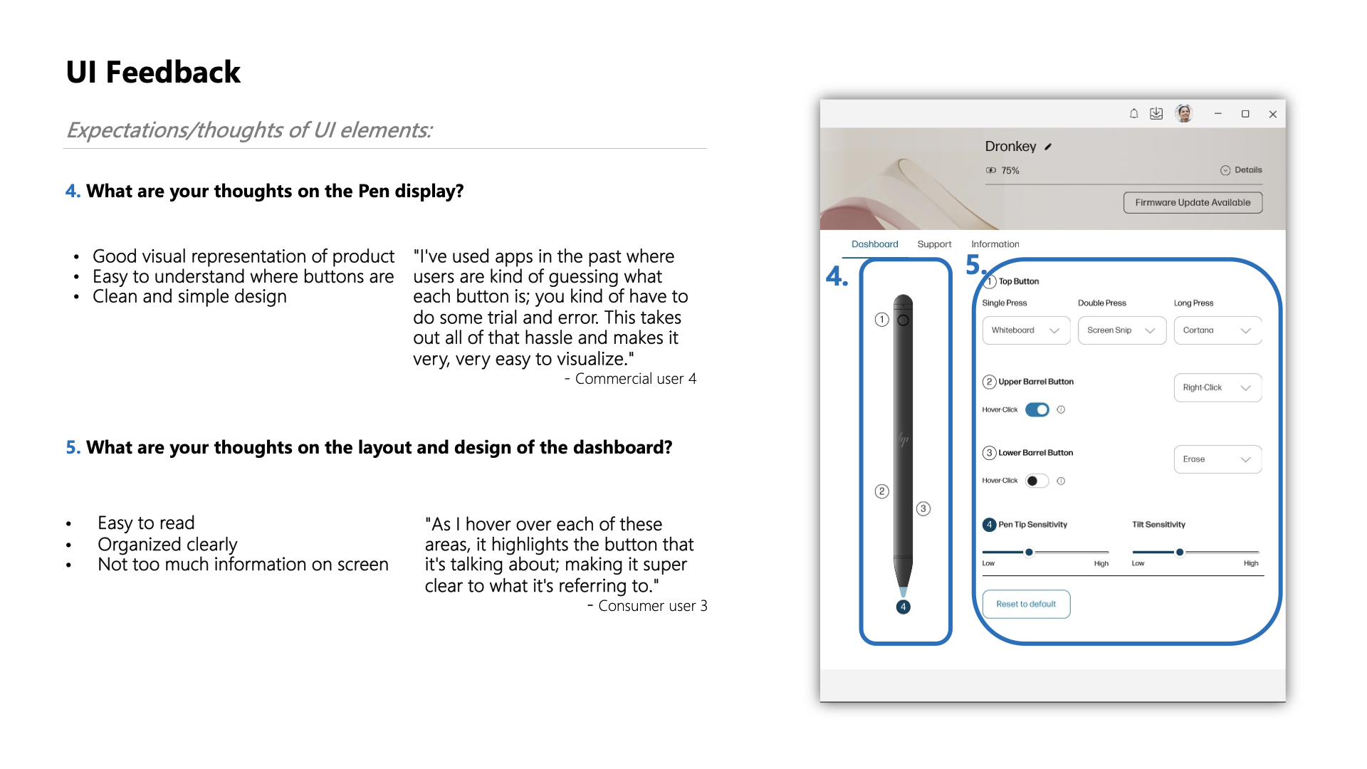
UI Feedback
What do you think about the Pen display?
- Good visual representation of the product
- It is easy to understand where buttons are
- Clean and simple design
- Easy to read
- Organized clearly
- Not too much information on the screen
Recommendations
Based on user feedback, consider the following minor changes:
- Enhance the visibility of the Information tab.
- Explore options for providing additional information on button functions without overwhelming the user.
- Ensure consistent terminology across the application for a seamless user experience.
📊 Business Impact & Key Metrics
- 📈 Usability Increase: Ease-of-use improved by 15%.
- ⏳ Efficiency Gain: 20% faster task completion.
- 💬 High User Satisfaction: Positive feedback across user segments.
Usability Scores:
- Before: [■■■■□□□□□□] 55%
- After:  [■■■■■■■□□□] 70%
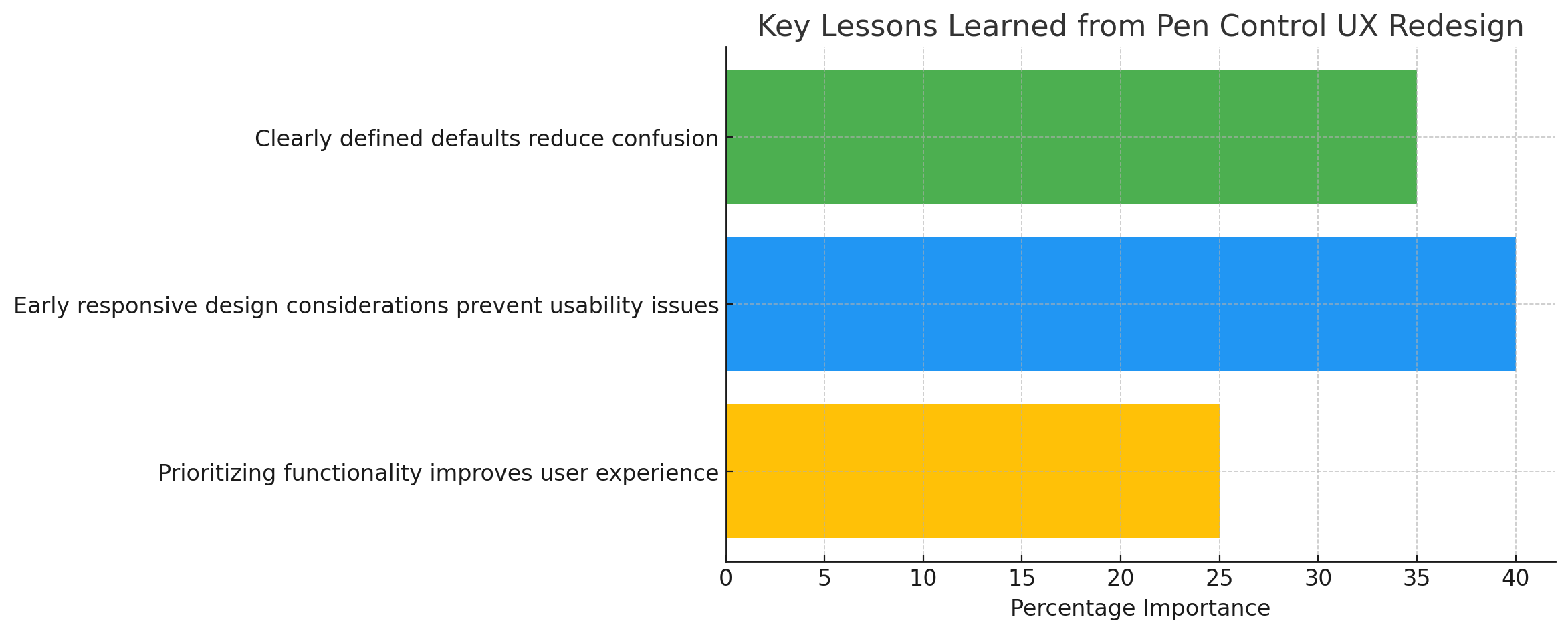
💡 Lessons Learned
- 👁️ Clearly defined defaults reduce confusion.
- 📏 Early responsive design considerations prevent future usability issues.
- ⚖️ Prioritizing functionality significantly improves overall user experience.
🚀 Future Roadmap & Next Steps
- 🖥️ Further optimize for smaller screens.
- ⚙️ Expand pen customization options.
- 🔄 Continue iterative improvements through ongoing testing and collaboration.
🏁 Conclusion
The Pen Control UX initiative within MyHP successfully addressed significant usability challenges through user-focused research, iterative design, and strategic collaboration. My role as the Lead Product Designer was pivotal in enhancing the user experience, highlighting the value of a responsive, iterative, and collaborative UX design process.