
Role
|
Team
|
Overview
PlayStation recognized as a global leader in interactive and digital entertainment, Sony Interactive Entertainment (SIE) is responsible for the PlayStation brand and family of products. As a UI/UX designer, I worked at the CRM Web team at Sony Playstation, which supports all the web & mobile development globally. I’ve provided UI/UX solutions based on the company goals and participated in building a new design system, designing a component library, and redesigning the PlayStation marketing sites. I’m experienced working with responsive web and mobile platforms using user-centric designs. I’ve created wireframes and mockups and provided design solutions based on the business requirements for the globalization project at PlayStation. I’m using tools such as Sketch, InVision, Freehand, Flinto, Adobe CreativeCC, etc.
Design Goals
- Creating an extensible design system shared with all the teams
- Redesign the entire global component library
- Discover the main pain point of our users and test possible solutions with prototyping and testing
Objectives & Solutions
- Incrementally release new components on the PS website that maximize user engagement and increase conversion rate and affinity for PlayStation.
- I created a “World Class” web and mobile design solution to give a unique look and feel to PlayStation.com.
- Product development efficiency will increase by creating a consistent web framework. Instead of repeatedly building similar components from scratch, Design Systems enables designers & developers to reuse components and increase efficiency.
- The design system allows creating consistent UI/UX for the entire product. Design Systems introduces a shared set of principles and rules to build components. It becomes much easier to develop consistent experiences across different platforms.
- Managing design at scale. Increased efficiency and consistency lead a company to build faster products at scale.
- We were collaborating with the other global web team, including the USA, EU, Japan. Users include Front End developers, designers, content creators, business owners, external users, and vendors.
- The design system allows easy prototyping, quick testing and easy to understand for everyone.
My Approach
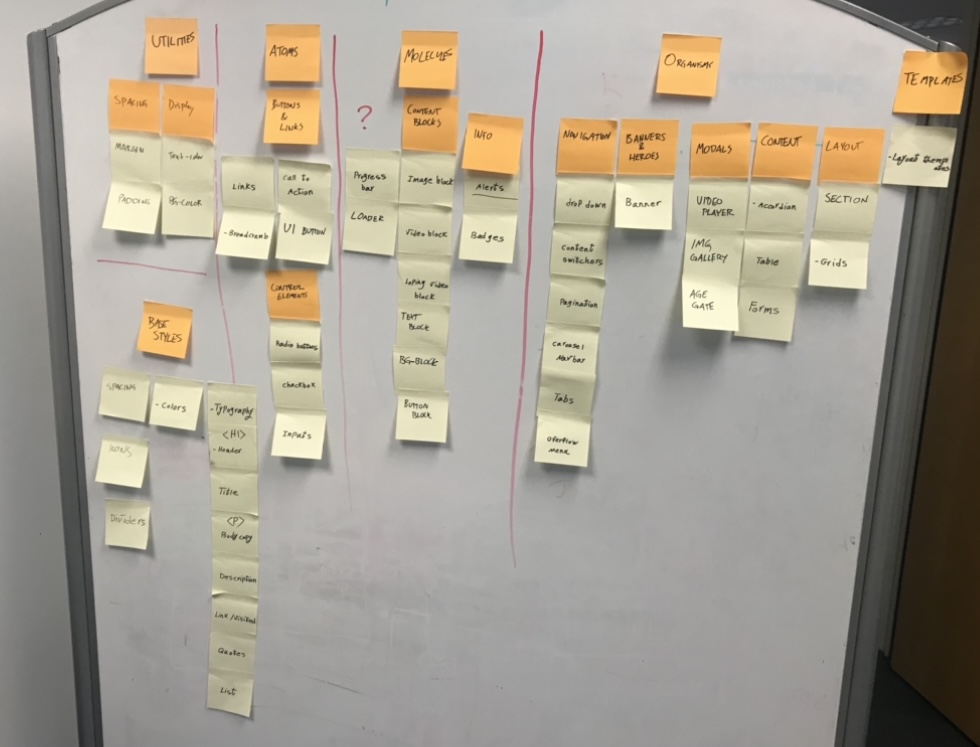
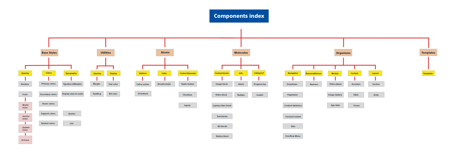
I started the new design system project by researching the needs. To solve the existing design problem, I had to understand and define those problems first. I broke down all the components into smaller pieces using the atomic design method. I used the card sorting method to create the component library architecture. Once I understood the pain points, the next step was redesigning the base elements. That research results led to the creation of a new design system and a Sketch Library. I’ve worked on the ADA compliant colors and covered the full redesign of the global component library.
Design System
A design system is a series of components that can be reused in different combinations. Design systems allow you to manage design at scale with more efficiency. So I started working on PS design system, which is a web framework and is a digital Interaction guideline.
Methodology: Atomic & Modular
Atomic design is a methodology for creating design systems. Clients and team members can appreciate better the concept of design systems by actually seeing the steps laid out in front of them.

Design Process
Discovery and research: User interviews, Stockholders interviews, Requirements, User feedback
Analysis: Industry analysis, design reviews, persona creation, task analysis
Planning: Journey mapping, write user stories, creating use cases
Design: Human-Centered design (UX), UI Design, design delivery, prototype, feedback and revisions, architecture and flow
Testing: Usability testing, web monitoring, A/B testing,
Listen to the input: Surveys, analytics review, usability bug review, feedback review, QA
 Branding
Brand Identity is the message the consumer receives from the product, person, or thing. The brand identity will connect product recognition. The identity should be defined in line with the strategy and the objectives of the brand. I worked on the following to redesign the brand guideline.
1.colors, 2. Fonts, 3. Spaces, 4. Shapes, 5. Icons, 6. Illustrations, 7. Photographs, 8. Animations
Expanding the color pallet that can pass accessibility
Design Challenges:
1. Is there enough colors for every use case?
2. Are these colors accessible?
Expanding our color palette was one of the earliest things I thought about when creating the design system since it’s so fundamental to design and development decisions. My desire to improve the color pallet has pushed me to explore the fundamentals of others’ choices before making my own.
I did a deep-dive analysis on color palette creation.
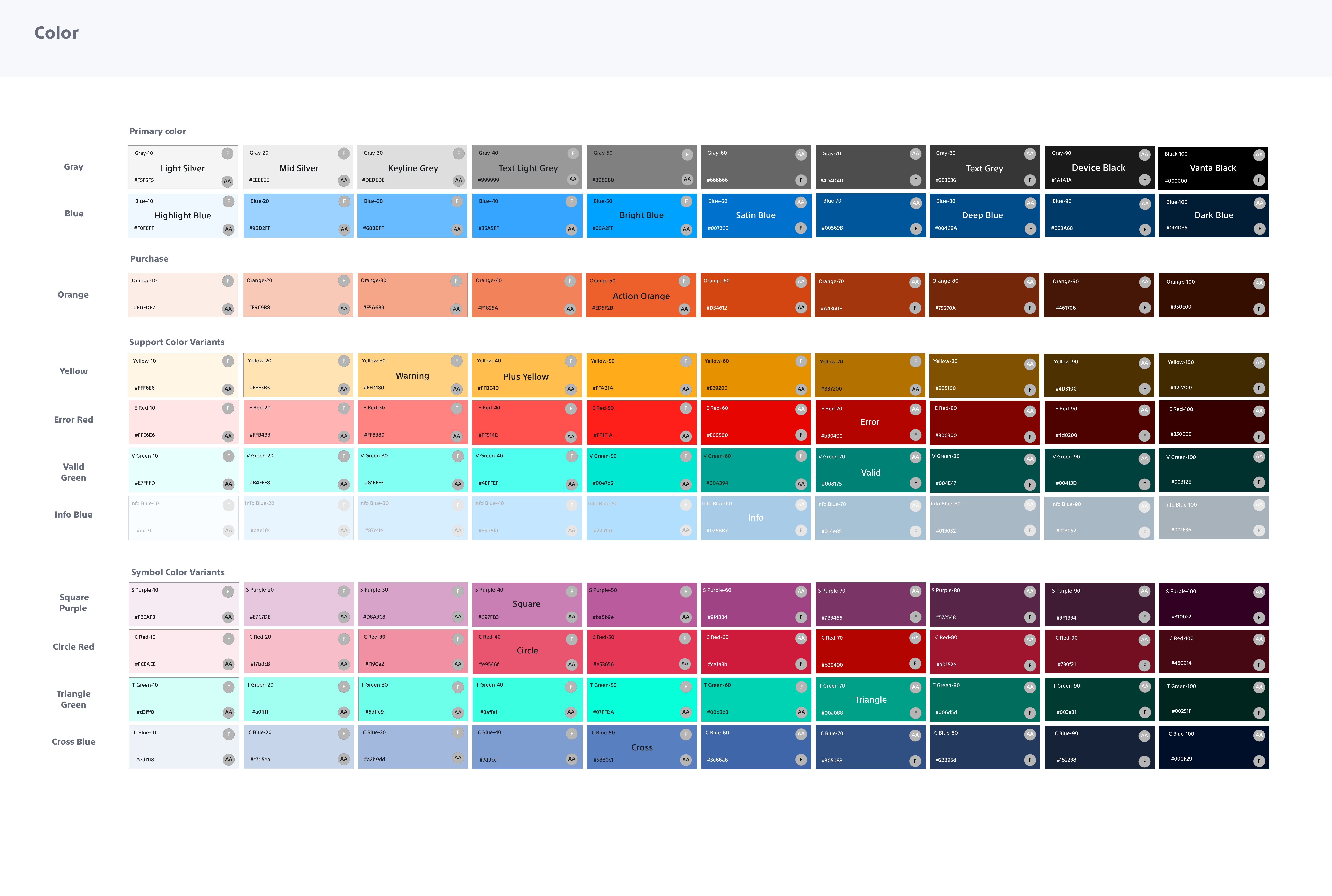 After I created the color palette, I run an accessibility test on each color. The base color is the brand color and a dominant color within the themes. These colors will support hover, active, and focus states for the base color in actionable elements such as buttons, links, and form elements.
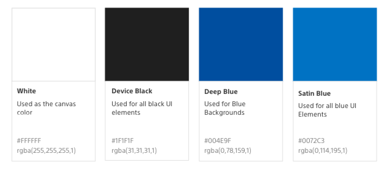 I’ve defined new roles for each color in the color palette and updated the color pallet based on the original colors from the color swatch. I turned the brand colors into symbols for the reusable sketch library. So everyone on the team can use those color throughout their projects.
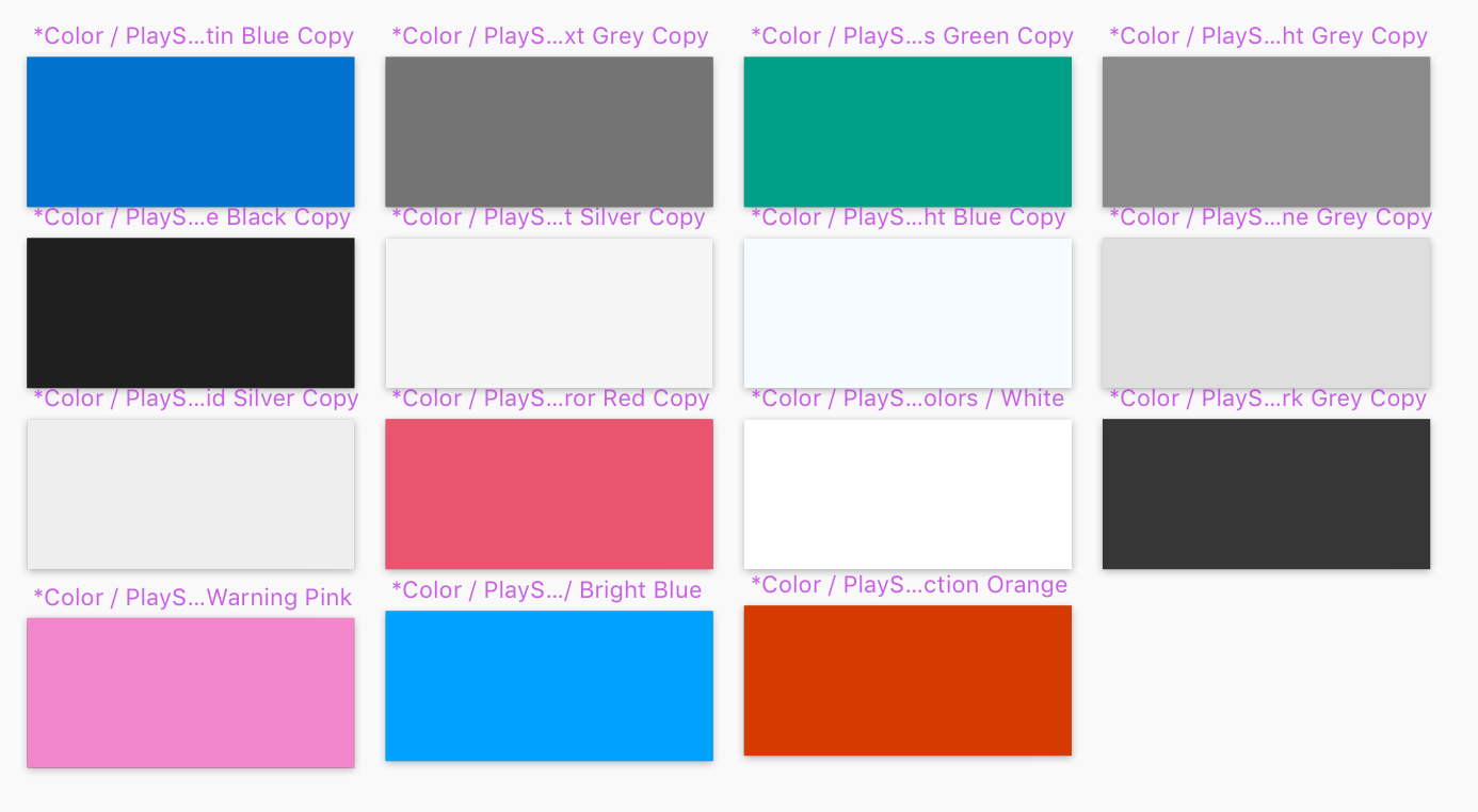 Reusable Sketch Library
My solution to a lack of unified pattern library was to create a master sketch file. The Master sketch file is a library of components so everyone, including designers, developers, content creators, and stack holders can use the same design patterns. This pattern library guaranteed a unified branding and look and feel for the entire company products. I discovered through my research that the difficulty of not having a centralized design system would lead to a bigger company problem.
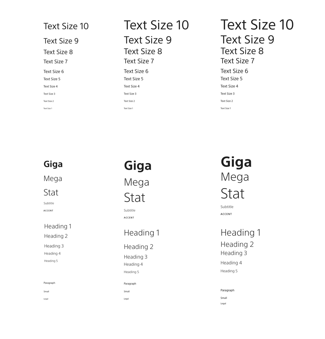
 Typography, Style, and Scale
I’ve used a design process and research methods to create a typographic font scale and defined use cases. I always determine the next type scale step based on the previous one. Once the design was established and approved by the business, I turned them into reusable symbols in the Sketch library.
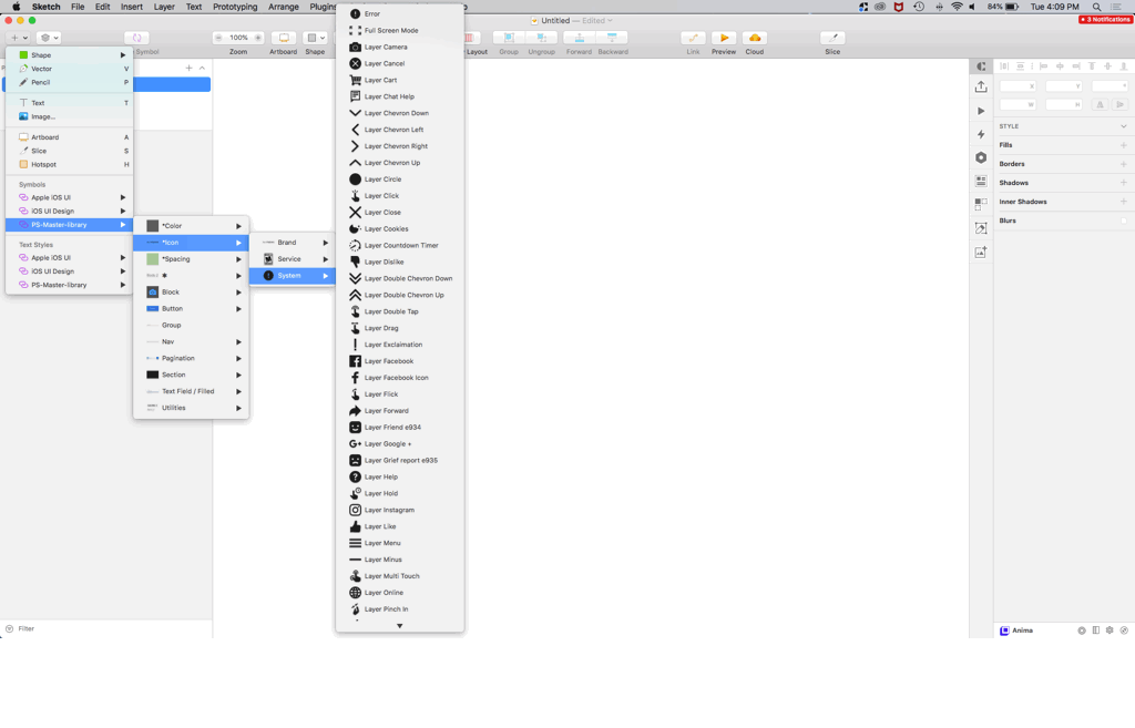
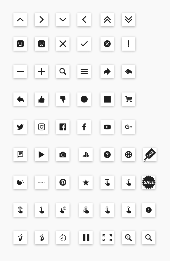
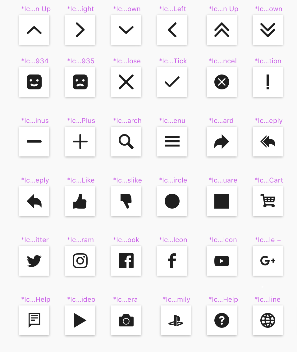
Icons as symbols
I’ve resized and scaled the icon library and turned them into symbols for Sketch library.
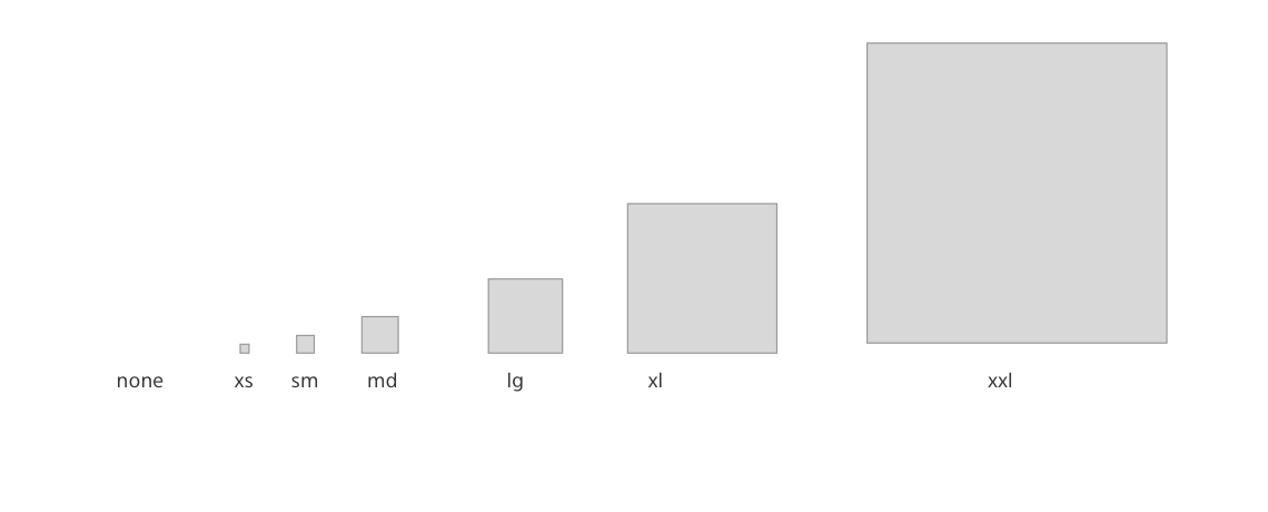
Layout and component spacing units
Spacing tokens are used to apply margin and padding across components and UIs consistently. Having a set spacing scale brings a rhythm to the product and creates a natural and familiar flow from page to page.
 Components & Patterns
Components & Patterns are at the heart of the System. All the previously mentioned elements will help us to create them and deliver a consistent experience. The components are our LEGO blocs. They’re used in Sketch by designers, and directly in the code by developers. Their functional behavior must be specified. As for the patterns, they are the building instructions that will allow us to use these components logically and consistently, across all the products.
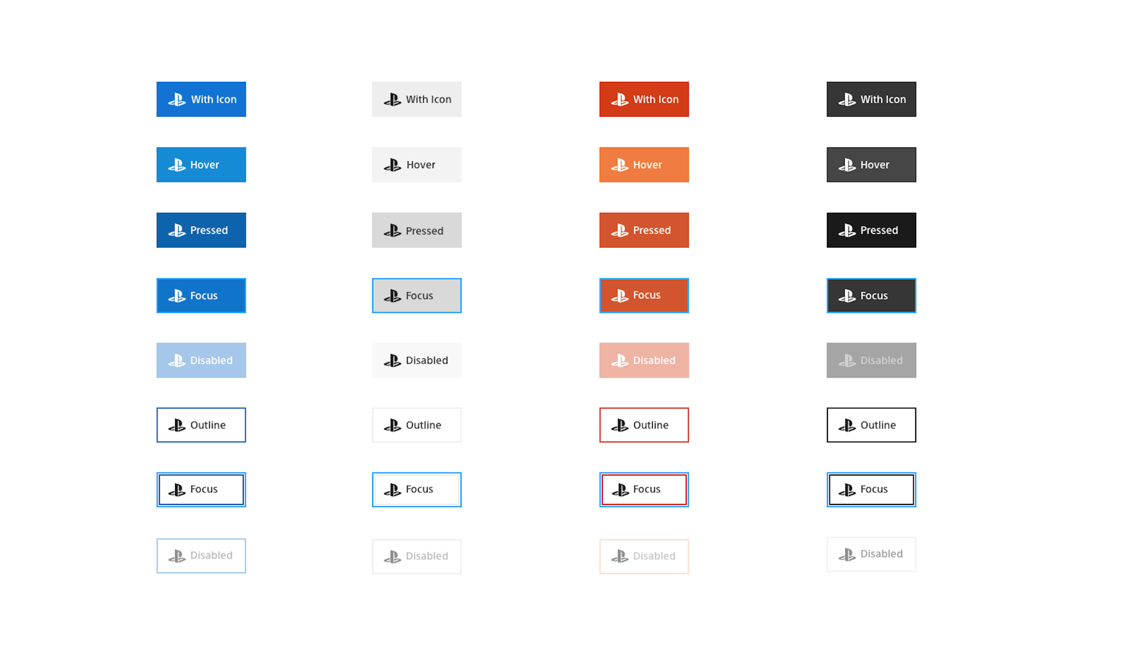
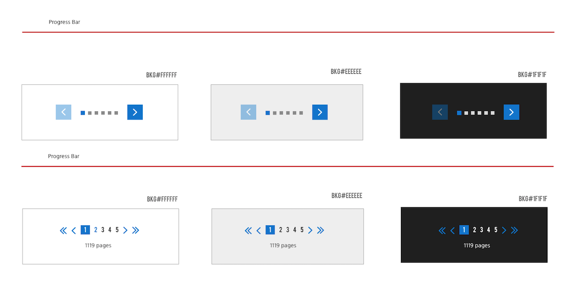
Reusable Pagination Block
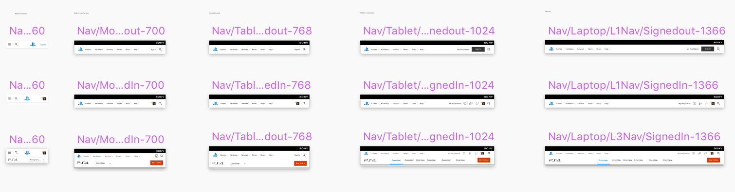
 Reusable Nav Bar
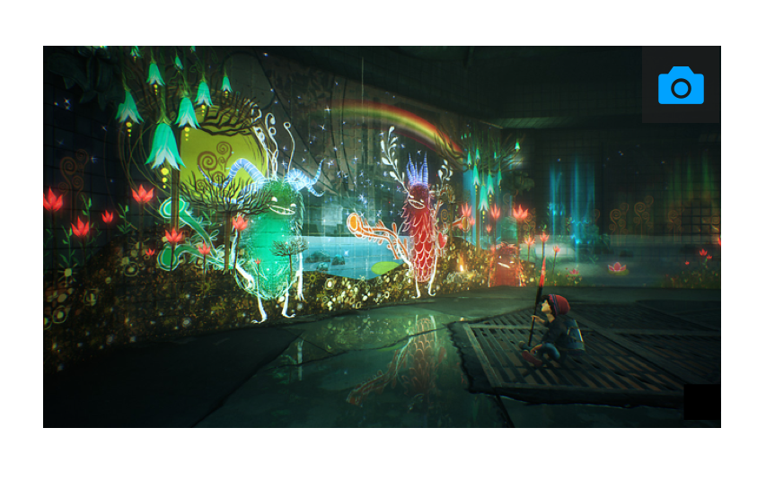
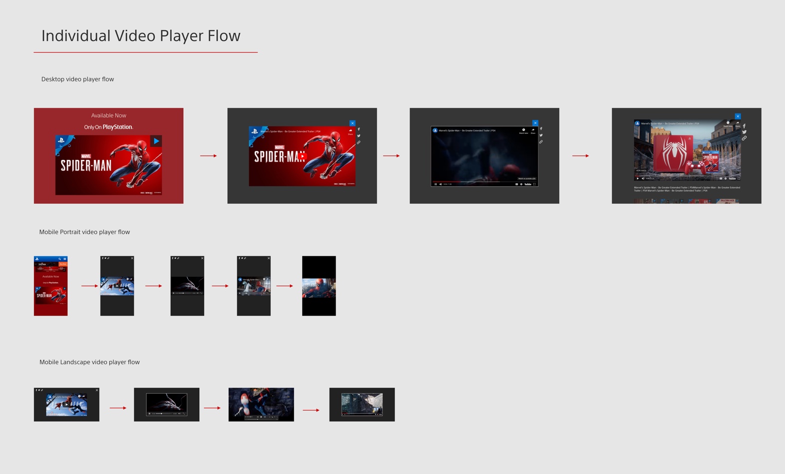
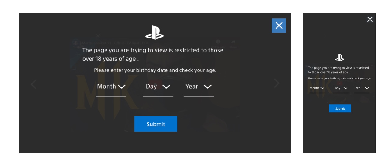
Reusable Image and Video Block
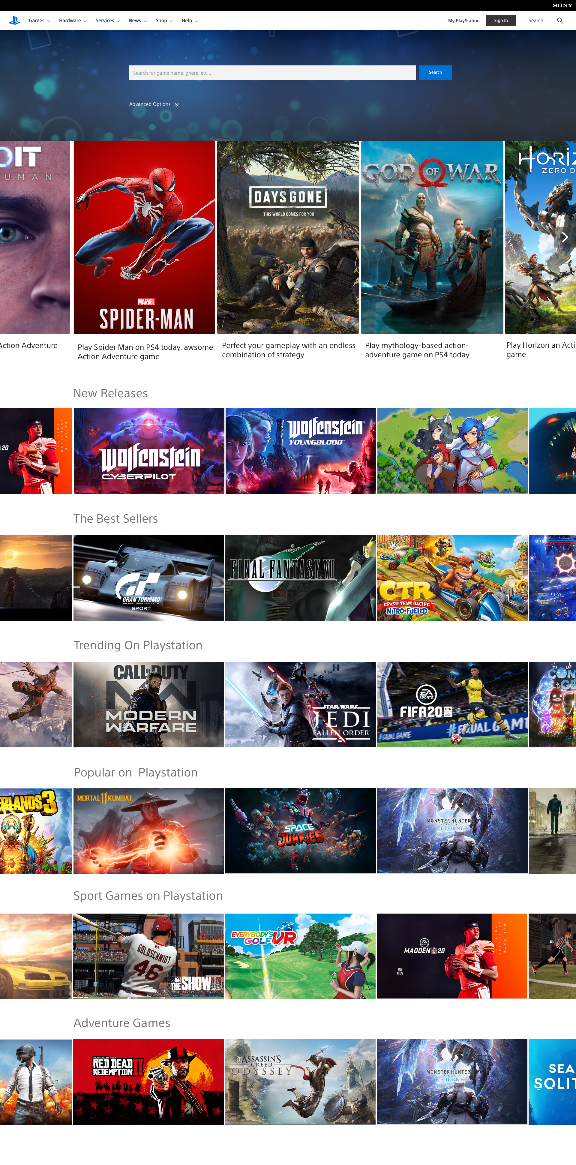
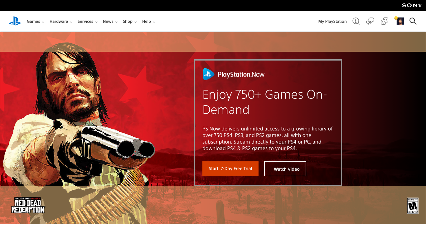
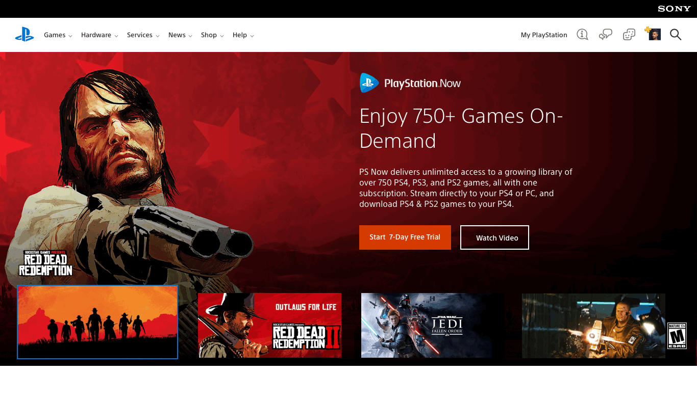
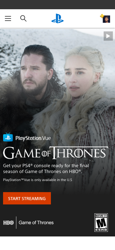
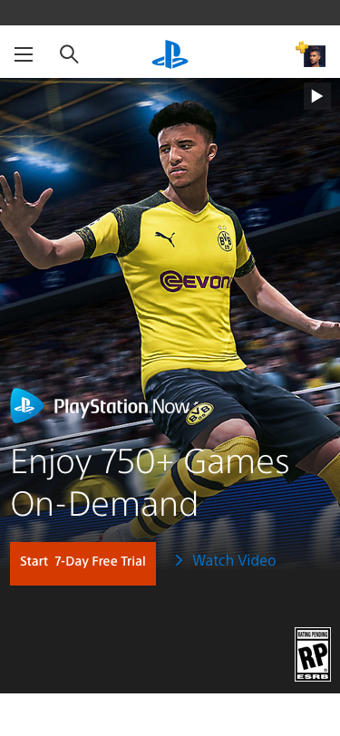
 Banner Design
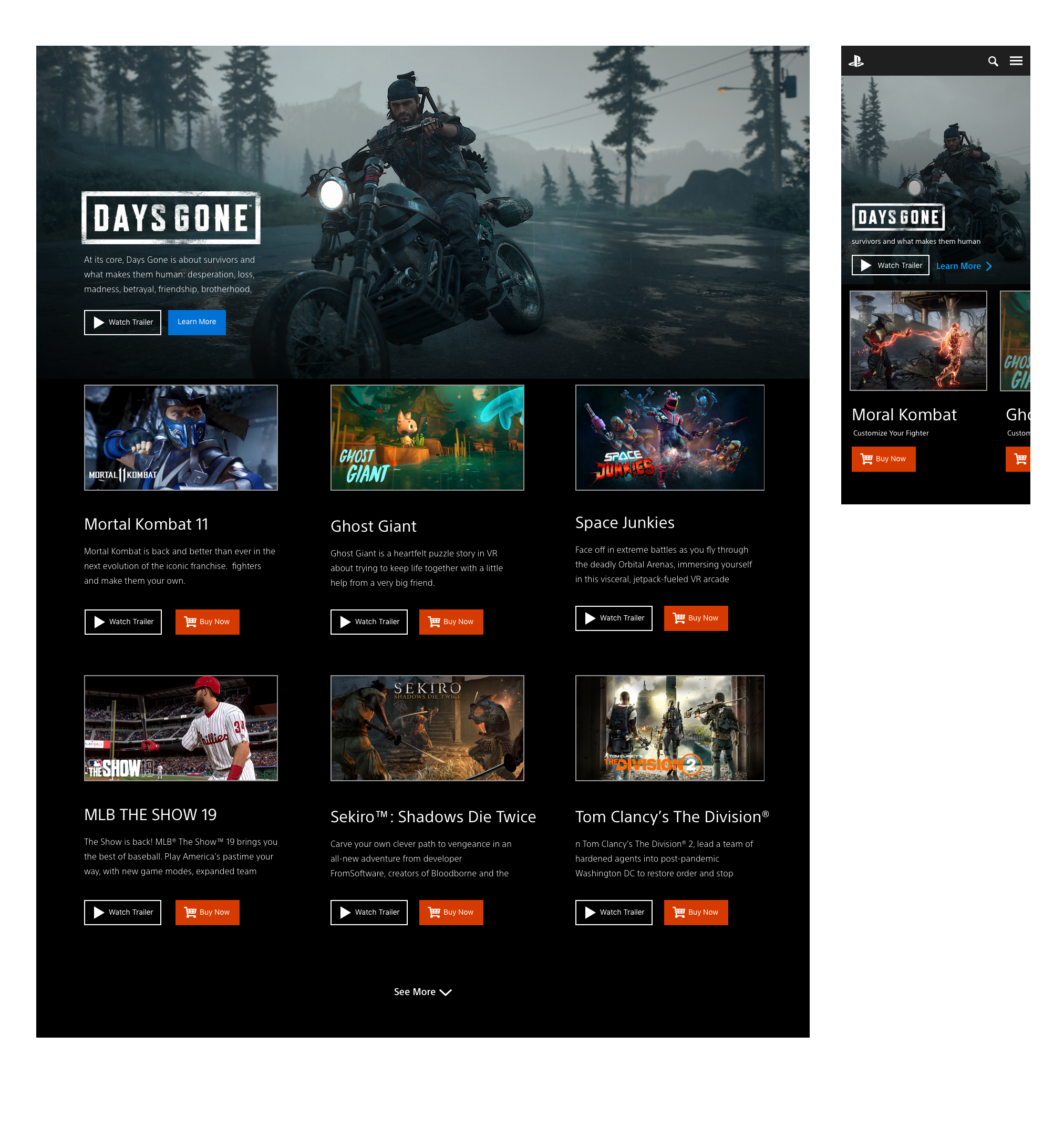 Product Banner Design


Inpage Banner Design

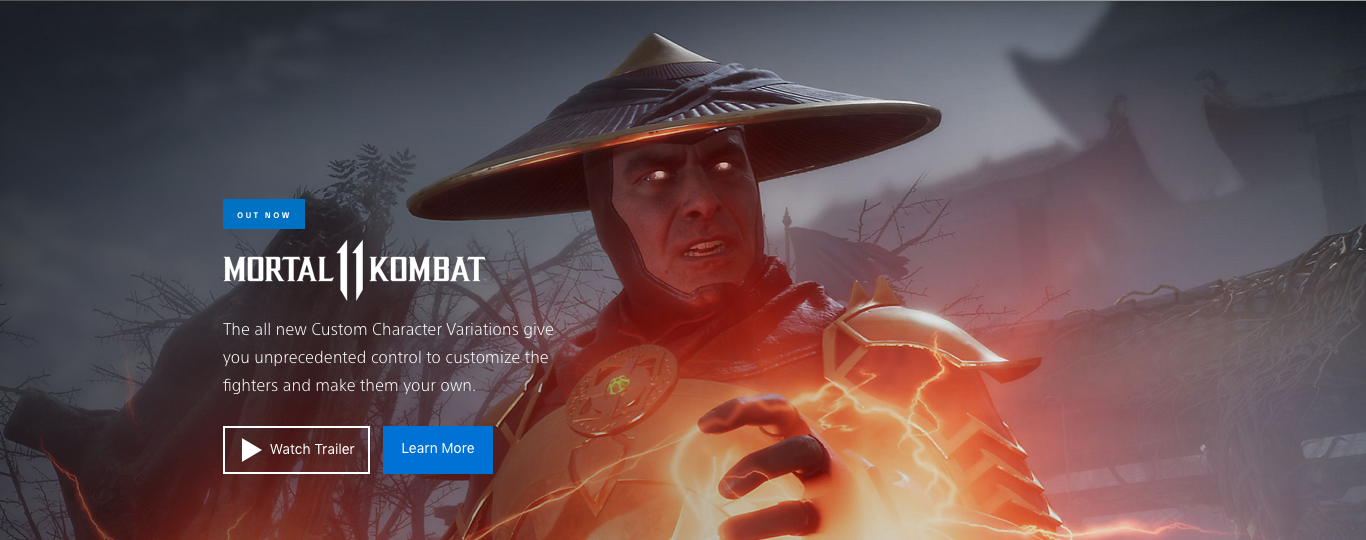
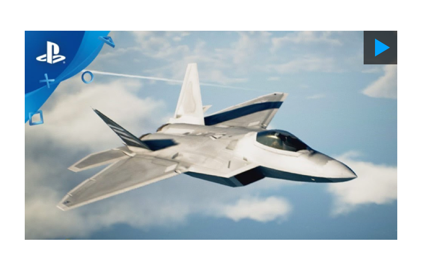
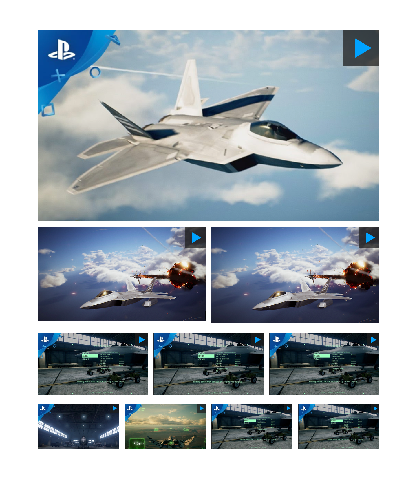
Game Banner Prototype on InVision
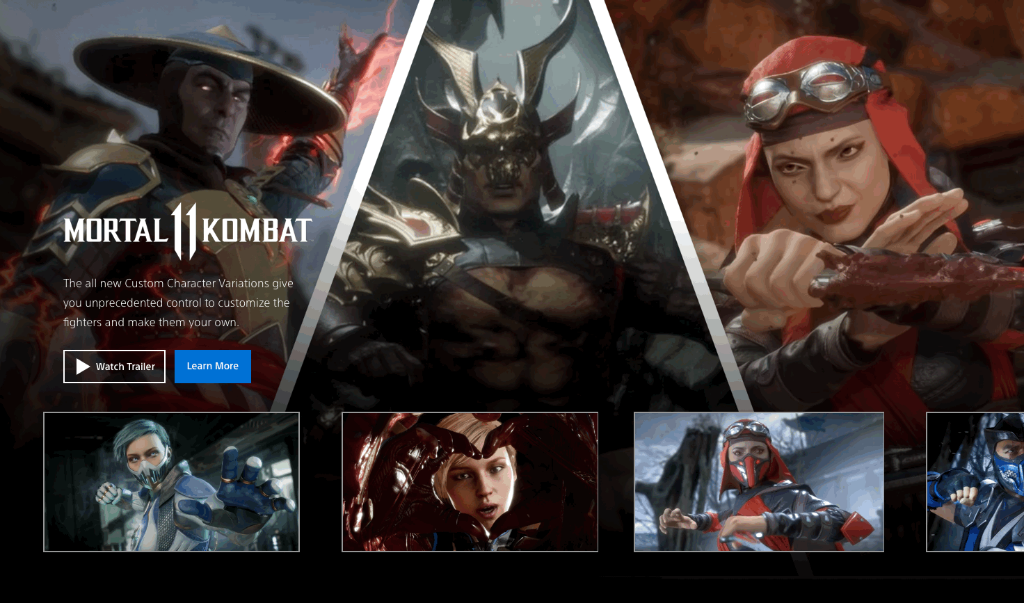

Custom interactive banner with image or video background and text overlay

Product Grid Design & Browsing Options
Product Grid Design