
Role
|
Team
|
Design Goals
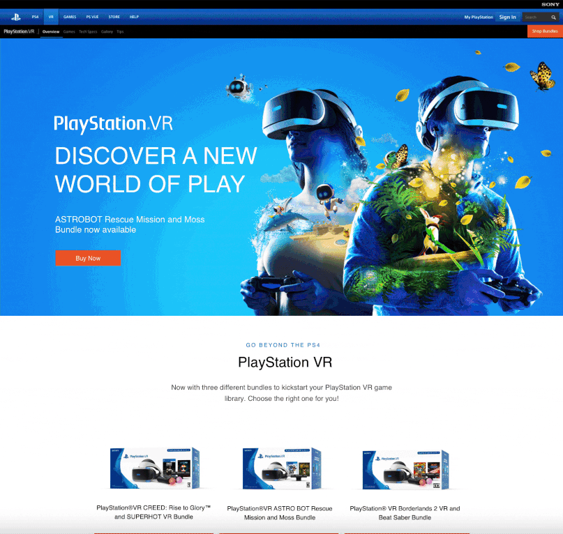
- Creating a new marketing page for PlayStation VR to showcase the product, packages, and related games. PS VR is a virtual reality headset developed by Sony.
- Creating page layout, banners, games grids, product displays, and intuitive eCommerce user experience.
- Discover the main pain point of users and test possible solutions with prototyping and testing.
Persona

Dan Sullivan
24 years old male
Salary: 90K
Budget: Up to $600 for a new device, $60 on new release game, $40 on downloadable games
Single
Lives in Boston, MA
Education: Bachelor’s degree
Goals:
- Get new VR games to download and play
- Ability to compete against friends
- Download recommended games
- Browse and buy VR and games quickly
- View plenty of games videos and images
- Getting the newest technology
Frustrations:
- New releases and discounted games are not always displayed clearly in the game grids, making it confusing
- Learn about new games and product functionalities
- Get necessary info on VR page visit
- Download suggested games quickly
Pain Points
- The game bundles were not visible to the user. It didn’t show an immersing shopping experience. It wasn’t swipe-able
- It didn’t show what VR headset can do
- It didn’t show the VR accessories
- It didn’t show suggested games and also the number of games the user can play on the VR
- It was not visual enough and lack CTA’s; learn more buttons, interactive futures, and content such as images or videos and
- The product bundles were static on mobile and took too much space on the mobile device by stacking information on top of each other. It was missing a carousel component and interaction for displaying products and futures.
*The VR mobile page layout and Component Re-Design
Problems With Previous Design
-
The game bundles were not visible to the user. It didn’t show an immersing shopping experience. It wasn’t swipeable
-
It didn’t show what VR headset can do
-
It didn’t show the VR accessories
- It didn’t show suggested games and also the number of games the user can play on the VR
- It was not visual enough and lack CTA’s; learn more buttons, interactive futures, and content such as images or videos and the product bundles were static on mobile and took too much space on the mobile device by stacking information on top of each other. It was missing a carousel component and interaction for displaying products and futures.
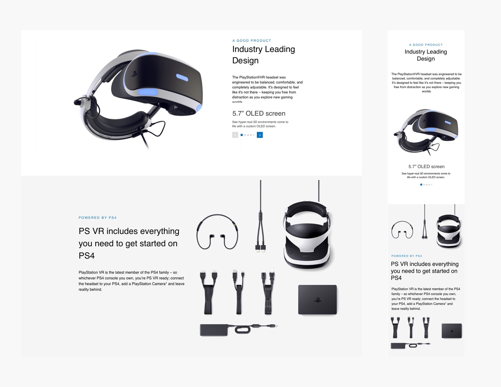
The New Design For Product Bundles
- Showing the product bundles was a priority. Adding a Product carousel for product bundles to help the user navigate through product packages. Adding horizontal swipe helps to show multiple products on sale by sliding action on mobile.
- Cleaning and simplifying the UI
- Showing how many bundles are available based on sales
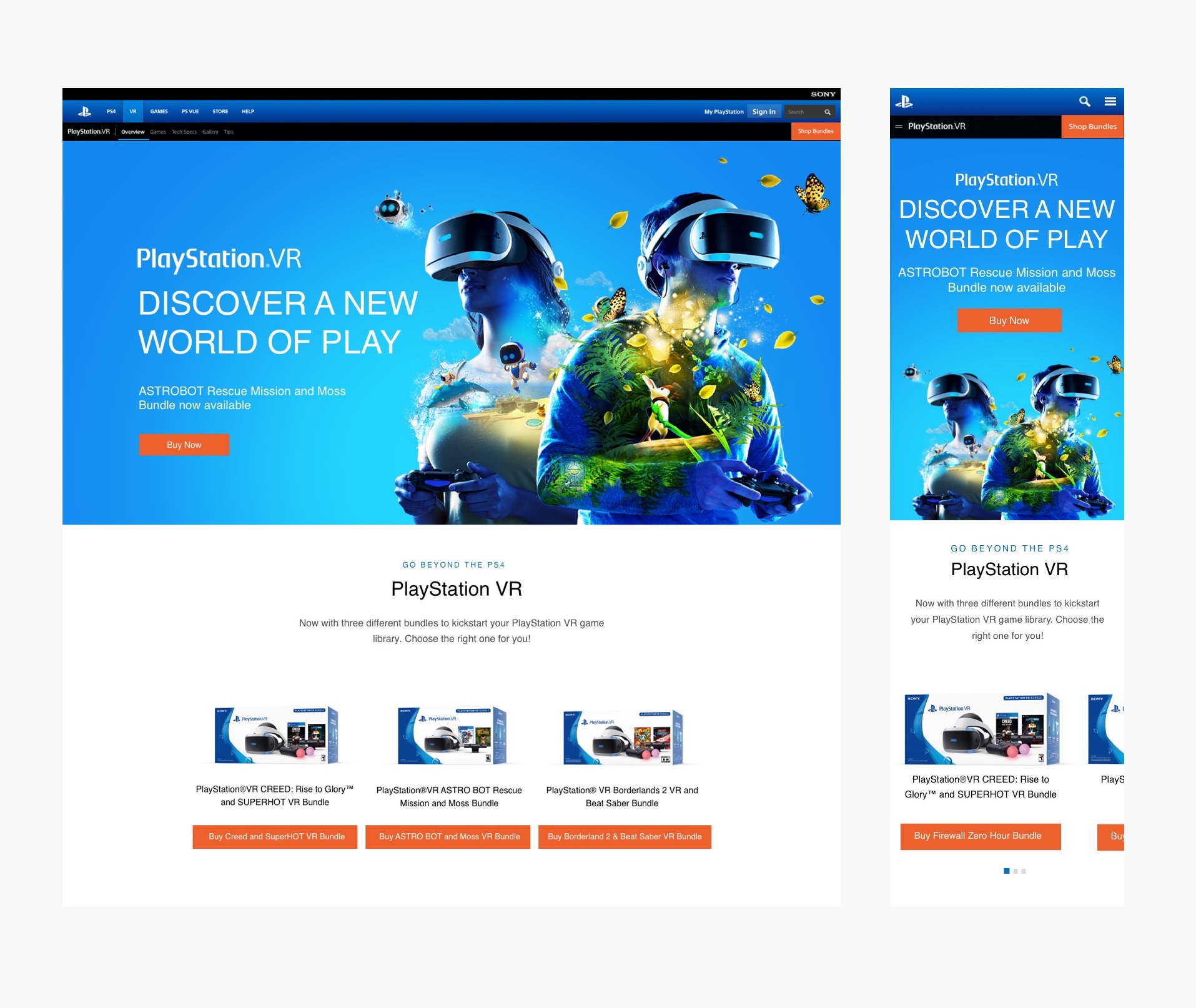
*Design layout for the VR bundles browsing on desktop and mobile
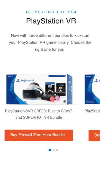 *Prototype for the product browsing swipe gesture on VR bundles
Problems With Previous Design
-
Lack of game visibility. There wasn’t any new release game component to show the user what’s new
-
No interactive game genres carousel for mobile. Users have to scroll a lot to see all games stacked on top of each other on a mobile device
-
Lack of visual assets to shows how many games are available for VR
-
Using a different background color to create a game section
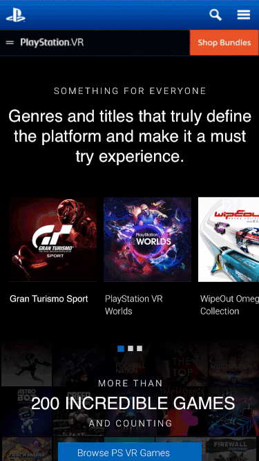
The New Design For Showing VR Games
-
Creating a shopping experience by adding the VR new release game component that has an interactive game banner on top of the component
-
Adding game genres carousel for mobile
-
Adding an interactive game banner that moves across the page that shows 200 games are available for VR and a CTA button that leads into the game page
-
Creating a unique user experience for desktop and mobile with a mobile-first approach in mind
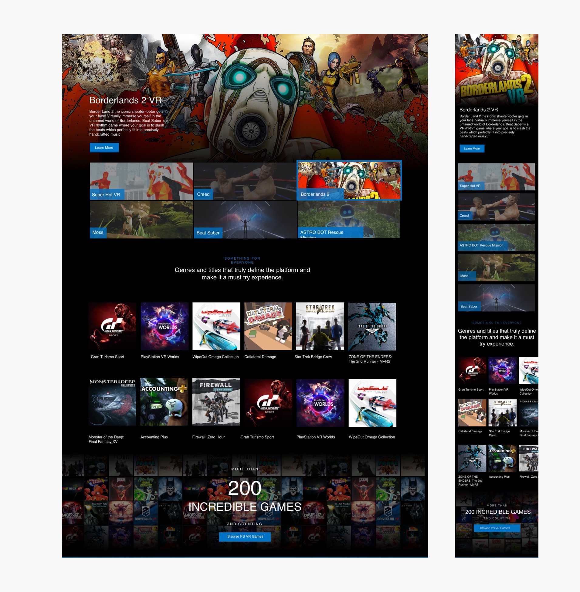
* Page layout for the game section that shows VR games and the new design that focuses on relevant content and product availability for the user based.
*Prototype for the game browsing on mobile
Problems With Previous Design
-
Lack of product visibility and buying options
-
No interactive game banners carousel. Users have to scroll a lot to see all information
-
Lack of visual assets to shows product and accessories available for VR
-
Boring design
The New Design For Product Banner
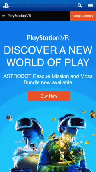
- Creating a pleasant shopping experience by adding colorful VR product banners. These banner components show what the VR headset can do. The banner background offers the product and accessories for PlayStation VR
- The Product banners suppose to communicate product look and feel, functionalities, deals, excitements, and emotions.
- Creating a unique user experience for desktop and mobile with a mobile-first approach in mind
- Utilities I added to the visual elements included logo, CTA buttons, Learn more, text blocks, slogan, gradient overlay options, Image or video, background options, and carousel components
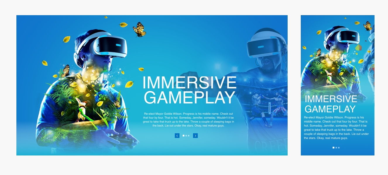
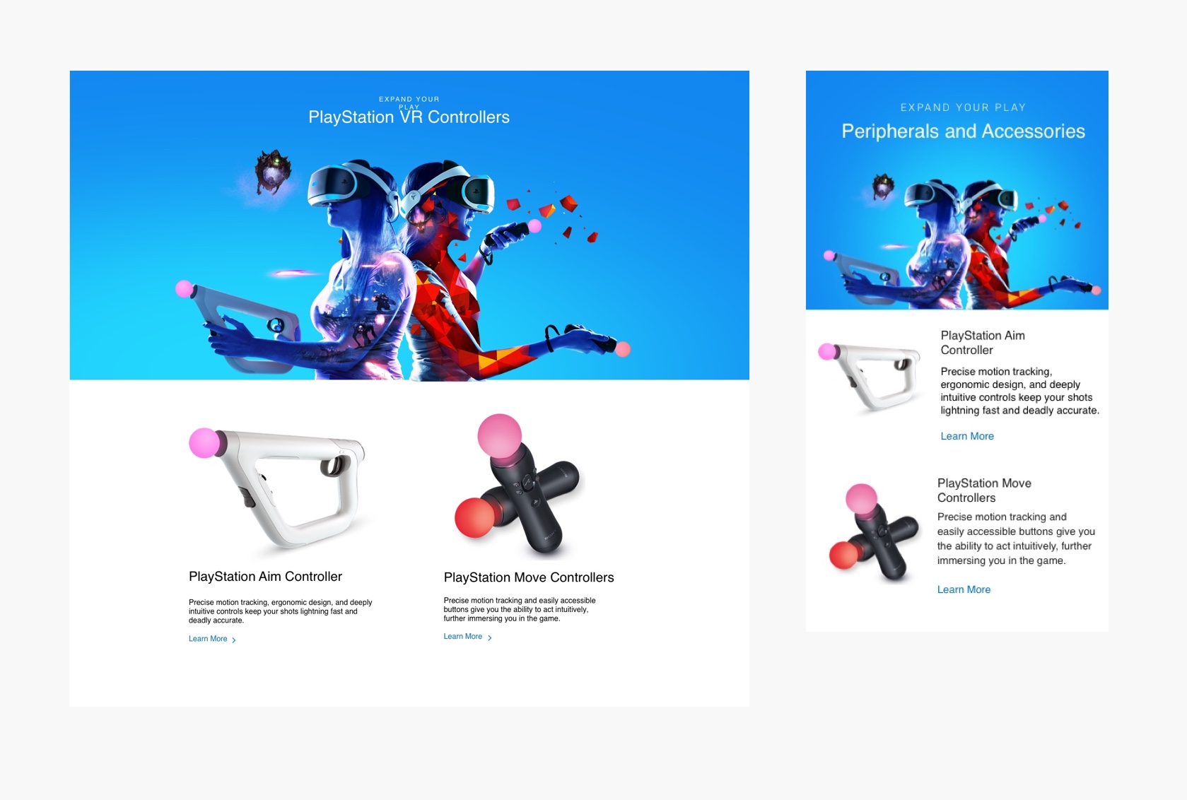
*The product banners are communicating product look and feel functionalities, accessories, deals, and excitements.
Testing Setup & Results
I used two methods to test the new design:
The testing method was to get the prototype in front of users and team members and get feedback.
User Testing (5 users)
Usability Hub (10 users)
-
The user is clear on what the product does and what accessories come with it.
-
The user can find newly released games, game genres, and the entire game library available for the VR.
-
After visiting the VR page, the user is eager to purchase a VR headset or games.
-
The user is getting more relevant products, suggestions, and deals.
-
Number of suggested products/games and accessories purchased increasing by 10%
Results
-
Solved UX challenges of the placement of the modules on components focusing on user-centric design. Module placement needed a lot of research and wireframing to reach the best solutions.
-
Created a new horizontal swipe component for PlayStation VR bundles to display multiple products. This swipe action is essential for the mobile user experience due to the limited space. The swipe component can show various products and create an intuitive user experience while browsing.
-
Created the game tile grid component to display newly released games and VR available games to provide better browsing and shopping user experience
*The VR desktop page layout and Component Re-Design