
🔹Situation:
PlayStation’s carousel banners lacked consistency, limiting promotional flexibility and failing to engage users across product, game, and seasonal campaigns.
🔹Task:
Redesign the banner system to support multiple types (Hero, Game, Product, Promo), improve promotional visibility, and increase user interaction with marketing content.
🔹Action:
-
Audited existing banners to identify conversion and engagement drop-offs.
-
Defined a modular banner framework: Hero, Product, Game, Simple, Ads.
-
Built reusable components with clear layout hierarchy and responsive scaling.
-
Enabled motion-ready designs for future animation support.
-
Developed clear guidelines for internal teams to use banners effectively.
🔹Result:
🎯 Boosted clicks on featured games and offers
🧠 Reduced creative production time through reusable templates
💼 Strengthened alignment between design and marketing goals
📊 Created a scalable system supporting promotion variety and brand consistency
Role
|
Team
|
Overview
Design Goals
- Created various banner types
- Customized user experience for desktop and mobile
- Increased product visibility and design consistency
- Created new banner flow
- Ability to display interactive background images and videos
- Adding animated banners and interactive functionalities
- Created new banner utilities
- Discover the main pain point of users and test possible solutions with prototyping and testing

*Understanding Pain Points & Brainstorming Solutions
Some of the Pain Points
- Lack of clarity and outdated design
- Missing the mobile-first approach
- Didn’t translate desktop functionalities into the mobile-friendly layout
- Need for responsive banner sizes
- Didn’t define banner types properly
- Lack of playful and engaging animated banners
- Limited interactive functionalities
- Lack of banner utilities
- Limited text readability and product visibility
Research
- My research study aims not to design only one Banner; I tried to create a visual language around banners by looking into the advertising industry and coming up with the best UX practices. It was essential to show the product and connect it to its lifestyle and make this experience memorable for the user.
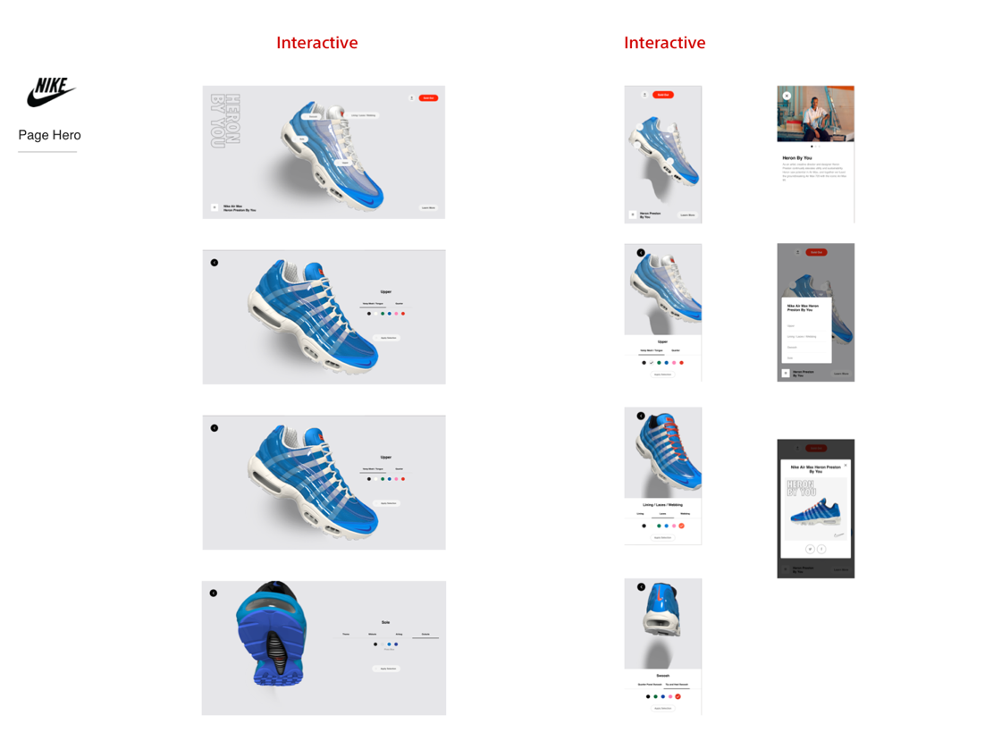
- I looked into competitive brands such as Xbox and Nintendo to research industry standards and look into features and functionalities from the UX standpoint. Also, I studied banners and heroes from other non-gaming brands such as Nike.
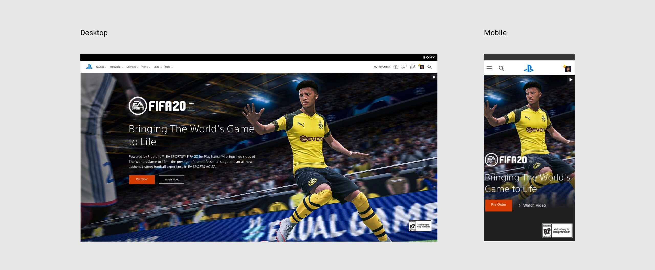
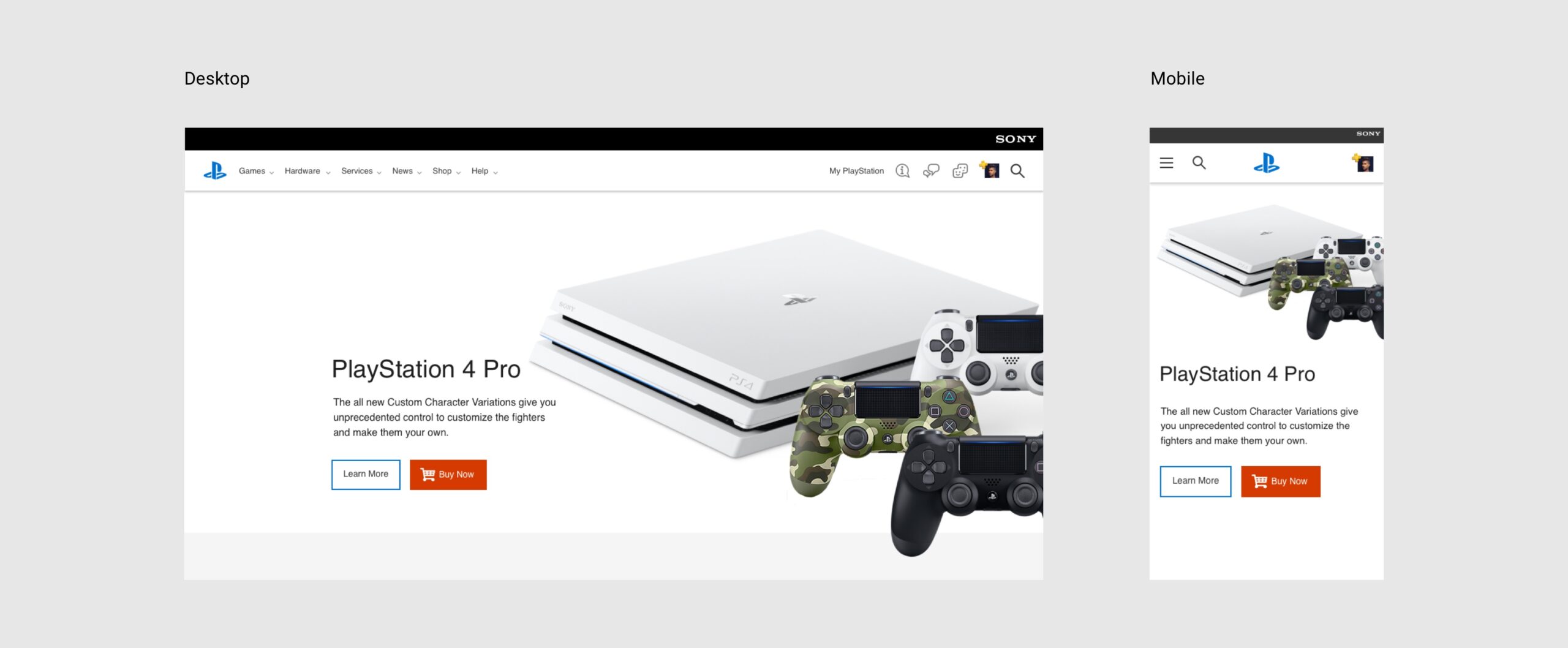
- I found that due to limited space on mobile, banners are smaller on mobile viewports. The UX challenge was how to make large call-out banners from the desktop and translate it into mobile and still impact the small screen as we do on a large screen.
- There was a need to cover different use cases for banner types on PlayStation, such as homepage hero, page banner, game page hero, regular page hero, etc.
- We needed to increase product visibility.
- Increase logo visibility, text readability and add CTA’s
- On mobile viewports, we needed to have shorter sentences and body messages.
- Figure out banner spacing and how that works for mobile
- Create a new gradient overlay for more text visibility
- Add new utilities to the banners. Add a sale tag, Game logo, CTA buttons, learn more, body text, slogan, gradient overlay, Image or video in the background, swipe gesture and, rotating web carousel.
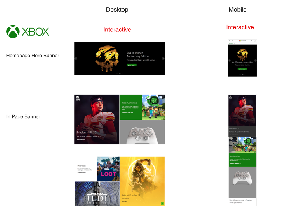
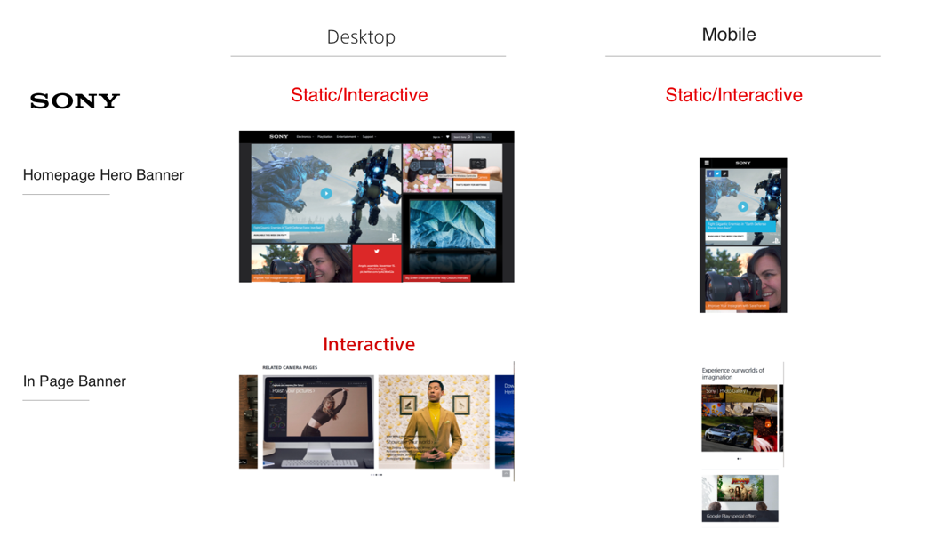
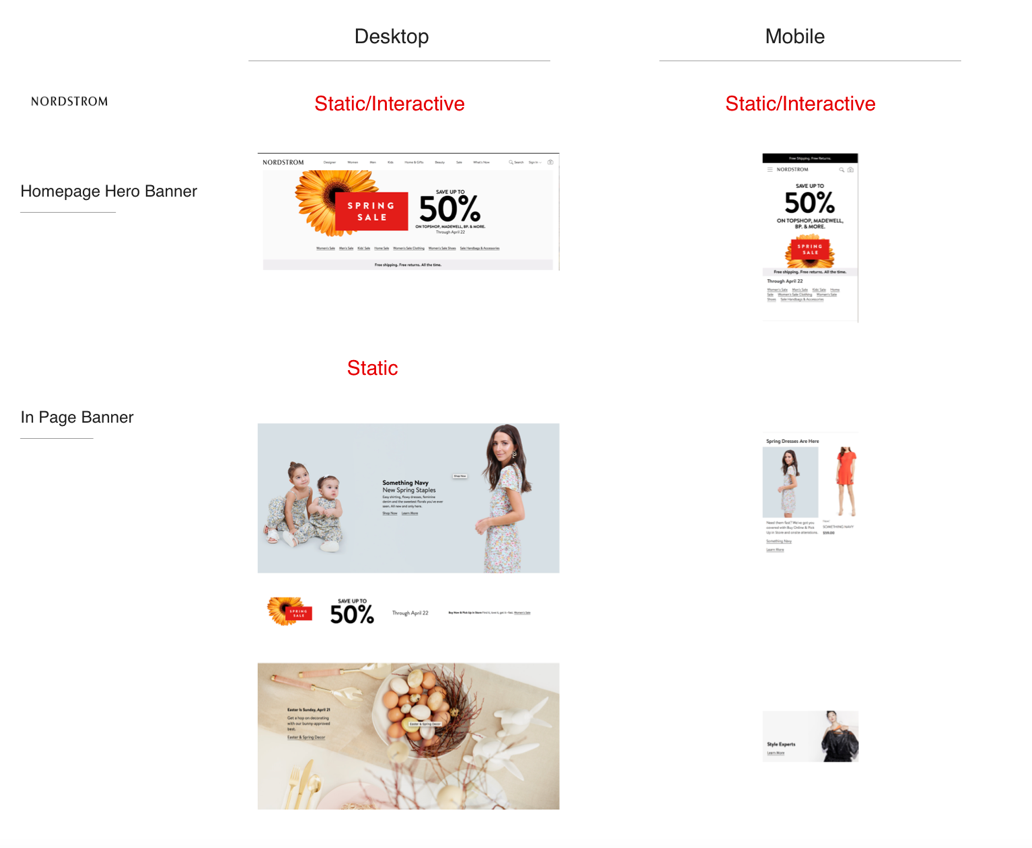
Competitive & Industry Analysis
- I picked these brands because they are the top game and marketing website.
- I specifically focused on the homepage hero, In-Page banners, and user Interactions.

Understanding who is our user
It is essential to understand who we are designing for and the user’s goals and frustrations.
Persona

Jennifer Johnson
19-year-old female
Budget: $40 on new release game, $20 on downloadable games
Single
Lives in Los Angeles, CA
Education: College student
Goals:
• Find new games and products fast
• Read the brief description and promptly browse through
• View plenty of games videos and images
• Ability to compete against friends
• Download recommended games
• Browse and buy games quickly since she has a short attention span
Frustrations:
• Lack of clarity
• Not seeing enough interactive visuals
• Boring static banners
• Lack of mobile interactions
• Not enough information provided on banners
• Not seeing enough banner utilities such as CTA’s
• Lack of related product or game suggestions from the page banners
User Interviews to Validate Pain Points
- How do you feel about the design?
- Is the banner design visual and interactive enough for you?
- Do you like the mobile banner experience? What is the most frustrating thing about the mobile banners?
- Do you get enough information about products or games from looking at the game banners?
- Do you see the related product/game suggestion on the in-page banner ads?
- Where would you click on this banner, and what do you expect to happen?
- What is the most frustrating thing about seeing the product or game banners?
- What is the most frustrating thing about the hero banners?
- What is the most frustrating thing about the in-page ad banners?

Brainstorming
I started brainstorming the solutions that map back to the problem statement. I focused on the problems that were important to both user and the business. I have expanded the most significant pain points and Could add new features and functionalities. Most of these ideas are based on design review, analytics, and gathered user feedback.
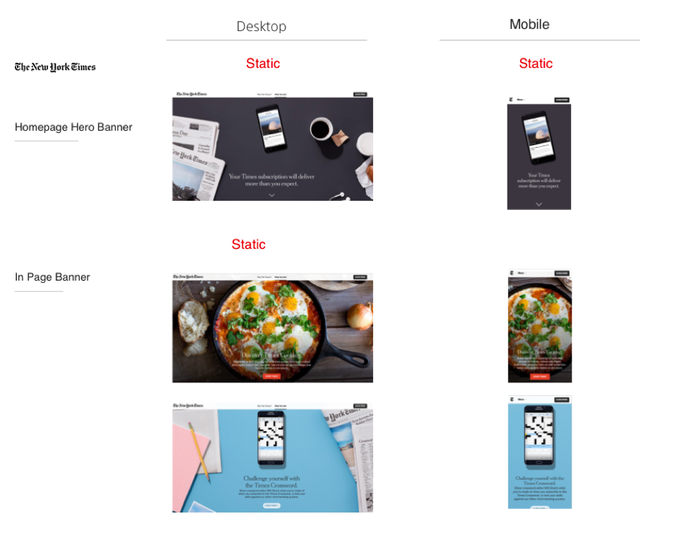
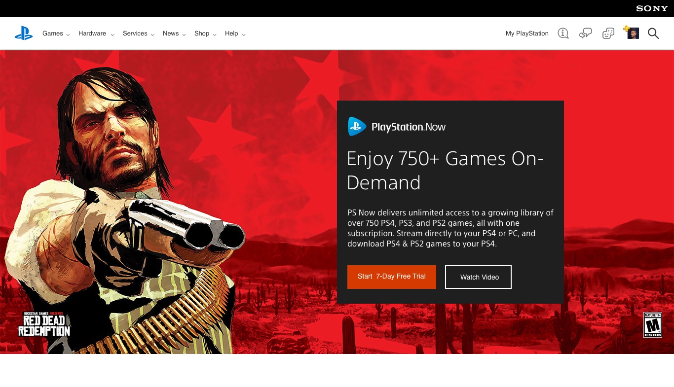
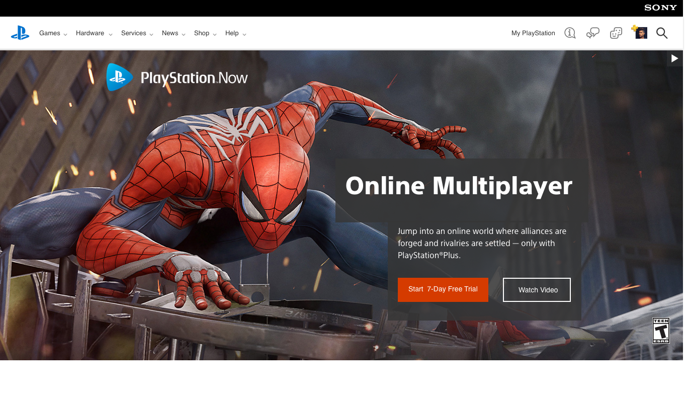
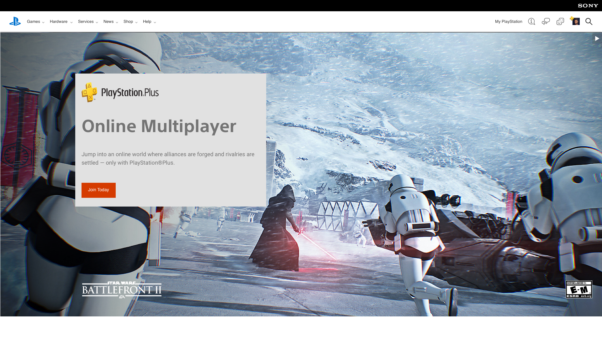
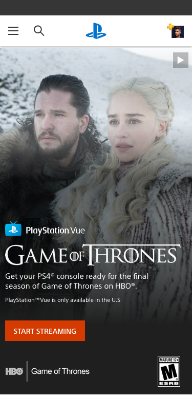
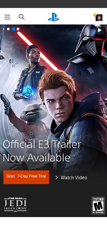
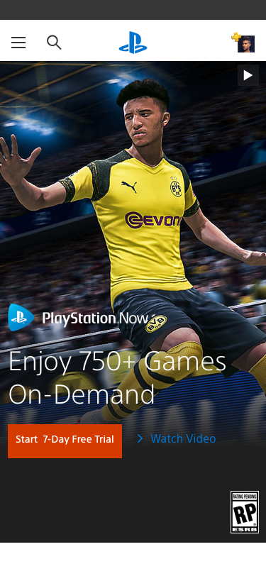
Banner Types
I discovered different banner types used throughout the website pages.
- Hero banner
- Game banner
- Inpage banner ads
- Product and accessories
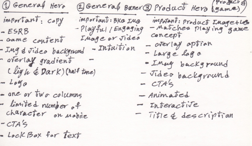
Solution Sketches
Before I spend any time on high-fidelity design, I started by doing solution sketches; each would have pros and cons based on the constraints.

Wireframes
Wireframes help make my design process iterative. Instead of combining the functionality, layout, and creative branding aspects of the product in one step, wireframes ensure that these steps are taken one at a time.
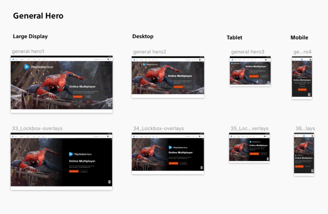
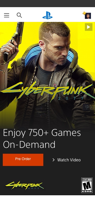
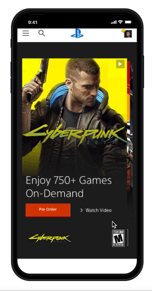
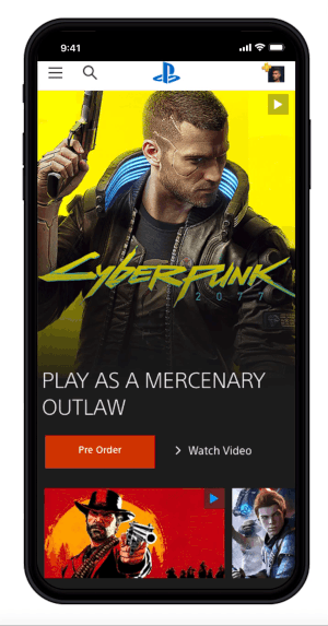
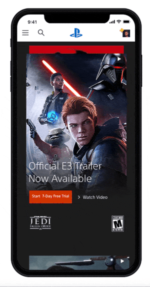
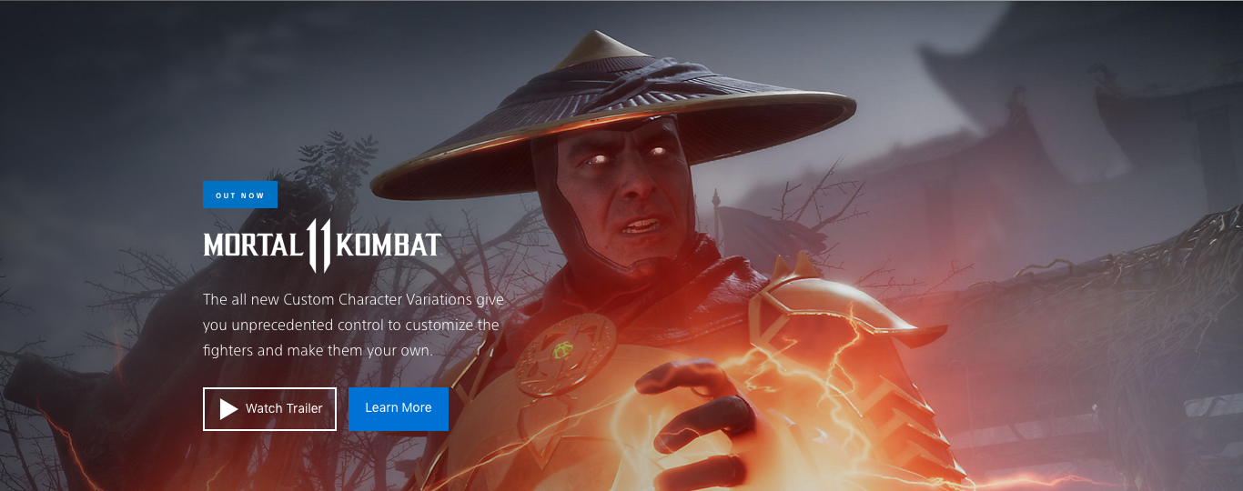
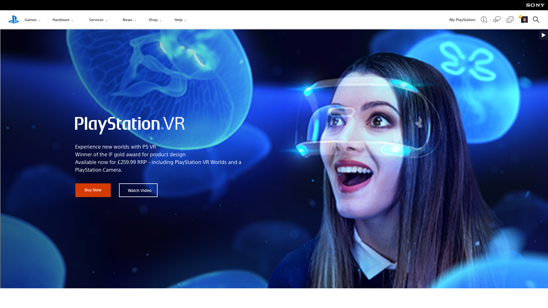
Hero Banner
The Hero Banner container is a flexible container extending to the grids or the full width of viewports. Inside the content container, you can add a text block, CTA button block, Legal text, brand logos, brand logos, 3rd party, or sub-logos. Inside of the box options: Alignment, Spacing, Text Block, Button block, Logo blocks.
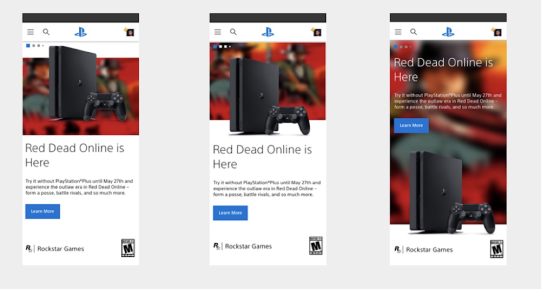
ViewPort Sizes
Anatomy
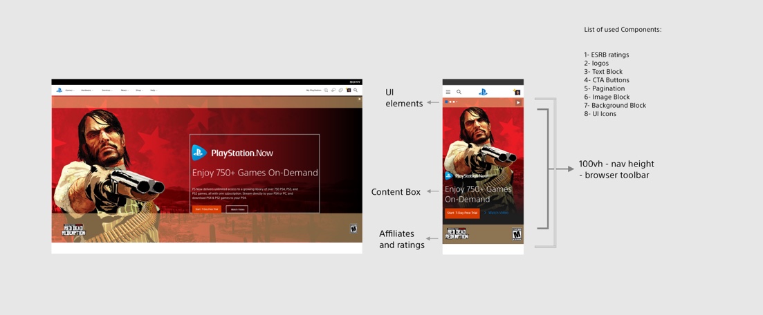
Content Container
The Hero Banner container is a flexible container extending to the grids or the full width. I added a text block, CTA button block, Legal text, PS logos, Brand logos, 3rd party, or sub-logos inside of the content container.
Inside the box, options are alignment, spacing, text block, button block, and logo blocks.
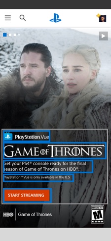
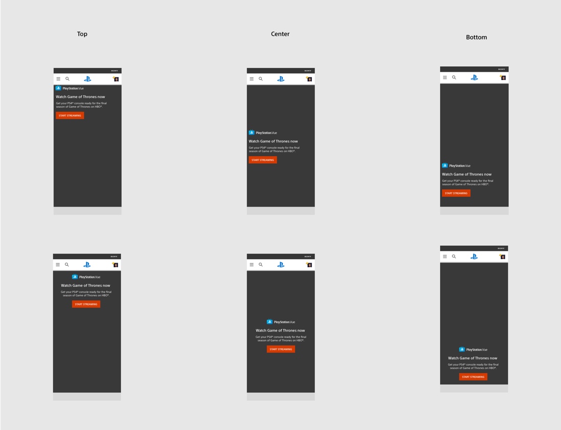
Text Block placement
Text Block component has flexible placement on the page. The author can then decide about the text block’s alignment on the page and align it to the grid.
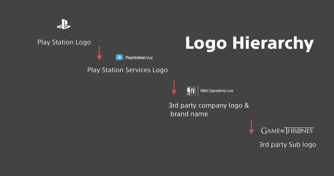
Logo Block
Text Block component has flexible placement on the page. The designer can then decide about the text block’s alignment on the page and align it to the grid. We have different logos to display on the banner component, so I have created a logo hierarchy to display symbols.
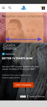
Component Blind Spots
The best UX practice for banner design is not to cover character faces or products with other banner utilities. I could accomplish this goal with a combination of aligning the box vertically and adding margin/padding to the component through the utilities I’ve built-in.
Second content-box
We have two content boxes in the hero. One of the boxes can wrap the content and CTA, and the second box (which is optional) could wrap an image.

Desktop Lockbox Option
The purpose of the lockbox is to make the text more readable against the background. This option is used when it is not covering content or character faces.

Placement of ESRB Rating logo
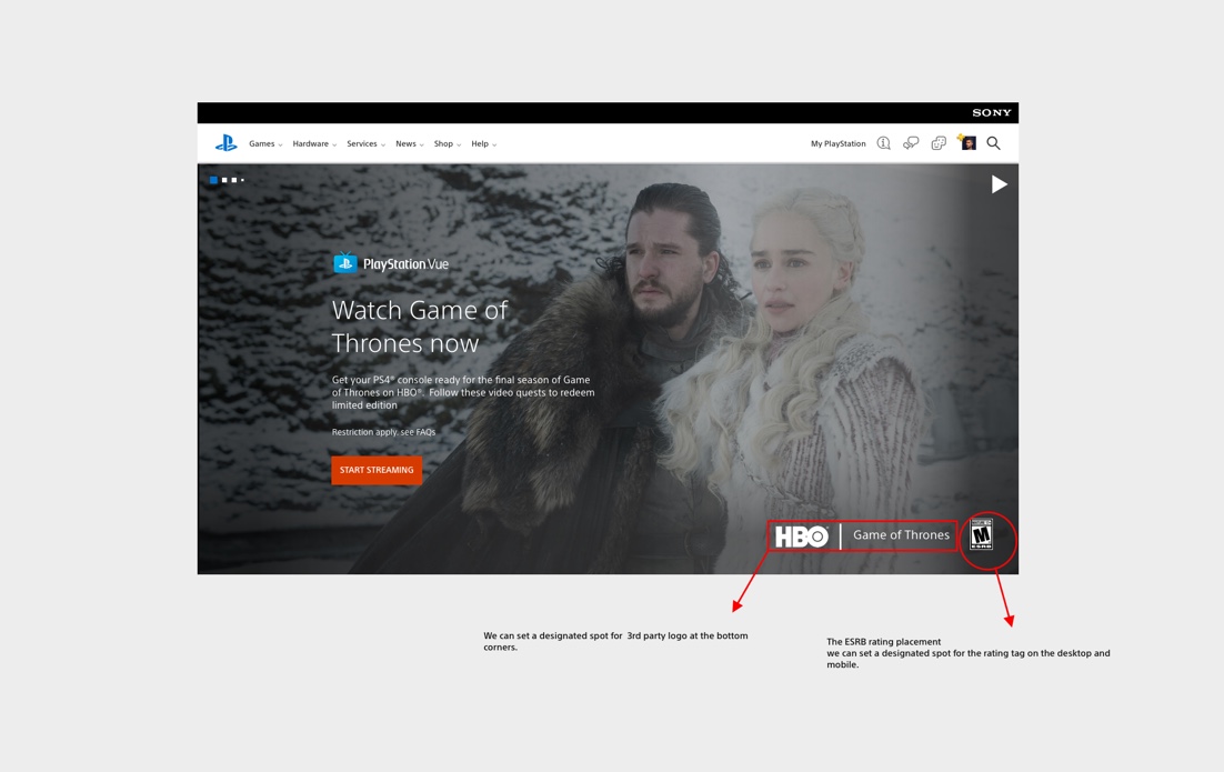
Simple Banner


Mobile Module Options

Animated Mobile Banner
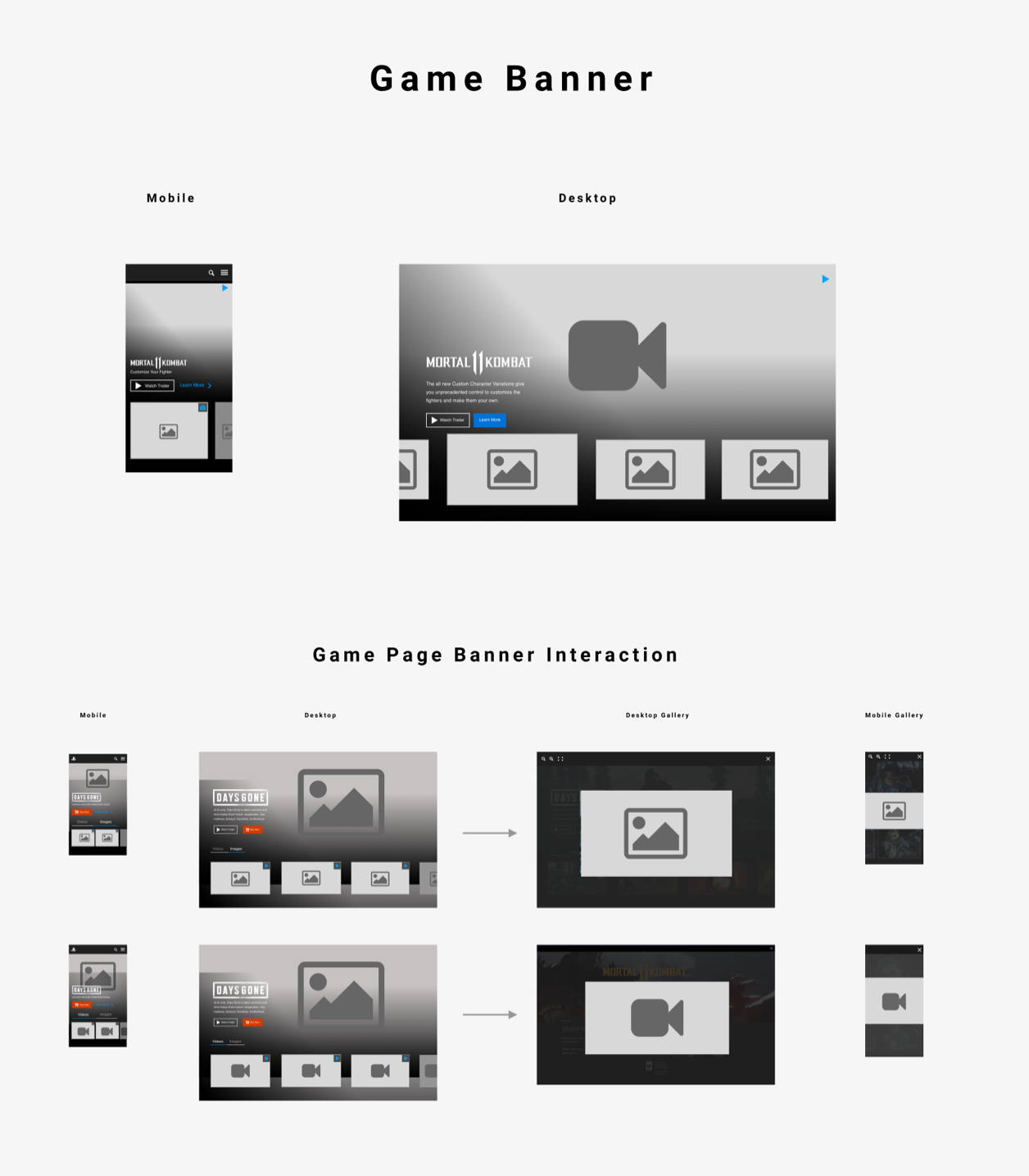
Game Page Hero Banner
Game Banner Prototype on InVision
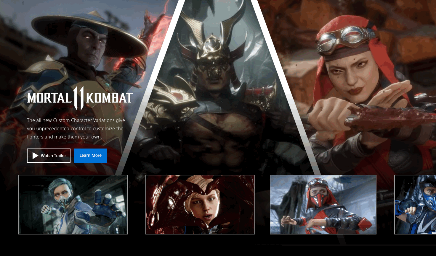


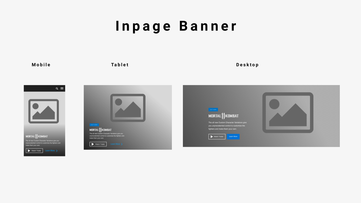
In-page Banner Ad

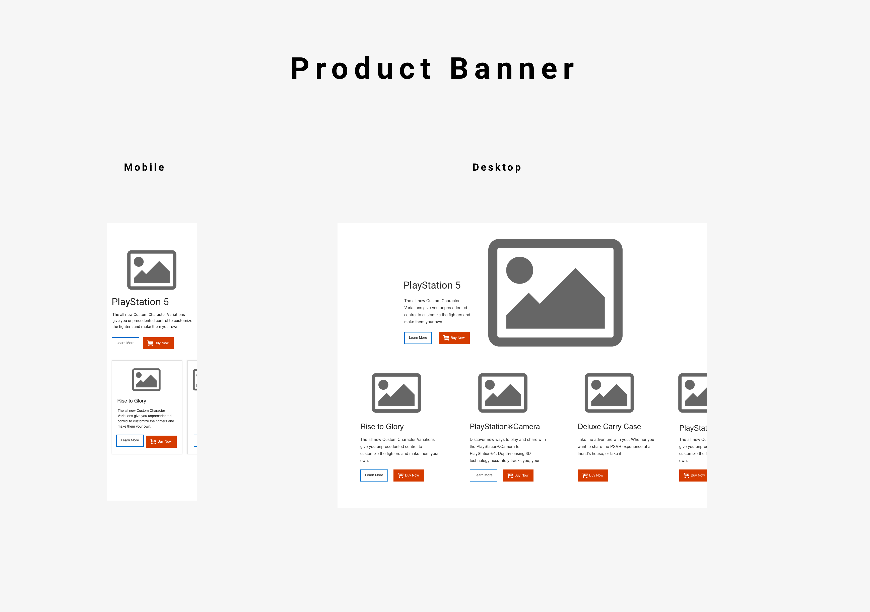
Product Banner


Results
To wrap this up, I would like to summarize my design solutions
- I designed customized user experience for desktop and mobile banners that increased product visibility, improved user experience, and design consistency throughout the entire product
- I’ve created various banner types based on user needs. Hero banner, product banner, simple banner, game banner, and banner Ads
- The user is getting more relevant products, suggestions, and deals
- I solved UX challenges of the placement of the utilities on banner components focusing on user-centric design. I added the ability to display interactive background images, videos and added animated banner functionalities
- I created a new horizontal swipe component for mobile banners. This swipe action is essential for the mobile user experience due to the limited space
- Discovered the main pain point of our target market and tested possible solutions with prototyping and testing